Design Manual Tasks via Task Designer Operation
The Task Designer Operation is the recommended method to design any custom Manual Task (MT) type. However, you can also choose any other Operation and proceed the old way to design MTs. For legacy MT design and customization methods, refer to the following documentation:
note
Any MTs designed previously with other Operation types remain executable and compatible with the WorkFusion platform functionality.
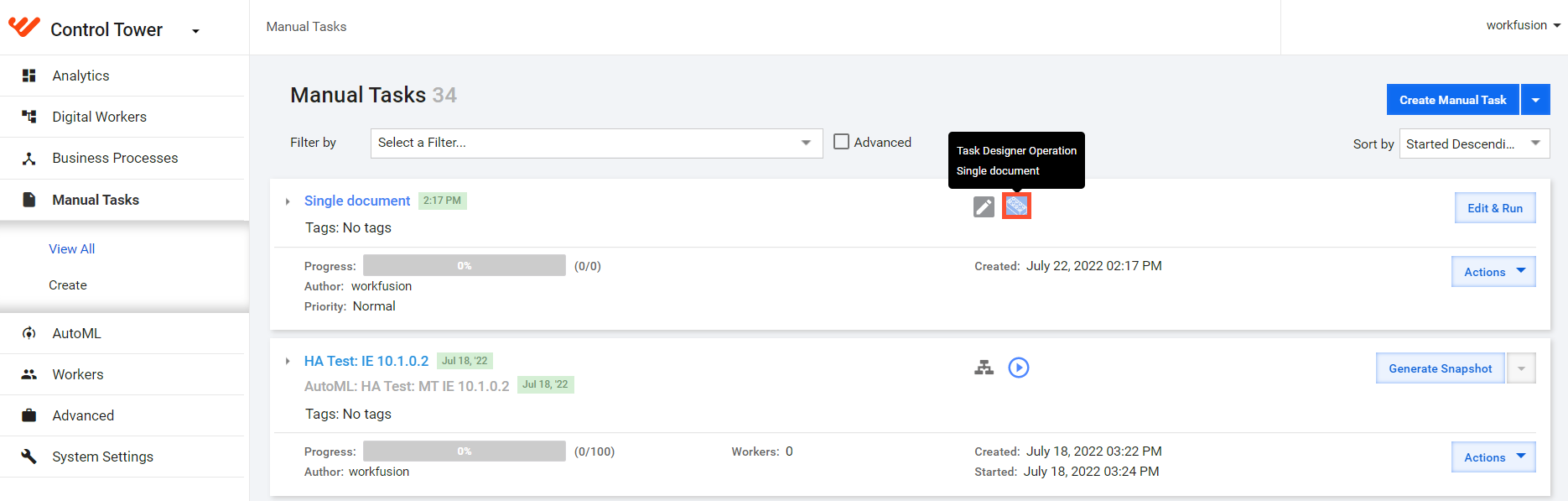
In the Manual Tasks list, tasks based on the Task Designer Operation have a special indication. When you move the pointer over the indication, a prompt appears, showing the layout template used to create the task: multi documents, single document, empty state.
Create Manual Task from Task Designer Operation
To create a Manual Task from the Task Designer Operation, follow the steps below:
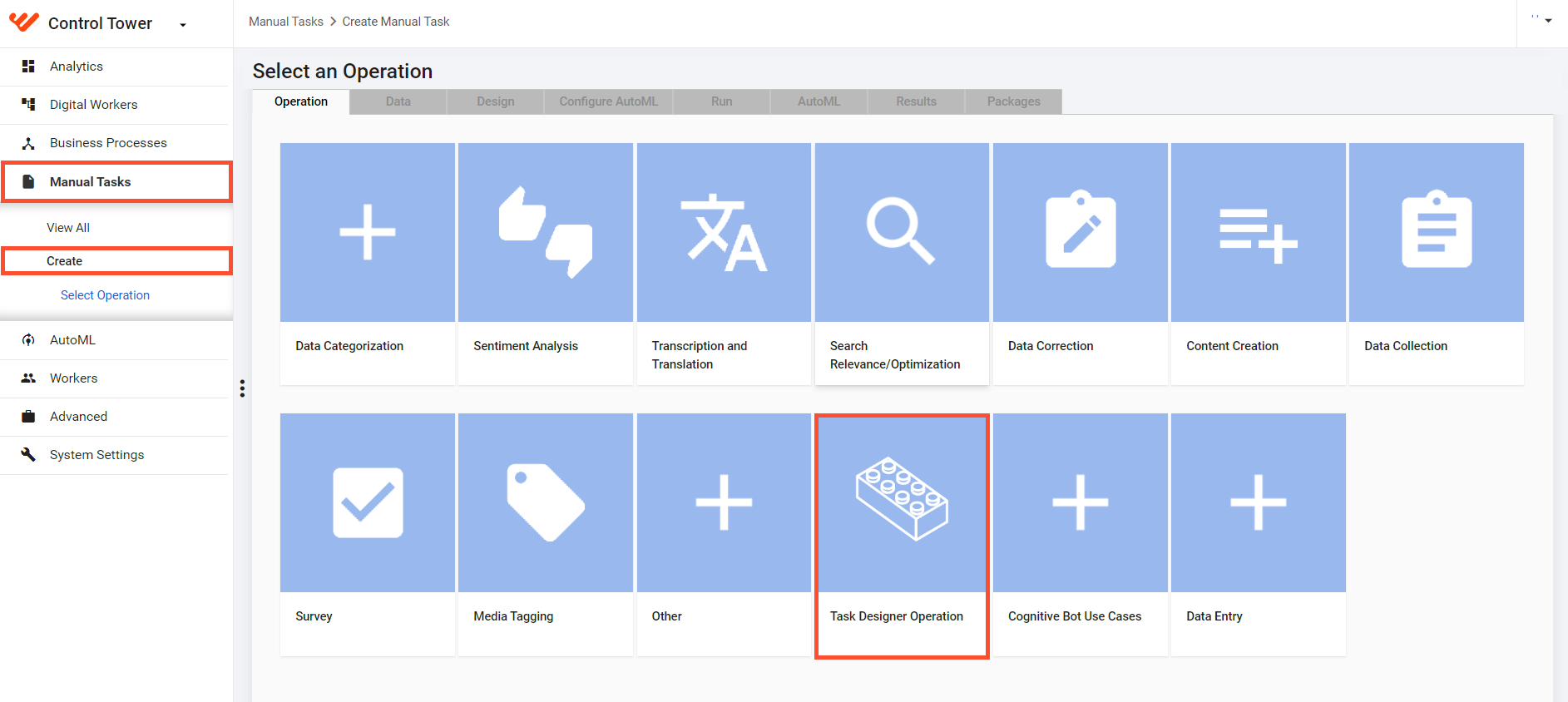
In Control Tower, go to Manual Tasks > Create and click Task Designer Operation.
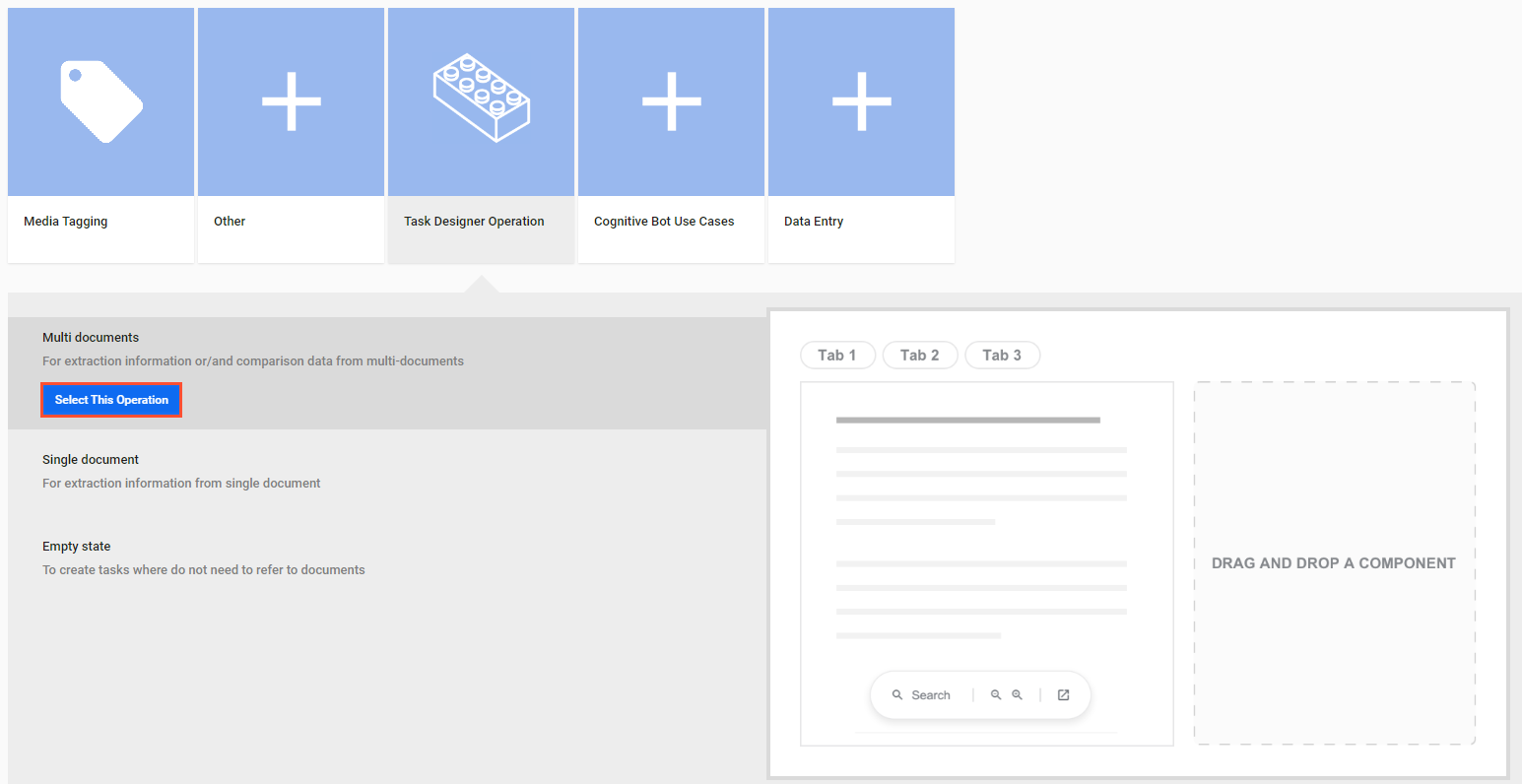
Choose one of the following layout templates and click Select this Operation:
Multi documents if you need to process multiple documents in a single MT.
Single document if you have only one document to process in your MT.
Empty state if you don't need to work with any documents in the task.
Upload data. Subsequently, you can see the uploaded data in the task preview area on the Design tab.
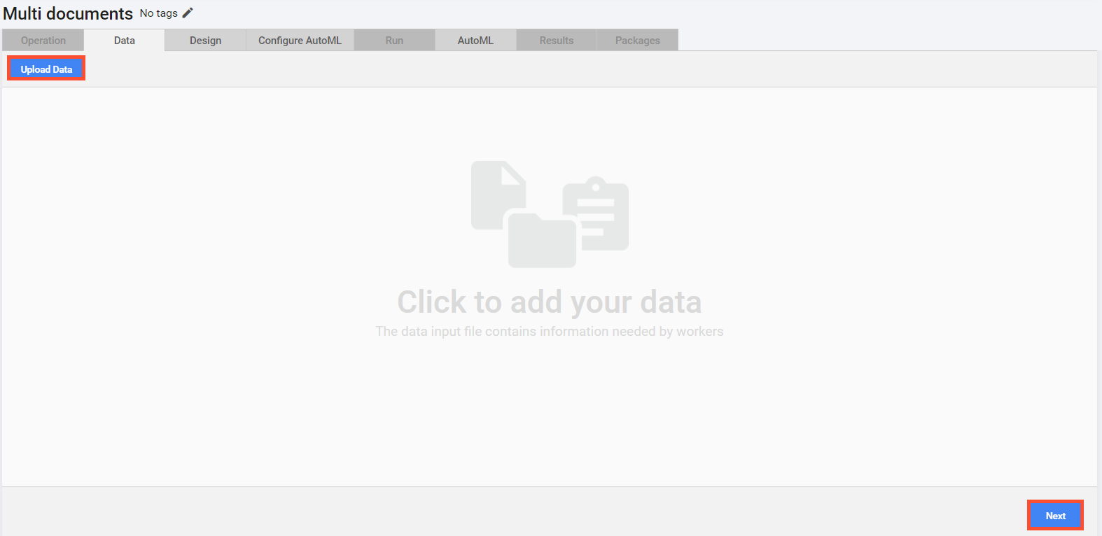
Click Next to get to the Design tab and start building a form layout. Depending on the option you chose in Step 2 above, the tab opens with one of the following templates already there:
Single-document Manual Task
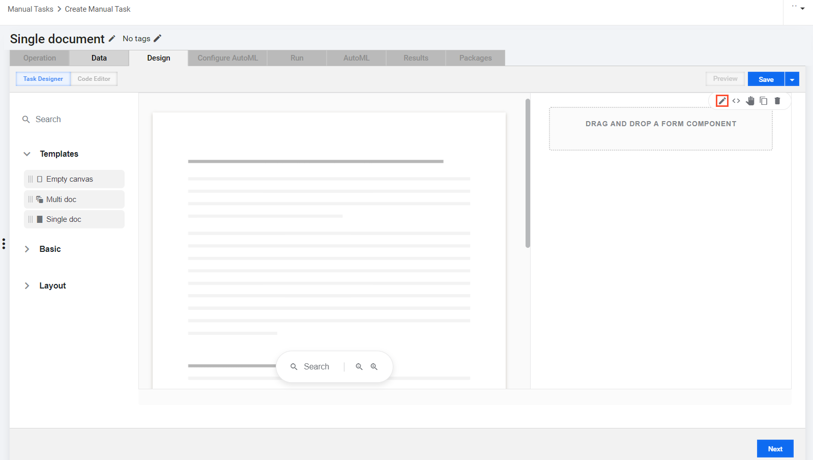
If you selected the Single document option to create Task Designer Operation, the Design tab opens with a Single document template already there.
To start building a form layout for the single-document task type, act as follows:
In the workspace on the right, move the pointer over the Single doc template and click the Edit (pencil) button to open the setting page.
In the window that opens next, specify the Property Name matching the column name with the task data from the input CSV file. Typically, it is
meta_info_json.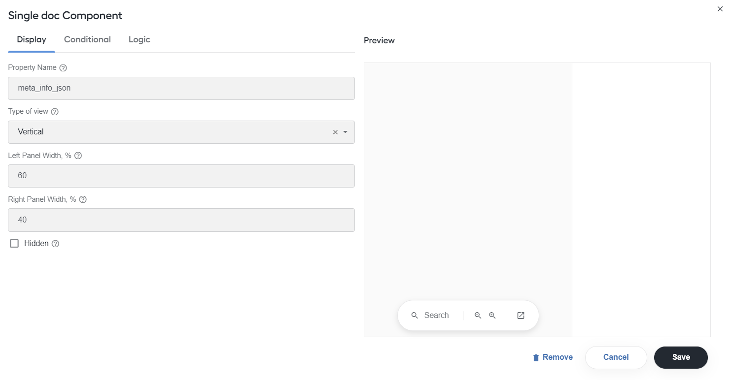
As a rule, the column in the CSV file comprises JSON with the following fields:
pages,ocrXmlUrl, andtaggedXMLif the model has already extracted fields.In the Preview area on the right, click the Save button to save the setting.
To add fields for tagging values, drag the components from the Basic or Layout menus on the left to the drop area on the right and make necessary changes on their setting pages. For details, refer to Add form components.
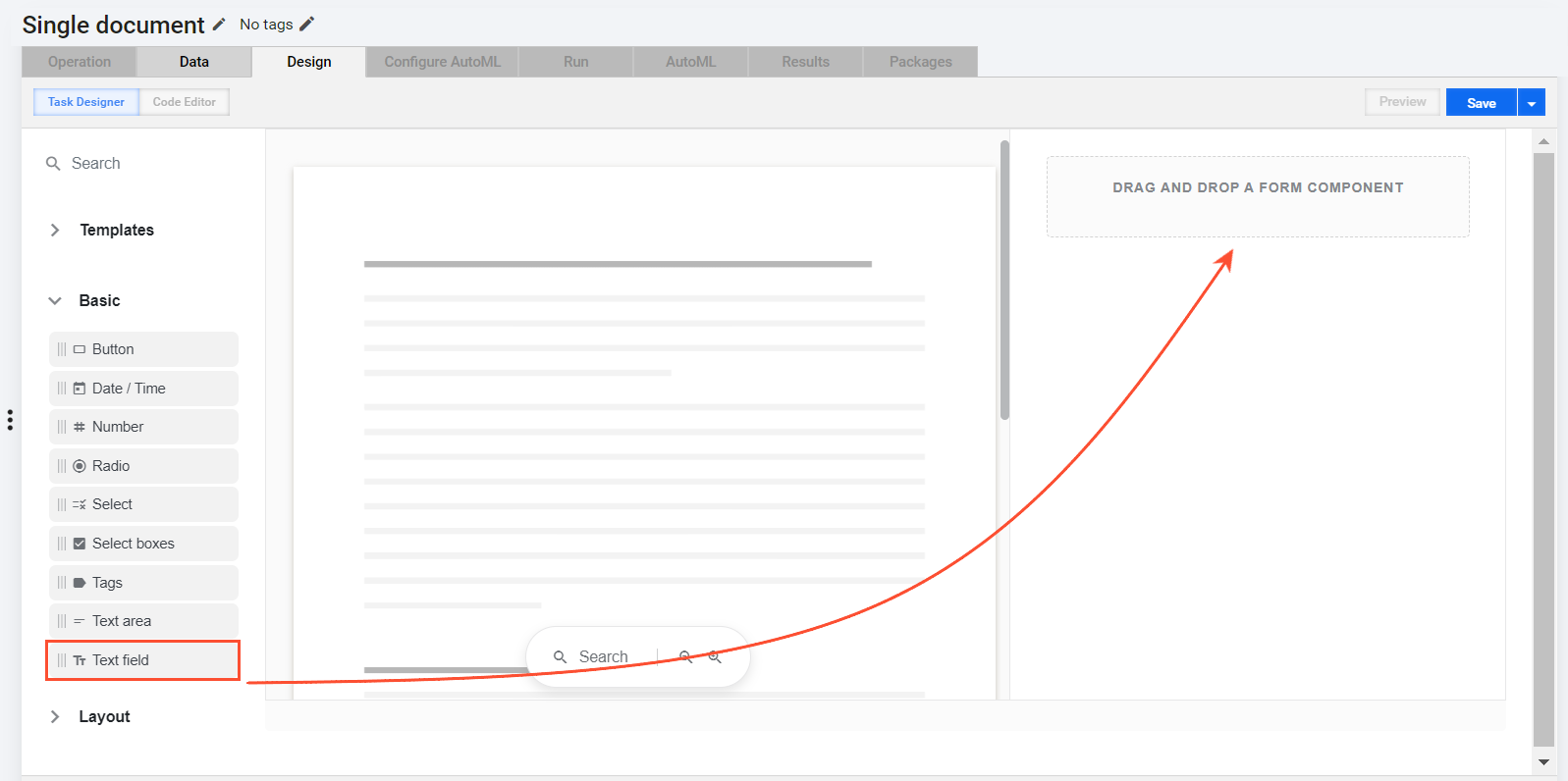
The Single document template supports the following components:
Basic menu Layout menu Date/Time Columns Number Content Radio Field Set Select HTML element Select boxes Line item Text area Panel Text field Table Once you finish building your form layout, click the Save button to save it.
Multi-document Manual Task
If you selected the Multi documents option to create Task Designer Operation, the Design tab opens with a Multi documents template already there. The template includes two tabs:
Summary, a preconfigured static page
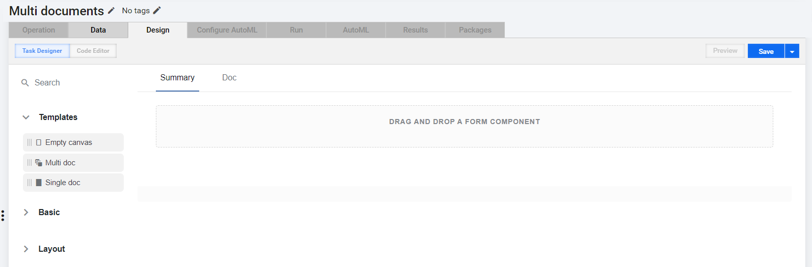
Doc with a space to preview documents
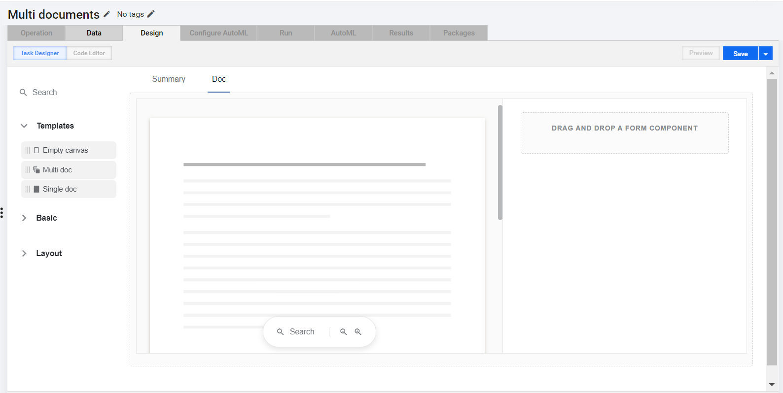
To start building a form layout for the task type, act as follows:
In the workspace on the right, move the pointer over the Multi documents template and click the Edit (pencil) button to open the setting page.
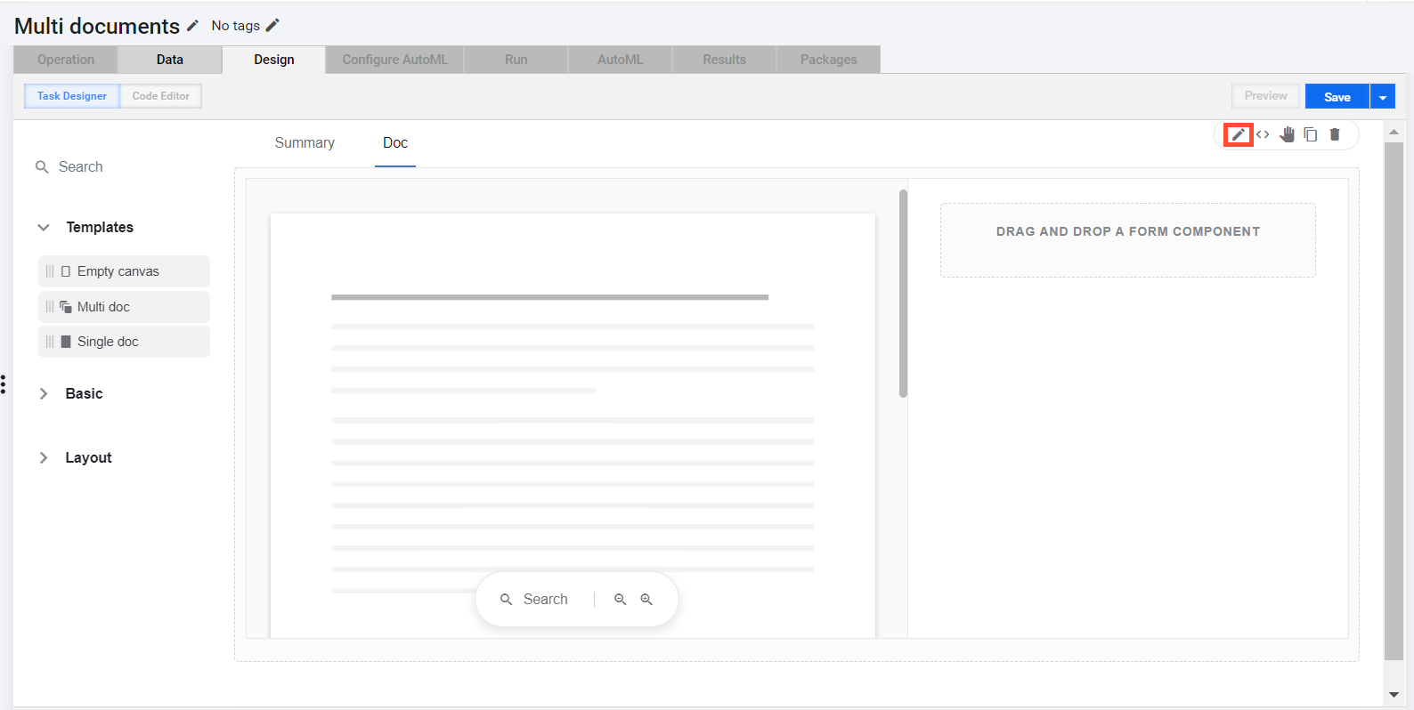
In the window that opens next, go to Display and set a dynamic tab—the task form tab to be dynamically multiplied depending on the input data:
In the Tabs section, select the Dynamic tab checkbox for the Doc item. If you leave Dynamic tab unchecked, you add a static tab—the one that's not going to change whatever input data you have.
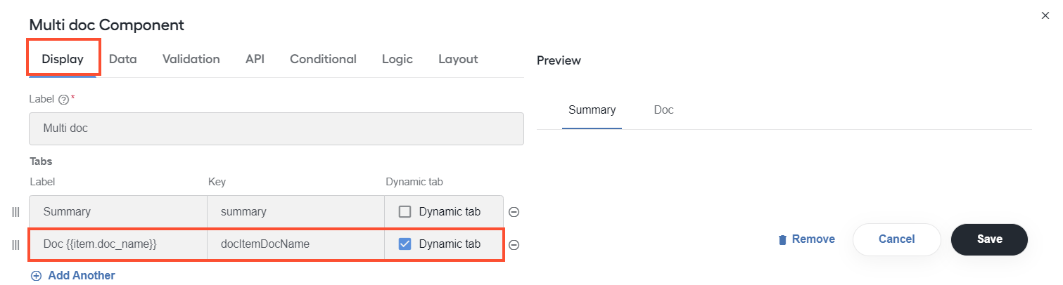
In the Label box in the same section, insert the tab name—typically, corresponding to that of a document in the MT, for instance, {{item.doc_name}}.
In the Type of view field, select Horizontal or Vertical to set how the tabs are to be arranged relative to each other when rendered.
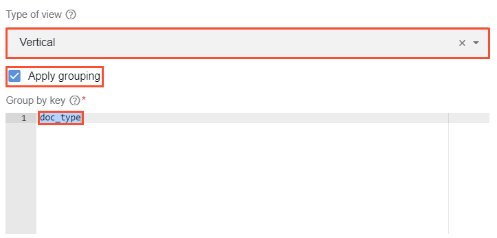
For the Vertical view, you can also set the tabs to be grouped by document types. For that, click Apply grouping and specify the
doc_typegrouping key.tip
- In the Label field, you can type in any value as it will not be used anywhere.
To map the input data to the Multi documents component, go to the API tab and specify the Property Name value to match the transaction data column name in the CSV file. Typically, it is
_sys_transaction_json.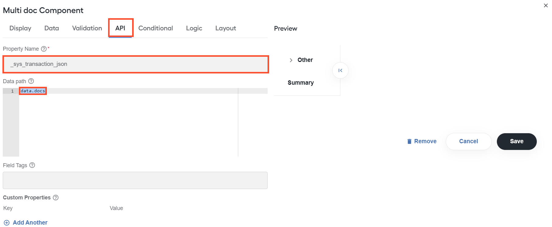
If the input document data set is nested deep, also add the Data path value. In the example, input data will include a Control Tower transaction comprising an object with a docs field containing a set of documents.
In the Preview area on the right, click the Save button to save the settings.
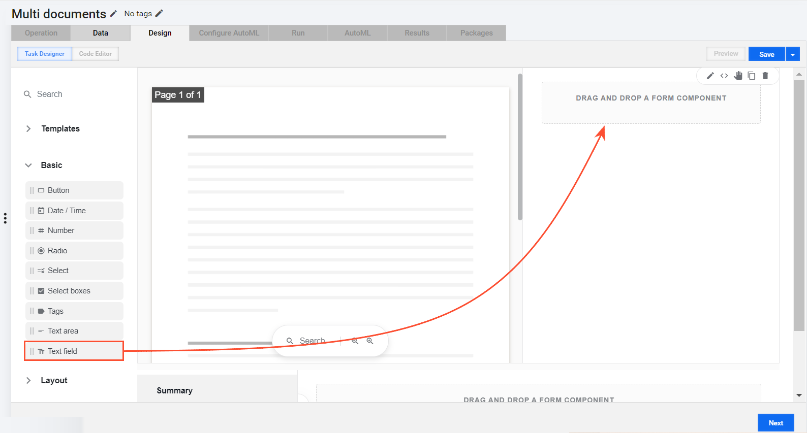
To set up a layout for each document form, drag the Single doc component to the drop area of the appropriate dynamic tab.
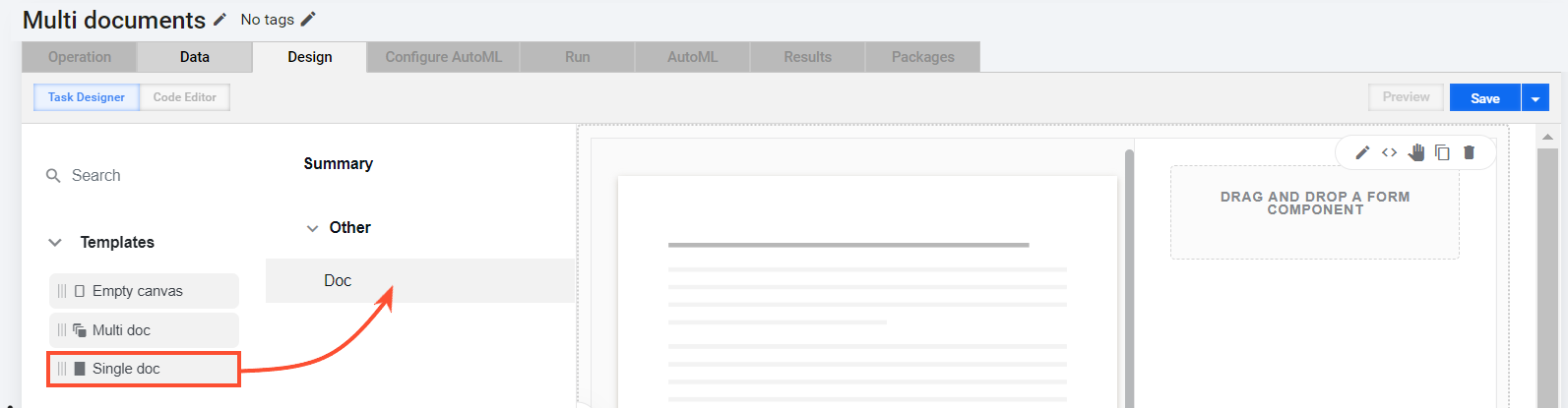
On the page that opens next, specify Property Name. Typically, it is
meta_info_json. This way, you map data from the inside of the multi-document transaction to the Single document component. Click Save to apply the changes.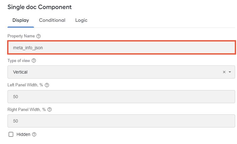
To add fields for tagging values, drag the components from the Basic or Layout menus on the left to the drop area on the right and make necessary changes on their setting pages. For details, refer to Add form components.
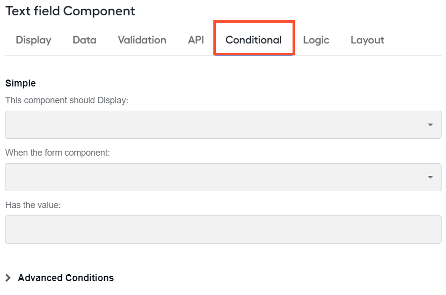
To configure viewing conditions for the added fields, open their setting page (if closed) and go to the Conditional tab.
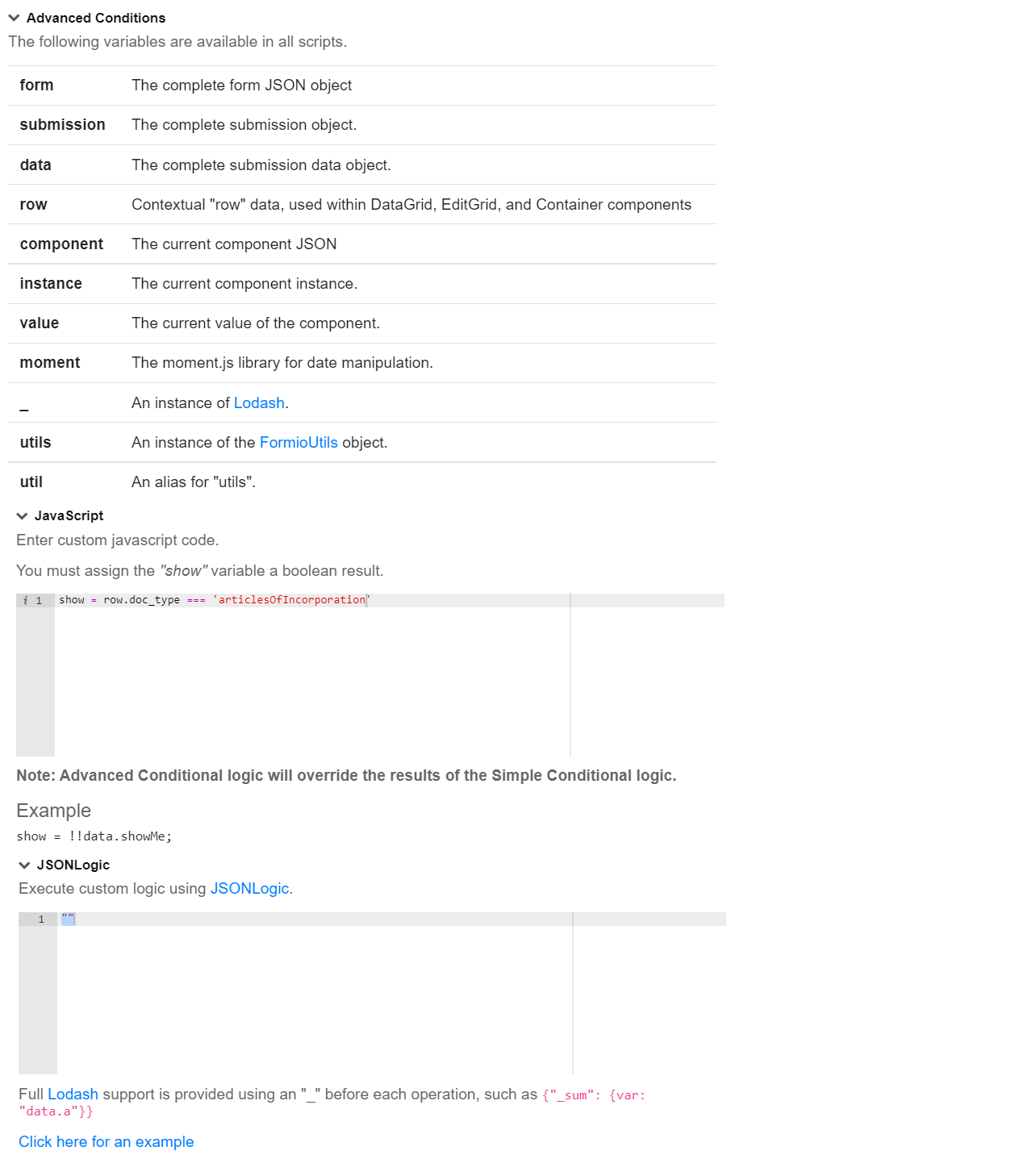
For the components within Data Grid, Edit Grid, Multi doc, and Container that might be dynamically created at runtime, set viewing conditions using the Advanced conditions section. The approach allows you to access values inside each row (tab).
Once you finish building your form layout, click the Save button to save it.
Empty state
If you selected the Empty state option to create Task Designer Operation, the Design tab opens with the Empty state template already there.
To build a layout, act as follows:
Drag any components from the Basic or Layout menus on the left to the drop area on the right and set them as appropriate. For details, refer to Add form components.
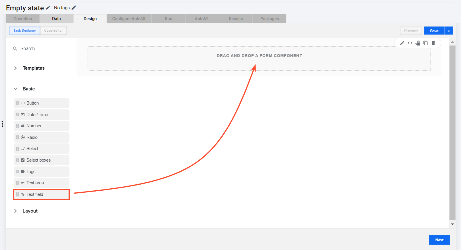
Once you are done with adding components to the layout, click the Save button.
You do not have to edit the configuration of the Empty state template. In a final MT form, any components you drag to the canvas are arranged in a consistent layout.
Add form components
To add components to a form layout, drag the options from the following two menus on the left to the drop area of the created form layout:
To edit any component settings, select the component and, in the top-right menu, click the pencil button to open the setting page, and make required changes.
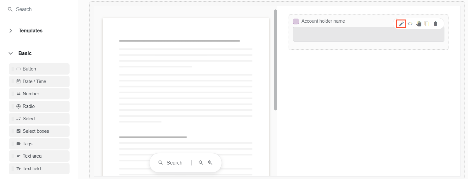
For more information on component settings, refer to the documentation.
Basic
The table below lists the components from the Basic menu and their brief descriptions.
| Component | Usage | Illustration |
|---|---|---|
| Basic/Button | Use the component to add a button. |  |
| Basic/Date/Time | Use the component to add the functionality to set the date and time. The default format for setting the date is yyyy-MM-dd. To change the date display format, open the setting page and go to the Display tab. | 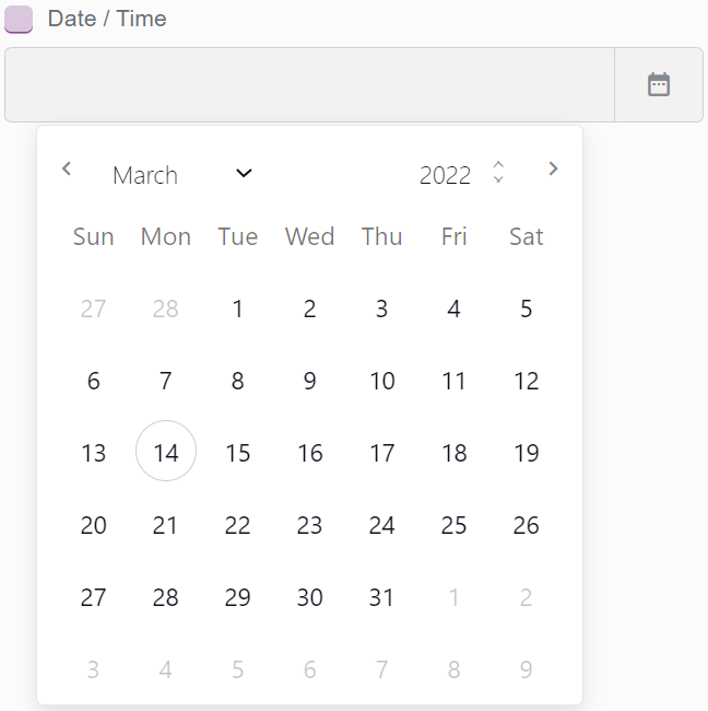  |
| Basic/Number | Use the component to limit input to numbers only. |  |
| Basic/Radio | Use the component to include radio buttons. | 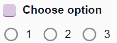 |
| Basic/Select | Use the component to add a selection list field. | 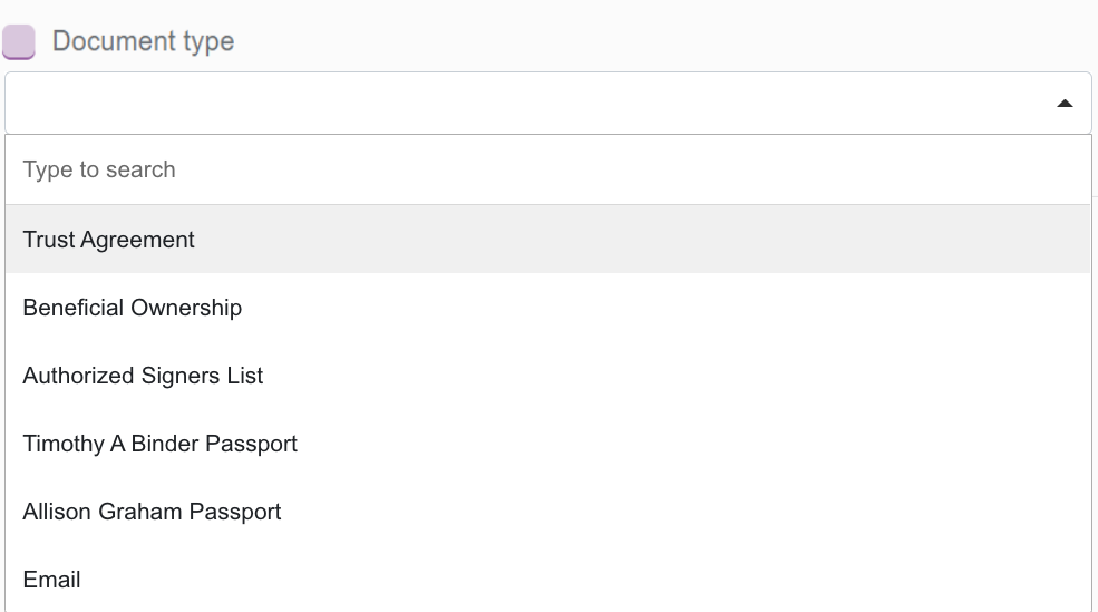 |
| Basic/Select boxes | Use the component to add select boxes to a page. | 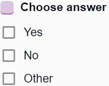 |
| Basic/Tags | Use the component to include a field for additional categorization using tags. | 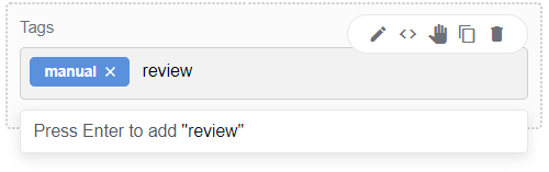 |
| Basic/Text area | Use the component to add a text area for extended descriptions. | 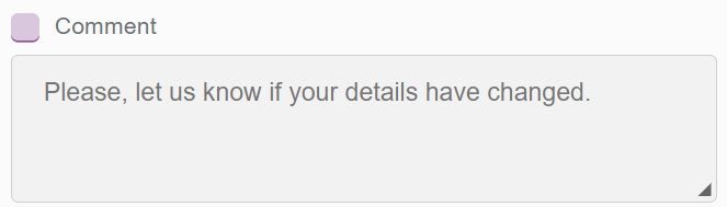 |
| Basic/Text field | Use the component to include a field for entering text. |  |
For more details and settings, refer to the documentation on the Basic menu components.
For tips on complex component configurations, refer to Deliver complex customizations via MT Designer.
Layout
The table below lists the components from the Layout menu and their brief descriptions.
| Component | Usage | Illustration |
|---|---|---|
| Layout/Columns | Use the component to organize the form content in a number of columns. | 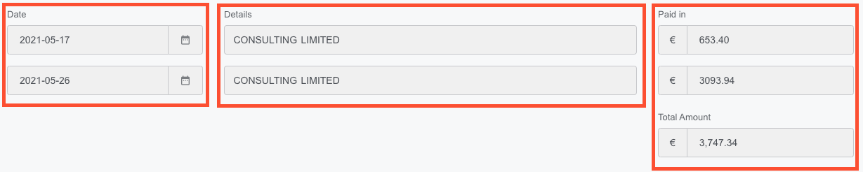 |
| Layout/Content | Use the component to add non-field information, for instance, instructions at the top of a form. Type the required content in the WYSIWYG editor. |  |
| Layout/Data Grid | Use the component to include a line item grid where you can add multiple components from the Basic menu. On a rendered form, the components in a Data Grid look like rows that you can add or remove dynamically as necessary. Data Grid is especially useful when you need to duplicate or add multiple field sets. For more information about the component, read the documentation. | In Task Designer: When rendered: When rendered: |
| Layout/Edit Grid | Use the component to include a field set for capturing and displaying data in a task form. Inside the grid, you can add multiple components from the Basic menu. On a rendered form, the components in an Edit Grid look like a table that you can edit dynamically as necessary. Edit Grid is especially useful when you need to duplicate or add multiple field sets. For more information about the component, read the documentation. | In Task Designer: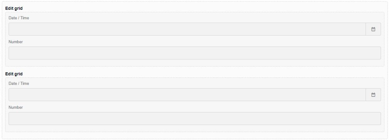 When rendered: When rendered: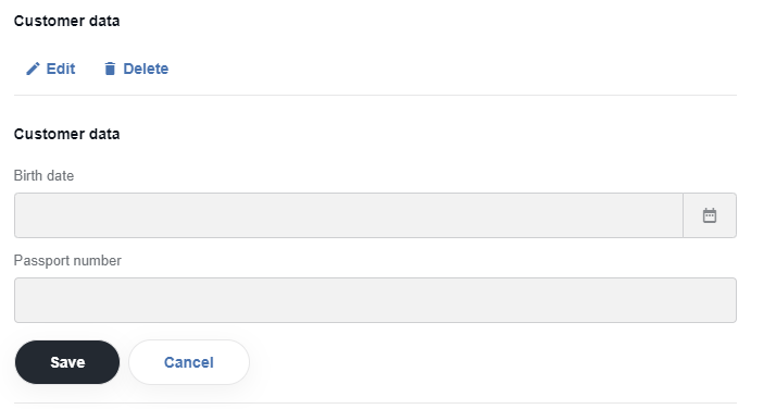 |
| Layout/Field Set | Use the component to create a title for an area in a form. Put it inside other Layout components or in between related components. | 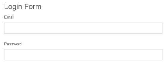 |
| Layout/HTML element | Use the component to set up an HTML element. |  |
| Layout/Panel | Use the component to combine a number of fields under the same title and apply identical styling. | 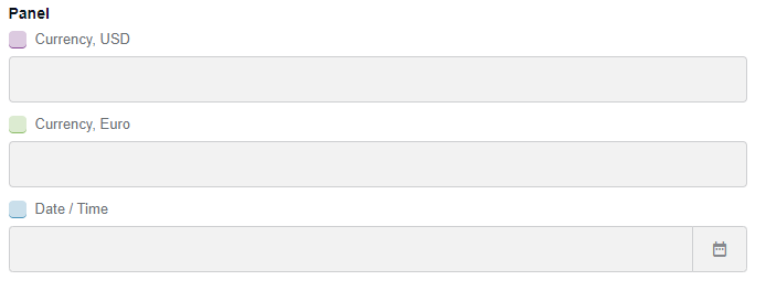 |
| Layout/Table | Use the component to organize the content in a table. | 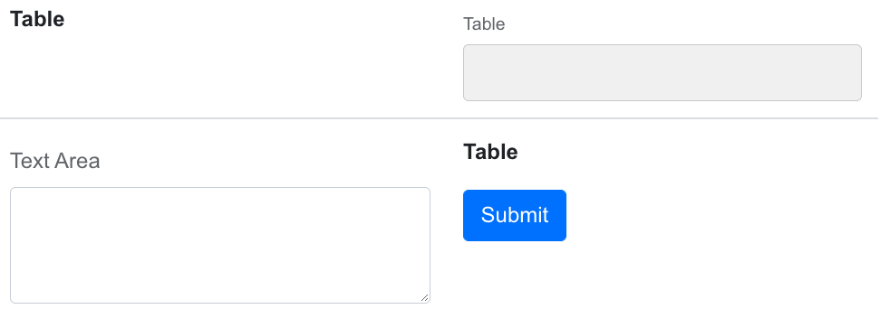 |
| Layout/Tabs | Use the component to organize the content as a collection of tabs. |  |
| Layout/Line Item | Use the component to organize the content as a table available for tagging. For details, refer to Line Item. | 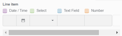 |
For more details and settings, refer to the documentation on the Layout menu components.
For tips on complex component configurations, refer to Deliver complex customizations via MT Designer.
Line item
Typically, one uses Line items to add a group of fields sharing identical attributes, for instance, a list of commodities in an invoice where each item has characteristics, such as name, price, vendor, and so on.
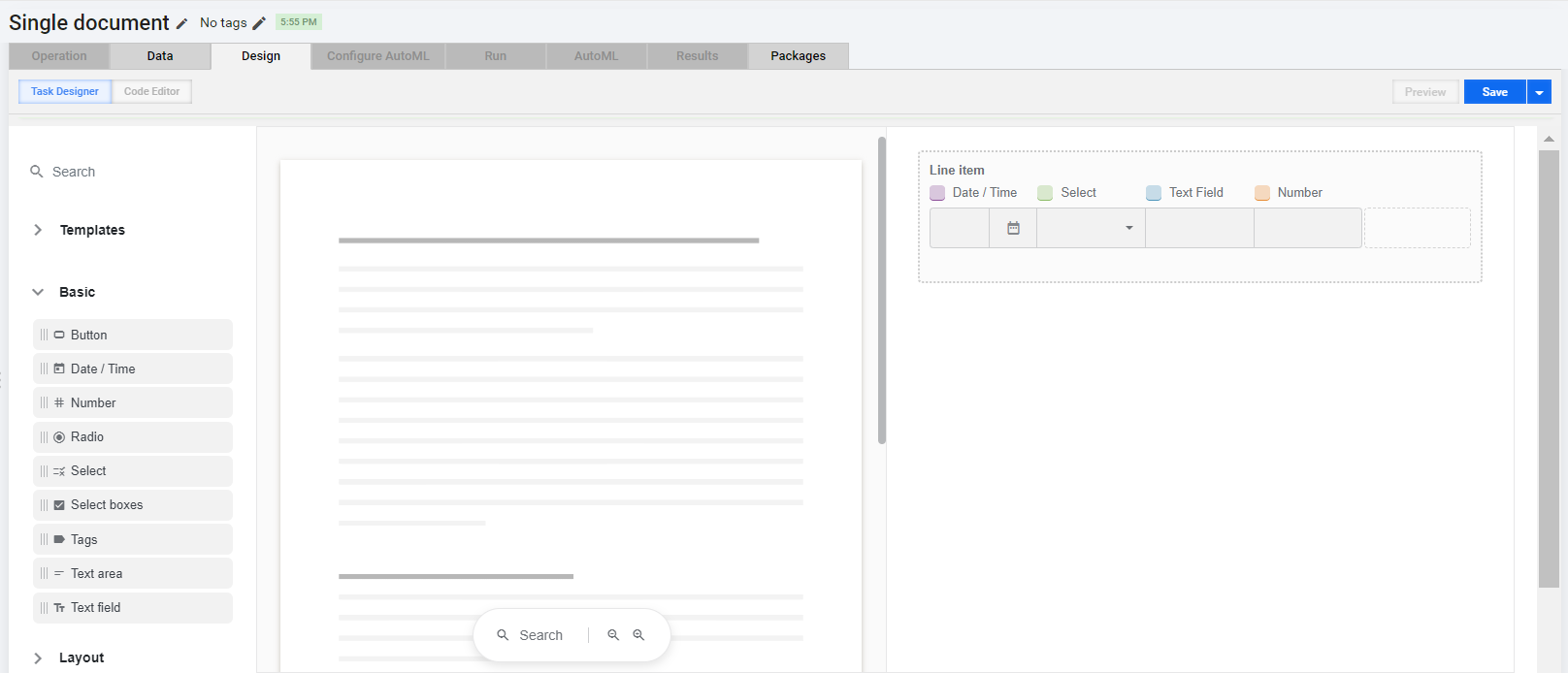
To create such a table, drag one or more of the following Basic menu components to the Line item drag-and-drop area:
Date/Time
Number
Select
Text field
Text area
note
Text area has a format that differs from the rest of the components in a Line item, which can affect the appearance of the layout.
When rendred, the components appear as a basic table row that you can duplicate several times in the course of tagging by clicking the Add row button.
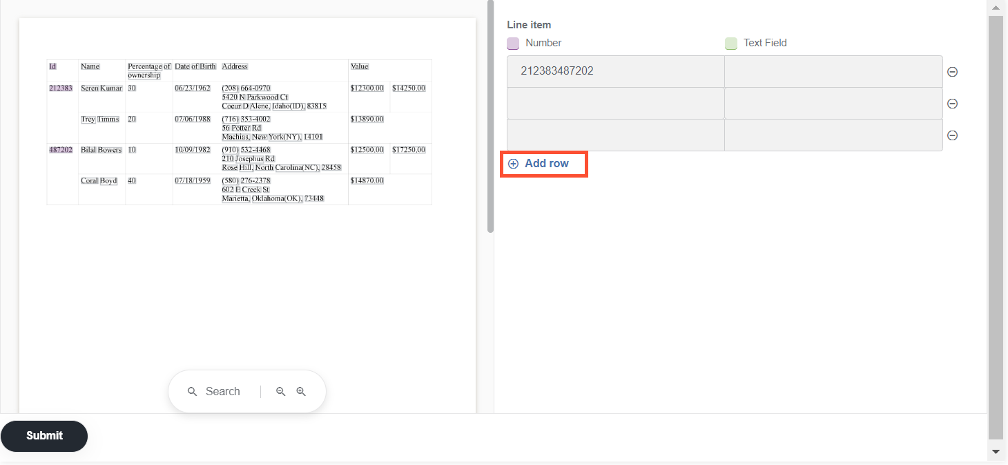
To configure the Line item component, follow the steps below:
Click the component's Edit (pencil) button.
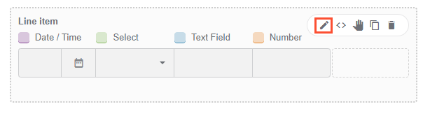
Make necessary changes on the Settings page:
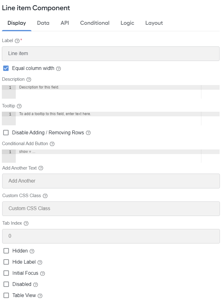
Set the table column width as described in the section.
Disable or enable removing rows by selecting the respective checkbox. The feature is off by default and is not recommended for usage as it limits tagging capabilities.
Change other general settings as described in the documentation.
Set column width in Line item table
By default, the table columns are set to have identical widths—the Equal column width checkbox is selected.
To set another column width, do as follows:
Deselect the Equal column width checkbox. A table appears, listing all Line item components.
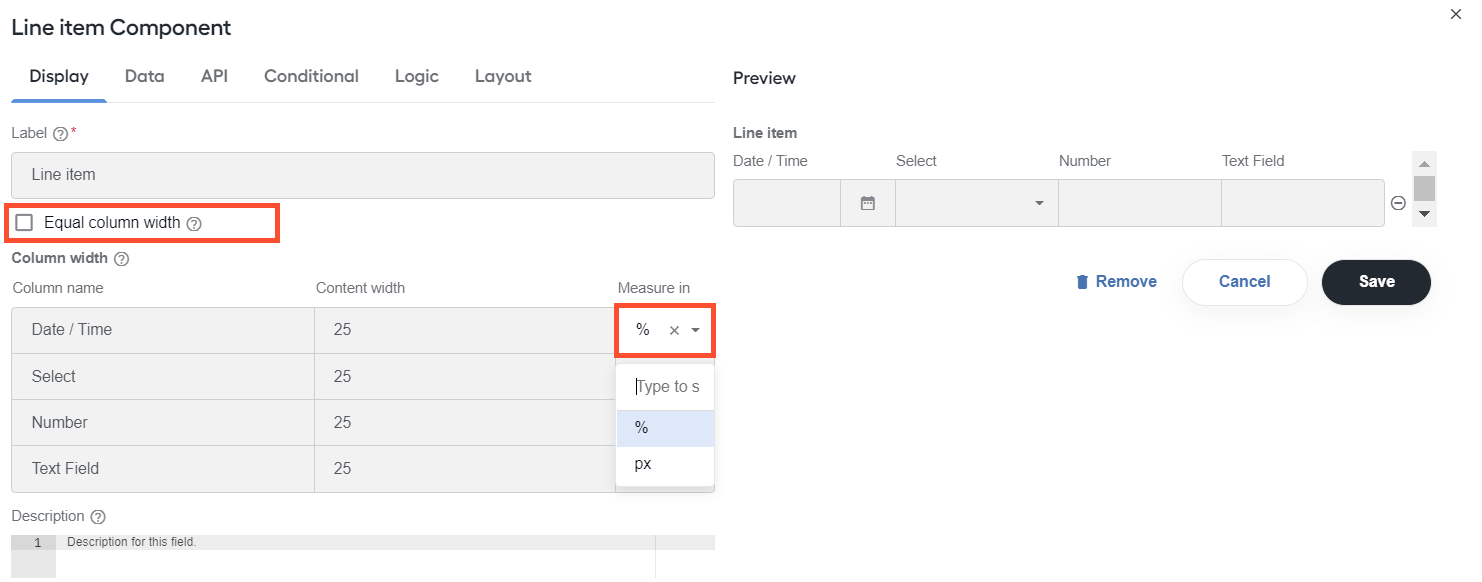
In the Measure in column, choose whether you are going to set up relative width in percents (%) or fixed in pixel (px).
In the Content width column, specify exact width values. The values are applied to entire columns in the resulting Line Item table.
If you set a fixed value for a single column, the rest of the table is adjusted accordingly to the width of the datapoint panel in the Manual Task.
Any percentage values you set are validated to total 100%. If any of them is invalid, you get appropriate warnings.
Any changes you make in the width settings are immediately visible on the Preview panel on the right. If the table width is more than the Preview display area, a scroll bar appears.
Configure table component settings
To set up a specific component in a table (Text field in the figure below), move the pointer over it, click the Edit (pencil) button, and make necessary changes. For details, refer to the following documentation on component settings.
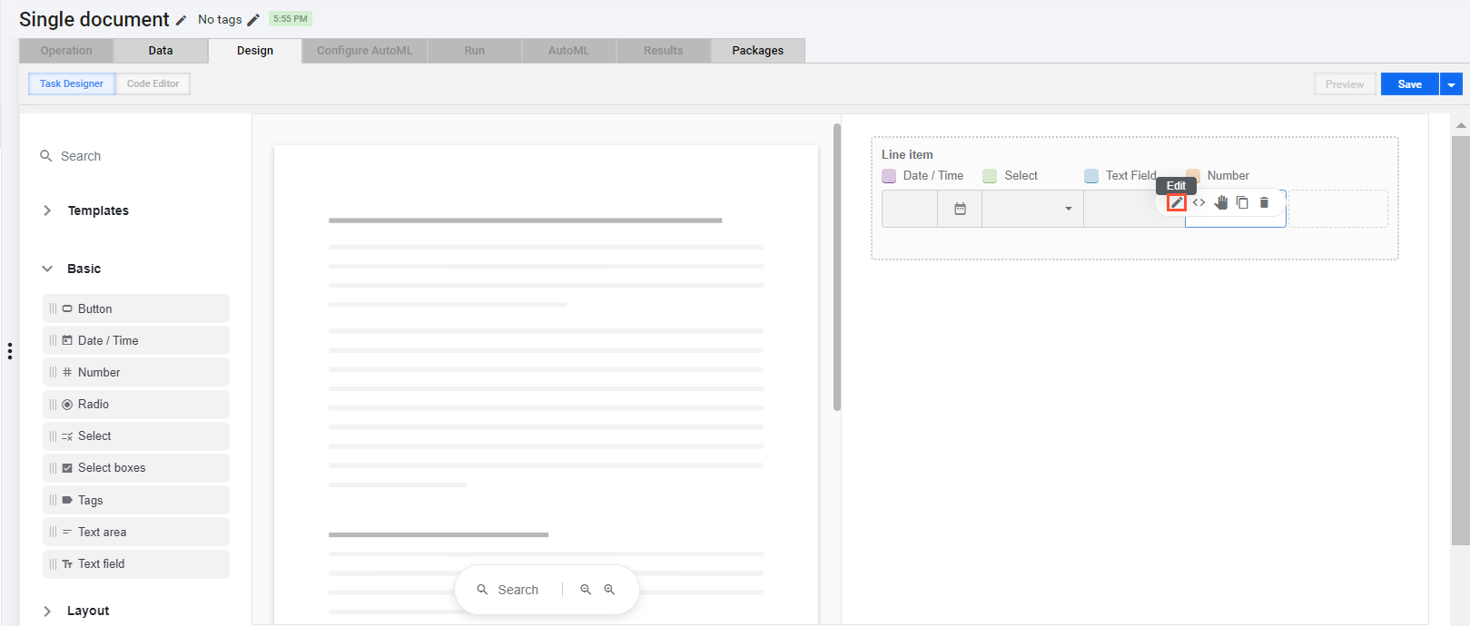
Any settings you apply to a particular component are applied to the entire Line item table column corresponding to that component.
important
When configuring Line item components, it is not recommended to set any of them to use multiple values (Data tab, Multiple Values checkbox).
Line item tagging
There are several ways how you can tag while you are working with the Line item component in a Manual Task form:
To tag a single content element, select the element in the original document and click the respective field in the Line item table.
The selected content element is inserted in the cell you clicked. In the original document, the element is highlighted in the color assigned to the cell.
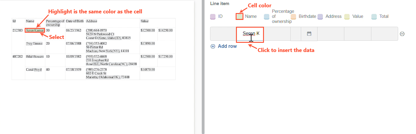
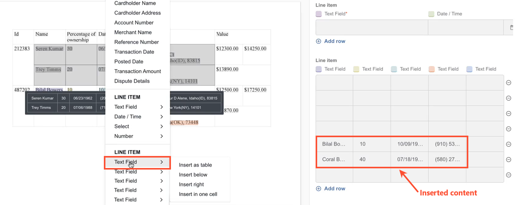
To tag multiple content elements, select them, click a cell in the Line item table. In the context menu, choose an option to insert the selected content from the original document.
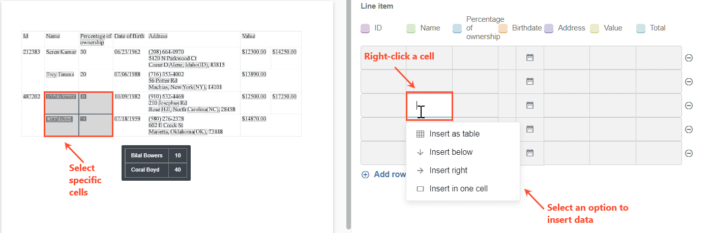
The content you selected is inserted in the Line item table, arranged in accordance wuth the insertion option you chose in the context menu. For instance, the figure below illustrates the case for the Insert as table option: cells are inserted the same way they are arranged in the original table.
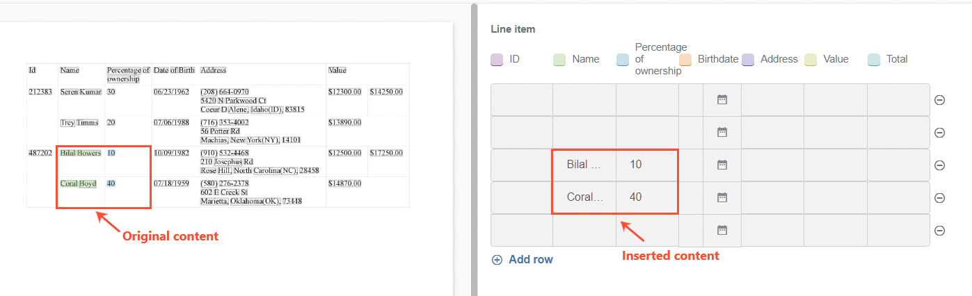
In the original document, the inserted content is highlighted in the same colors as assigned to corresponding cells.
An alternative way to tag multiple content elements is to select them in the original document and right-click the selection to open a context menu. In the menu, choose a Line item table element from where you want to start the insertion and select an option for how the data is to be inserted.
Set tagging hotkeys
To make tagging faster and more convenient for human operators, you can set up tagging hotkeys. The feature is available only for those form components that allow tagging inherently, for instance, Text field, Number, Line item, and so on.
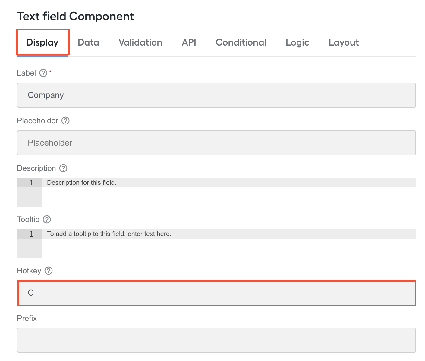
You can set up tagging hotkeys on the setting page as you add an MT form component to a layout. For an existing form component, open the setting page by clicking the Edit button (pencil).

On the setting page, go to the Display tab. In the Hotkey field, type in the hotkey you want to set up for the particular field. Use any letter or digit.
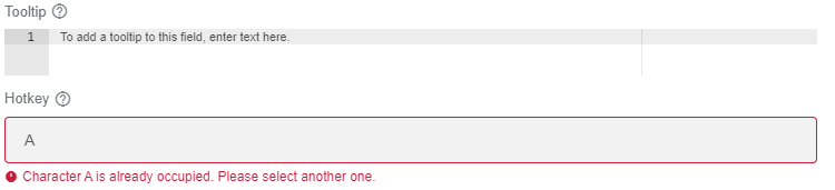
Mind that you can't assign the same hotkey to several fields. If this happens, you get a warning that the character you attempt to add as a hotkey is already in use.
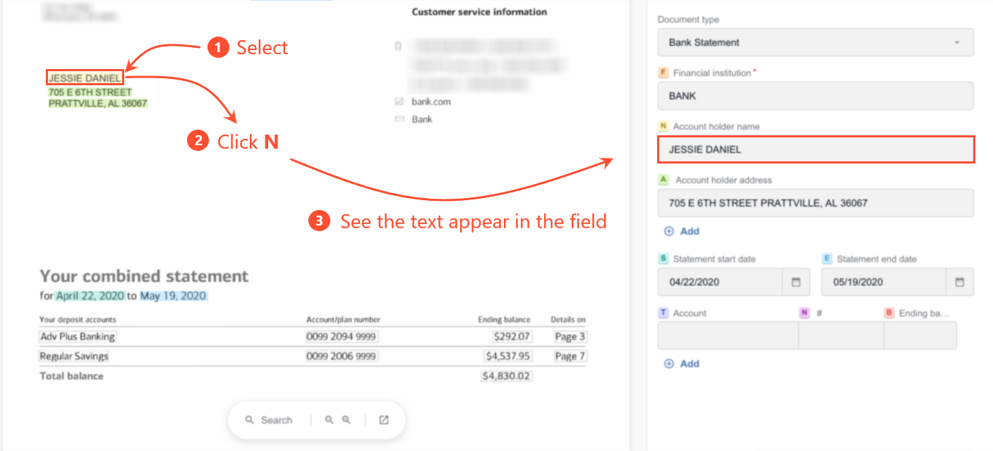
In the resulting Manual Task form, each tag-labelled field has a color indicator next to its name with the hotkey letter or digit inside it:
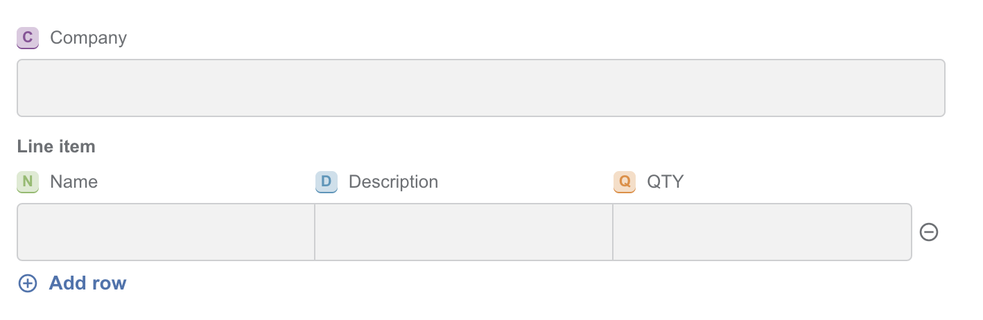
To tag a value in a document, select a text chunk and press the required hotkey. The selected text chunk appears automatically in the field corresponding to the hotkey you pressed. In the text, you see the chunk highlighted in the color corresponding to the tag.