
Check high-availability environment
A dedicated HA Overview dashboard was created to facilitate the detection of inconsistencies in a high-availability (HA) environment.
It highlights the following information:
- Service statuses
- Nodes on which active service instances are running
Service statuses
In an HA environment, services can run in the active-active mode or active-standby mode. The following visualization displays the service state in the time-series format.
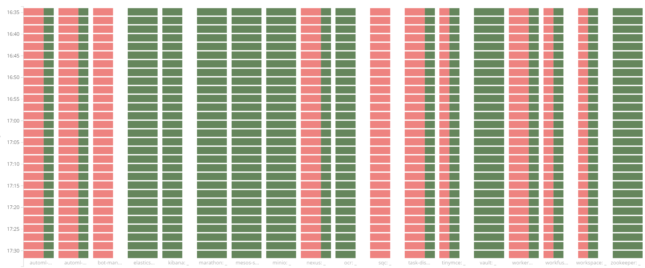
Each bar displays the number of nodes that reported a service as up and the number of nodes that reported the service as down. Data is aggregated at two-minute intervals.
For active-active services, the bar is green, in which case all nodes report services as up. For active-standby services, the bar is only partially green: exactly one node reports services as up, others are down.
As the time-series visualization is used, it is easy to spot service state changes over a period in the past. For example, when a service restarts, there is a "down" and "up" message from the same node at one time interval (two minutes). On the chart, this event looks like a spike in comparison to adjacent time intervals.
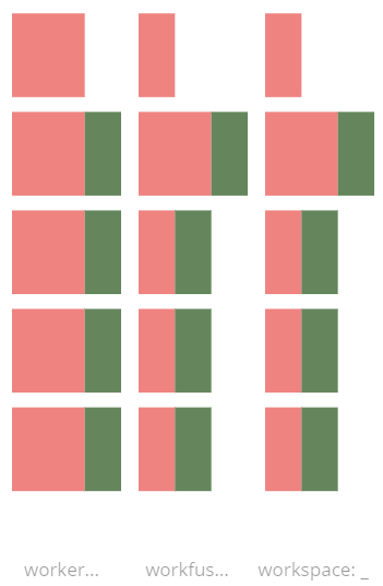
Active nodes
This chart is useful to spot which node is currently active for a particular service to further conduct a more in-depth investigation. You only have to hover over the service of interest.
