
Perform monitoring
Monitoring
- Model errors analysis:
- extraction analysis
- post-processing analysis
- Exceptions handling:
- gateway.log
- scaling.log
- ducc.log
- model.log
- webharvest.log
Tableau Server
WorkFusion platform uses Tableau Server to:
- Create and render BI Widgets displayed on WorkFusion Dashboard.
- Create and render Automation Chart.
- View and compare experiment results to find the best suiting ML model (Data Scientist View).
Use Data Scientist view
To analyze experiment results, you can use one of the following navigation patterns:
- Experiment Groups > Group > Experiment > Run > Confusion Matrix > Set > ROC
- Per Tag Results > Run > Confusion Matrix
note
Tableau interactions are quite complex, and if you just click the top level tabs (Experiment, Overview, and so on), the plotted results may not reflect the experiment you would like to see.
Experiment Groups
The tab contains a list of groups for all the uploaded experiments.
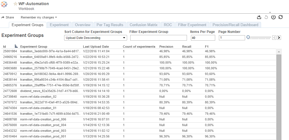
Experiments are grouped on the first page, which you see upon logging in into Tableau. Numbers for precision, recall, and F1 on Experiment Groups tab are shown for the best experiment even though it might not be the final production experiment (it can happen with the Information Extraction + Relation Extraction combined model).
To view the Experiment Group details, click the Experiment Group name.
Experiment
A core structure of any Tableau chart (a Tableau chart integrated into WorkFusion Machine Learning or Virtual Data Scientist framework) is an experiment. Experiment is a combination of training set of documents that contain mark-up of some view that should be automated, and a particular machine learning algorithm that take a training set and generates a binary model to use instead of (or in junction with) crowd workers. Usually, but not always, results of an experiment are obtained using n-fold cross validation to ensure statistically correct numbers instead of a lucky split of data set into training and testing part.
Experiment (and a solution for a particular crowd task automation) may involve several steps of different models. Then, experiment will include several 'steps' with separate charts for each, but they will be grouped like on the screenshot below.
Usually, for an n-step experiment you will get n+1 charts, because every step gets its quality measured on gold input, and combination of all steps is also measured on raw input against golden data. The Experiment tab in tableau consists of a set of charts that represent different high-level overview of results achieved by machine learning algorithm.
Experiments can be selected by using the Experiment Filter, and the accuracy of the selected experiment(s) can be displayed with different Detalization (Document, Span, or Token).
After selecting a specific experiment from the top grid, you will be redirected to the Experiment tab.
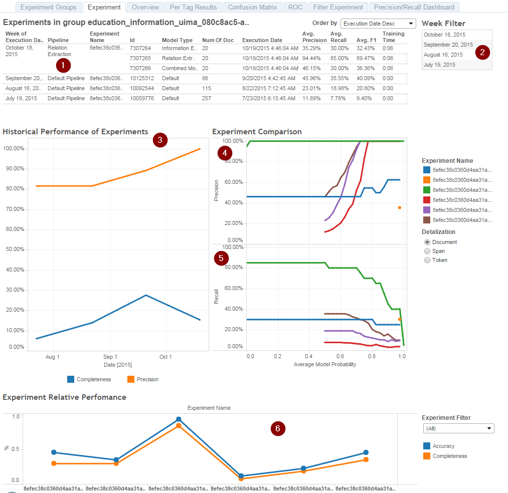
The Experiment tab contains the following items:
List of all experiments in a particular Experiments Group.
Week filter: filter experiments by week in case there are lot of experiments in the group.
Historical performance of experiments chart (in case there are several experiments). This chart is shown in WorkFusion for an automated task and that chart is a subject to mock up for demo in case of requirements.
Experiment comparison chart representing the data in terms of Precision versus Probability.
Experiment comparison chart representing the data in terms of Recall versus Probability.
As we use probabilistic models, both these charts (4 and 5) represent how well the model performs if we use only answers with average probability of X or higher.
The **Experiment Relative Performance **chart displays Accuracy, Completeness and F1 Score for the most accurate experiment per day. Experiments comparison in one chart. Here, you can see comparison of overall document-level Precision and Recall of every experiment you have uploaded. On that chart, experiments aren't sorted based on time, but are sorted alphabetically, so you cannot use that chart as a time series evaluation unless you upload experiments with alphabetically increasing way as well as increasing their upload date.
Overview
The Overview tab presents more detailed information about the selected experiment. The experiment runs are divided into three columns, each of them shows Precision, Recall and F1 for Token, Span, or Document.
Initially, that chart was developed for Information Extraction tasks that were solved using Conditional Random Fields models. In this approach, these models work on three major structures – Tokens (for example, words), Spans (for example, multiple words tagged as a particular information type), and Sentences (for example, Sequences in term of CRFs). That is why you can see per-token, per-span, and per-document tables with different values. If your experiment does not fall into CRF-like model, the per-token part will be empty.
After selecting a specific run value (Precision, Recall, or F1), you are redirected to the Confusion Matrix tab.
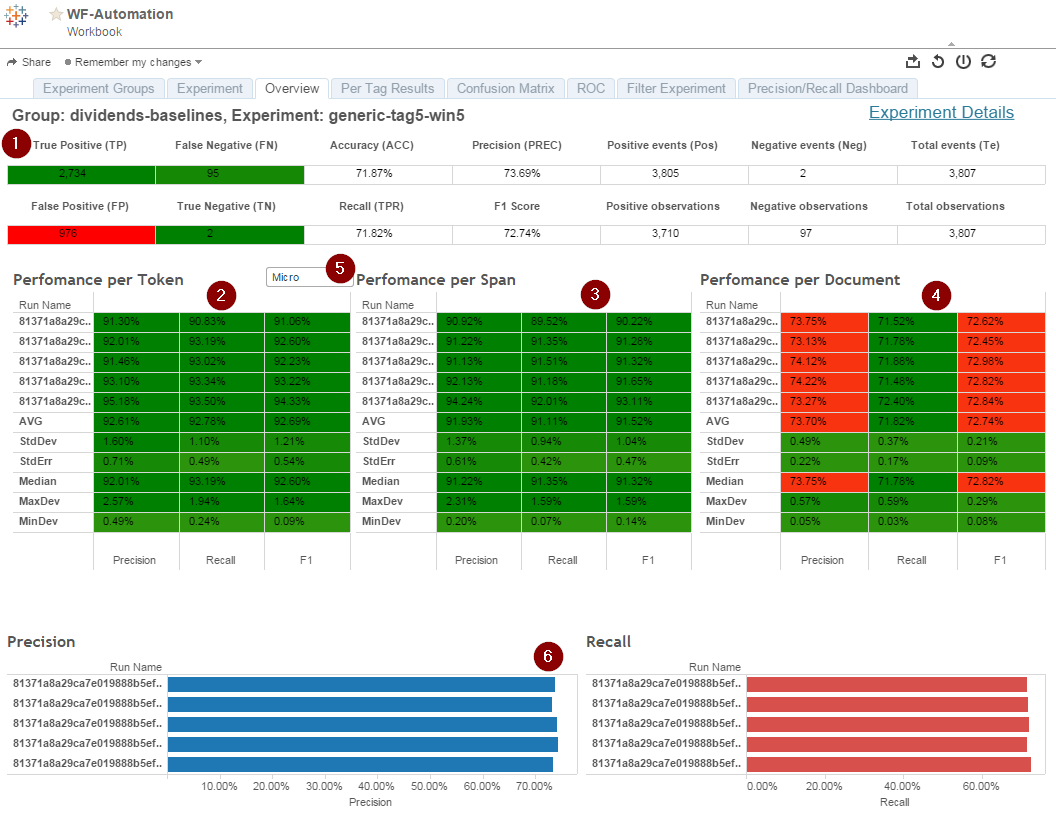
The Overview tab contains the following items:
Table with amount of true/false positive/negatives observations in terms of documents.
Performance per token for all folds.
Performance per span for all folds.
Performance per document for all folds.
Micro/Macro precision switch for 2-4: By default, switch is turned for micro average, when metrics are counted as a sum of all applicable values (e.g. true and false positives to count positive decision accurancy). If you switch to Macro average, you will get values of average values per fold per every object. Meaning, you will have a precision for tag1 and tag2, and their average will be the value for precision.
Precision and Recall bars to see if there are any deviating runs.
The Overview tab is useful to assess quality of a model and dataset and make a call if future development should be done to improve quality or new dataset is required. Small or imbalanced dataset will result in higher values of standard deviation. Also, this tab allows to see how well model does NOT extract any data from given input by assessing true negative values.
From the Overview tab you can head in two directions:
- By clicking Per Tag Results, you can head to the corresponding tab for that experiment.
- By clicking the run name or AVG row, you are redirected to Confusion Matrix.
Per Tag Results
The Per Tag Results tab displays a list of experiments for the selected group of data for Span to provide deeper analytics into results of a model.
As well as the Overview tab, this collection of charts was built taking into account the Information Extraction tasks, and Tag is understood as an answer crowd or model may extract from a document. Document could have one or more answers, so numbers present on that chart do not correspond to document processing metrics.
Information in this tab can be used to detect the worst performing tags to concentrate the efforts on. Junction of information available on the chart provides both quality metrics and distribution of answers across gold documents of results, provided by model.
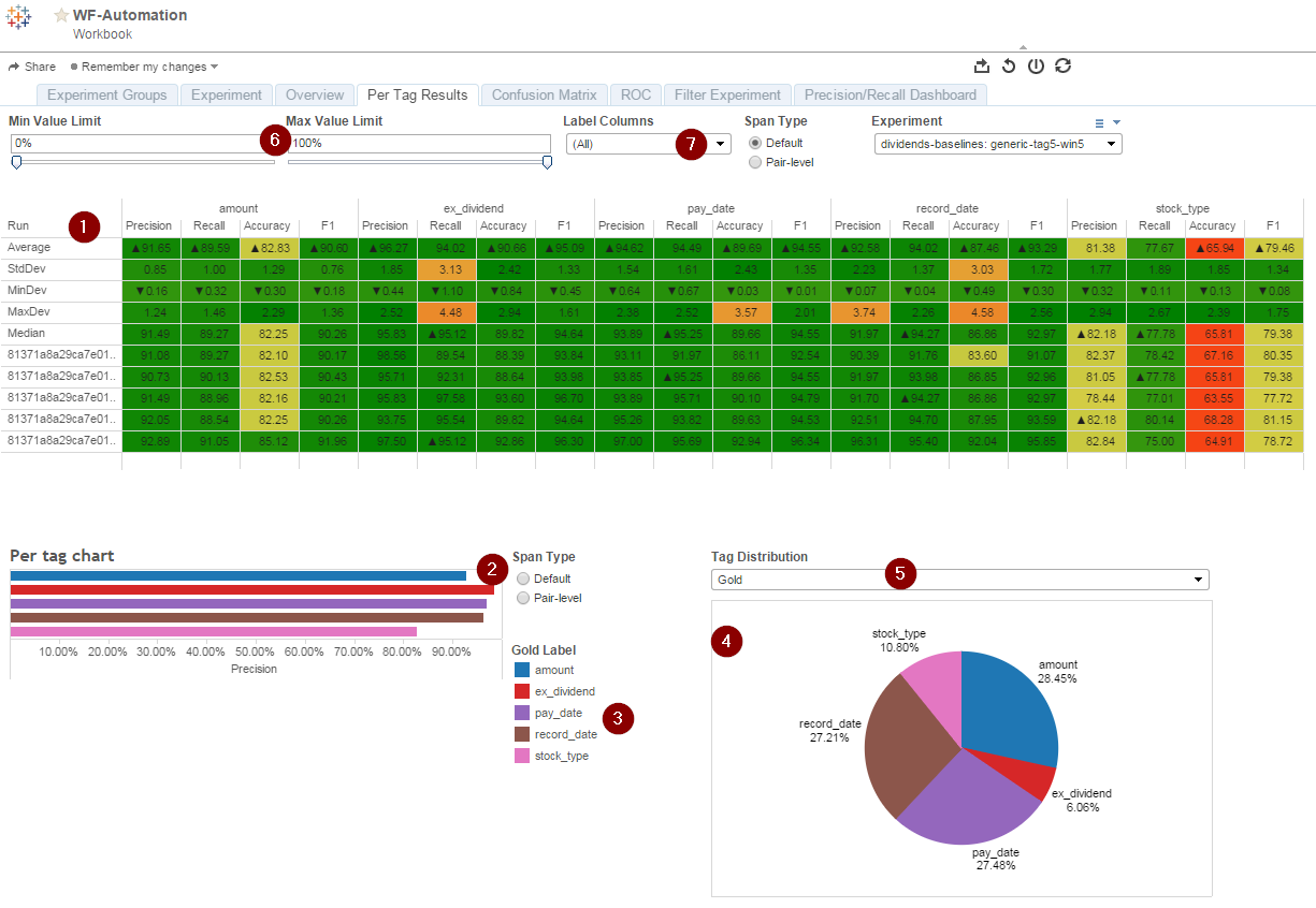
Table with all available tags and their metrics.
Per Tag Chart shows a rough estimation of tags performance by precision.
Color codes for the tags.
Tag Distribution pie chart.
The Tag Distribution filter to switch between gold data and predicted data distribution.
Sliders to highlight values by defined value (non-matching values will be grey to distinct values of interest).
Selector for particular tags.
caution
Selector's functionality is limited, as values in the drop down list are collected across all experiments, so the number values is quite overwhelming.
Confusion Matrix
The tab displays a list of matching tags for modelSet and goldSet. Tags can be sorted using a Sort By filter.
Confusion Matrix offers to choose particular experiment and specific Run using Experiment and Run filters providing deep insights into what model results in and mistakes model does. Each document in a training set is processed with a ML model and compared with information that should be extracted (gold data). So, Confusion Matrix does show the confusion between the extracted answers (combination of 1+ answers is called 'model set'). In addition, different metrics are provided per each model set.
Model sets for information extraction are formed in the following way:
Number_of_asnwers : answer1(count_of_answer1)|answer2(count_of_answer2)…|answern(count_of_answern)
Such form allows to see, if a model misses some fields or over-extracts the others. In another types of uploaded data, the model sets can be divided by the "~" symbol.
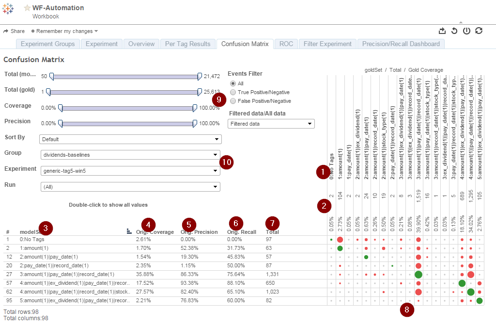
Answer sets in gold data.
Percentage and count of such sets in gold data.
Model sets refers to a list of model data sets.
Original Coverage is percentage of documents in test set that has such combination of answers extracted.
Precision is precision of the model set relatively to gold set.
Recall is recall of model set.
Total count is a count of such model sets.
Color-coded confusion marks: Green sign corresponds to both matches of the answer set match and answer text match.All that is up-right of green diagonal corresponds to model under-extraction (model does miss some information). Everything down-left of that diagonal corresponds to model over-extracted results (gold set is smaller than model answer set).
Sliders to filter rows and columns by count of documents with such answer set, by coverage or by precision.
Drop-down menus to select from experiment groups, experiments and experiments run.
After selecting a specific tag from the modelSet column, you are redirected to the ROC tab.
ROC (Receiver Operating Characteristic)
The tab displays a chart with Precision and Average Probability, and Original Recall for the selected tag.
The ROC chart differs from the classic representation used to assess performance of binary classifier over true/false positive ratio. In our implementation, the chart is used to measure quality of predictions made by model for a specific set of answers. Three measures being considered are precision, recall, and coverage, but the real value delivers only precision and coverage.
The X axis of the chart corresponds to a probability measure, as all models we are using are probabilistic.
Precision measure shows a number of model answers of the given type matching with crowd's annotations. This is the only way to assess quality of a model in a human-less way. A model is considered as a good one, if it corresponds to crowd's annotations, no matter what quality crowd provides. The metric is computed as a usual classification precision:
true_positive / ( true_positive + false_positive ).
The second metric is Coverage, which directly corresponds to the
amount of crowd HITs. In fact, a crowd is not involved, as we process it
using machine learning model. The Coverage is computed with the
following formula: ( true_positive + false_positive ) / test_set_size .
Recall corresponds to a usual metric and is provided for analytics.
It is calculated as true_positive / ( true_positive + false_negative ).
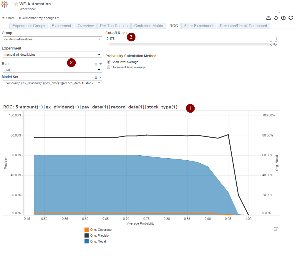
ROC chart with three lines:
- Black line: precision of particular answer set.
- Blue area: recall of particular answer set.
- Orange line: coverage against test set.
Selectors to choose another answer set or particular fold of experiment.
The Cut-off Rules slider allows you to change range of accuracy for a selected graph.
It is important to understand, that you cannot use the ROC chart to compare two answer sets. If you select two model sets in a corresponding drop-down list, you will get averaged lines for selected model sets. The ROC chart is suitable only for analysis on per-answer-set base.
The ROC chart is a numeric base for the Precision/Recall Dashboard, that is shown to the customer.
Filter Experiment
The tab displays a list of matching tags for modelSet and goldSet for a selected experiment in the single Run. It means, it shows in a numerical manner what automation one can get from a model at desired precision level.
The chart serves for analytical use only, as it is not shown to customer by default in Control Tower Dashboard (to view the chart it is necessary to enter Tableau). However, underlying SQL request that generates these charts, is used in WorkFusion Platform to get required cut off rules and integrate them into Business Process unless Advanced calibration is in use.
Cut off rules usually consist of a model answer (or a set of answers) with the lowest and highest values of probability given by the model that ensures data quality at a set level (or higher).
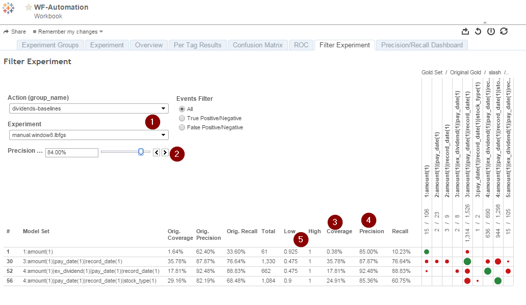
The Filter Experiment tab consists of the following items:
Selection of experiments group and particular experiment.
Minimal acceptable precision for automation.
Coverage of every set of answers.
True precision of extracted data with these margins of probability. As you can see, true precision may be much higher since there are no probability limits that will give exact precision, and thus customer will be getting data with higher quality. That limitation is the reason of some flat lines on the Precision/Recall dashboard.
Low and high thresholds of average probability of an answer that are used as cut off rules in WF business process.
Precision and Recall
The tab contains a chart displaying Automation Rate and Accuracy for a particular group and experiment. The Group and Experiment can be selected using filters. The chart is displayed in WorkFusion as the Automation Chart.
One of core functions of Tableau charts is to provide customer is to provide customer or Data Scientist with an understanding of what amount of Manual tasks can be done automatically thus saving money. For this purpose, we introduced a chart that represents a tradeoff between the precision (meaning conformity with crowd) and the automation rate in a graphical manner. The chart's name does not refer to the classical recall metric, and axis of chart are named Accuracy (X) and Automation rate (Y).
The Accuracy and automation rate is calculated on a single document (in other words, a single Manual task) level. An accurate document means 100% match to crowd's annotation. An automated document means a document that is or will be processed by machine learning model without human interaction.
Precision/Recall handles are built by taking the maximum coverage value from ROC chart at every 0.5% precision dot starting from 0% up to 100%. Sum of the coverages of every model set at a given precision level (X) is the Y value in the chart.
For marketing purposes, the Y axis is inverted so that chart goes up (while the real automation rate, obviously, decreases when the more strict Accuracy threshold is set). In a newer version of the chart, the lowest shown accuracy value is 80% (since anything lower than that isn't a very good automation candidate). So, during analytics, you should understand, that a higher line represents a worse experiment.
You can use that chart to compare two experiments loaded into the same group of experiments, which allows you to select the best experiment for automation amount of X percents.
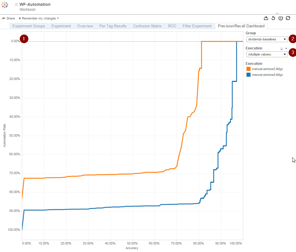
Automation rate vs. Accuracy chart. The chart is shown in the Control Tower Automation interface with the only one experiment to be displayed. You can click a handle on the chart to generate cut off rules, which can be seen on the Filter Experiment tab.
Selector of group of experiments.
Drop-down list of available experiments. Here you can select several experiments to compare.