Create and manage charts and dashboards
Connect to database
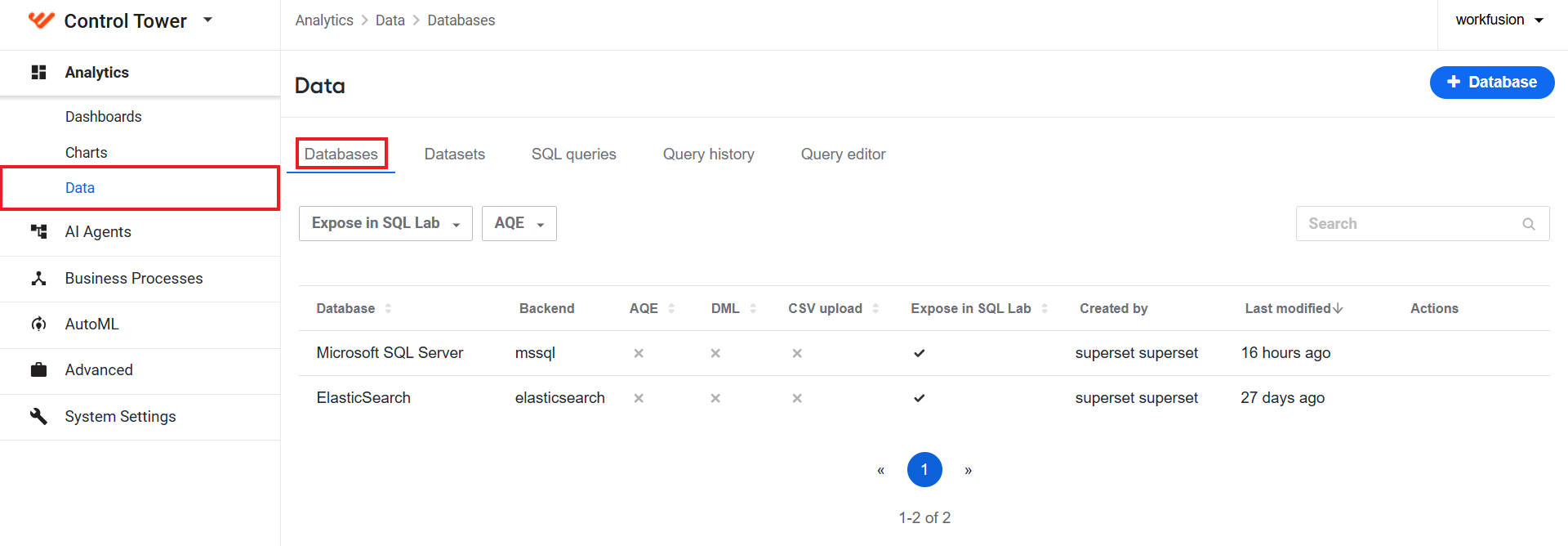
To manage existing Superset-related database connections, navigate to Analytics > Data > Databases. The database connections in the list are created at the installation level and available out of the box.
The Databases page is only available to the Administator users.
In 10.3, Work.AI analytics is decoupled from the MS SQL database tables, and all data is stored and managed using Elasticsearch indices. MS SQL is only supported for backward compatibility.
View dashboards
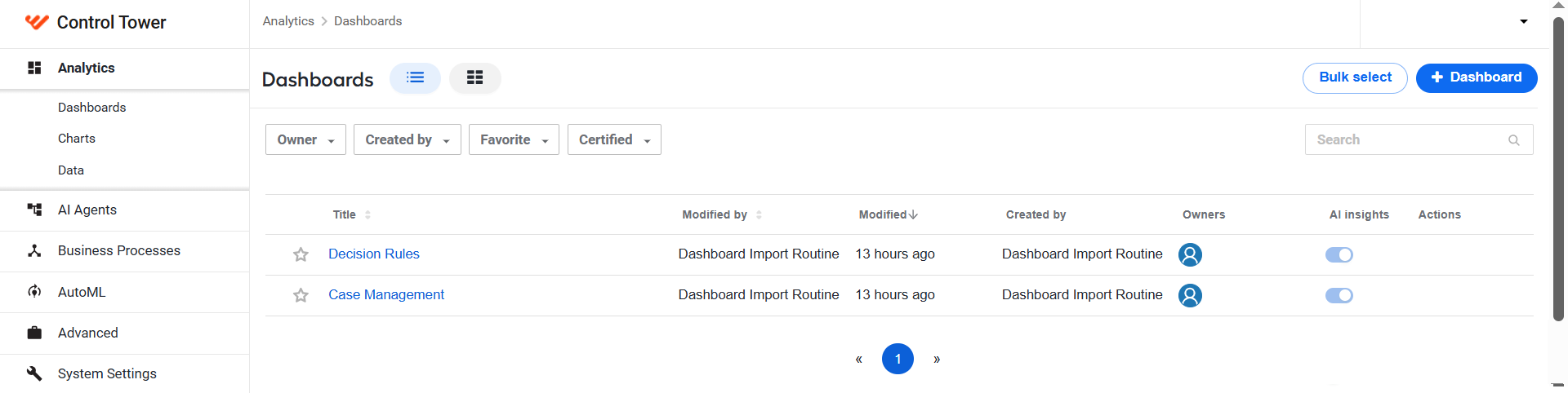
To view all out-of-the-box (OOTB) and custom dashboards, log into Control Tower and go to Analytics > Dashboards.
Filter dashboard data
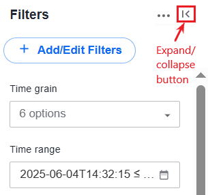
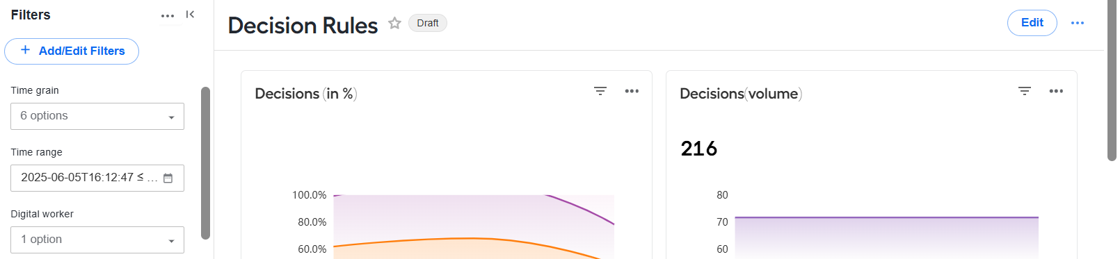
To filter data on dashboards, use the Filters panel to the left of dashboard views. You can show or hide the panel by clicking the expand-collapse button.
Set filters
OOTB dashboards work with the default filters described in the sections below. You can also add your own custom filters or remove any existing one as instructed in the Add or remove filters section.
Time grain
Available for the following OOTB dashboards: Case Management, Decision Rules
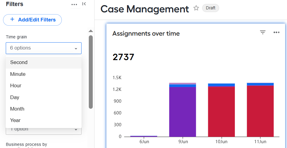
The filter allows you to customize the representation of the time-dependent data within the specified time range across all views. The grain you set is the time interval corresponding to a single point in a view.
To set the filter, select any value from the drop-down options.
Time range
Available for the following OOTB dashboards: Case Management, Decision Rules
The filter limits the display of process execution data to a specific period. To set the filter, follow the steps below:
Click the field or the calendar icon in the field.
In the Edit time range window, select a range type and configure required settings. The settings can differ, depending on the selected range type. The Actual time range section will display the resulting time range.
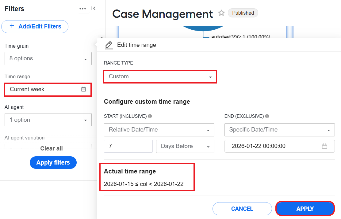
Click Apply to update the filter settings. The filtering time range becomes visible in the Time range field in the Filter panel.
AI Agent
Available for the following OOTB dashboards: Case Management, Decision Rules
The filter limits the displayed data to one or more specific AI Agents. To set the filter, click the drop-down box and choose one or more options.
AI Agent variation
Available for the following OOTB dashboards: Case Management, Decision Rules
The filter limits the displayed data to one or more AI Agent variations. To set the filter, click the drop-down box and choose one or more options.
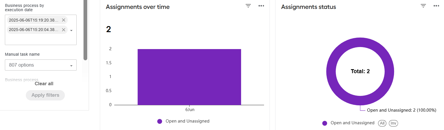
Business Process by execution date
Available for the following OOTB dashboards: Case Management
The filter limits the displayed data to one or more Business Process runs executed on a specific date. To set the filter, click the drop-down box and choose one or more options.
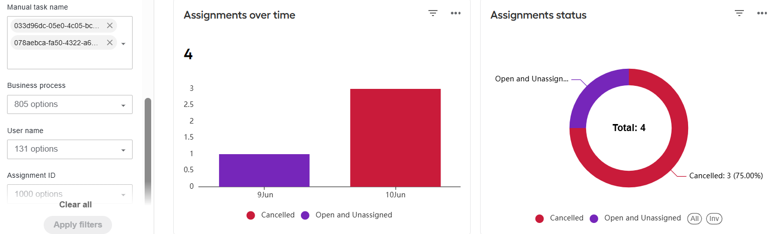
Manual Task name
Available for the following OOTB dashboards: Case Management
The filter restricts the data display on the dashboard to one or more specific Manual Tasks. To set the filter, click the drop-down box and choose one or more options.
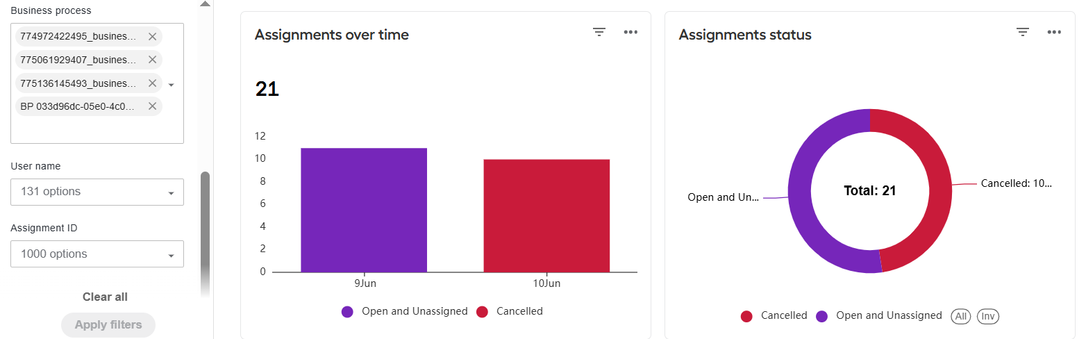
Business Process
Available for the following OOTB dashboards: Case Management, Decision Rules
The filter limits the displayed data to one or more Business Processes with a preset schedule. To set the filter, click the drop-down box and choose one or more options.
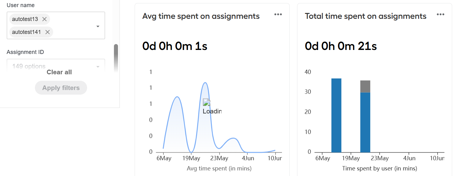
User name
Available for the following OOTB dashboards: Case Management
The filter limits the display to the assignment data associated with one or more specific users. To set the filter, click the drop-down box and choose one or more options.
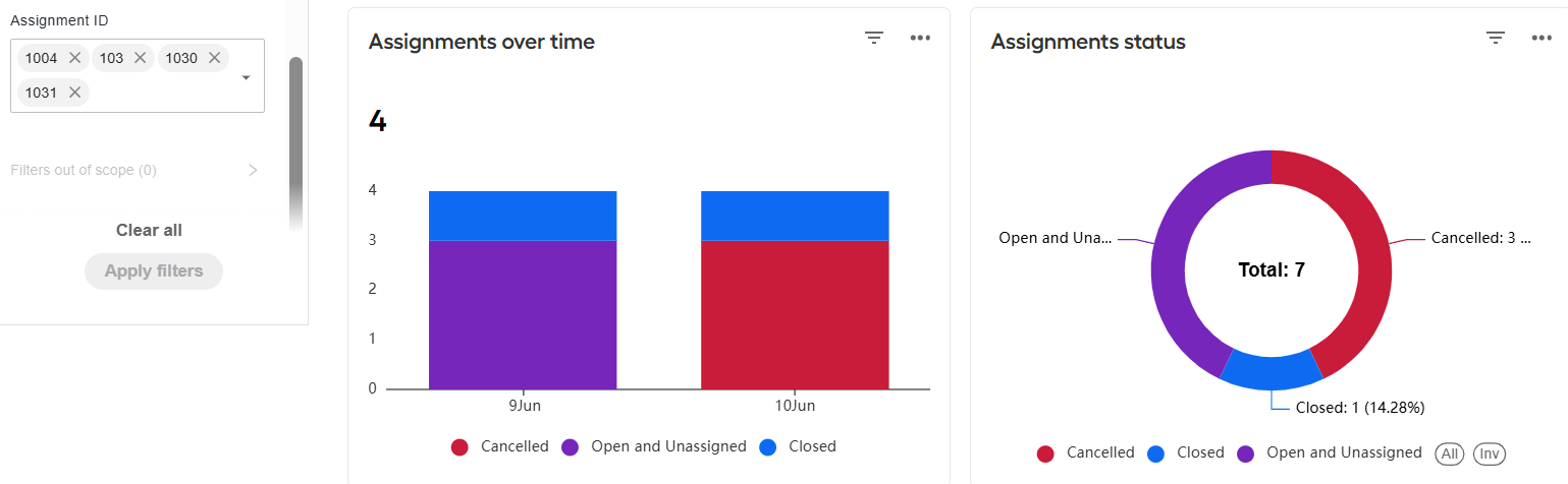
Assignment ID
Available for the following OOTB dashboards: Case Management
The filter limits the display to the data associated with one or more Workspace assignments with selected IDs. To set the filter, click the drop-down box and choose one or more options.
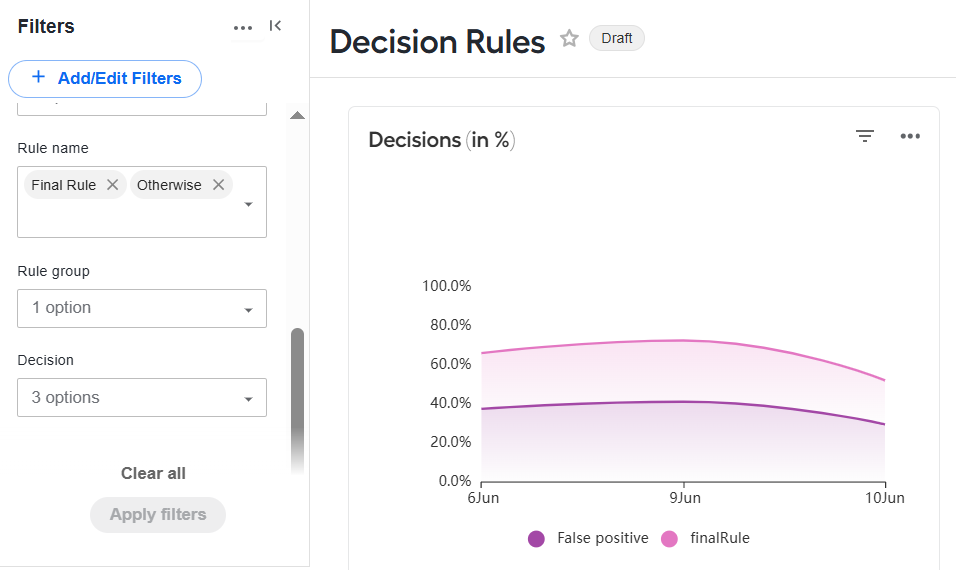
Rule name
Available for the following OOTB dashboards: Decision Rules
The filter limits the displayed data to one or more rules from Decision rules steps. To set the filter, click the drop-down box and choose one or more options.
Rule group
Available for the following OOTB dashboards: Decision Rules
The filter limits the displayed data to one or more groups of rules. To set the filter, click the drop-down box and choose one or more options.
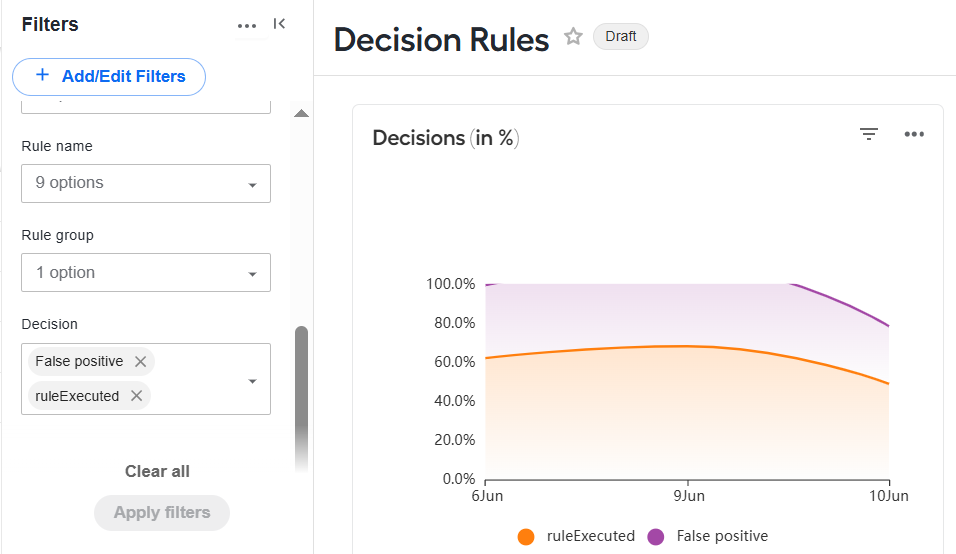
Decision
Available for the following OOTB dashboards: Decision Rules
The filter limits the displayed data to one or rule-based decisions. To set the filter, click the drop-down box and choose one or more options.
Apply and clear preset filters
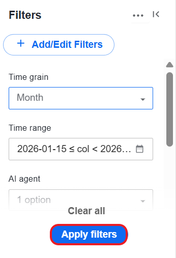
Once you set all necessary filters as described above, click Apply Filters in the Filters panel.
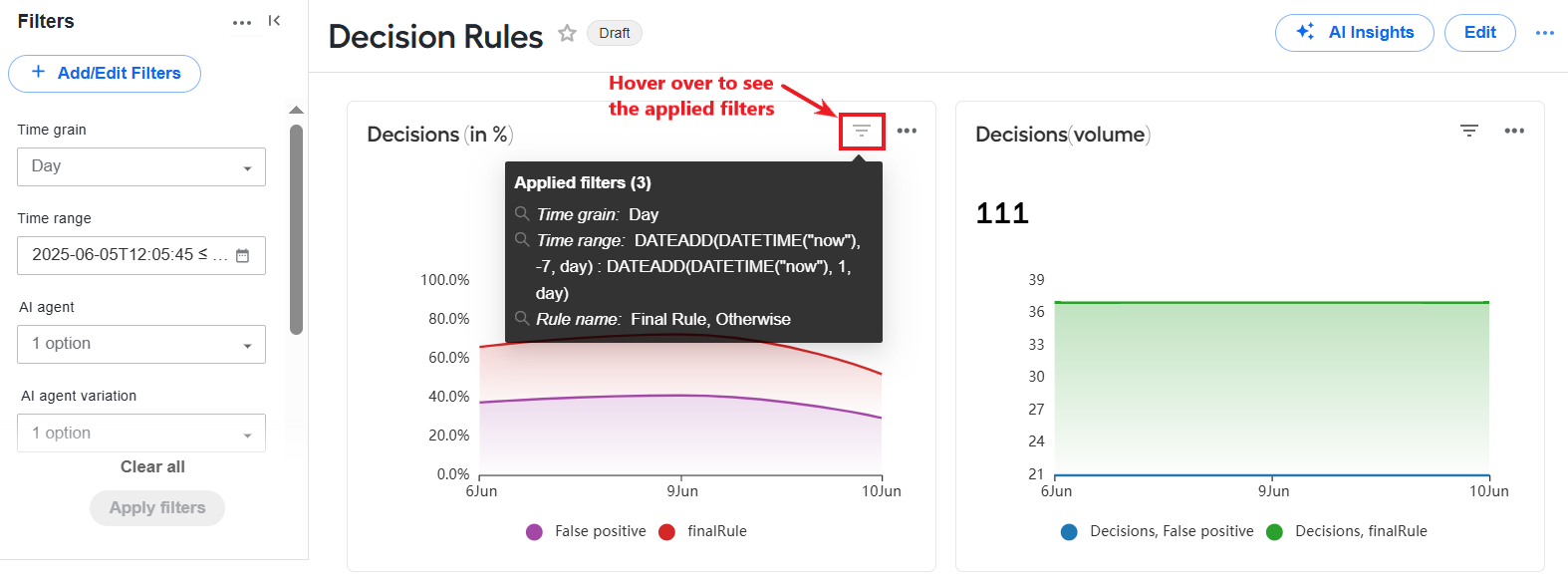
The views on the right will change and display data in accordance with filtering criteria. To see the exact applied filters, hover over the control in the top right corner of a view.
To cancel all applied filters, click Clear All.
Edit filters
To edit a filter on a dashboard page, follow the steps below:
At the top of the Filters panel, click + Add/Edit Filters.

In the displayed window, select a filter you want to edit. You can change the following:
On the SETTINGS page: filter configuration options that can vary from one filter to another.
On the SCOPING page: dashboard views affected by applying the filter.
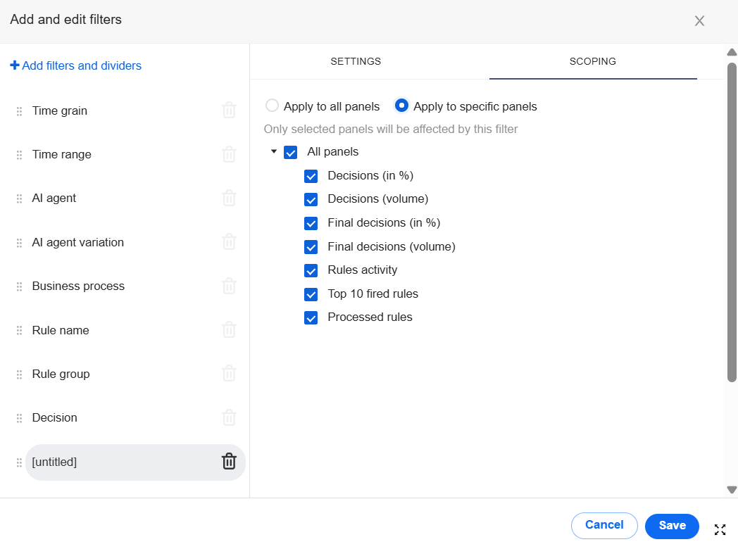
Click Save to update the filter.
Add or remove filters
In addition to the existing default filters, you can set up custom ones. To do that, follow the steps below:
At the top of the Filters panel, click + Add/Edit Filters.
In the displayed window, click Add filters and dividers and choose Filter.
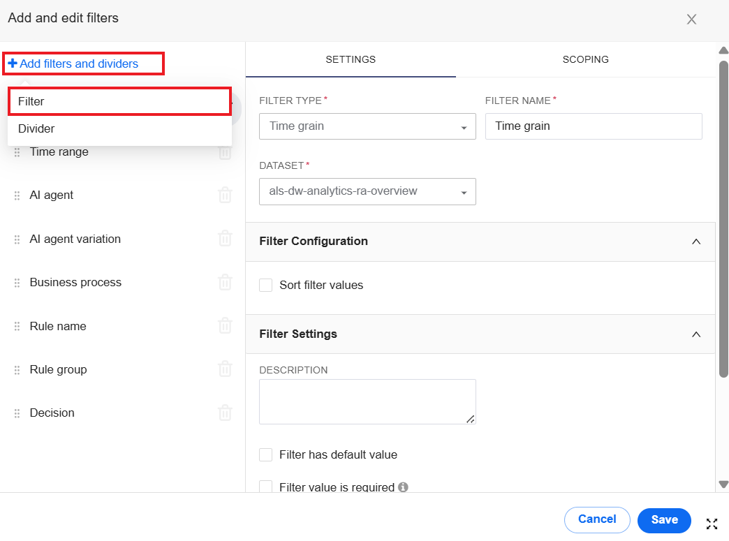
On the SETTINGS tab, set a name for the filter, select its type, and configure other settings. The configuration options can differ, depending on the selected filter type.
On the SCOPING tab, specify the dashboard views to be affected by applying the filter. By default, any new filter is applied to all views.
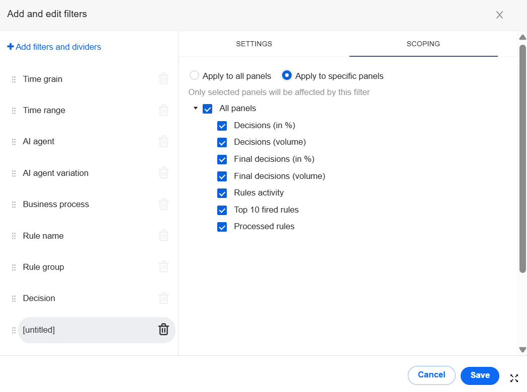
Click the Save button. The new filter appears in the Filters panel.
To remove a filter, follow the steps:
At the top of the Filters panel, click + Add/Edit Filters.

In the displayed window, hover over the filter you want to delete and click the Delete button.
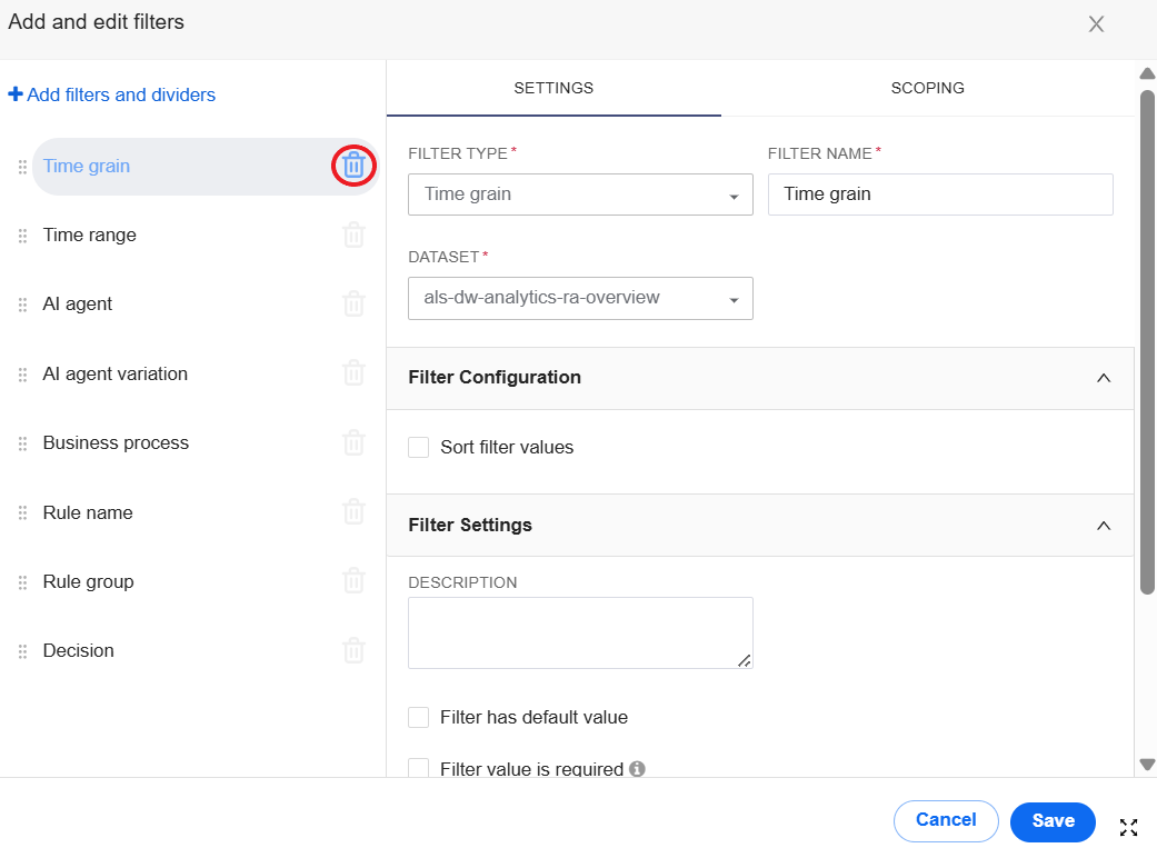
Click the Save button. The new filter is removed from the Filters panel.
Create dashboard
To create a custom dashboard, follow the general sequence of steps:
Build a chart on top of the dataset.
Build a dashboard using one or more charts.
Create dataset
A dataset is an abstraction that points to data in the data storage. This data is used to create charts and, consequently, dashboards in Work.AI Analytics. The Analytics component itself doesn't have a storage layer to store your data but instead pairs with an existing SQL-speaking data storage.
To view available datasets (if any), navigate to Analytics > Data > Datasets. Mind that the Data tab and dataset-related functionality are available only to users with the Developer or Administrator roles and appropriate permissions. For details, refer to Set roles and permissions for Superset Analytics.
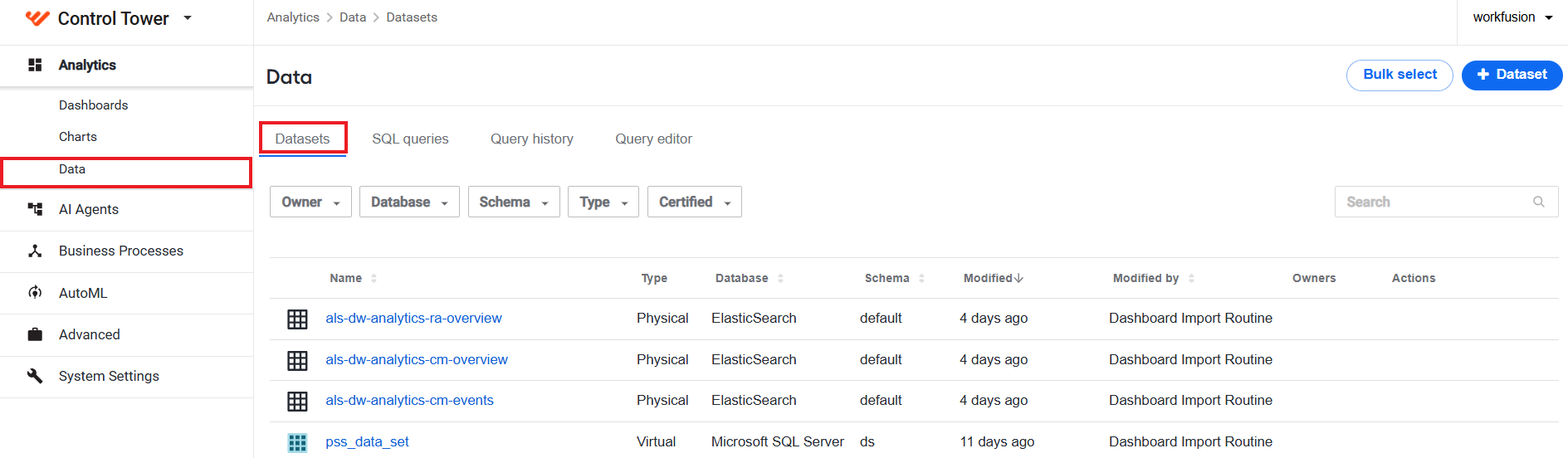
There are two methods to create a dataset:
Via Data tab
To create a dataset on the Data tab, do the following:
In Control Tower, navigate to Analytics > Data > + Dataset.
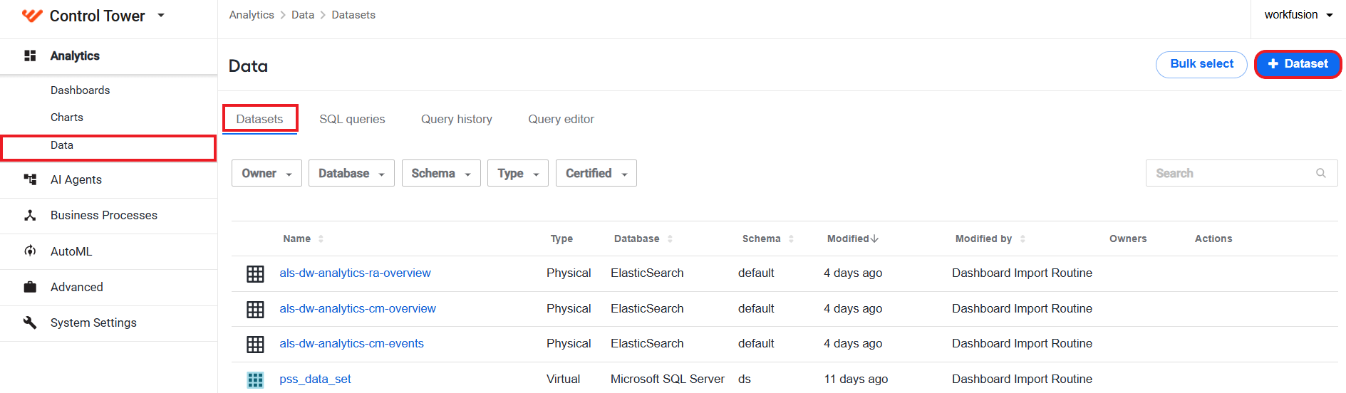
The New dataset window appears. From here, you can also start the flow to create a chart using a query by clicking the respective link on the right.
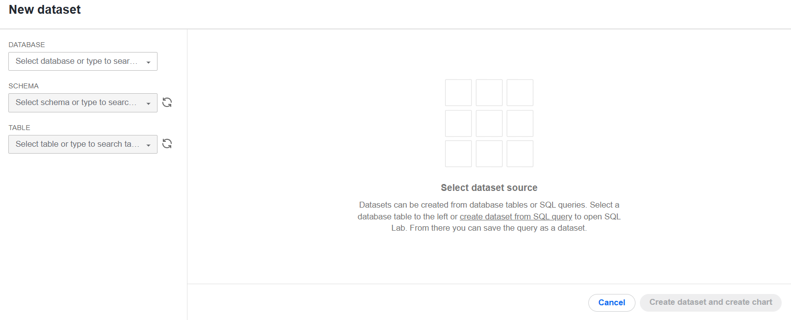
In the window, specify the following dataset properties using the dropdowns that appear:
DATABASE (in the example below, ElasticSearch)
SCHEMA (in the example below, default)
TABLE (in the example below, analytics_ct_events_2025.06)
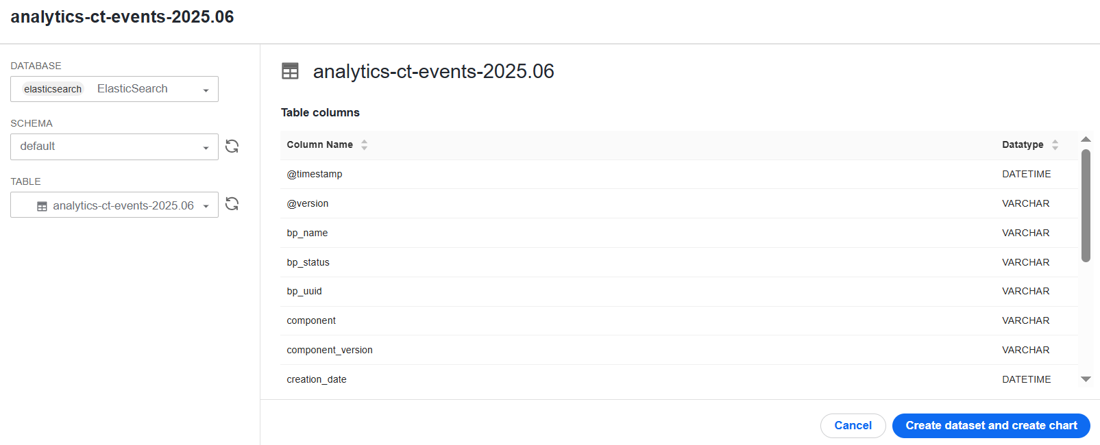
As soon as you choose a table, you will see its contents (columns and data types) on the right.
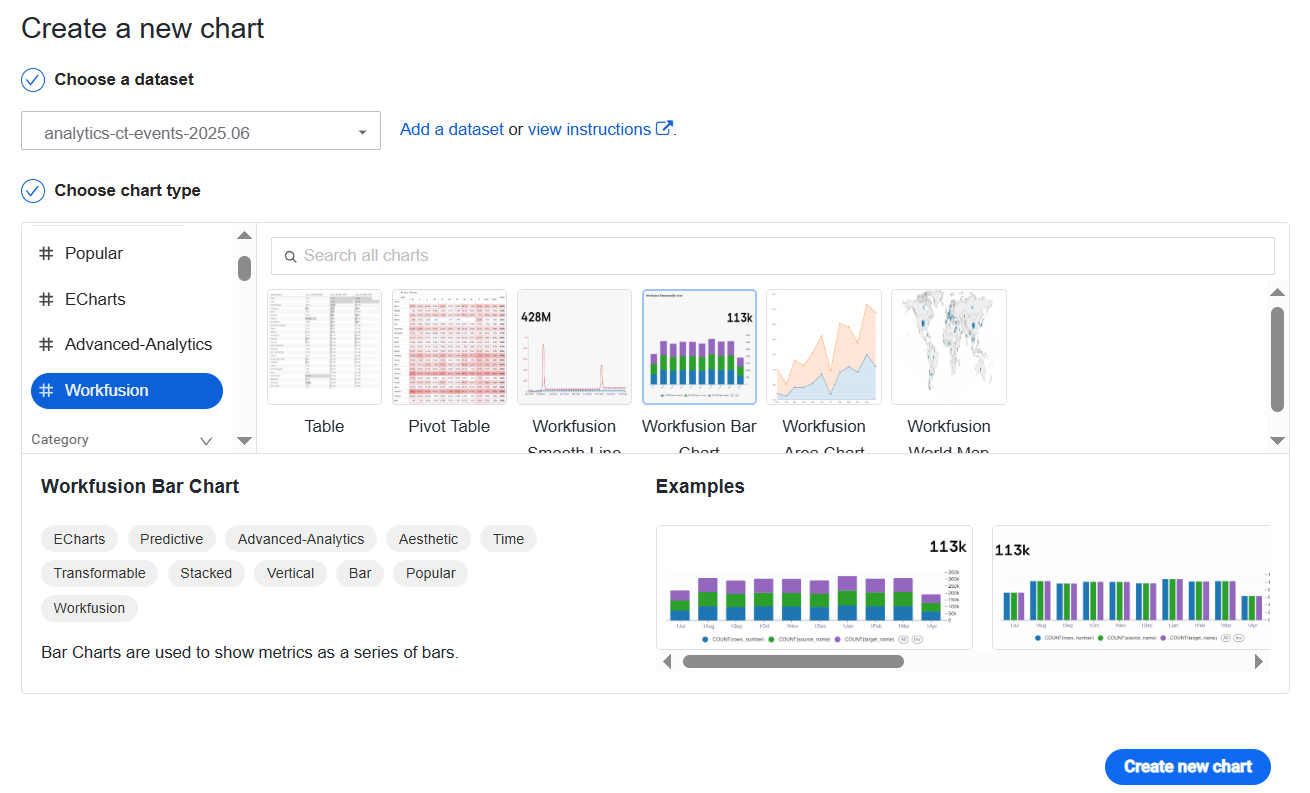
Click Create dataset and create chart. Your dataset appears in the list on the Datasets page, and you are forwarded to the Create a new chart window. You can proceed with creating a chart.
Using SQL queries
Another way to create a chart is to use SQL queries:
In Control Tower, navigate to Analytics > Data > Query Editor.
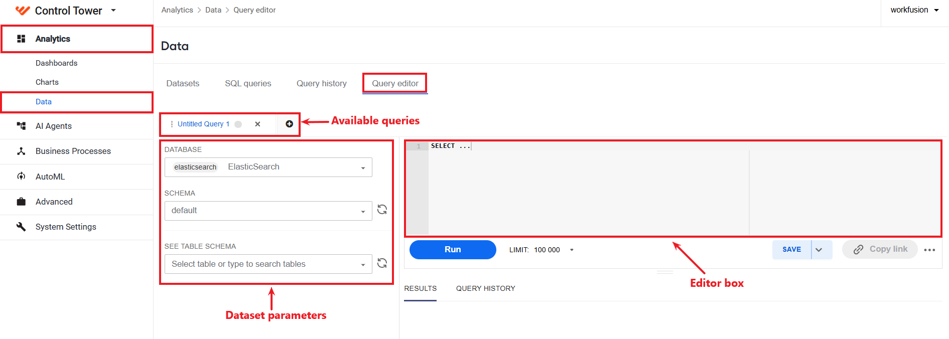
On the Query Editor tab, you can create a query from scratch or based on an existing query (if any). The range of existing queries is represented as a row of tabs above the editor box and the dataset parameter panel.
Set the dataset parameters by filling in the following fields (if needed):
- DATABASE
- SCHEMA
- SEE TABLE SCHEMA
In the editor box, write your query.
Click Run to test the query. The output of the query run appears in the RESULTS panel.
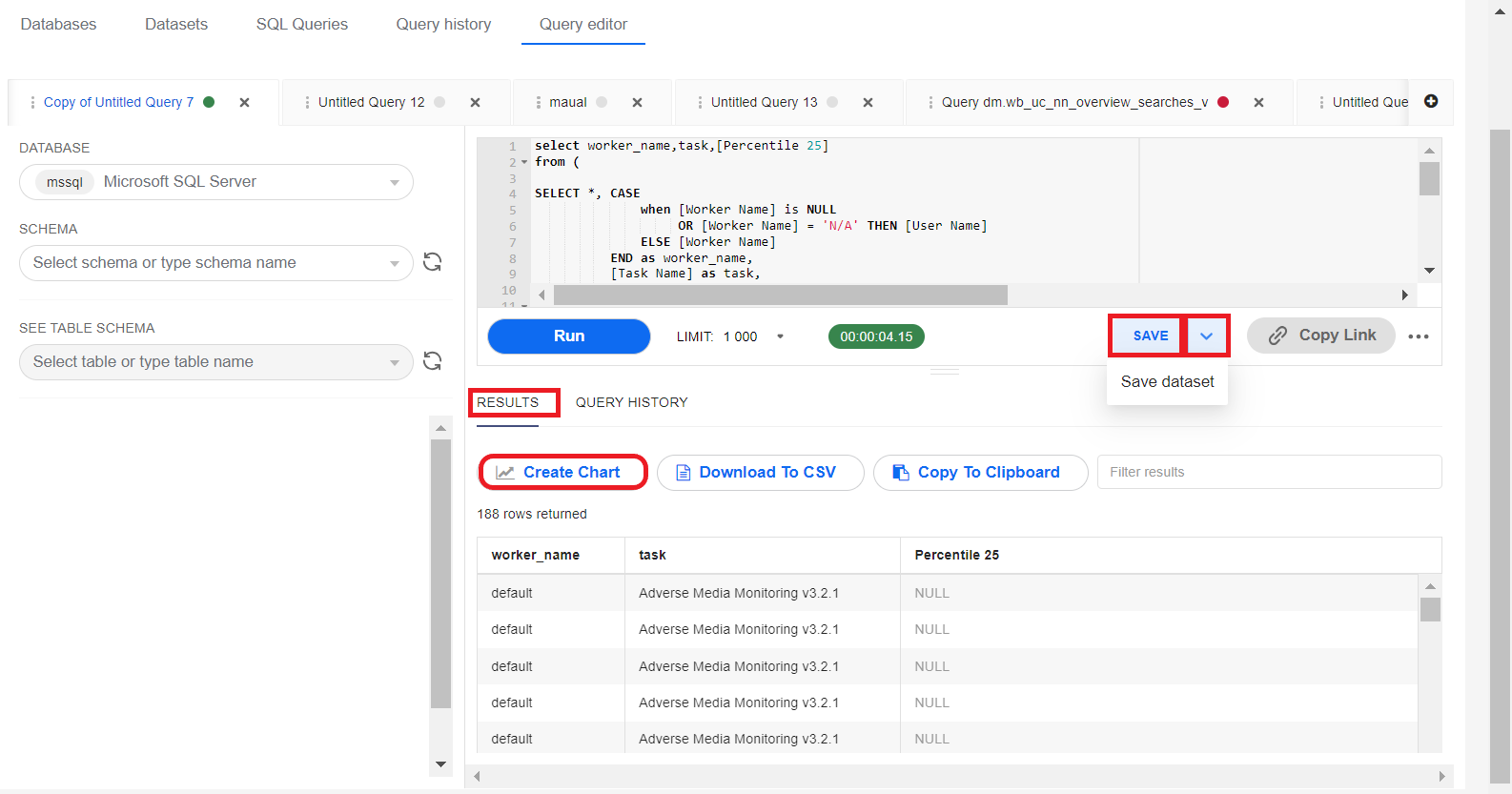
If you are satisfied with the output, you can proceed in one of the following ways:
Create a chart with the dataset you obtained using the query. To do that, click Create Chart button and proceed as described in the Create chart section.
Save the query: click SAVE, and the query appears in the list on the SQL Queries tab.
Save the query as a dataset: click the arrow next to SAVE and select Save dataset. The respective dataset appears in the list on the Datasets tab.
Create chart
Work.AI offers several OOTB charts you can find under the #Workfusion label when creating a chart manually. Besides, you can customize the OOTB charts or create custom ones from scratch.
There are two methods how you create a chart from scratch:
Create chart manually
To create a chart manually, follow the steps below:
In Control Tower, navigate to Analytics > Charts > + Chart.
 warning
If you don't see the Charts or other tabs, ask your administrators to enable respective permissions for your user or group.
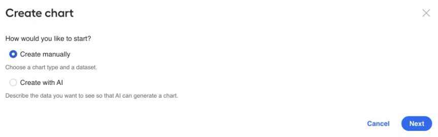
In the Create chart dialog, choose Create manually and click Next. When the AI Chart Generator is disabled, the dialog is skipped and you go straight to the Create a new chart window.
In the displayed window, specify the parameters for your new chart:
In the Choose a dataset box, choose a dataset to use in your chart, for example, the one you created in the Create dataset section.
In the Choose chart type box, choose a required out-of-the-box chart or another type.
Click Create new chart.
On the displayed screen, configure required parameters and click Create Chart. The resulting visualization appears in the empty space on the right.
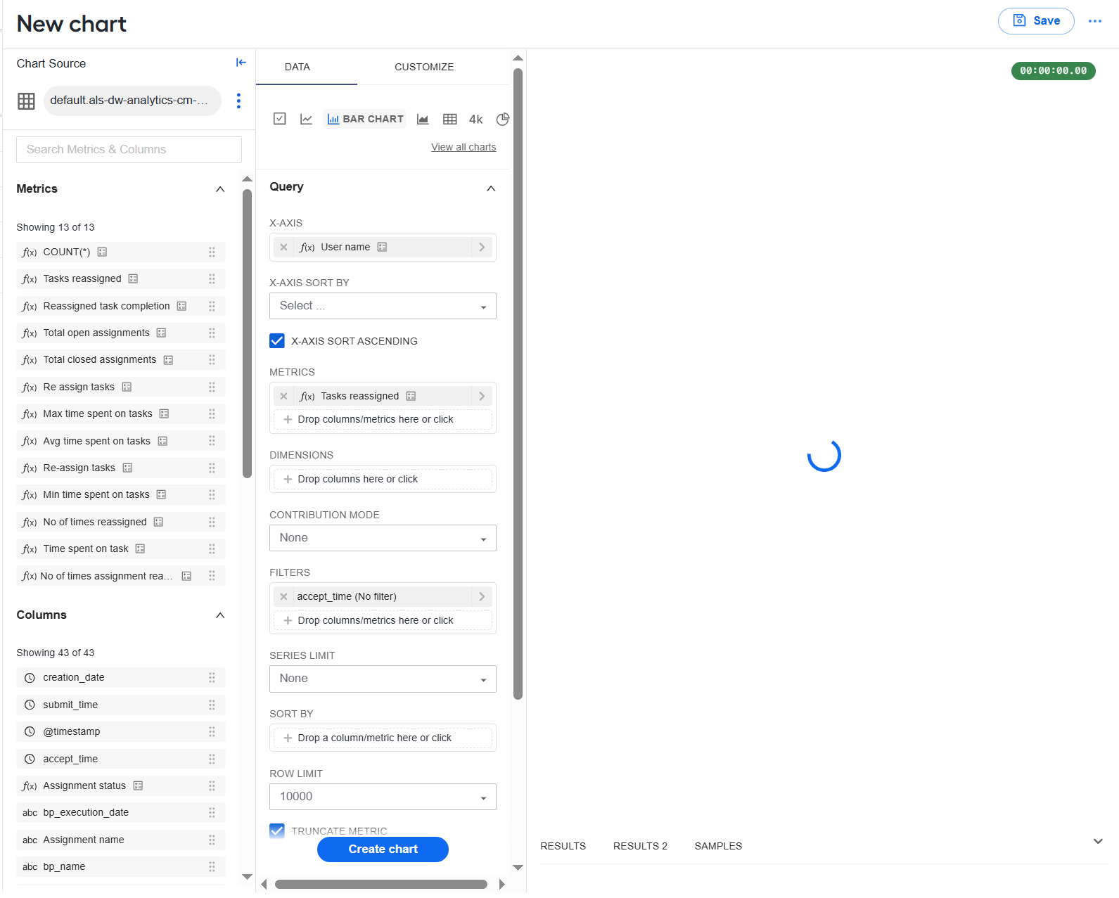
To save the resulting chart, click the Save button in the top right corner of the New chart page:
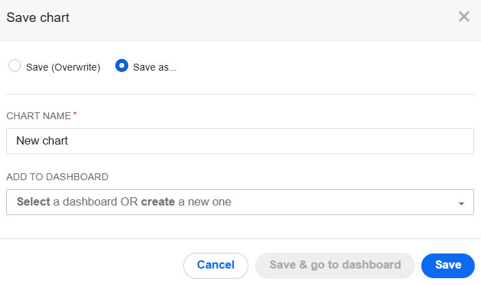
On the Save chart screen, in the ADD TO DASHBOARD box, select the dashboard where you want the chart to appear.
Click Save or Save & go to dashboard to open your updated dashboard.
Create chart with AI
You can create charts with AI only if both the conditions are satisfied:
In the Work.AI installer, the
advanced_analyticsflag is set totrue.You have the AI Chart Generator permission enabled for your role.
To create a chart with AI, follow the steps below:
In Control Tower, navigate to Analytics > Charts > + Chart.
In the Create chart dialog, choose Create with AI.
In the field displayed under the Create with AI option, insert an SQL query or add a prompt describing the requirements to the chart and click the create button. Any prompts created previously are available as drop-down options.
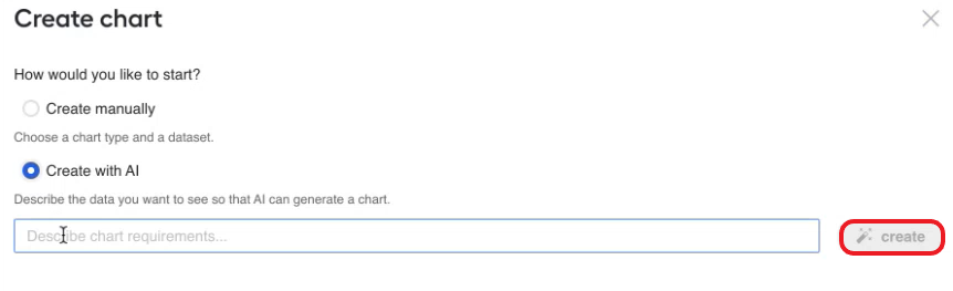
GenAI generates a chart based on the requirements or query, displaying it below the prompt area. To customize the chart, click its name and, in the displayed popup, make changes and click Save.
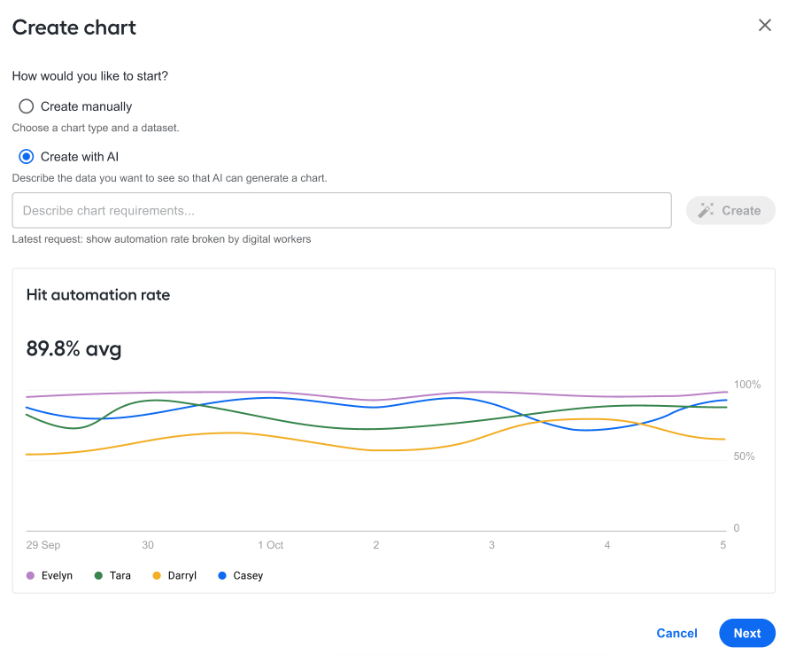
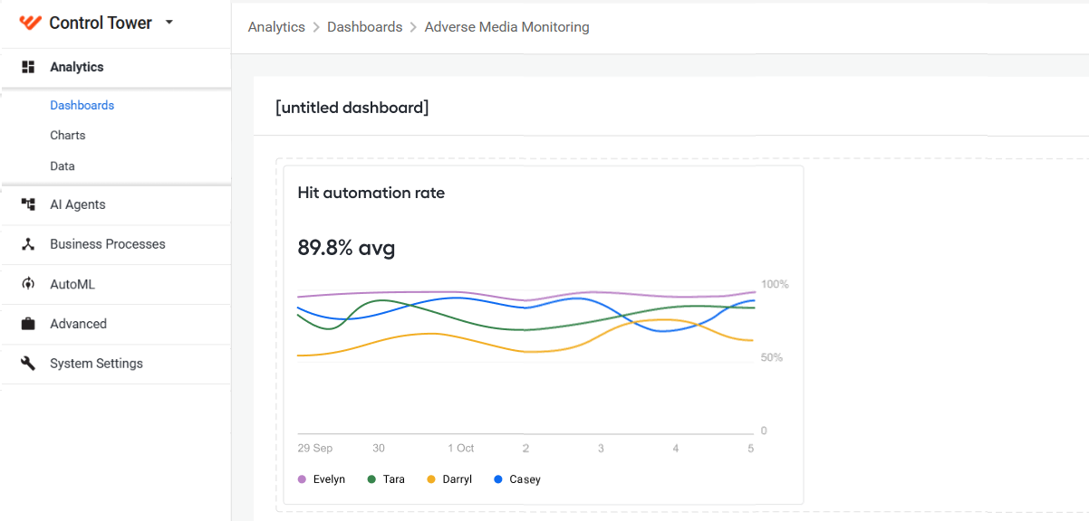
Click Next, and the chart is created and added to the list of available charts (or to a dashboard where you are creating the chart). If you added customizations in a separate popup, click the Refresh button before clicking Next.
Customize charts
You can configure charts in one of the two ways:
Using the interface controls on the DATA and CUSTOMIZE tabs
Using the advanced JSON editor and the Apache ECharts syntax
The sections below describe some sample chart configuration and customization cases with user interface controls:
For more customization options with interface tools, read the official Superset guides.
Adding chart metrics
To set chart metrics, use one of the sections on the DATA tab:
Query: choose metrics for rendering area, bar, and line charts.
Query - Number Chart: set metrics for number charts. You can select up to five metrics and set their formatting individually.
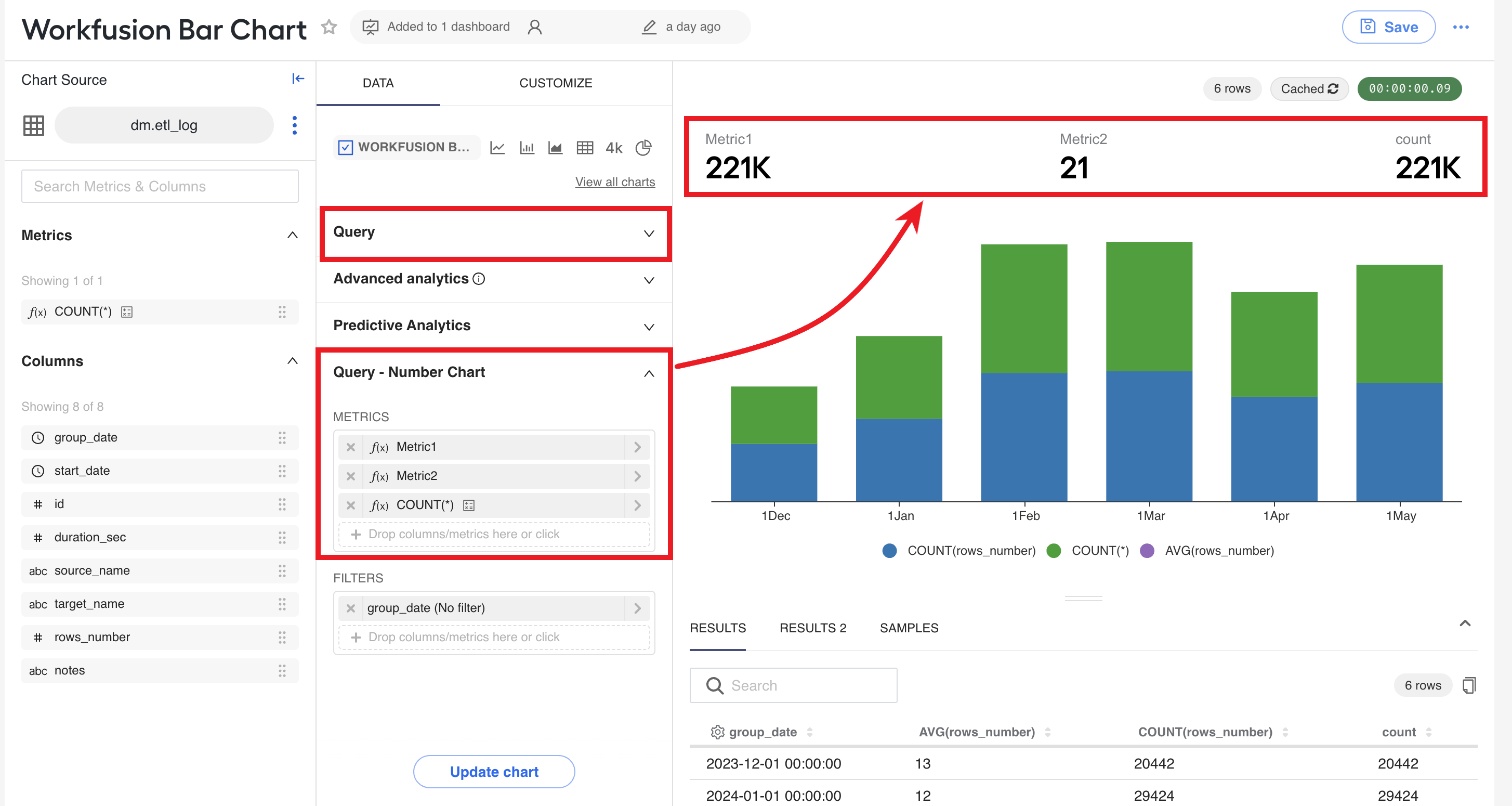
You can also fetch chart metrics by creating custom SQL expressions. The feature allows you to directly connect to the database and run the queries without a database editor. With your SQL engineers' assistance, you can also create complex SQL logic, for example, to integrate multiple tables and join all their datasets.
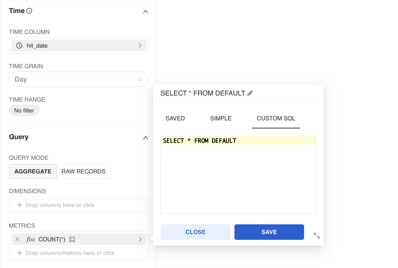
Chart display direction
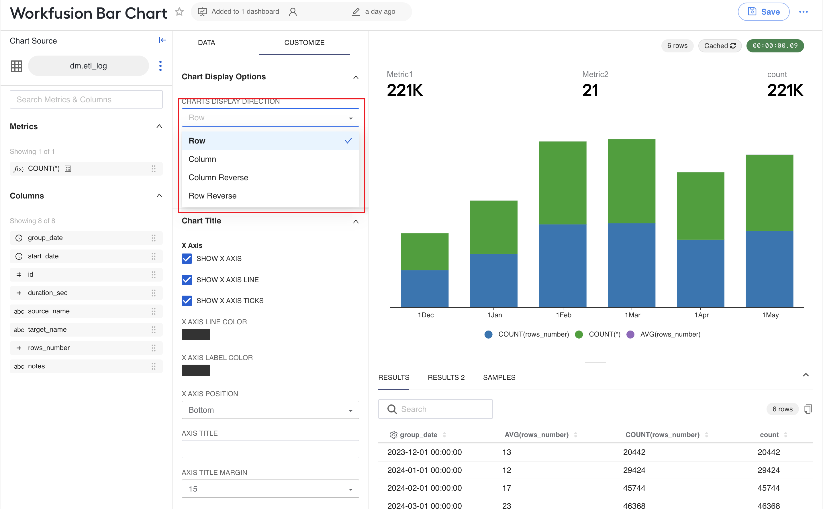
To change the display direction in a bar, area, line, number charts, follow the steps below:
Navigate to the CUSTOMIZE tab.
Expand the Chart Display Options section.
Select an option in the CHARTS DISPLAY DIRECTION drop-down list. The appearance of the chart on the right changes accordingly.
X and Y axis display settings
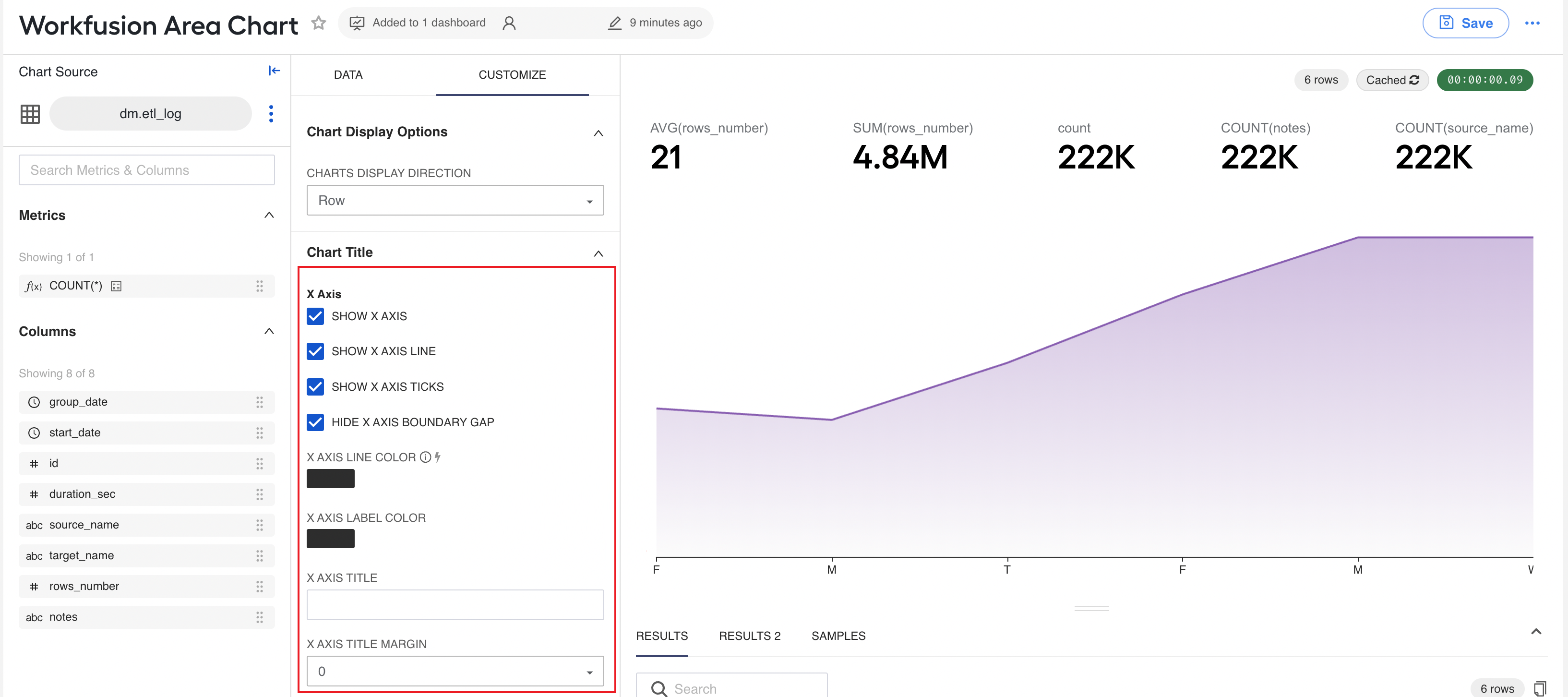
To adjust the display of the X axis, navigate to the CUSTOMIZE tab, expand the Chart Title section, and change the settings in the X Axis sub-section as required:
Show X axis: deselect to hide the X axis from the display, together with respective values
Show X axis line: deselect to hide the X axis line but leave the values displayed
Show X axis ticks: deselect to hide the small lines that indicate specific points along the X axis
Hide X axis boundary gap: select to hide the gap between the X axis and the chart graphics
X axis line color: click to choose a color for the X axis line in the palette
X axis label color: click to choose a color for the text along the X axis
X axis position: select where the X axis line is to be displayed relative to the chart graphics
Axis title: specify a title for the X axis
Axis title margin: set a distance from the chart title to the chart graphics
To adjust the display of the Y axis, navigate to the CUSTOMIZE tab, expand the Chart Title section, and change the settings in the Y Axis sub-section as required:
Show Y axis: deselect to hide the Y axis from the display, together with respective values
Show Y axis line: deselect to hide the Y axis line but leave the values displayed
Show Y axis ticks: deselect to hide the small lines that indicate specific points along the Y axis
Show Y axis minor ticks: select to show the smaller markers along the Y axis indicating the intervals between the major labeled ticks
Show Y axis split line: select to show lines to trace values corresponding to major ticks along the Y axis
Show Y axis minor split line: select to show lines to trace values corresponding to minor ticks along the Y axis
Y axis line color: click to choose a color for the Y axis line in the palette
Y axis label color: click to choose a color for the text along the Y axis line
Y axis position: select where the Y axis line is to be displayed relative to the chart graphics
Axis title: specify a title for the Y axis
Axis title margin: set a distance from the chart title to the chart graphics
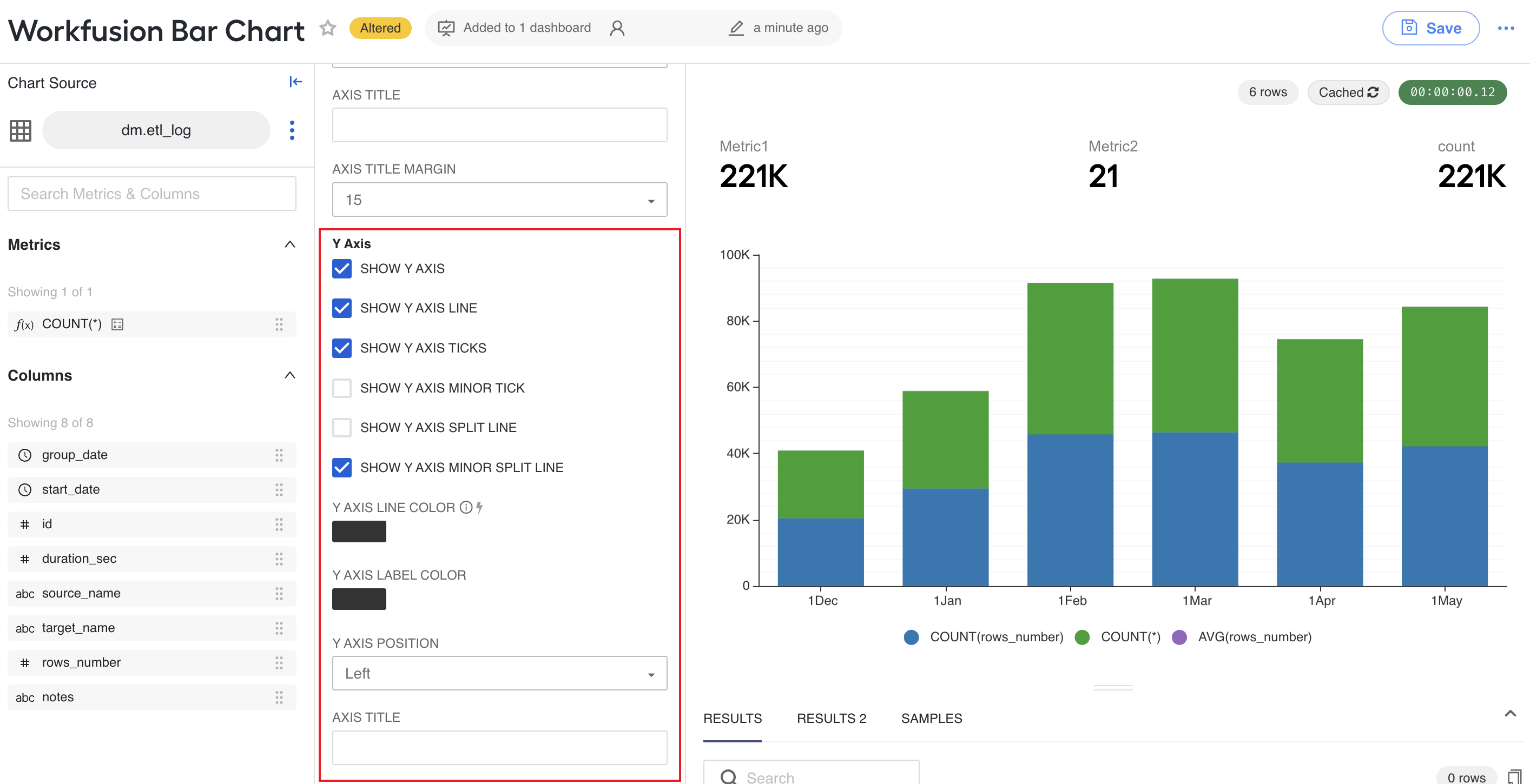
Chart legend
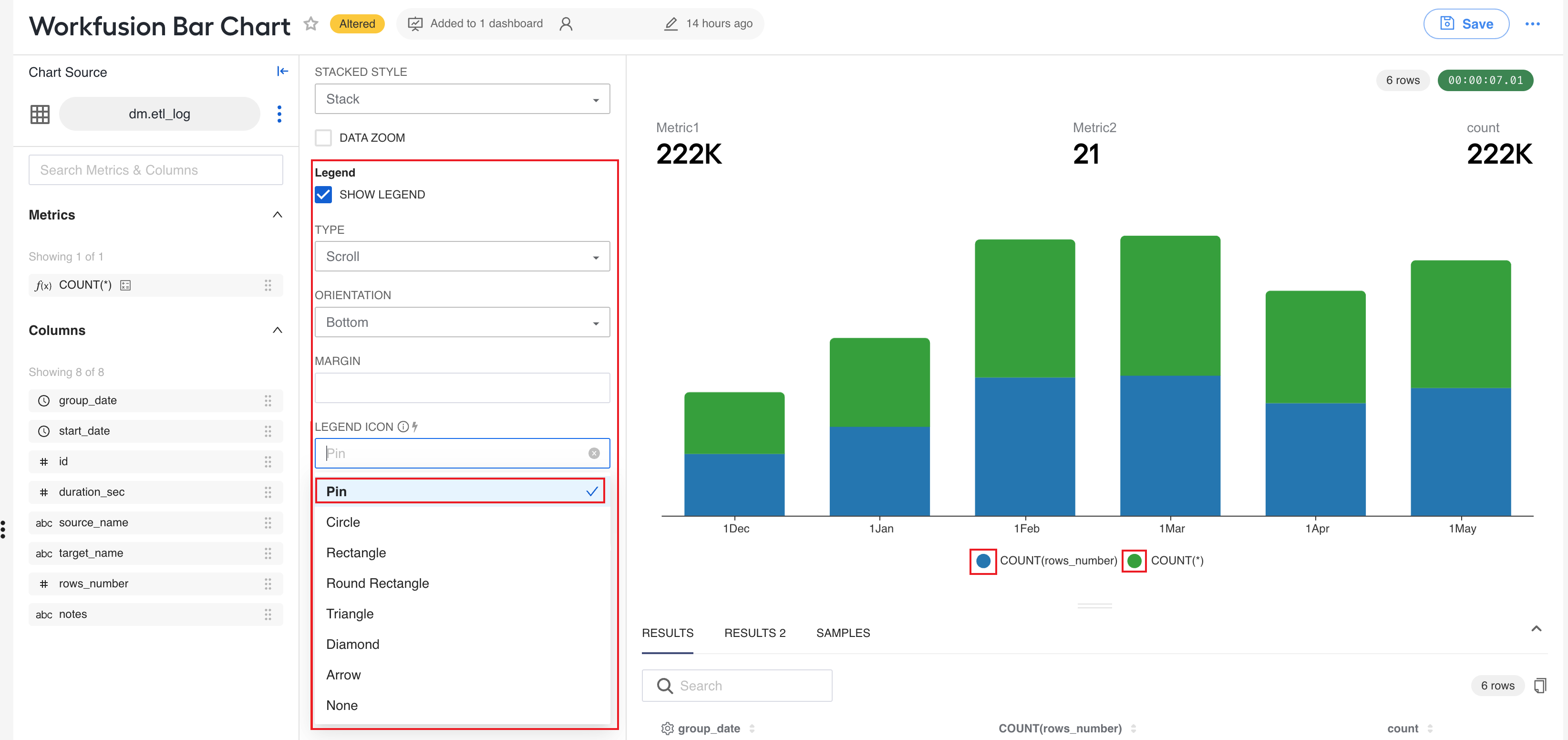
To enable the display of a legend for a chart, navigate to the CUSTOMIZE tab, find the Legend section, and select the SHOW LEGEND checkbox. Then, set a type, orientation, and choose an icon from the Legend icon drop-down list.
Formatting number charts
The Options - Number Chart section on the CUSTOMIZE tab features the following controls to customize number charts:
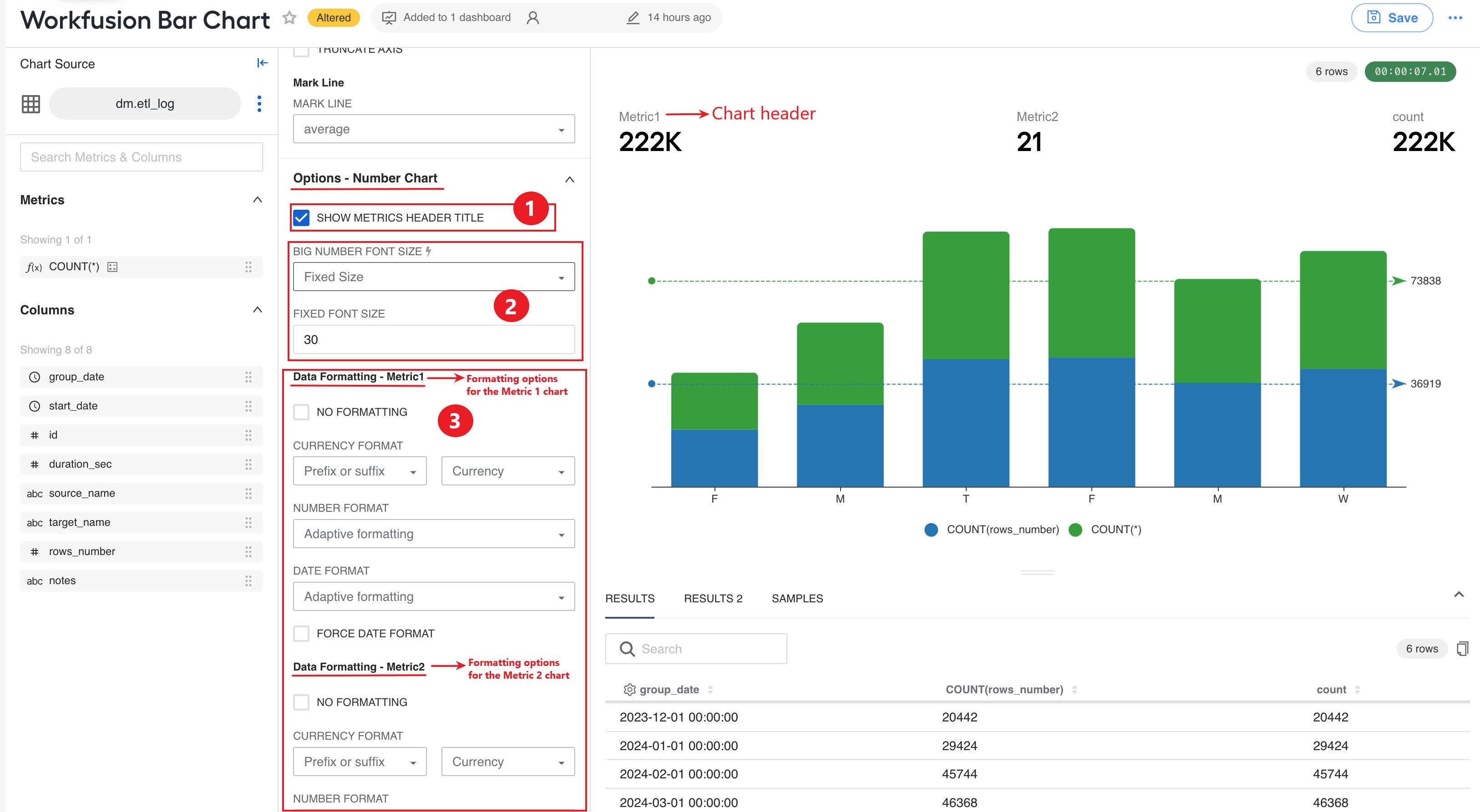
To display a header for a number chart, select the SHOW METRICS HEADER TITLE.
To change a font for the numbers, choose an option in the BIG NUMBER FONT SIZE drop-down box and specify a font size in the FIXED FONT SIZE field.
If you are using multiple charts, you can configure separate formatting settings for each of them in appropriate sections.
Customizing WorldMap charts
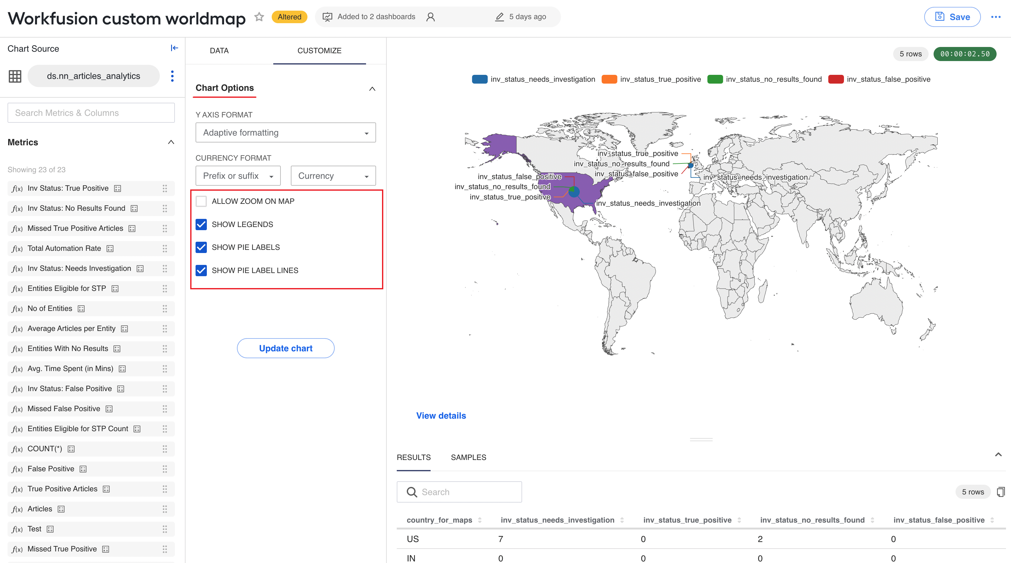
To customize the display on the WorldMap chart, switch to the CUSTOMIZE tab and find the Chart Options section. In the section, apart from the axis formatting, you can configure the following:
ALLOW ZOOM ON MAP: select to allow zooming in or out of the chart
SHOW LEGENDS: select to show a data legend for the chart
SHOW PIE LABELS: select to show label names for the pie diagram sectors within the chart
SHOW PIE LABEL LINES: select to show the lines mapping to the pie diagram sectors
Navigation to other dashboards
You can add a button to a chart, allowing you to navigate to another dashboard:
On the DATA tab, find the View Details section.
Select SHOW VIEW DETAILS BUTTON.
Specify the name of the dashboard where you want the users to navigate by clicking the button.
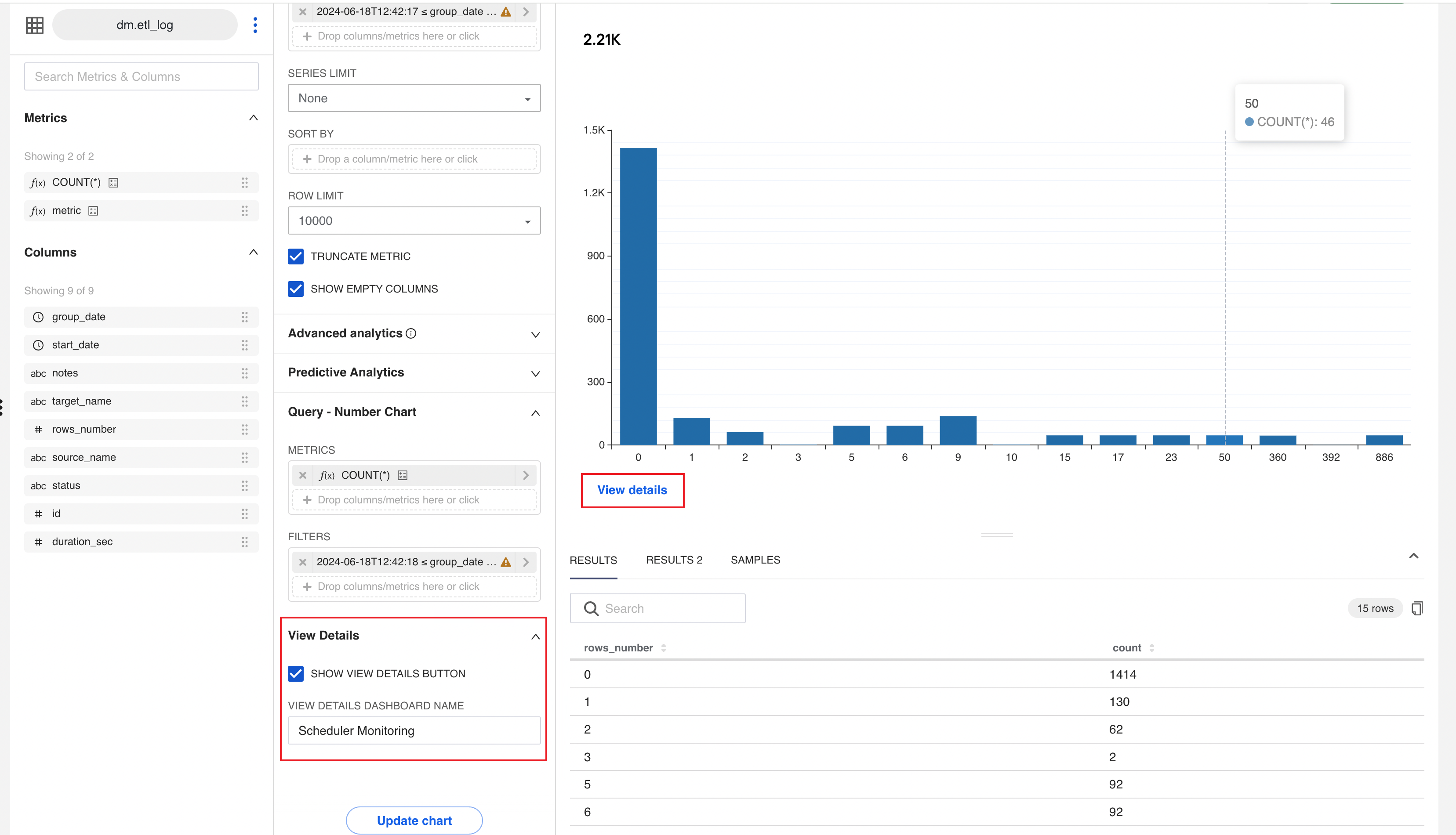
Upon navigation, the filters applied in the source dashboard are carried over to the destination one. On the destination dashboard, you will also see the Back button allowing you to go back to the source dashboard.

Customizing table charts
You can apply the following customizations to the Table type OOTB chart.
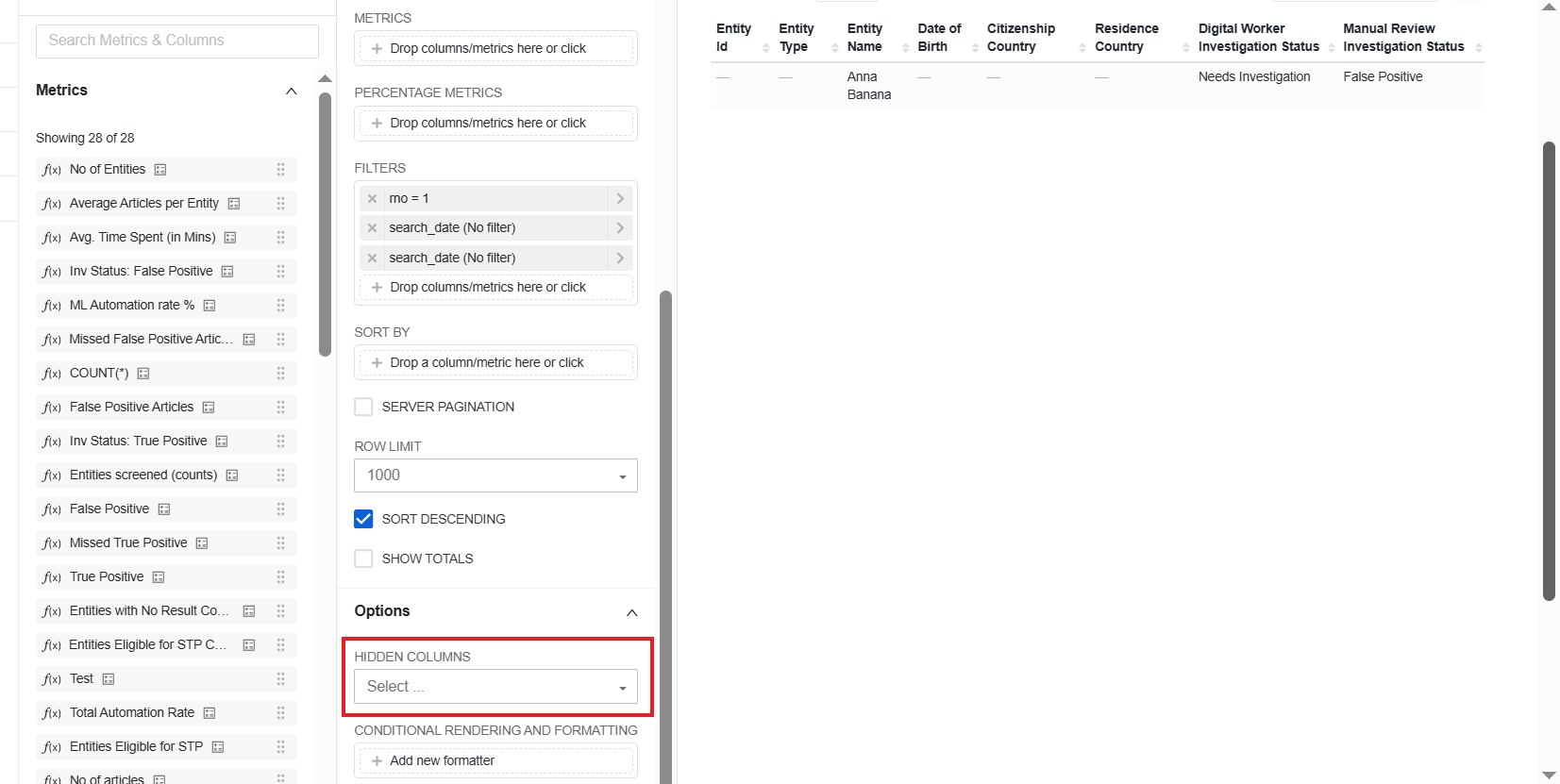
Hide columns
On the DATA tab, go to the Options section.
In the HIDDEN COLUMNS drop-down box, select the columns that you want to hide from your table chart.
Click Update chart. The columns are no longer visible in the area on the right.
Set conditional rendering and formatting
On the DATA tab, go to the Options section.
In the CONDITIONAL FORMATTING AND RENDERING field, click Add new formatter.
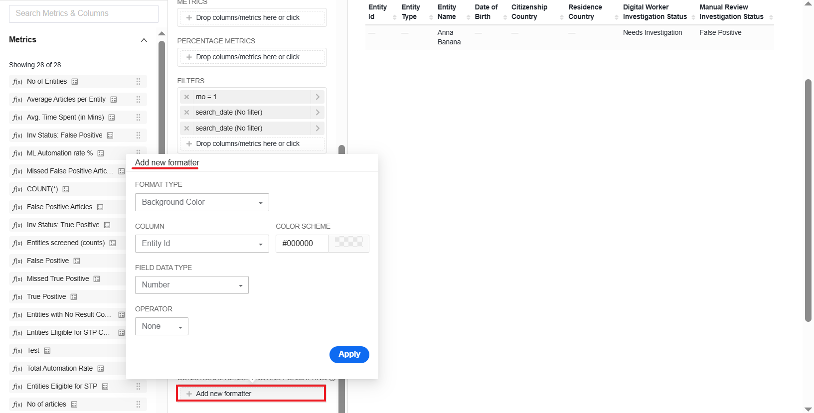
In the Add new formatter configuration screen, choose a format type and configure it as required:
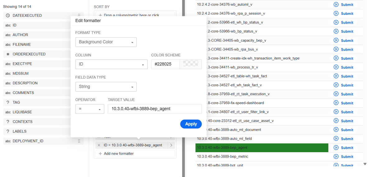
Background Color
The background of one or more fields in the specified column is highlighted in the color selected in the COLOR SCHEME field. The coloring is applied based on the condition you set in the OPERATOR and TARGET VALUE fields.
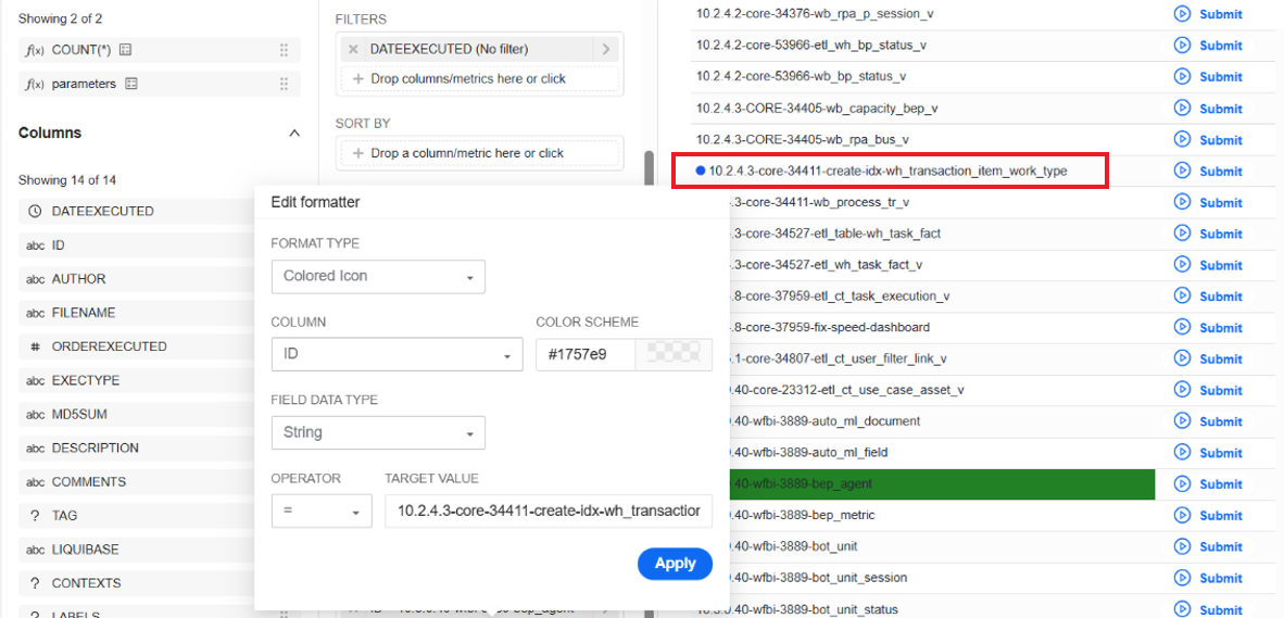
Colored Icon
When you apply the formatter, the icon for a field in the specified column becomes colored as specified in the COLOR SCHEME field when the conditions in the OPERATOR and TARGET VALUE fields are met.
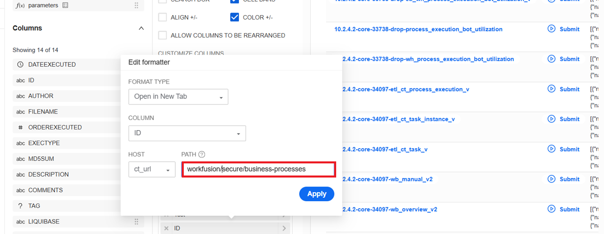
Open in New Tab
Set a host and a path to the page that will open as you click a link in the specified column. In the example below, the links in the column listing Business Process IDs are set to open the Business Processes page in Control Tower.
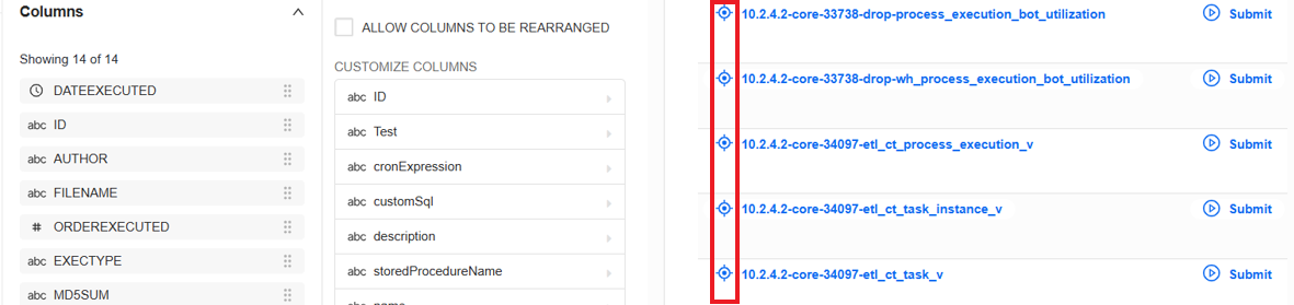
If you use the Open in New Tab (Icon) option, you can also set an icon to be displayed next to the clickable text or even instead of the text.
Submit via API
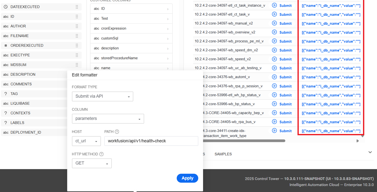
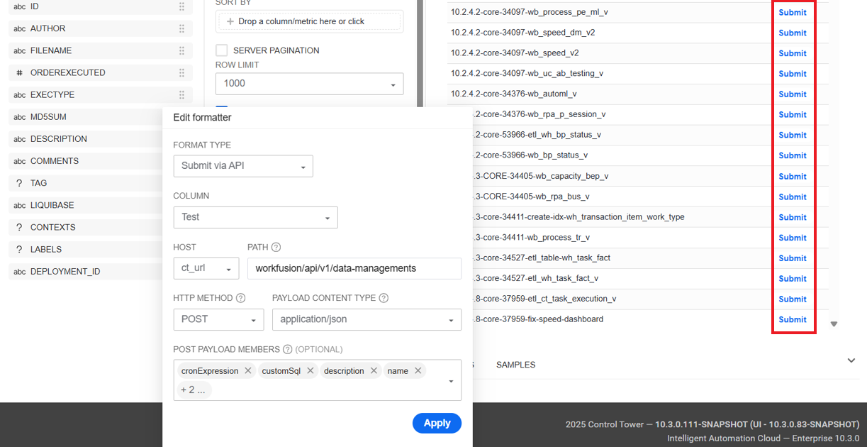
If you apply the formatter, clicking a link in the specified column sends a
POSTorGETrequest to submit or fetch chart values. The response status is displayed in a pop-up as you hover over the link.GET request example: clicking a link in the highlighted column returns the specified parameters from the API endpoint in the PATH field. As a result, you get the health status data.
POST request example: clicking a Submit link submits the chart data to the API endpoint specified in the PATH field. The submitted payload is constructed from the POST PAYLOAD MEMBERS field. As a result, a data management procedure is created based on the parameters specified in the POST PAYLOAD MEMBERS field.
If you use the Submit via API (Icon), you can also set an icon to be displayed next to the clickable link or even instead of the link.
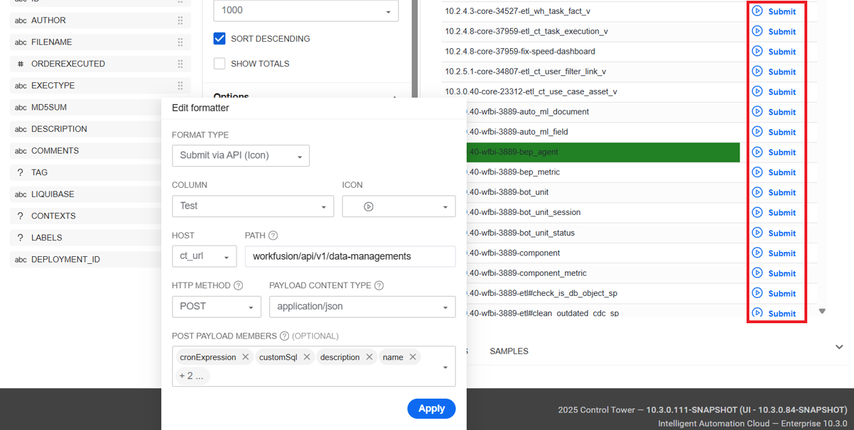
In the Add new formatter configuration screen, click the Apply button.
Click Update chart. The created formatters are applied based on the configurations. You can create as many formatters as you need.
Advanced JSON editor
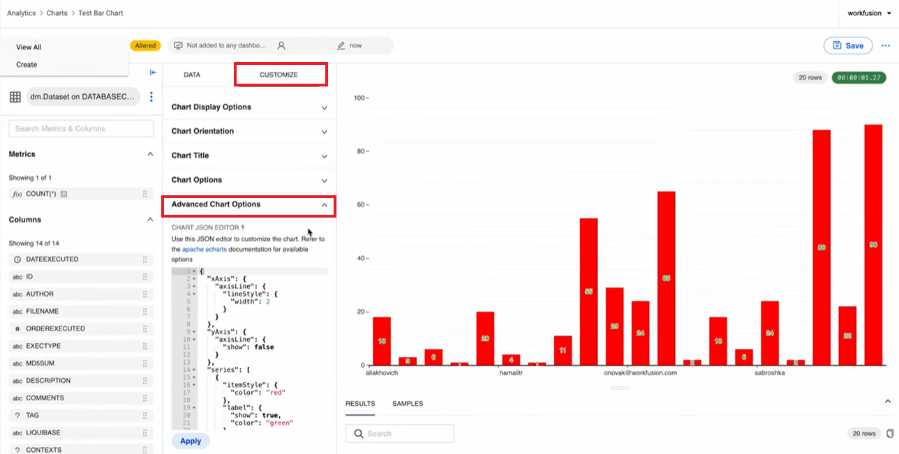
Managing a large number of chart configurations with user interface controls can become an overwhelming task. To simplify the task and give advanced users full control over the configuration process, a raw JSON editor is provided in WorkFusion Analytics. You can directly input valid chart configurations in JSON using the Apache ECharts syntax:
Go to the CUSTOMIZE tab of the chart configuration screen and click Advanced Chart Options.
Add your raw JSON syntax and click Apply. The result is displayed in the panel on the right.
Build dashboard
To build a dashboard, do the following:
In Control Tower, navigate to Analytics > Dashboards > + Dashboard.
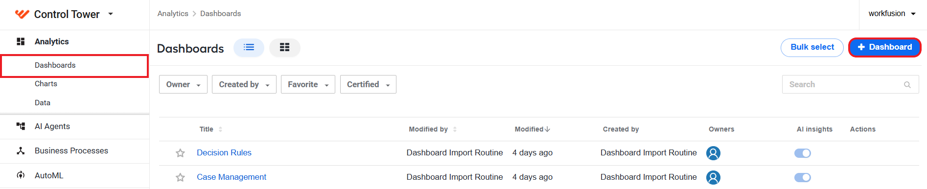
On the Dashboard screen, set the dashboard name.
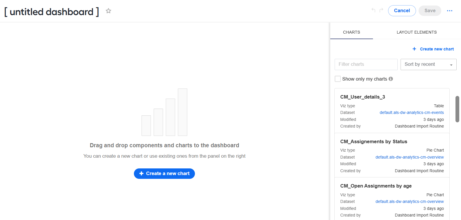
To build a dashboard, drag charts and layout elements from the tabs on the right:
- The CHARTS tab contains a list of all charts you have access to (i.e., charts you have created or a team member has shared ownership access). Alternatively, click Create a new chart button and build a chart from scratch.
- The LAYOUT ELEMENTS tab lists elements to customize your dashboards, for instance, headers, markdown code, and so on.
Click Save. The resulting dashboard is saved with the Draft status and appears in the list on the Dashboards page.
In the Draft status, the dashboard is not visible to anyone but you. To make it publicly available, click the Draft indication next to the dashboard name.

The Draft status is changed to Published, and the dashboard becomes publicly available.

You can also set any published dashboard back to the Draft status by clicking the Published indication.
If you need to update a dashboard, select it in the Dashboards list. Once the dashboard's page opens, click Edit to switch to the Edit mode and make necessary changes.
Delete dashboard
To remove a dashboard permanently, follow the steps below:
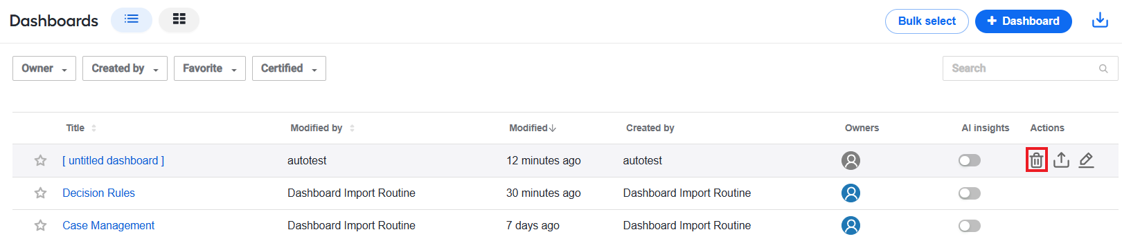
Navigate to Dashboards, hover over a line corresponding to the dashboard you want to remove, and click the Delete button.
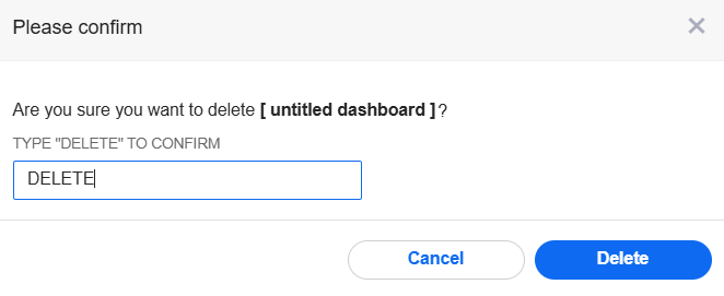
Confirm the deletion: type in DELETE and click Delete. The dashboard is removed from the list.
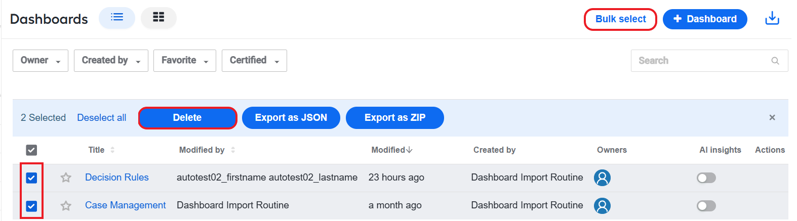
If you want to delete more than one dashboard, you can use the bulk delete feature. To do that, click the Bulk select button on the Dashboards page, select the dashboards you want to delete, and click Delete.
Configure dashboard and chart properties
To change the properties of a dashboard, follow the steps below:
Open the Dashboard properties window in one of the following ways:
On the Dashboards list, hover over the dashboard for which you want to change properties. In the Actions column, click the Edit button.

On the dashboard's page, click the Edit button to switch to the Edit mode. Then, open the Actions menu and select Edit properties.

In the Dashboard properties window, make changes as appropriate and click Save.
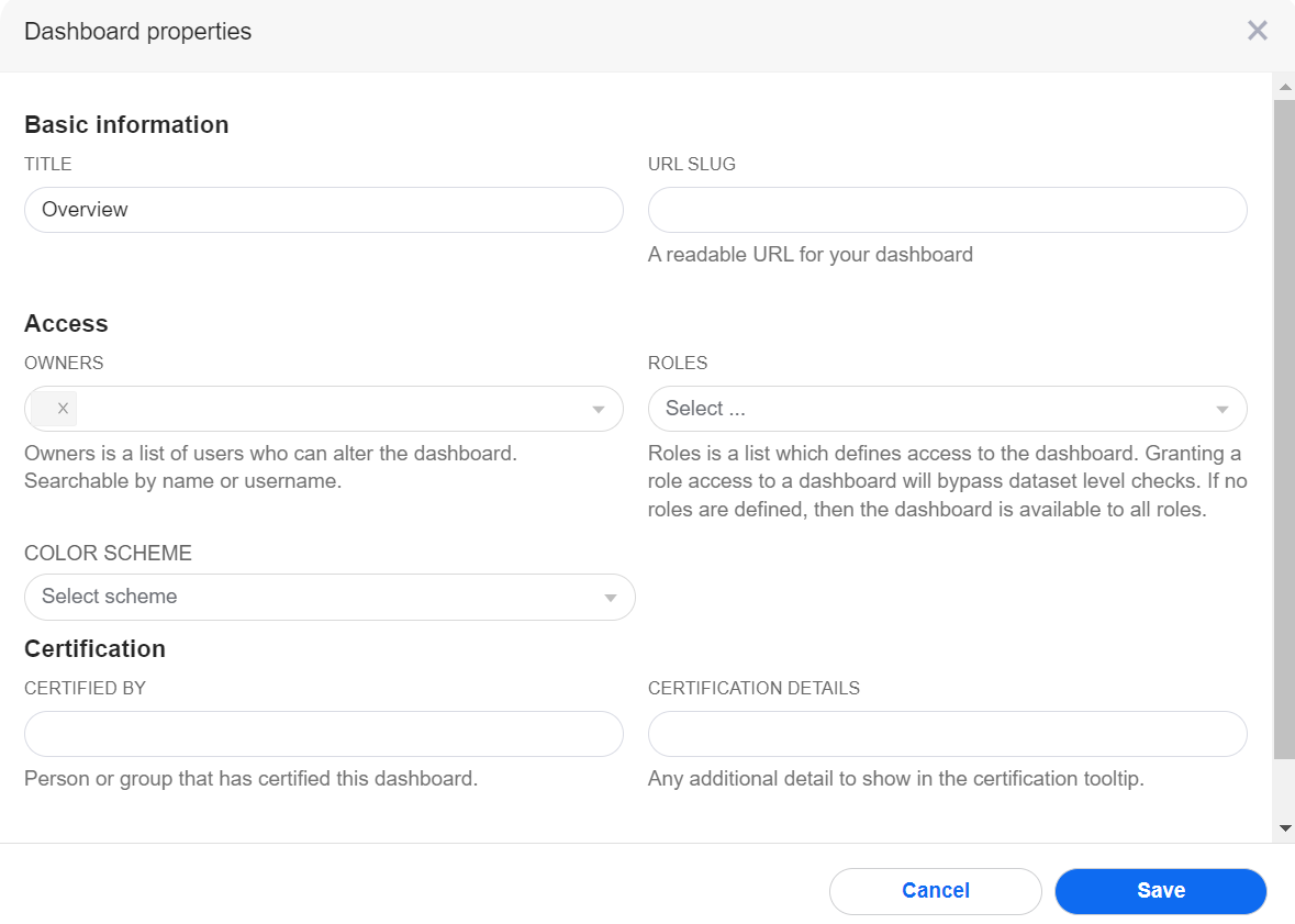
If you are making changes to the dashboard properties in the Edit mode, the Save button is replaced by Apply.
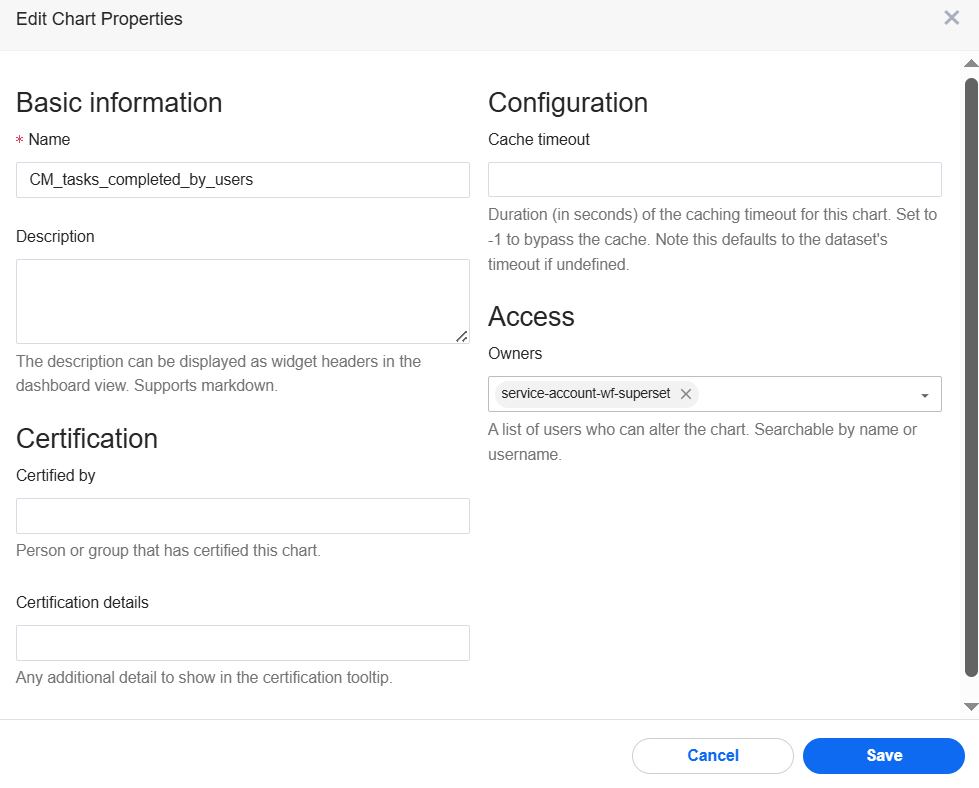
To edit the properties of a chart, follow the steps below:
Go to Charts and click the chart for which you want to change properties.
On the chart's page, open the Actions menu and select Edit chart properties.
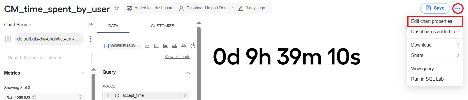
In the Edit chart properties window, make required changes and click Save.
Refresh dashboard data
For a one-time manual refresh of the dashboard data, open the Actions menu for the dahsboard and choose Refresh dashboard.
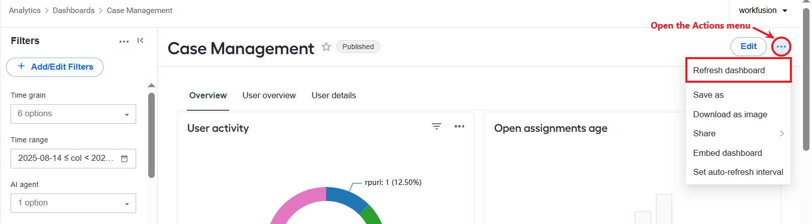
To avoid refreshing the dashboard manually if you need to do this frequently, you can set an auto-refresh interval:
On the dashboard page, open the Actions menu next to the Edit button and choose Set auto-refresh interval.
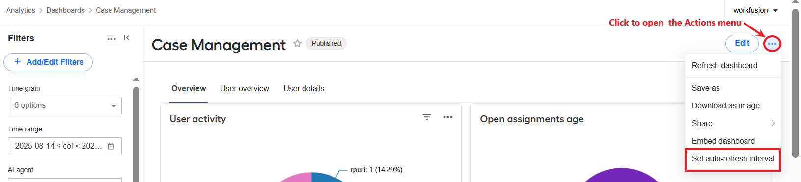
In the displayed window, choose a refresh frequency and click Save for this session. The dashboard will be refreshed based on the interval setting as long as you are logged in the same session. After a logout, you will need to set the interval again.

Share dashboards and charts
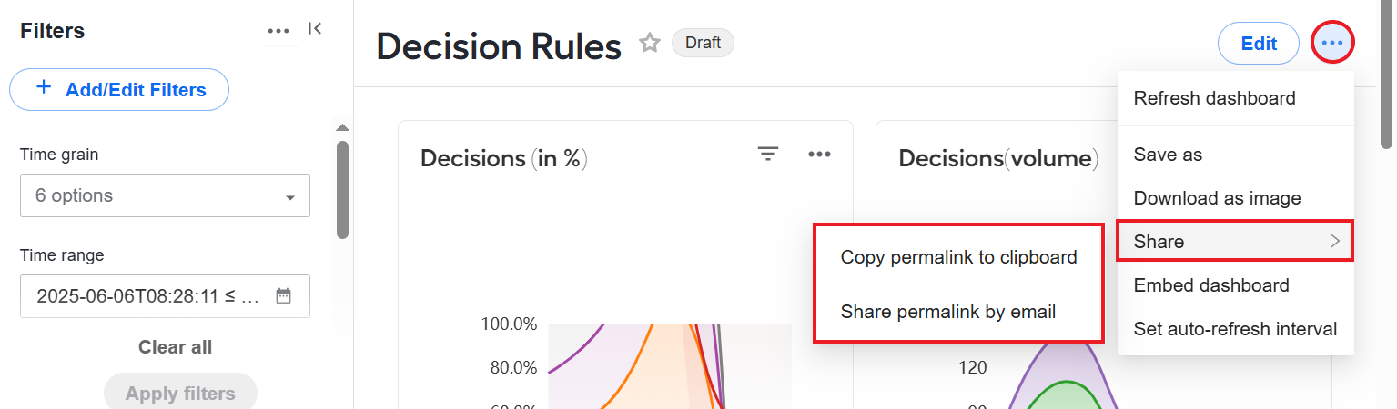
You can share dashboards and charts with any users who have appropriate permissions to access dashboards. Users with read-only permissions can only view shared dashboards and charts, and users with edit permissions can view and edit them.
To share a dashboard, open the dashboard you want to share and, in the Actions menu, click Share and select a method to share the dashboard.
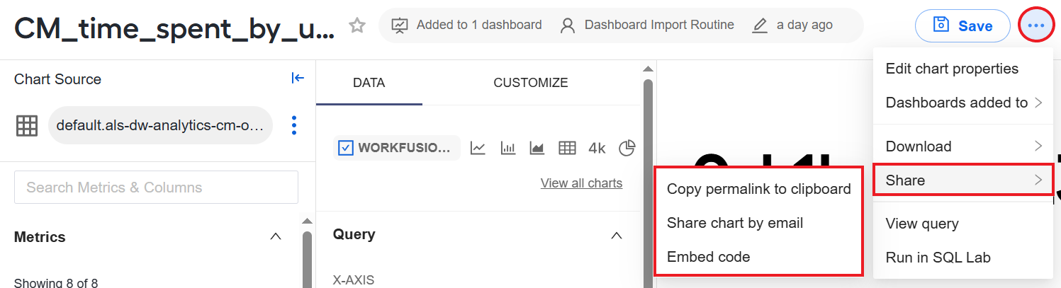
To share a chart, open the chart you want to share and, in the Actions menu, click Share and select a method to share the chart. You can open and share a chart from the Charts page or straight from a dashboard.
Access chart data via API
WorkFusion offers a dedicated POST /chart/{chart_name}/data REST API endpoint for retrieving data from specific charts created in the Analytics component.
The API enpoint uses the Bearer Token authentication type. The URL is to begin with the following pattern:
https://control.tower.host/api/v1
POST /chart/{chart_name}/data
Takes the chart name and uses the query context stored when the chart was saved to return a payload data response. The response comporises only the data related specifically to the chart in the {chart_name} parameter.
Additionally, you can set endpoint parameters to filter the result data based on the following:
Dimensions
Time range
Metrics
Path parameter
chart_name: the name of the chart from where you want to get data. Required.
Request body
The request body is a parameter array containing the following:
extras: criteria to filter response data based on chart metricsfilters: criteria to filter response data based on dimensionsformat: response format; typically,json
{
  "datasource_id": 0,
  "extras": {},
  "filters": [
    {
      "col": "name",
      "op": "==",
      "val": "0"
    }
  ],
  "force": true,
  "format": "string"
}
Request body example
{
    "extras": {"having":"COUNT(*)>0"},
    "filters": [
        {
            "col":"source_name",
            "op":"==",
            "val":"etl_process_execution_v"
        }
    ],
    "force": true,
    "format":"json"
}
Response body
{
  "result": [
    {
      "annotation_data": [
        {
          "additionalProp1": "string",
          "additionalProp2": "string",
          "additionalProp3": "string"
        }
      ],
      "applied_filters": [
        {}
      ],
      "cache_key": "string",
      "cache_timeout": 0,
      "cached_dttm": "string",
      "colnames": [
        "string"
      ],
      "coltypes": [
        0
      ],
      "data": [
        {}
      ],
      "error": "string",
      "from_dttm": 0,
      "is_cached": true,
      "query": "string",
      "rejected_filters": [
        {}
      ],
      "rowcount": 0,
      "stacktrace": "string",
      "status": "stopped",
      "to_dttm": 0
    }
  ]
}
Response example
Below is an example of a response to an API call with filtering based on dimensions.
{
  "result": [
    {
      "data": [
        {
          "count": 1,
          "duration_sec": 0,
          "group_date": 1745798400000,
          "id": 2,
          "notes": "ok",
          "rows_number": 0,
          "source_name": "etl_ct_process_execution_v",
          "start_date": 1745798400000,
          "target_name": "ct_process execution"
        },
        {
          "count": 1,
          "duration_sec": 0,
          "group_date": 1745798400000,
          "id": 2,
          "notes": "ok",
          "rows_number": 0,
          "source_name": "etl_ct_process_execution_v",
          "start_date": 1745798400000,
          "target_name": "ct_process execution"
    }
  ]
}
Migrate dashboards
Superset allows migrating dashboards across different environments. For example, after creating a dashboard and checking it on a test instance, if everything goes well, you can use the functionality to import the working dashboard into the production environment.
Only users with the Admin permissions can export and import dashboards.
To export a dashboard, navigate to Analytics > Dashboards and, in the Actions column, click the Export button corresponding to the dashboard you want to export.
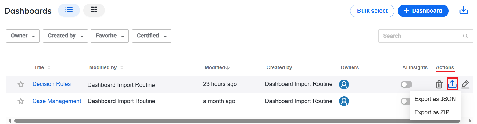
Depending on the chosen option, the dashboard is saved to your computer as a JSON or a ZIP file. The exported artifact also contains associated datasets and charts.
To select several dashboards for export, do the following:
On the Dashboards page, click Bulk select.
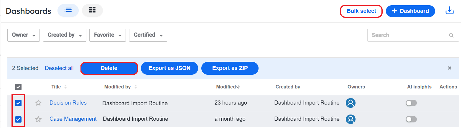
Choose as many dashboards as you need to export and click Export as JSON or Export as ZIP. Depending on the button you clicked, the dashboards are saved to your computer as JSON or ZIP files.
To import a dashboard, do the following:
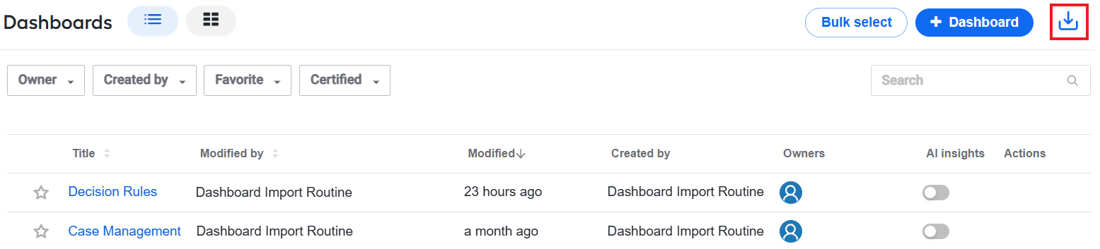
In the target environment, on the Dashboards page, click Import.
On the Import dashboard window, click Select file, then select the saved dashboard JSON or ZIP on your computer.
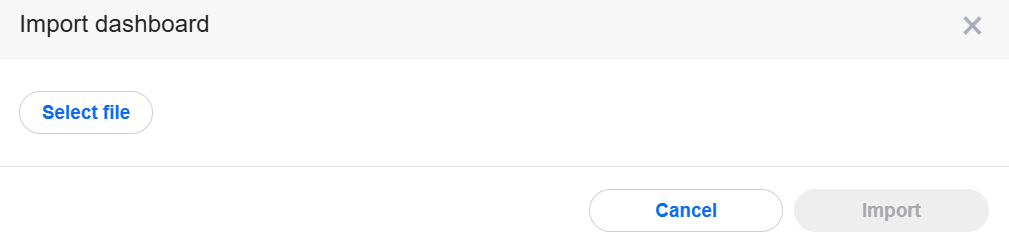
Click Import.
You can only import one dashboard at a time.
Read more
Since Work.AI analytics is originally based on Superset, you can refer to the Superset official documentation for additional details.