Decision Rules dashboard
The Decision Rules dashboard provides information about rules and rule-based decisions associated with the execution of no-code Decision Rules steps in Business Processes (BP). Using the dashboard, you can accomplish the following:
Review and analyze rule executions in Control Tower, including metrics, such as the frequency of rule firing, outcomes and their impact on BPs
Get detailed insights into the rules that fired during each BP execution
Evaluate how rules are executed in your automations and adjust them accordingly to improve Business Process performance
The dashboard collects data using an event-based approach. All dashboard data is stored and managed using Elasticsearch indices.
Access no-code rules dashboard
To access the Decision Rules dashboard in Control Tower, go to Analytics > Dashboards and choose Decision Rules in the dashboard list.
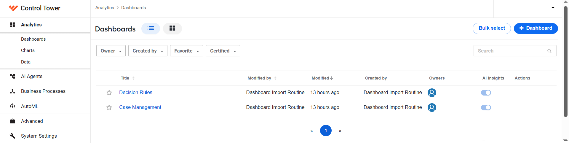
If you can't access the dashboard, make sure you have all necessary permissions for your role.
The Decision Rules dashboard features three types of visualizations:
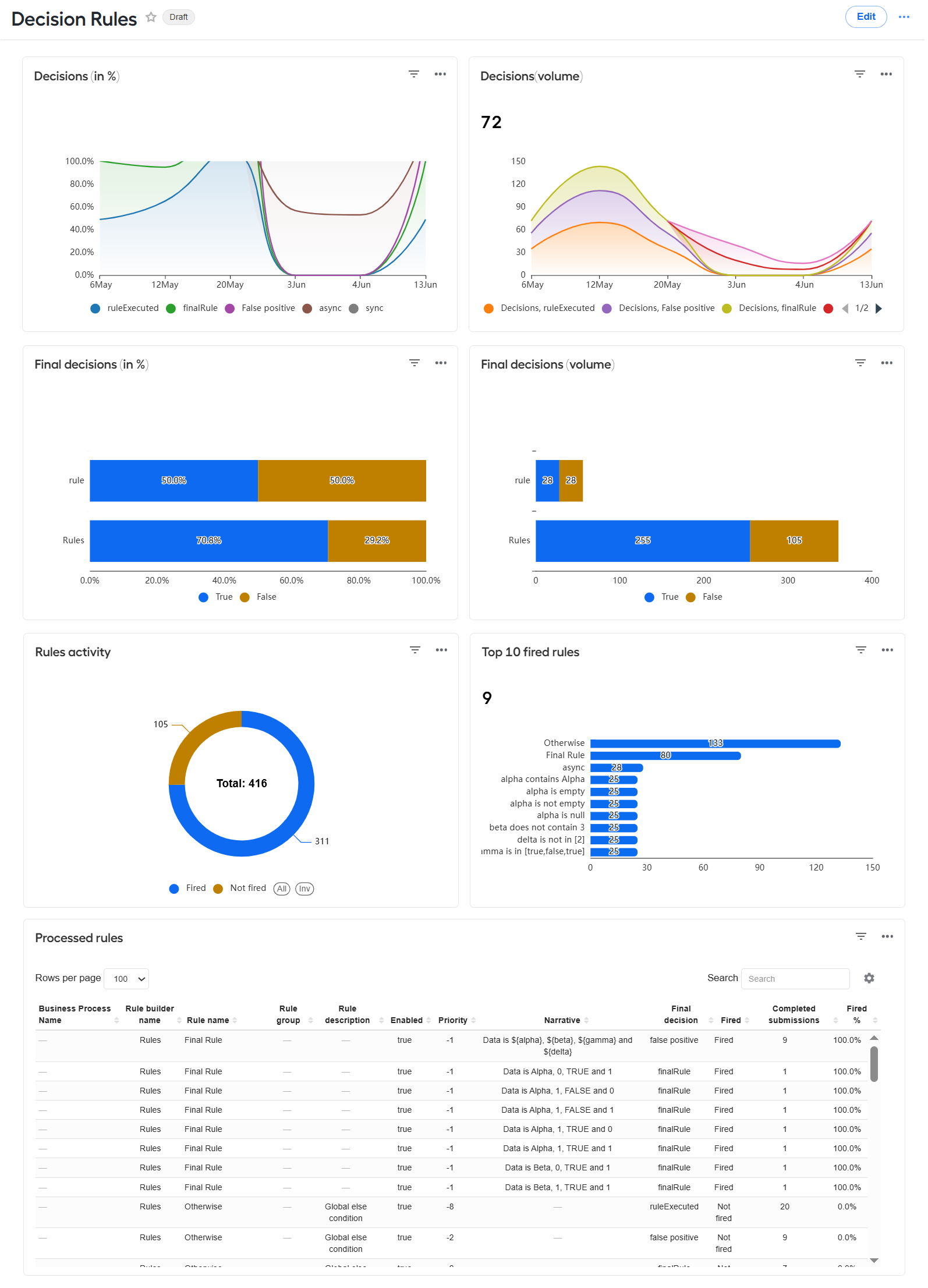
You can filter and sort dashboard data based on various parameters, such as time, Business Process, rule type, AI Agent, and so on. For more information, read Create and manage charts and dashboards | Filter dashboard data.
Clicking any elements in charts or tables changes the dashboard display interactively to reflect the data related to the element specifically. For instance, if you click the Fired segment in the Rules activity chart, the display of the entire dashboard will change to reflect data on fired rules only.
Review dashboard data
Decision-related views
The Decisions (percentage) chart displays the distribution of decisions across different types as a percentage of the total over a specified period. You can adjust the period and time grain for the chart using the Time range and Time grain dashboard filters.
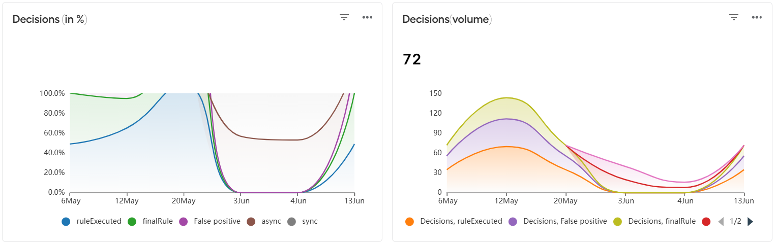
The Decisions (volume) view shows the total number of decisions taken for rules (the digit in the top left corner of the chart) and their trends over time with breakdown by types. You can adjust the period and time grain for the chart using Time range and Time grain dashboard filters.
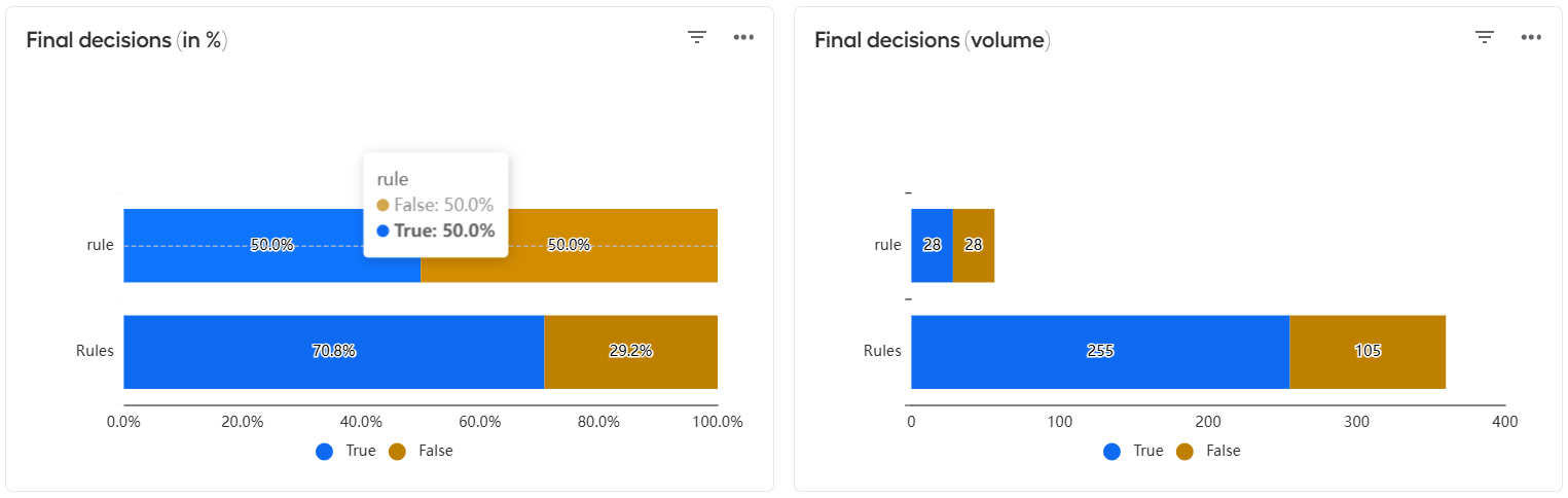
The Final decisions and Final decisions (volume) charts show how final decisions correlate with specific rule-processing outcomes in per cents or numbers, accordingly. For instance, in the figure below, the rules final decision was taken in 50% percent of cases when the rule outcome was True.
Rule-related views
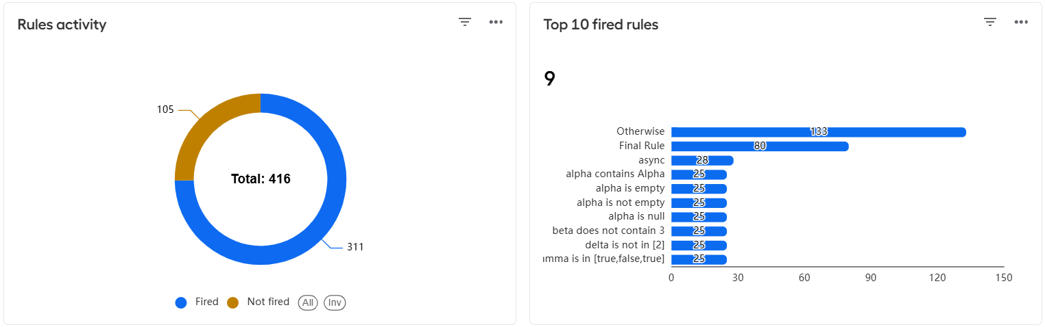
The Rules activity chart shows the distribution of total rules as a percentage across the three categories: fired, not fired, and other.
The Top fired rules chart displays the five rules with the highest frequency of firing. You can also see how many times each of the rules fired.
Processed rules table
The table provides a comprehensive overview of all rules submitted during Business Process execution in Control Tower.
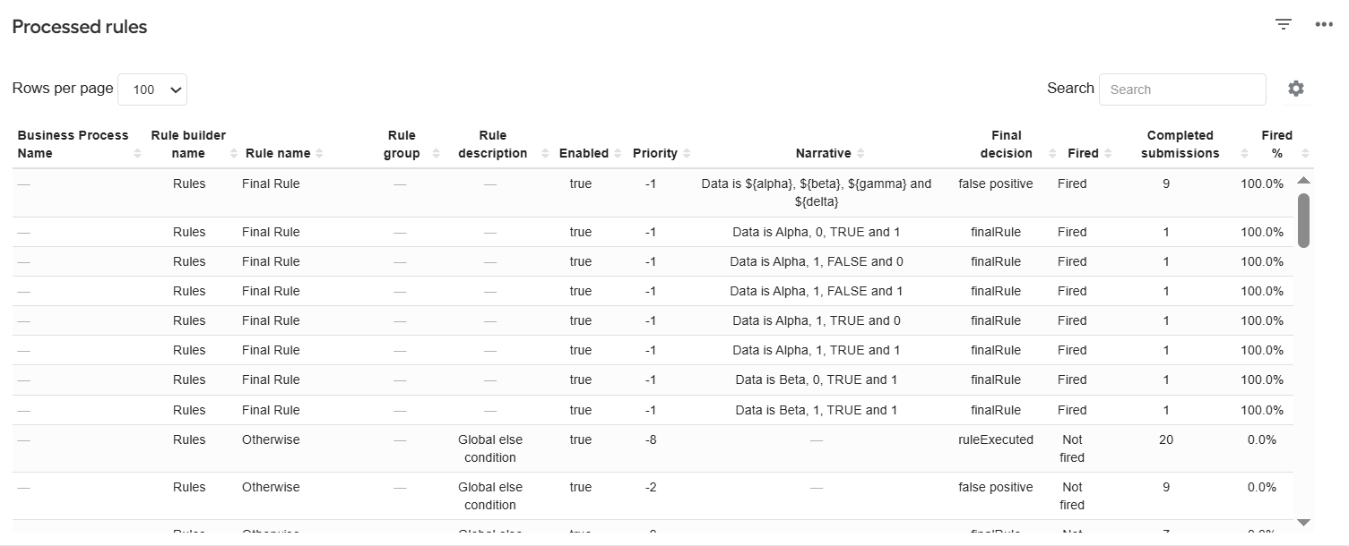
To change the arrangement of the columns in the table, drag and drop the column names as required.
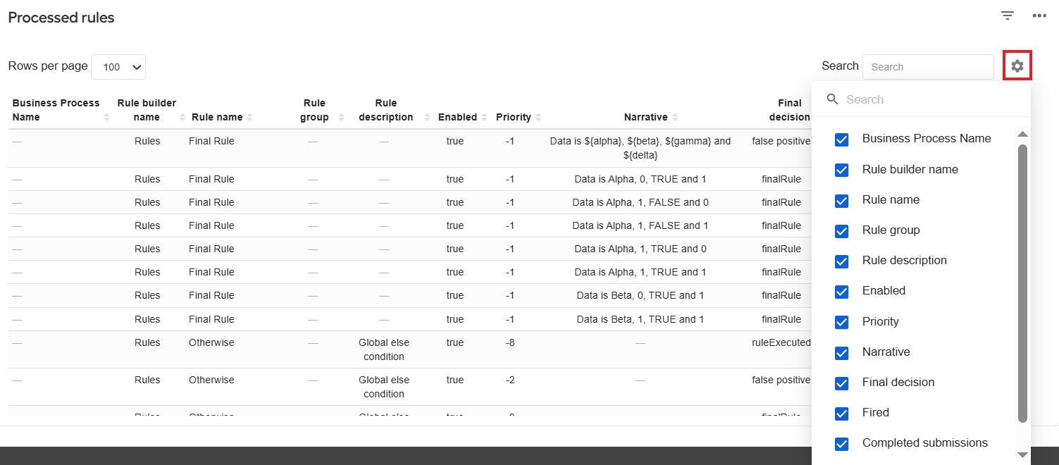
To exclude some columns from the display, click the cogwheel button in the top right corner of the Processed rules table and deselect the names of the columns you want to hide.
To change the metrics displayed in the Processed rules table, customize the chart. For details, read Create and manage charts and dashboards | Create chart.
Generate dashboard reports with AI
For the dashboard, you can also leverage the AI insights capability that analyzes the dashboard metrics for you and creates a report with insights based on key performance indicators (KPI). The KPIs are preconfigured at the dataset level for each of the dashboard charts.
For instructions on enabling and using the AI insights capability, read Learn about analytics in WorkFusion | Get analytics insights with AI.