Deliver complex customizations via MT Designer
The article is a runbook that describes how to create complex custom configurations for Manual Tasks in MT Designer and how to resolve related issues. Before proceeding, review the instructions for simpler use cases in Design Manual Task forms.
Query Data Stores
Data Stores are tables that contain data in various formats. To access them, go to Advanced > Data Stores.
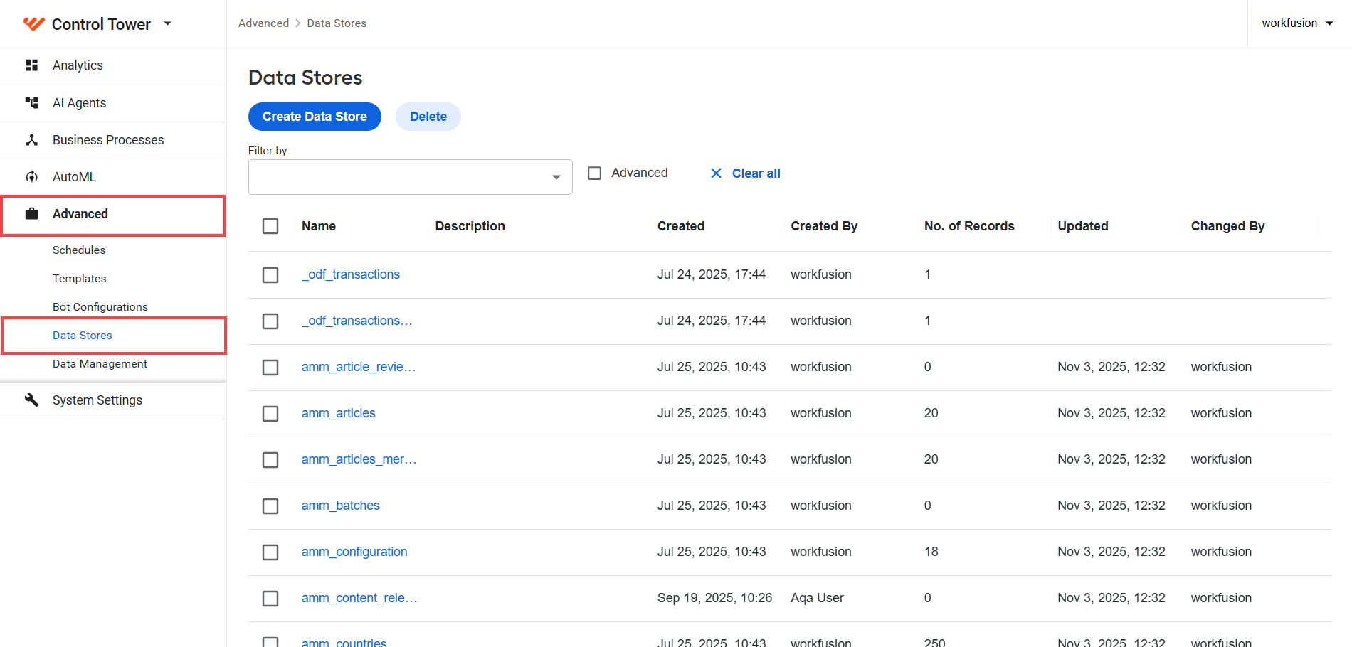
When you click any item in the Data Store list, you see that each table has a unique set of columns, as shown in the example below:
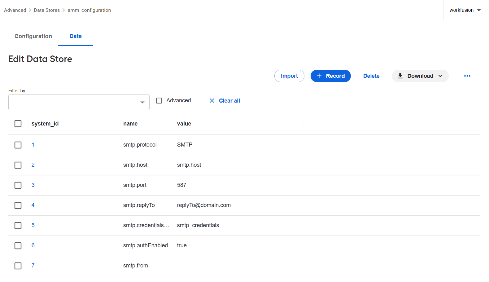
To query a Data Store, create a custom query. Custom queries are defined per Manual Task as described below:
Open the Business Process that contains the Manual Task and double-click it.
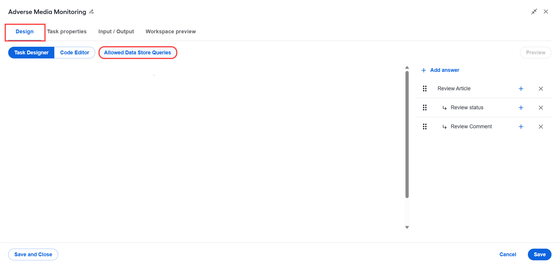
Navigate to the Design tab and click Allowed Data Store Queries.
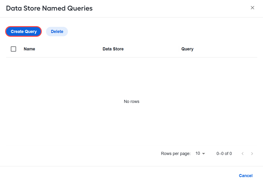
In the popup that appears, click Create Query.
In the next screen, provide a name to reference the query, select the associated Data Store, and add the query.
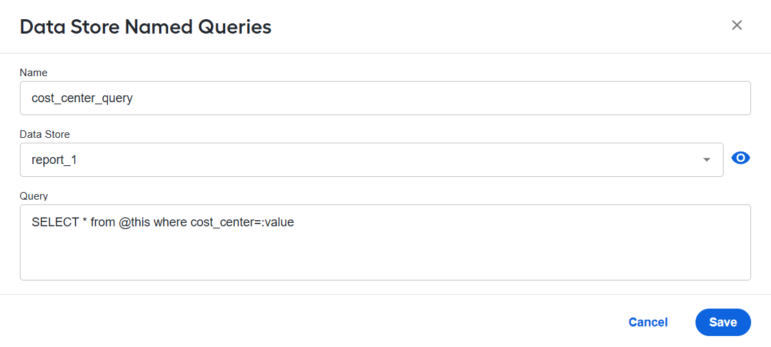
You can click the eye icon to open the selected Data Store in a new browser tab.
In the example above, the following query is used:
SELECT * from @this where cost_center=:value
The query includes two variables:
@thisreferences the Data Store selected in the Data Store drop-down field.:valuerepresents the field name where data is sent in the next step. In real-world cases, multiple field names can be used, but this example shows only one for simplicity.
After the query is created, proceed as follows:
On the Design tab of the Manual Task, switch to Task Designer.
In the layout, locate the Text Field component that will send a request to the named query and click the pencil icon to open its setting page.

Navigate to the Validation tab and click Custom Validation.
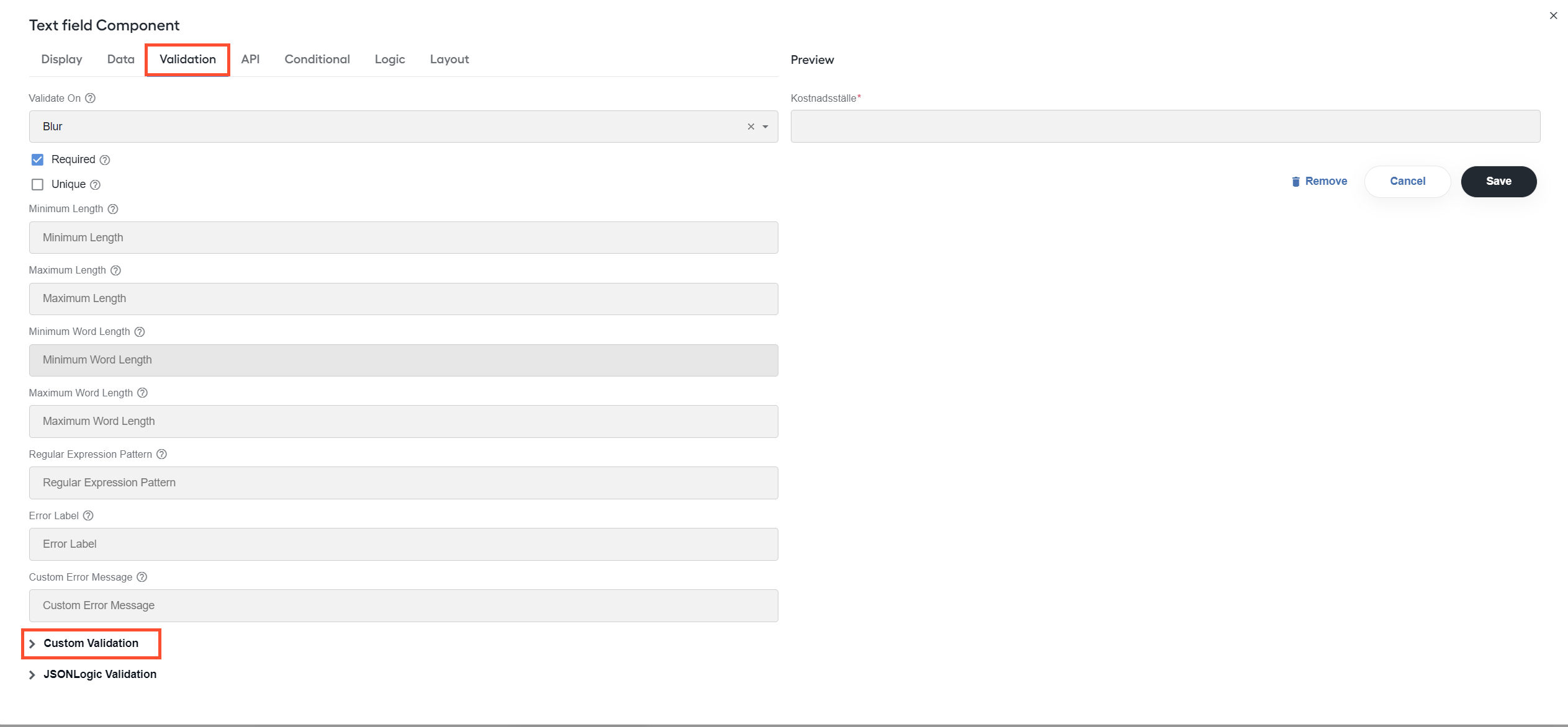
In the custom validation code block, paste the following code:
View code
// a general-purpose function to send a named query request
function queryDataStore(queryName, parameters) {
  var nativeId = new URLSearchParams(window.location.search).get('submissionUUID');
  var url = new URL(`${window.location.origin}/workfusion/api/v2/datastores/executeNamedQuery`);
  url.searchParams.set('queryName', queryName);
  url.searchParams.set('parameters', JSON.stringify(parameters));
  url.searchParams.set('nativeId', nativeId);

  return fetch(url.toString())
      .then(response => response.json());
}

// the actual query
queryDataStore('cost_center_query', {value: input})
    .then(console.log);
The code prints the query results to the console. The queryDataStore function uses the previously defined query name (cost_center_query) and a parameter object containing the value field.
Use allowed Data Store query with Select component
For the Select component, data should be an iterable object. To use allowed Data Store queries with the Select component, follow the steps below:
Create an allowed Data Store query:
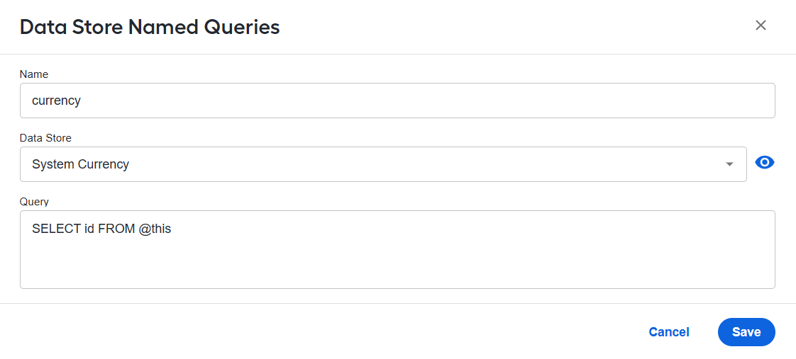
In your Manual Task, go to Code Editor and put the code for getting
hitIdbefore<@taskDesignerScript />: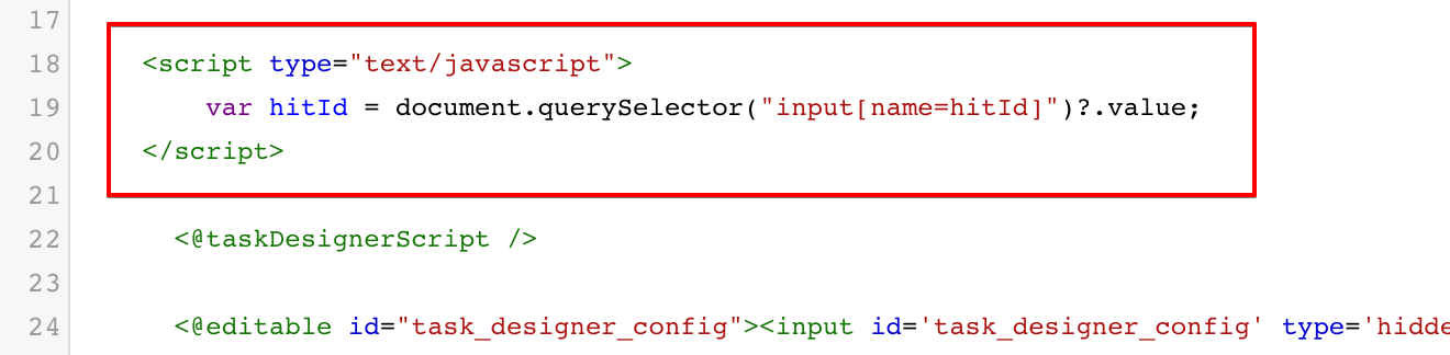
To configure the Select component, open its settings page and, on the Data tab, do as follows:
Set Data Source Type to URL.
In the Data Source URL field, specify
{{window.location.origin}}/workfusion/public/v2/datastores/executeNamedQuery?queryName=currency&nativeId={{hitId}}.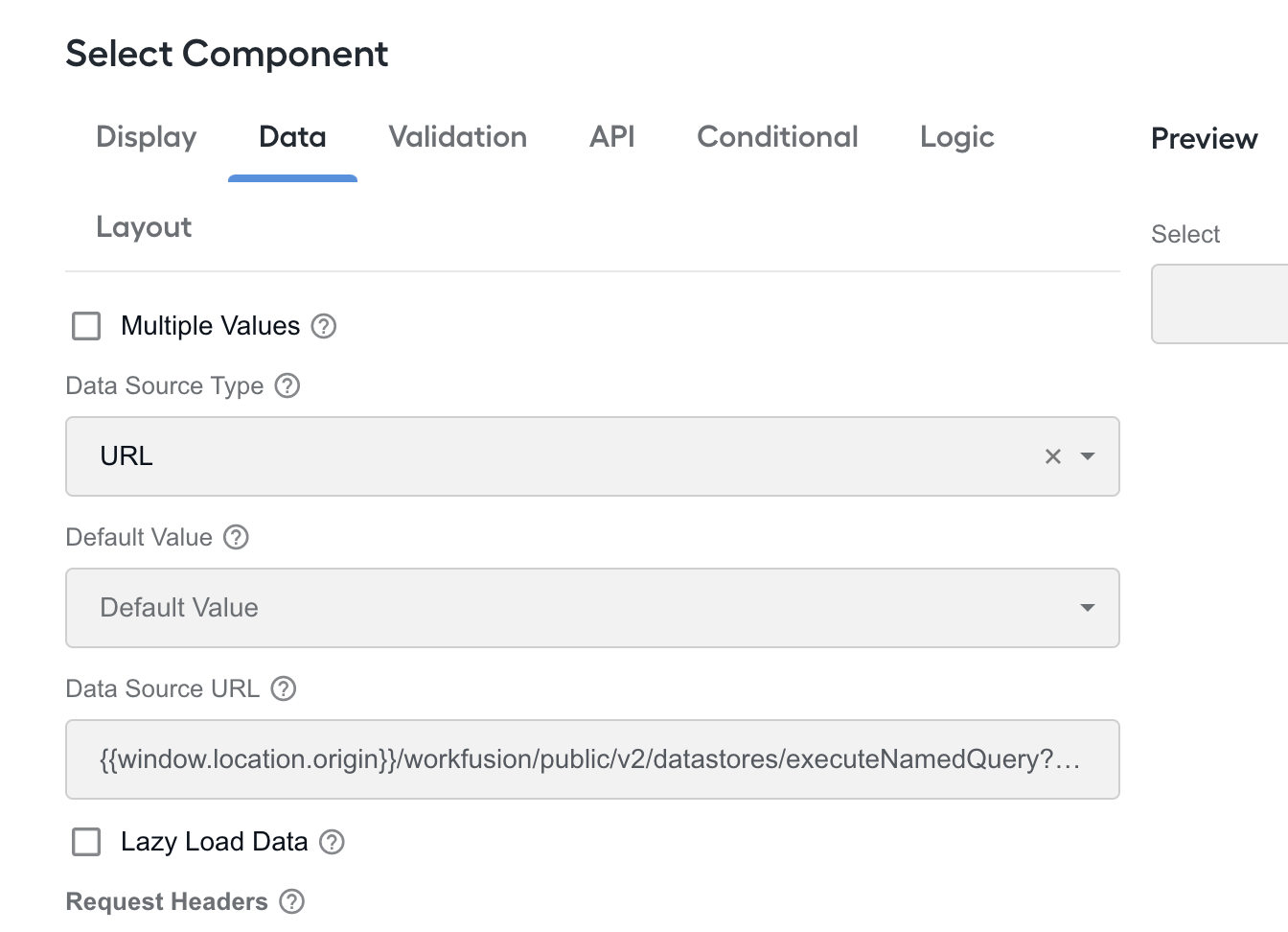
In the Item Template box, add
<span>{{ item[0] }}</span>.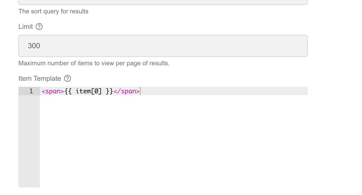
The response to the request is as follows:
[["AED"],["AFN"],["ALL"]...].
The customization works only in Workspace as there is no hitId in the preview on the Control Tower side.
Restrict input to be selected from Data Store entries
To use a custom Data Store as the source of a component, follow the steps below:
Go to the Data tab of the component and set URL for Data Source Type.
To use a relative path, specify Data Source URL in the following format:
{{window.location.origin}}/workfusion/api/v2/datastores/autocomplete-data?datastore={datastore_name}&maxRows=300If you use a heavy Data Store, apply
maxRowsto define the maximum amount of records to return. In the example above, 300 records are used. If the parameter is not provided, the server uses 50 records by default.
The autocomplete-data endpoint requires a Data Store with at least the id and name columns. If the Data Store does not contain these columns, an error is thrown.
Let's consider some required fields:
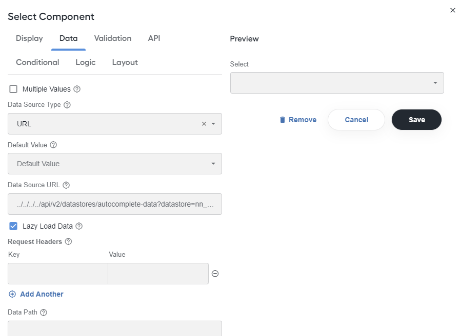
The properties are as follows:
ID Path defines where to select the option's ID, for example, the
rowData[0]element in the data source URL JSON's response.Value Property defines where to get values for selection, for example, the
rowData[1]element in the data source URL JSON's response.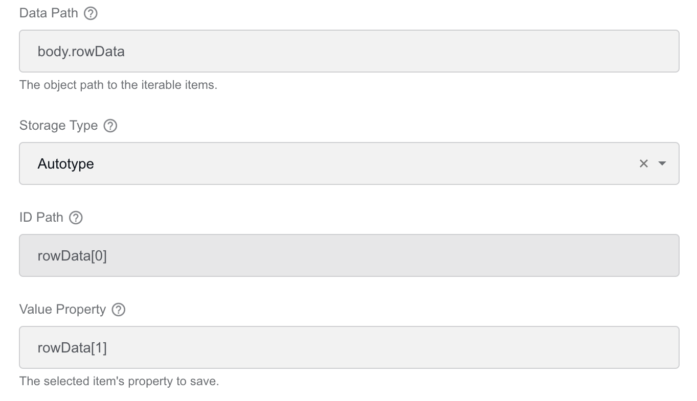
Item Template defines the HTML template to display items for selection, for example, the
rowData[1]element in the data source URL JSON's response.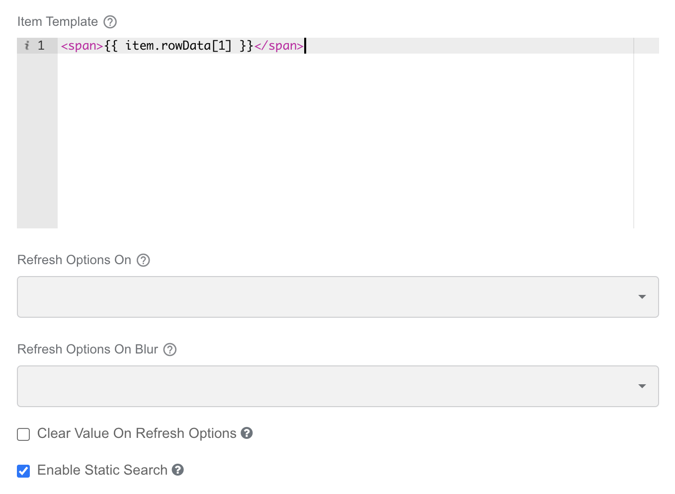
To configure other fields, follow the best practices.
Enable advanced rendering for HTML element
Content rendering in an HTML element has access to global variables, despite the fact it is not mentioned in the provided description. The variables available in a context are listed in the table below:
| Variable | Description |
|---|---|
| form | Complete form JSON object |
| submission | Complete submission object |
| data | Complete submission data object |
| row | Contextual row data used within DataGrid, EditGrid, and Container components |
| component | Current component JSON |
| instance | Current component instance |
| value | Current value of the component |
| moment | moment.js library for date manipulation |
| _ | Lodash instance |
| utils | FormioUtils object instance |
| util | Utils alias |
View example
To render a label with an icon when the control value=pass, use the following code:
{% const key = 'company_id_comment' %}
{%
let label, iconColor, iconName;
if (data[key] === 'pass') {
  label = 'Passed';
  iconColor = '#51c071';
  iconName = 'check_circle';
}
%}
<div class="validation-message">
  <font face="Material Icons" size="4" color="{{iconColor}}">{{iconName}}</font>
  <span>{{label}}</span>
</div>
In the code above:
On line #1, there is an inline script block.
On line #2 to #9, there is a multi-line script block.
On line #4, you access a global data object.
On #11 and #12, you can interpolate the variables defined in the script block.
Set validation behavior
On the Validation tab, you can select a validation strategy for a form layout component using the Validate On field:

The following options are available:
Change: the custom logic is triggered after every keystroke.
Blur: the custom logic is triggered after the focus is not on the component anymore.
However, if you choose the Blur strategy and start typing in another component, you can notice that validation is triggered after every keystroke. This means that the validation strategy always behaves like it’s set to Change whenever you modify another component.
Select component
For a Select component, you can only set the validation strategy to Change. The Blur strategy will not work with it.
Trigger validation after component value change
Sometimes, you need to trigger validation only when a component value changes, for example, to send a Data Store request. There is no baked-in feature that supports the logic. To make it work, open the Validation tab, click Custom Validation, and add the script in the code block:
View script
function hasInputChanged() {
  if (instance.getValue() !== instance.previousValue) {
    instance.previousValue = instance.getValue();
    return true;
  }

  return false;
}

if (hasInputChanged() && instance.getValue()) {
    // put a custom code here
    console.log('input has changed')
}
Set validation and values for components other than validated one
The example below illustrates the following validation case: once a component value is cleared, you clear other components as well.
View example
function hasInputChanged() {
  if (instance.getValue() !== instance.previousValue) {
    instance.previousValue = instance.getValue();
    return true;
  }

  return false;
}

// list of api keys of other components
const fieldsToClear = [
  'gln',
  'payment_bankgiro',
  'payment_iban',
  'organization_number',
  'vat_number',
];

if (hasInputChanged() && !instance.getValue()) {
  for (const fieldName of fieldsToClear) {
    // get a schema object for a component
    const schemaComponent = utils.getComponent(form.components, fieldName);

    // get an instance of a component
    const result = instance.root.getComponentById(schemaComponent.id);

    // manually reset the value
    result.setValue('')
  }
}
Set component validity after asynchronous action
In a custom validation code block, you can assign a valid variable as mentioned in the instruction to the block:
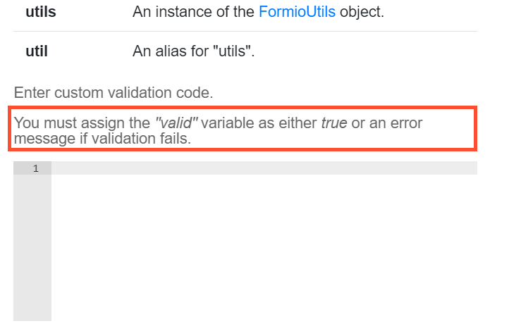
So, you can set the following:
valid = false
However, you CANNOT do the following:
setTimeout(() => {
   valid = false
}, 1000)
To make it work asynchronously, add more code to it. In the example below, you query a Data Store only when the input changes. Then, if the response is empty, you set an error message:
View code
function queryDataStore(queryName, parameters) {
    //  We're setting the validation as invalid the moment the request is sent out. It will only be validated once the request comes back and the input is checked
    instance.invalid = true
    // function from data store example
}

function hasInputChanged() {
    // function from validation trigger example
}

function setError(message) {
    instance.setCustomValidity(message);
}

if (hasInputChanged() && instance.getData()) {
    queryDataStore('target_guery_name', {value: input})
        .then(response => {
            if (response.length === 0) {
                setError(`Value doesn't exist in a data store`)
            } else {
                instance.invalid = false // this resets the invalid state
            }
        })
        .catch(error => {
            setError(error.message);
        });
}
Thanks to instance.setCustomValidity(message) present in the code above, you do not set a valid variable directly. Instead, you invoke a setCustomValidity method on a component instance itself.
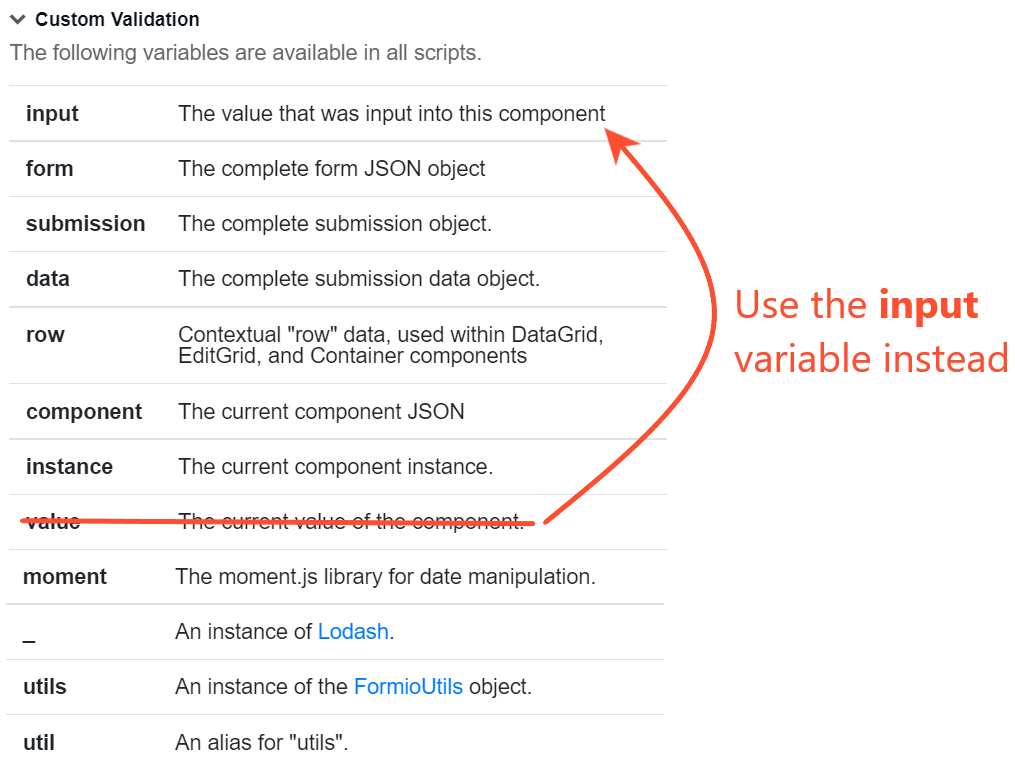
View accessible variables for custom validation
The reference section for the custom validation feature contains a list of available variables. However, the list is not accurate. See the correct one below:
Calculate value by button click
To enable calculating a value upon a button click, configure the Button component:
Set Action to Custom.
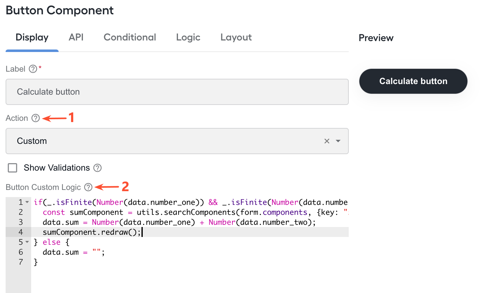
In the Button Custom Logic field, add the following code:
View code
// Find the component where you should display the calculated value.
// Use utils - an instance of the FormioUtils (http://formio.github.io/formio.js/docs/identifiers.html#utils) object.
// "sum" - the property name of the component where the calculated value is to be displayed.
const sumComponent = utils.getComponent(form.components, "sum");
// Check if the two fields are filled.
// "number_one" and "number_two" - property names of components.
if(_.isFinite(Number(data.number_one)) && _.isFinite(Number(data.number_two))) {
   const calculatedValue = Number(data.number_one) + Number(data.number_two);
// Set the calculated value.
sumComponent.setValue(calculatedValue);
} else {
  // Reset the value if one of the fields is not filled.
  sumComponent.resetValue();
}
Add custom form.io components
The instruction below details how you can add custom components created outside the platform to the MT Designer menu and include them in a Manual Task. For more information on the custom form.io component, refer to the documentation.
In Control Tower, create a template. Set the Template Type to macro.
On the Content tab inside the created template, add the custom component code from your file.
To see the sample code for a custom Header component, download the zip file and import it as a template to your instance.
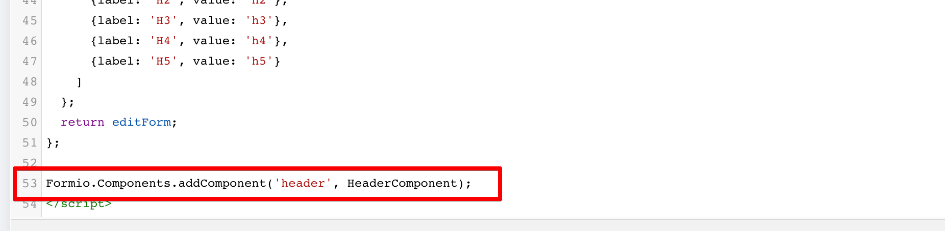
Add the following as the last line in the created template:
/**
* component_name - placeholder for the component name
* ComponentClass - placeholder for the component class name
*/
Formio.Components.addComponent('component_name', ComponentClass);
For the sample custom Header component, the line would look like this:
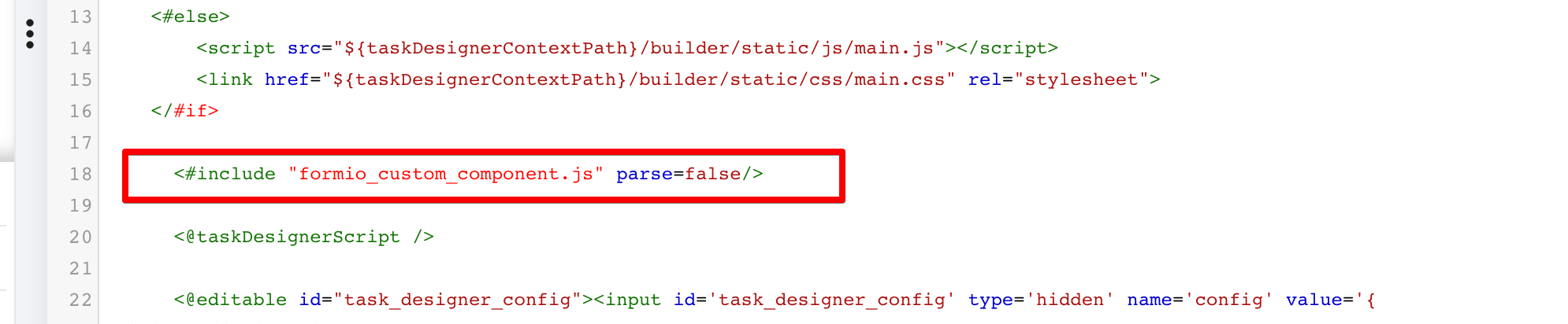
In the Manual Task created from Task Designer Operation, go to the Design tab and click the Code Editor button.
Before the
<@taskDesignerScript />line, insert your template with a custom component as shown below:/**
* formio_custom_component.js - the name of your template
*/
<#include "formio_custom_component.js" parse=false/>The example below illustrates the inclusion of a macro template with a custom component taken from the form.io documentation.
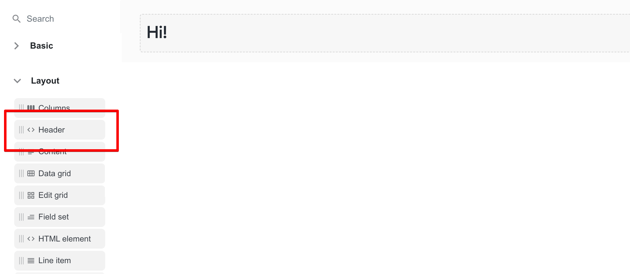
As a result of applying the above customization, the custom Header component is added to the Layout group on the MT Designer menu and the layout of the created Manual Task form.
Add static block from input file
To add a static block from an input data file to a Manual Task form, follow the steps below:
Create a Manual Task from Task Designer Operation and upload input data as detailed in the instruction.
noteYou can use any Task Designer Operation type: Multi-page task or Single-page task.
For the example mentioned throughout the instruction, the Single-page task is chosen. To dowload the input data file used in the example, click the link.
In Task Designer, on the Layout menu, select the Columns component and drag it to the drop area on the right.
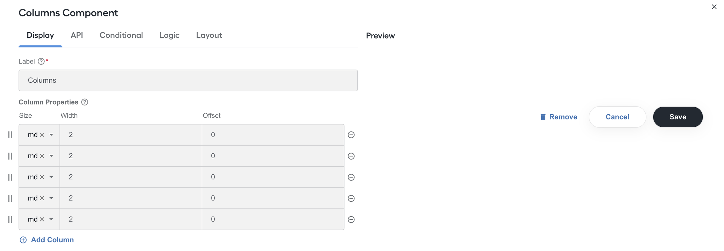
As the component's setting page opens, go to the Display tab and add the required number of columns, depending on the intended number of static blocks. In the example below, five columns were added to enable the display of five static blocks.
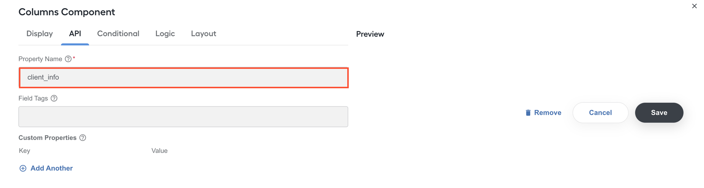
Navigate to the API tab for the same component. Set the Property Name value (in the example below, client_info) for fetching the data from the uploaded input file.
Click Save to save the Columns component settings.
On the Layout menu, select the HTML element component and drag it to the drop area of any Column component on the right.

As the component's setting page opens, in the Content box, configure the property name you would like to show in the block.
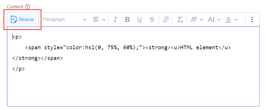
You can use Rich Text Editor or convert HTML markup (from previous versions) to Rich Text by clicking the Source button.
warningString interpolation breaks if styles are applied solely to a variable when using a templating language. The correct way is to apply styling to handlebars as well:
<b>{{row.doc_type}}<b>.For example, if you set Property name to
{{data.client_info?.client_id}}, the code in the Content box will be as follows:<div>
<div>FPN</div>
<div>{{data.client_info?.client_id}}</div>
</div>Select the Refresh On Change checkbox to enable re-rendering of the property name in the HTML content when the value in the form changes. If the checkbox is not selected, you will not be able to read the value from the data object.
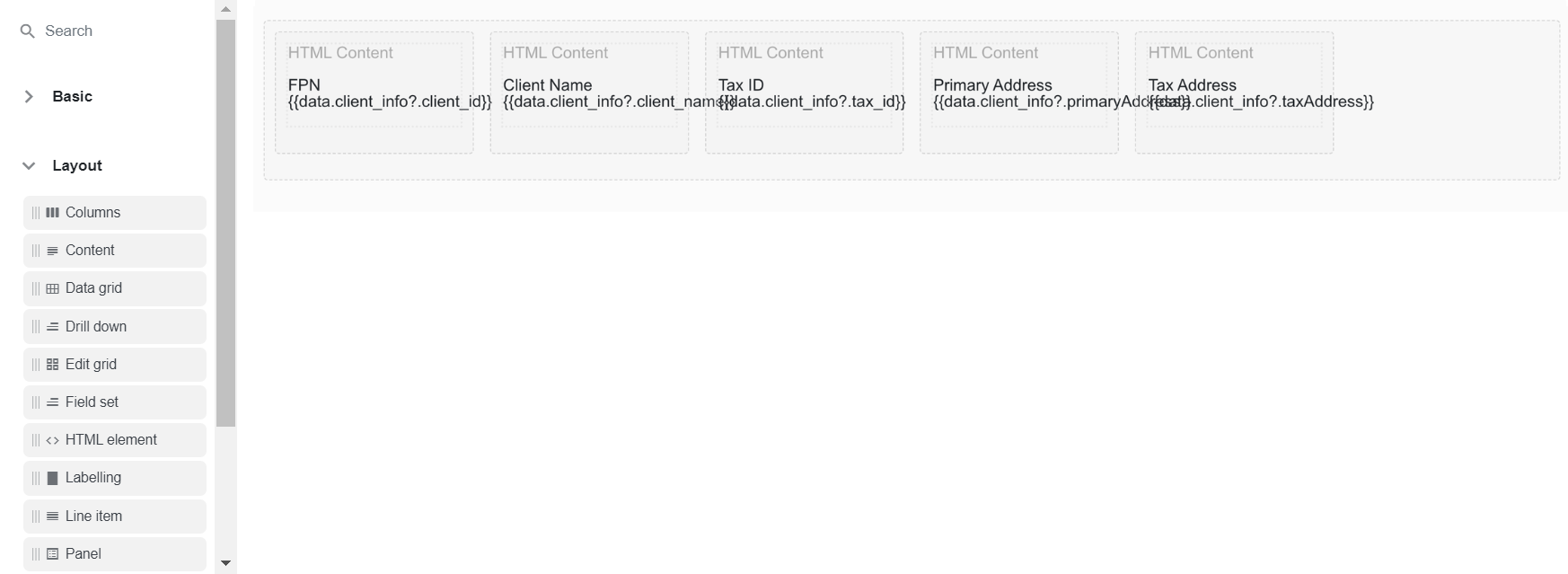
Repeat Steps 6-8 for the rest of the created Column components. The resulting Task Designer view should be similar to this one:
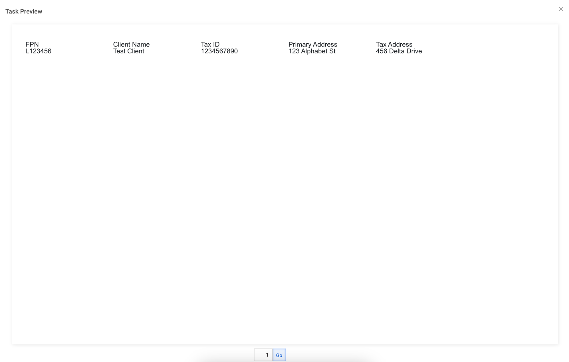
Click Save. If you click the Preview button, the static block should look similar to this:
For the example used throughout the instruction, the resulting JSON code is as follows (the one you get should be similar to this):
View code
{
  "display": "form",
  "components": [
    {
      "label": "Columns",
      "columns": [
        {
          "components": [
            {
              "label": "FPN",
              "attrs": [
                {
                  "attr": "",
                  "value": ""
                }
              ],
              "content": "<div>\n  <div>FPN</div>\n  <div>{{data.client_info?.client_id}}</div>\n</div>",
              "refreshOnChange": true,
              "key": "fpn",
              "type": "htmlelement",
              "input": false,
              "tableView": false
            }
          ],
          "width": "2",
          "offset": 0,
          "size": "md",
          "push": 0,
          "pull": 0,
          "currentWidth": "2"
        },
        {
          "components": [
            {
              "label": "Client Name",
              "attrs": [
                {
                  "attr": "",
                  "value": ""
                }
              ],
              "content": "<div>\n  <div>Client Name</div>\n  <div>{{data.client_info?.client_name}}</div>\n</div>",
              "refreshOnChange": true,
              "key": "client_name",
              "type": "htmlelement",
              "input": false,
              "tableView": false
            }
          ],
          "width": "2",
          "offset": 0,
          "size": "md",
          "push": 0,
          "pull": 0,
          "currentWidth": "2"
        },
        {
          "components": [
            {
              "label": "Tax ID",
              "attrs": [
                {
                  "attr": "",
                  "value": ""
                }
              ],
              "content": "<div>\n  <div>Tax ID</div>\n  <div>{{data.client_info?.tax_id}}</div>\n</div>",
              "refreshOnChange": true,
              "key": "tax_id",
              "type": "htmlelement",
              "input": false,
              "tableView": false
            }
          ],
          "size": "md",
          "width": "2",
          "offset": 0,
          "currentWidth": "2"
        },
        {
          "components": [
            {
              "label": "Primary Address",
              "attrs": [
                {
                  "attr": "",
                  "value": ""
                }
              ],
              "content": "<div>\n  <div>Primary Address</div>\n  <div>{{data.client_info?.primaryAddress}}</div>\n</div>",
              "refreshOnChange": true,
              "key": "primary_address",
              "type": "htmlelement",
              "input": false,
              "tableView": false
            }
          ],
          "size": "md",
          "width": "2",
          "offset": 0,
          "currentWidth": "2"
        },
        {
          "components": [
            {
              "label": "Tax Address",
              "attrs": [
                {
                  "attr": "",
                  "value": ""
                }
              ],
              "content": "<div>\n  <div>Tax Address</div>\n  <div>{{data.client_info?.taxAddress}}</div>\n</div>",
              "refreshOnChange": true,
              "key": "tax_address",
              "type": "htmlelement",
              "input": false,
              "tableView": false
            }
          ],
          "size": "md",
          "width": "2",
          "offset": 0,
          "currentWidth": "2"
        }
      ],
      "key": "client_info",
      "type": "columns",
      "input": false,
      "tableView": false
    }
  ]
}
Mark required field as not applicable if document contains no value
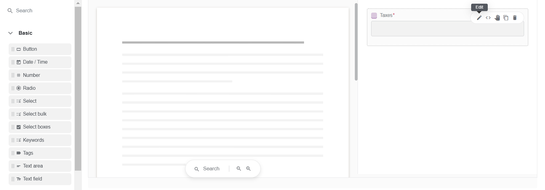
This section details how to create a customization where a required field contains the n/a (not applicable) value if the processed document includes no matching value. The example in the screenshots below illustrates the setup of the required Taxes field.
To implement the customization, follow the steps below:
Add a required Text component to a created Manual Task layout.
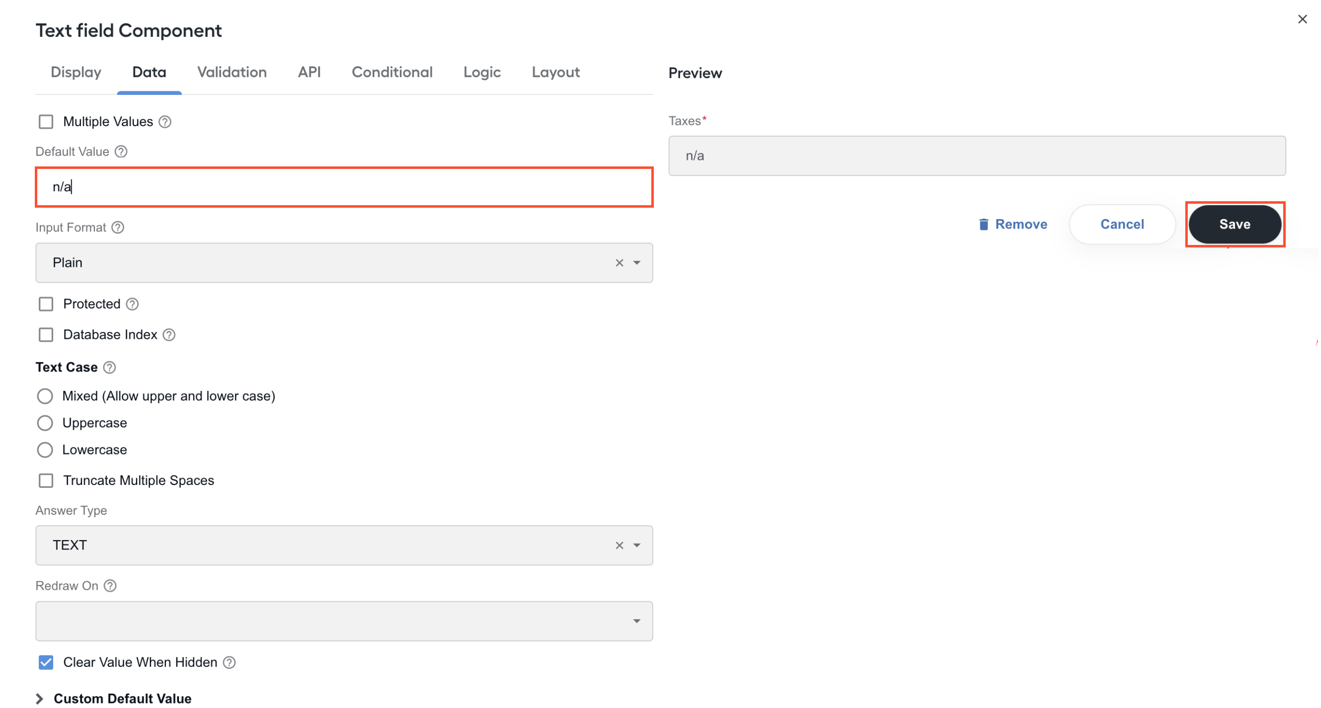
On the component's setting page, go to the Data tab. In the Default value field, enter n/a and click Save.
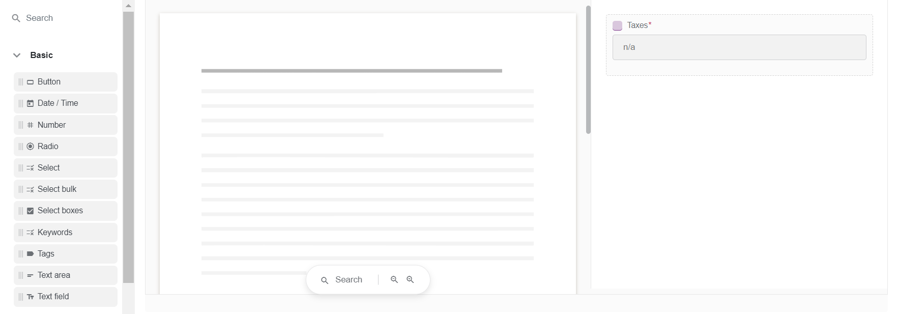
As a result, in the Preview area, the field displays n/a if the document processed in the Manual Task contains no value corresponding to the field.
For the example with the Taxes field, the resulting JSON code is as follows:
View code
  {
  "display": "form",
  "components": [
    {
      "key": "meta_info_json",
      "leftPanelWidth": 60,
      "rightPanelWidth": 40,
      "input": true,
      "clearOnHide": false,
      "tableView": false,
      "label": "",
      "type": "InformationExtractionComponent",
      "components": [
        {
          "label": "Taxes",
          "tableView": true,
          "answerType": "TEXT",
          "validate": {
            "required": true
          },
          "key": "text_field",
          "type": "textfield",
          "input": true,
          "defaultValue": "n/a"
        }
      ]
    }
  ]
}
Make required field optional based on other field values
This section details how to create a customization where you make a required field optional based on the content of another field. In the screenshots below, the required Taxes field is set to become optional when the Vendor field value is Donald Trump.
To create the customization, follow the steps below:
Create a Manual Task and add a couple of Text field components to it. Make one of them required.
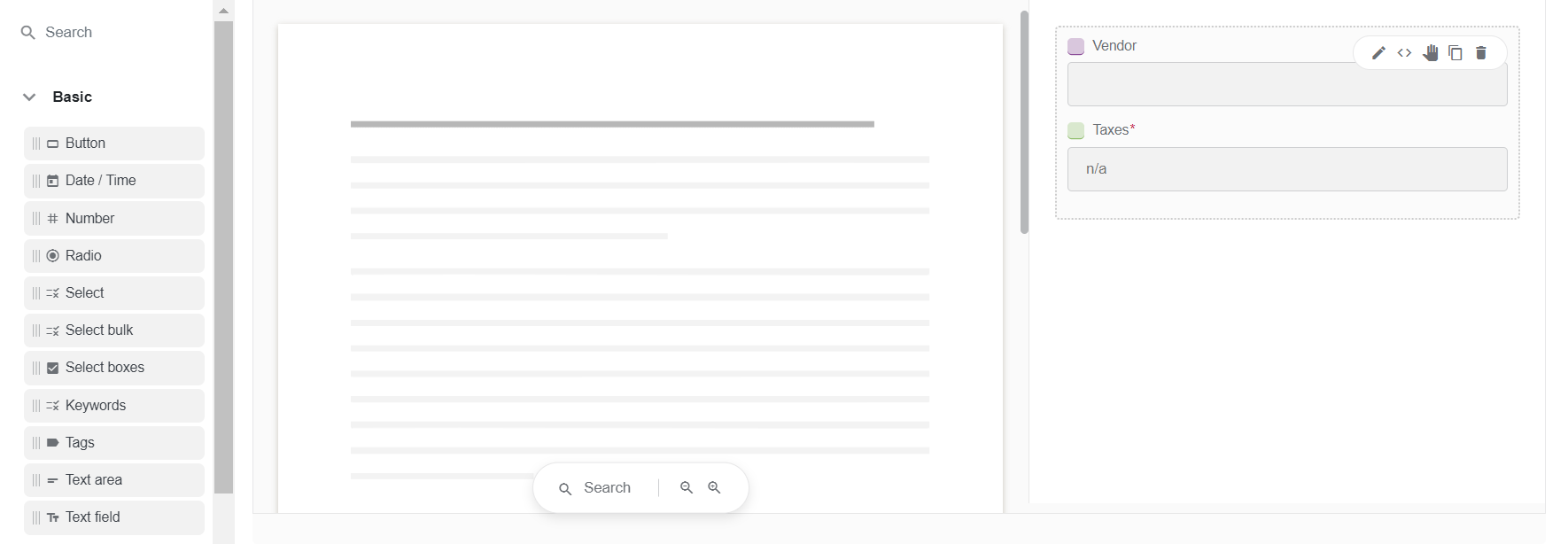
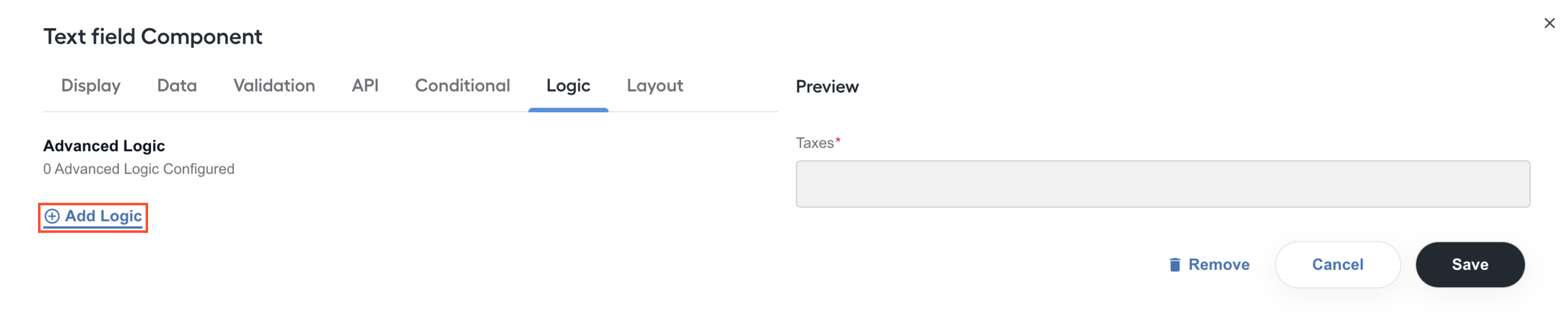
Click the Edit (pencil) to open the setting page of the required field (Taxes, in this example), go to the Logic tab, and click Add Logic.
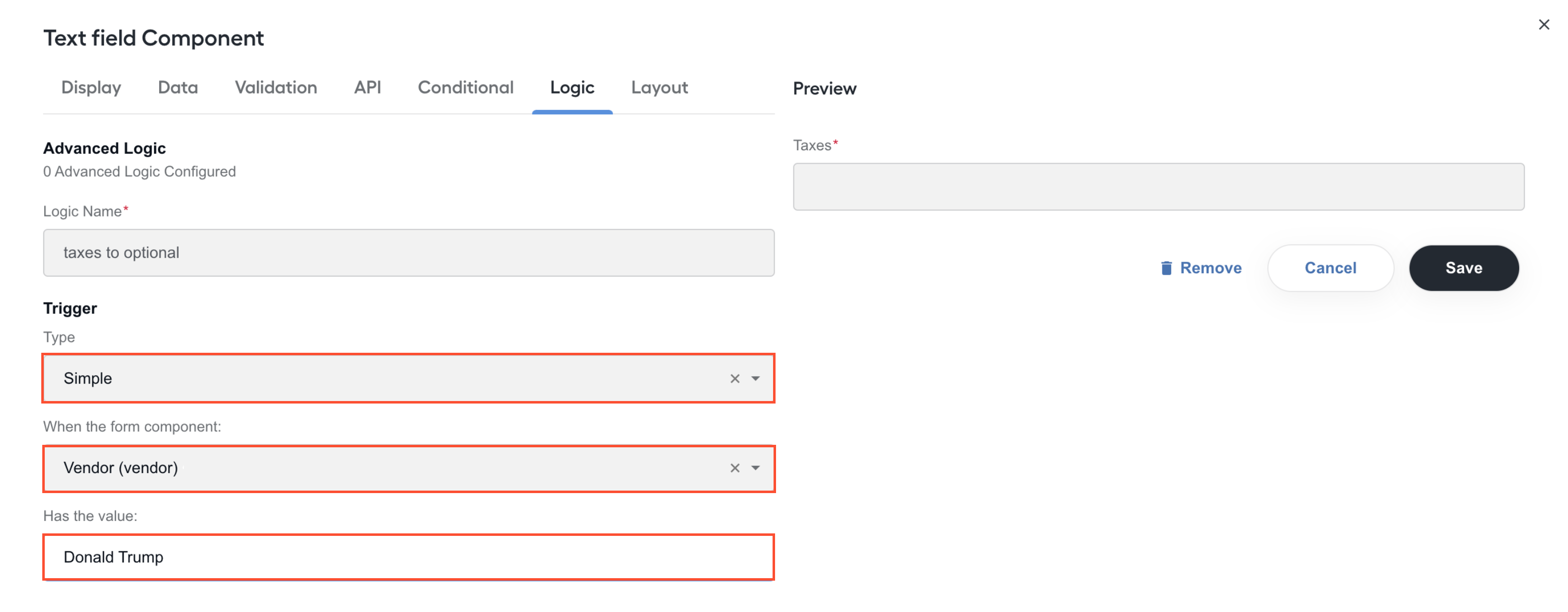
For the logic, set a name and a trigger by filling in the highlighted fields:
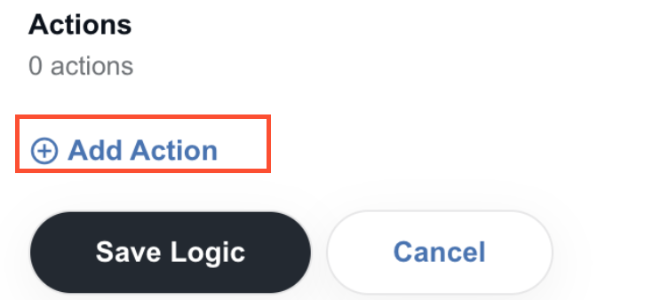
Click Add action.
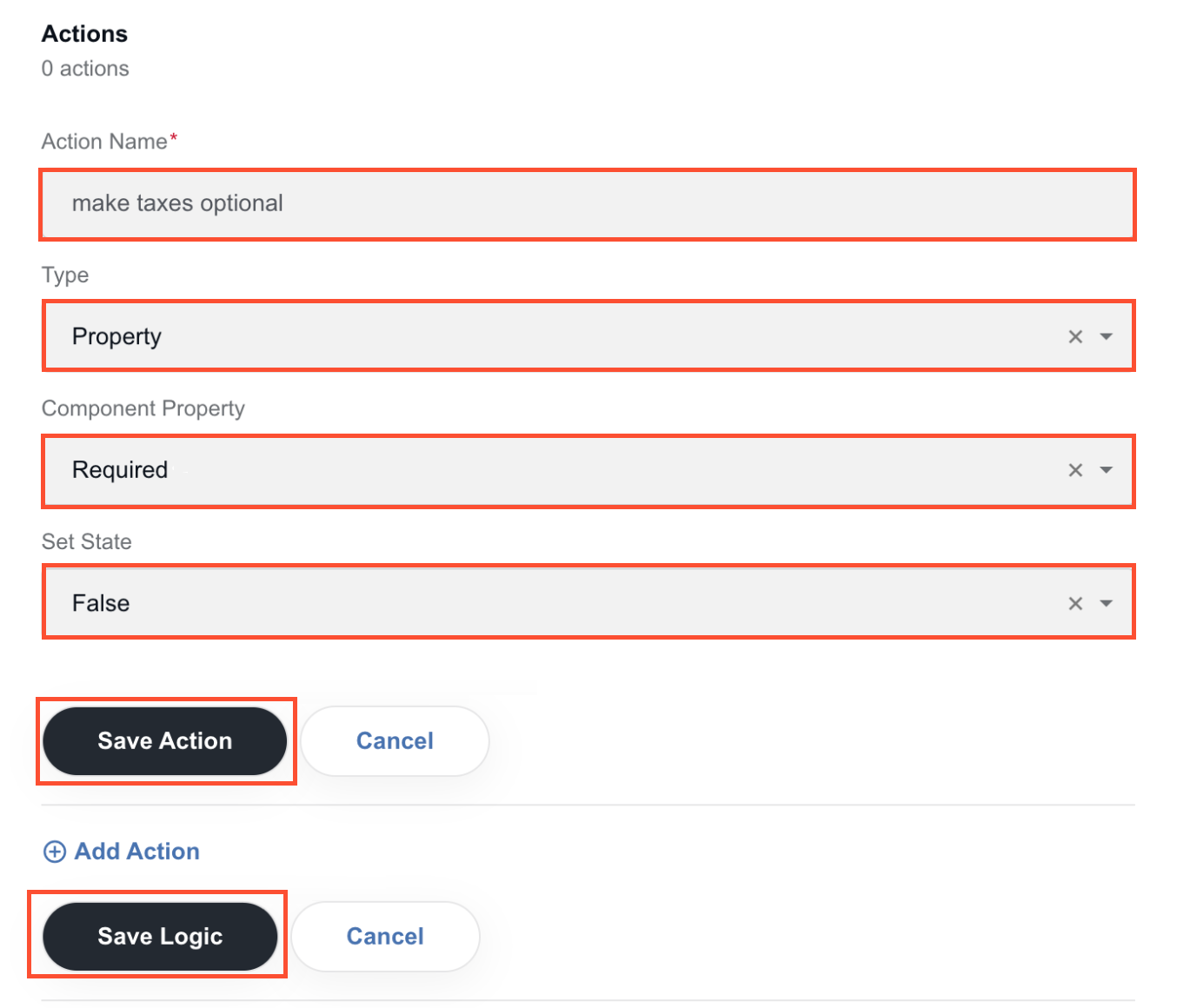
Set the action to be initiated by the trigger, click Save action, and then Save logic.
In the Preview area, click Save to apply the created logic.
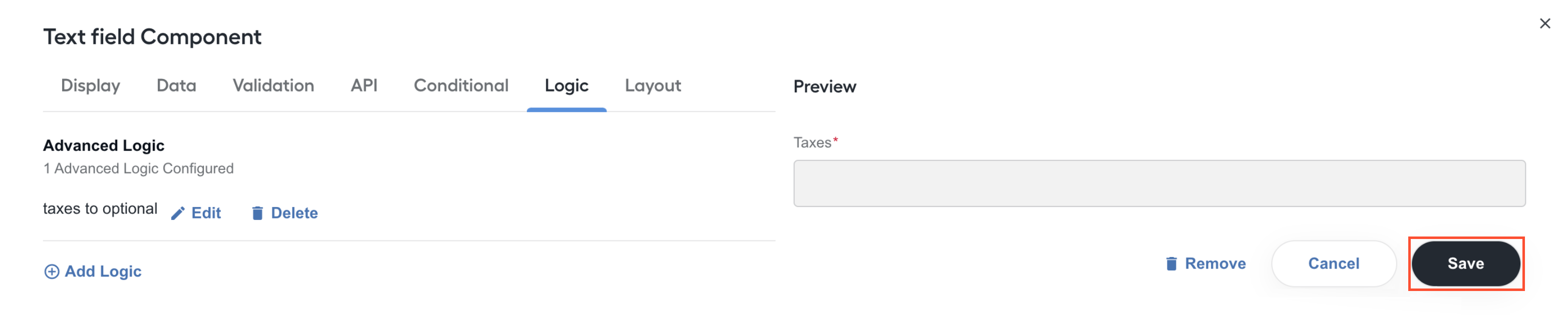
Switch to Preview. Check if the action you set in Step 5 is executed as you apply the trigger from Step 3.
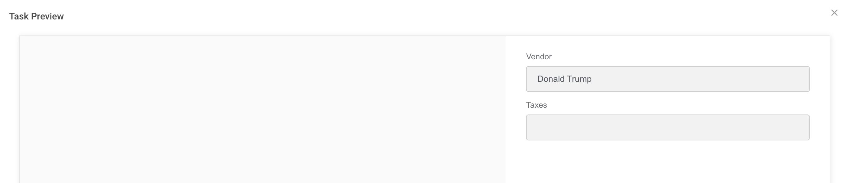
In the screenshot above, the Taxes field becomes optional (the * asterisk mark disappears) when you set the Vendor field to Donald Trump.
In this example with the Taxes and Vendor fields, the resulting JSON is as follows:
View code
{
  "display": "form",
  "components": [
    {
      "key": "meta_info_json",
      "leftPanelWidth": 60,
      "rightPanelWidth": 40,
      "input": true,
      "clearOnHide": false,
      "tableView": false,
      "label": "",
      "type": "InformationExtractionComponent",
      "components": [
        {
          "label": "Vendor",
          "tableView": true,
          "answerType": "TEXT",
          "key": "vendor",
          "type": "textfield",
          "input": true
        },
        {
          "label": "Taxes",
          "tableView": true,
          "answerType": "TEXT",
          "validate": {
            "required": true
          },
          "key": "taxes",
          "logic": [
            {
              "name": "taxes to optional",
              "trigger": {
                "type": "simple",
                "simple": {
                  "show": true,
                  "when": "vendor",
                  "eq": "Donald Trump"
                }
              },
              "actions": [
                {
                  "name": "make taxes optional",
                  "type": "property",
                  "property": {
                    "label": "Required",
                    "value": "validate.required",
                    "type": "boolean"
                  },
                  "state": false
                }
              ]
            }
          ],
          "type": "textfield",
          "input": true
        }
      ]
    }
  ]
}
Set field value based on one for another field
This section details how to create a customization where a value in one field depends on the content in another. This involves setting up a Text field component associated with a Select one.
In the screenshots below, Currency is a Text field component, Vendor is a Select one, and they are customized to display the following:
$ in the Currency field when Vendor contains Donald Trump.
Euro in the Currency field when Vendor contains Gucci.
The general customization flow is as follows:
Create a Manual Task and add one Text field and one Select component to its layout as shown in the figure below.
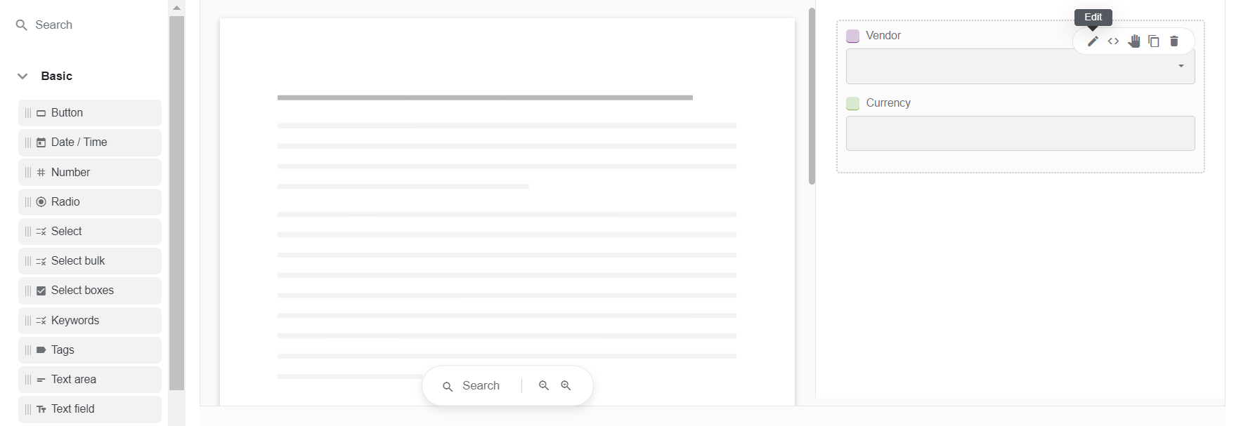
Click the Edit (pencil) button, open the Text field component's setting page, navigate to the Logic tab, and click Add logic.
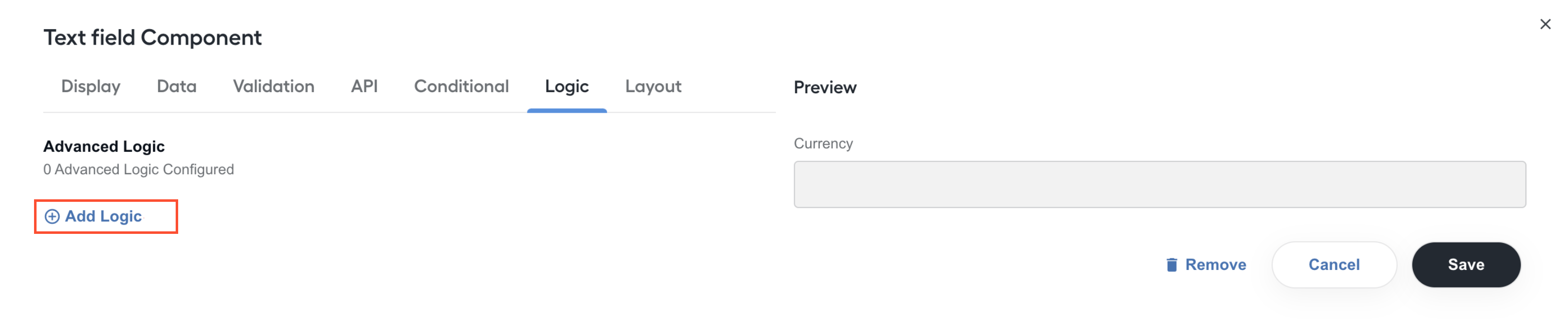
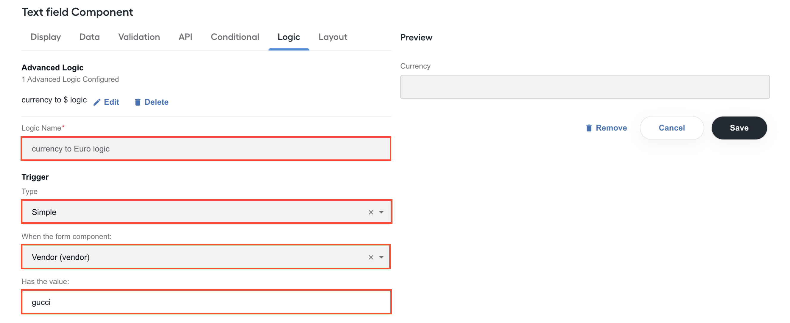
For the Text field logic, set a name and a trigger by filling in the fields as shown below:
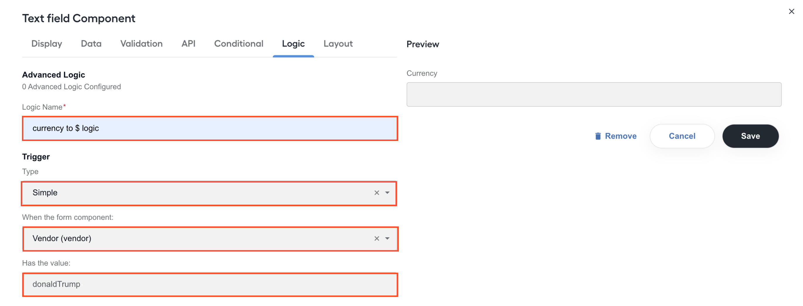
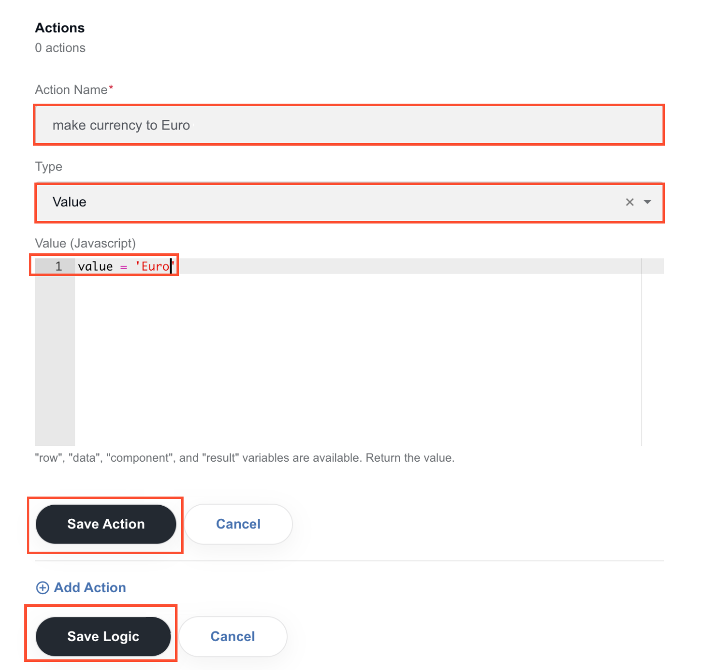
Click Add action.
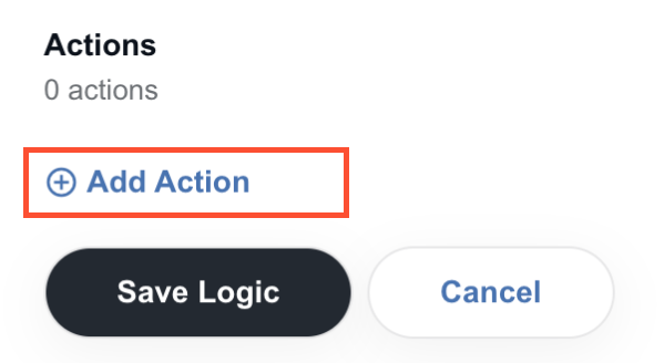
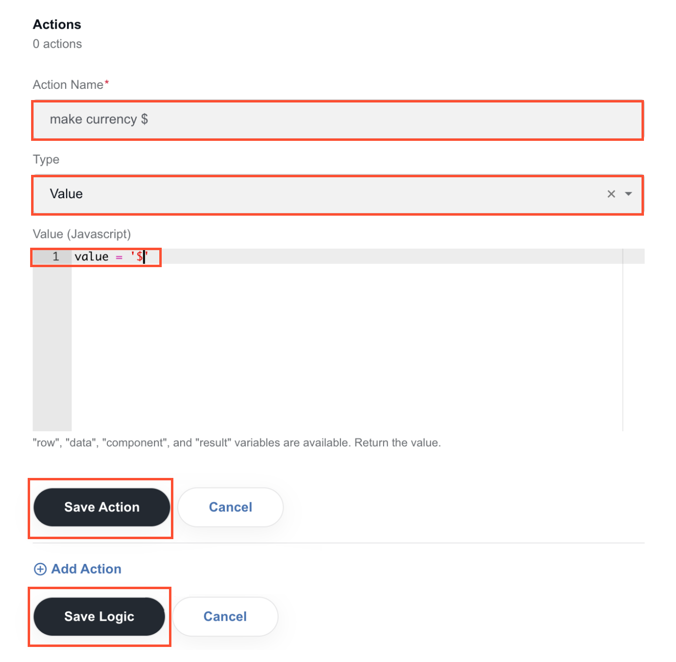
Set the action to be initiated by the trigger, click Save action, and then Save logic.
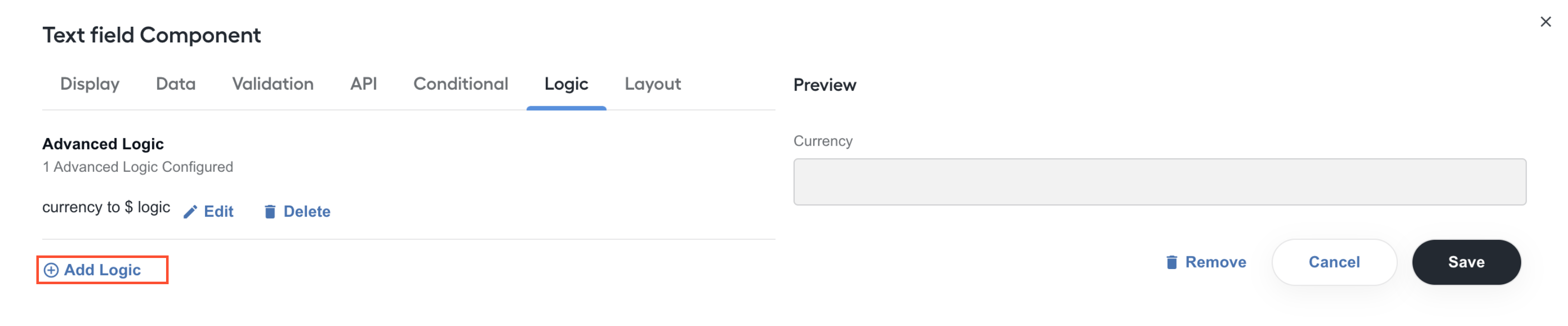
Click Add logic again to configure an alternative logic.
Set a name and a trigger for the alternative logic by filling in the fields as shown below:
Click Add action.
Set the action to be initiated by the trigger, click Save action, and then Save logic.
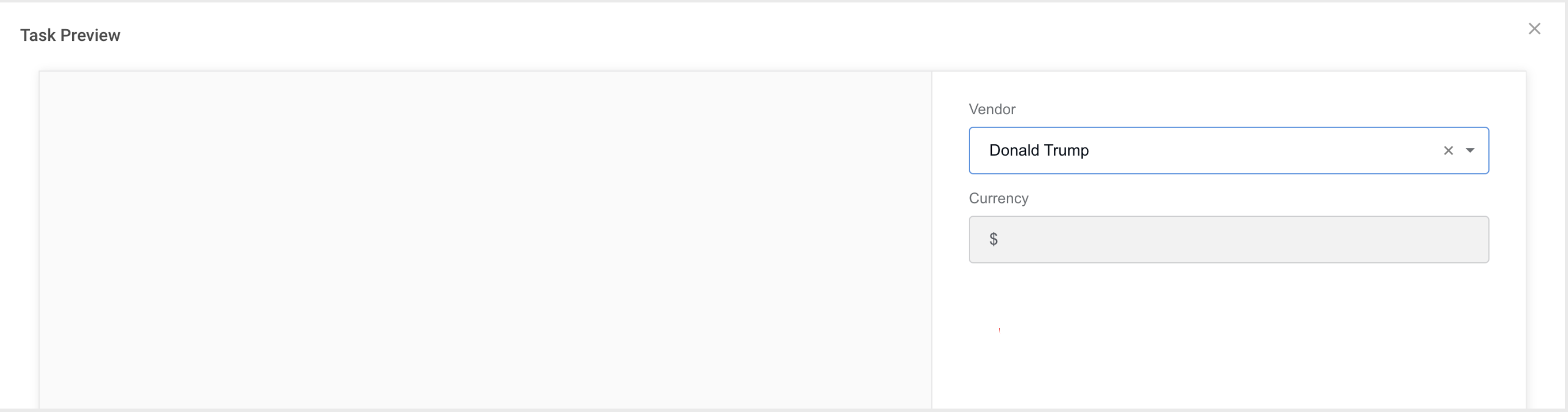
Go to the Preview page and check how the value in the Text field (Currency in this example) changes, depending on the value in the Select field (Vendor in this example).
For the assumptions in the example, the UI results are as follows:
If you select Donald Trump as the vendor:
If you select Gucci as the vendor:

The resulting JSON is as follows:
View code
{
  "display": "form",
  "components": [
    {
      "key": "meta_info_json",
      "leftPanelWidth": 60,
      "rightPanelWidth": 40,
      "input": true,
      "clearOnHide": false,
      "tableView": false,
      "label": "",
      "type": "InformationExtractionComponent",
      "components": [
        {
          "label": "Vendor",
          "tableView": true,
          "data": {
            "values": [
              {
                "label": "Donald Trump",
                "value": "donaldTrump"
              },
              {
                "label": "Gucci",
                "value": "gucci"
              }
            ]
          },
          "answerType": "TEXT",
          "validate": {
            "onlyAvailableItems": true
          },
          "key": "vendor",
          "type": "select",
          "input": true
        },
        {
          "label": "Currency",
          "tableView": true,
          "answerType": "TEXT",
          "key": "currency",
          "logic": [
            {
              "name": "currency to $ logic",
              "trigger": {
                "type": "simple",
                "simple": {
                  "show": true,
                  "when": "vendor",
                  "eq": "donaldTrump"
                }
              },
              "actions": [
                {
                  "name": "make currency $",
                  "type": "value",
                  "value": "value = \"$\""
                }
              ]
            },
            {
              "name": "currency to Euro logic",
              "trigger": {
                "type": "simple",
                "simple": {
                  "show": true,
                  "when": "vendor",
                  "eq": "gucci"
                }
              },
              "actions": [
                {
                  "name": "make currency to Euro",
                  "type": "value",
                  "value": "value = \"Euro\""
                }
              ]
            }
          ],
          "type": "textfield",
          "input": true
        }
      ]
    }
  ]
}
For troubleshooting tips, refer to the following support guides: