Analyze results
Along with the out-of-the-box operational analytics of the Work.AI platform, the Adverse Media Monitoring (AMM) AI Agent includes the following pre-built dashboards for real-time continuous monitoring of the solution by operations managers:
- Adverse Media Monitoring
- Adverse Media Monitoring Investigation Details
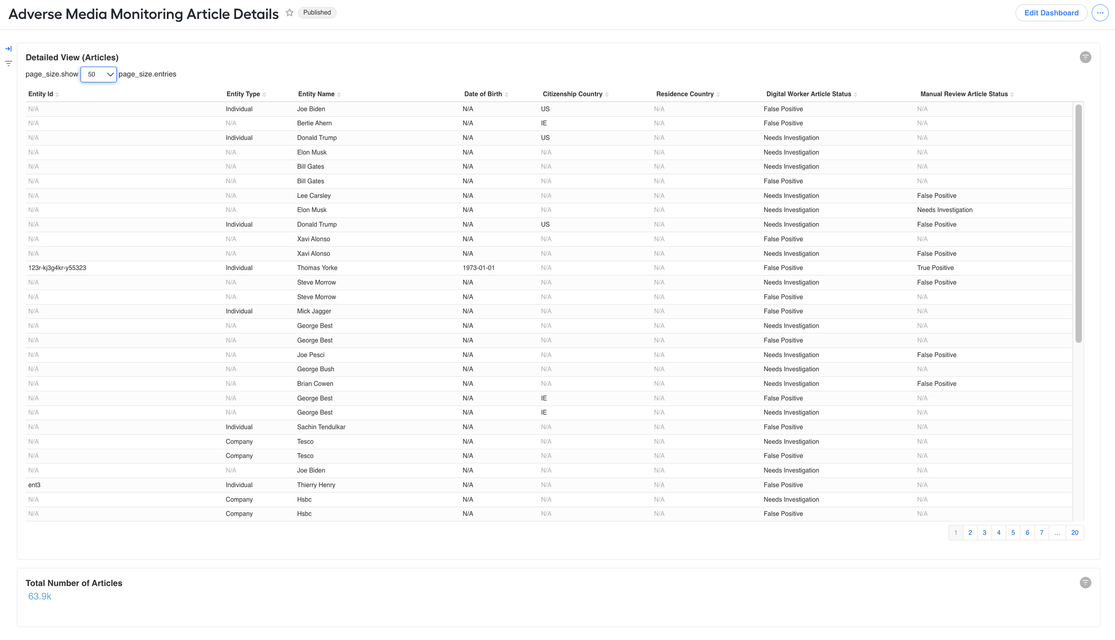
- Adverse Media Monitoring Article Details
The dashboards allow the following:
Get insights into the solution's effectiveness
Track overall performance
Search for improvement opportunities, identify and troubleshoot issues
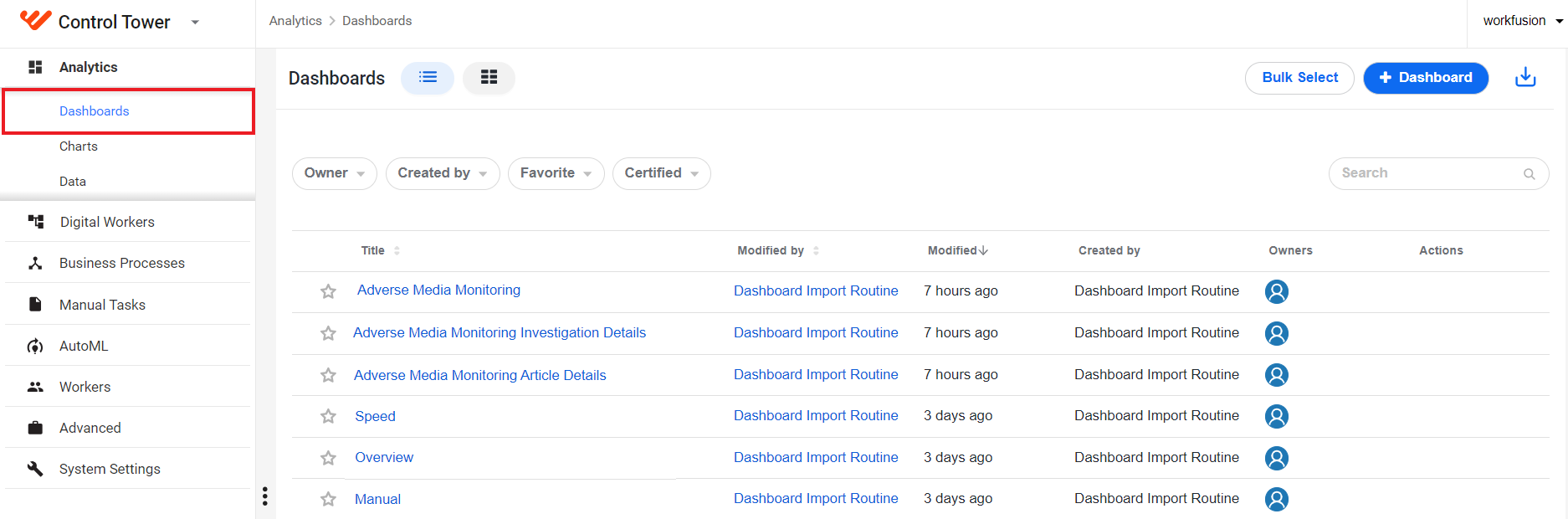
To access the dashboards, log in to Control Tower and click Analytics > Dashboards.
Adverse Media Monitoring dashboard
The Adverse Media Monitoring dashboard focuses on processing time and quality. It allows you to track the following metrics:
- Automation rates
- Average time spent on assignments
- Matched and missed False Positive and True Positive statuses in a table and diagram
- Article-specific statistics
- Screened entity analysis
- Investigation statuses across countries
Filtering options allow you to display data for specific Business Process instances, AI Agent versions or variations, and model versions. Additionally, you can filter screening results by the time period:
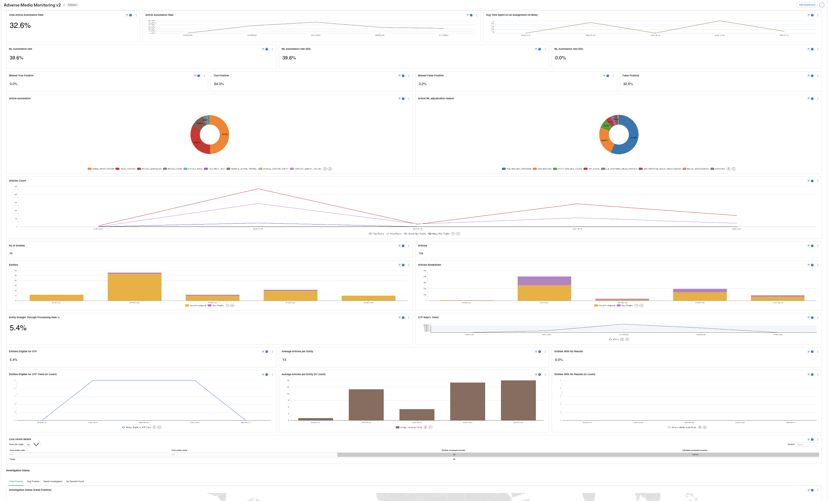
The dashboard includes the views described in the sections below.
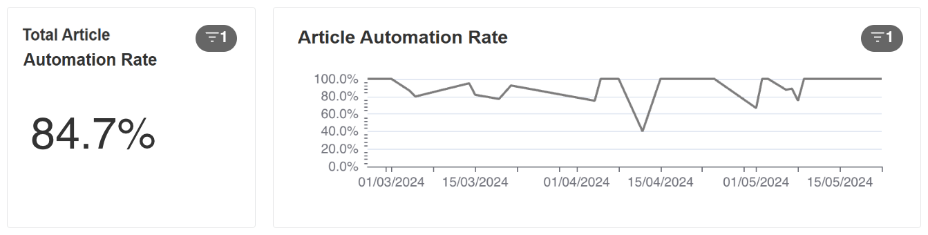
Article automation rate
The dashboard views show the total percentage of articles that were automatically dispositioned using Evan and the metrics trend over time.
Manual time metrics
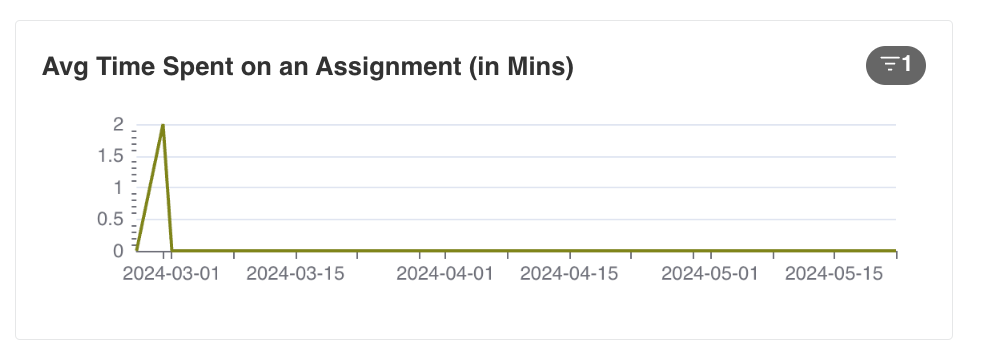
The view displays the summary information about the average time (in minutes) per assignment for assignments submitted daily over a selected period.
From the example below, you can see that, over the last seven days, the average manual time is 1 minute 23 seconds per task. You can see the manual processing step behavior is stable, and there are no dependencies on task volumes—hence, the team works well.
ML automation rate
The dashboard views show the percentage of articles that were automatically processed by the machine learning (ML) model without requiring human intervention (overall and per language). This metric helps evaluate the efficiency of the ML model in reducing manual workload.

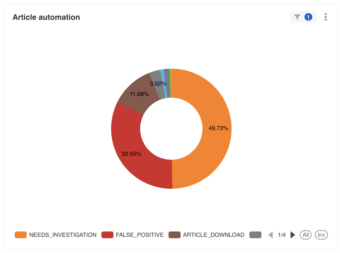
Article automation pie chart
The pie chart provides a detailed breakdown of how articles are being processed, showing the distribution between automated and manual processing. This visualization helps identify trends in automation effectiveness over time.
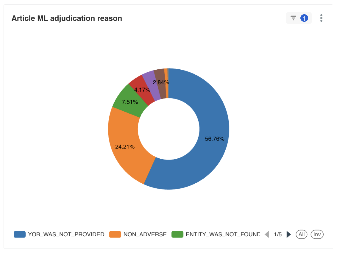
ML adjudication reason pie chart
The pie chart displays the various reasons provided by the ML model when making automated decisions on articles. This helps understand the ML decision-making patterns and identify areas for model improvement.
False Positive and True Positive metrics
| Metric view | Description |
|---|---|
 | Shows how many True Positive articles were missed. |
 | Indicates how many False Positive articles were missed. |
 | Shows how the detection of True Positive articles contributes to the automation rate. |
 | Indicates how the detection of False Positive articles contributes to the automation rate. |
Article-specific analytics
The Article Count view shows a diagram of False Positive, Missed False Positive, Missed True Positive, and True Positive articles distributed over time.
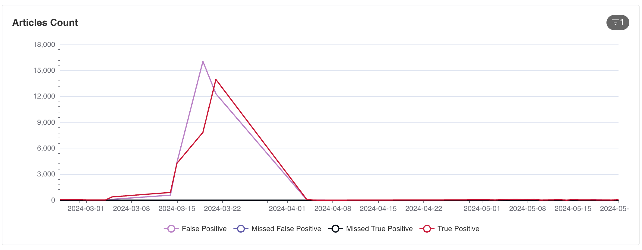
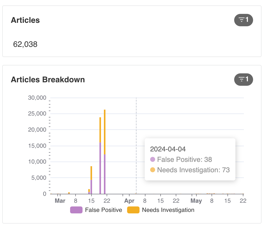
The Articles and Article Breakdown views show the total number of articles processed daily, broken down by the investigation status. The data allows you to evaluate the volumes and understand the trends of daily investigations and their relative volumes in all searches.
Entity-specific insights
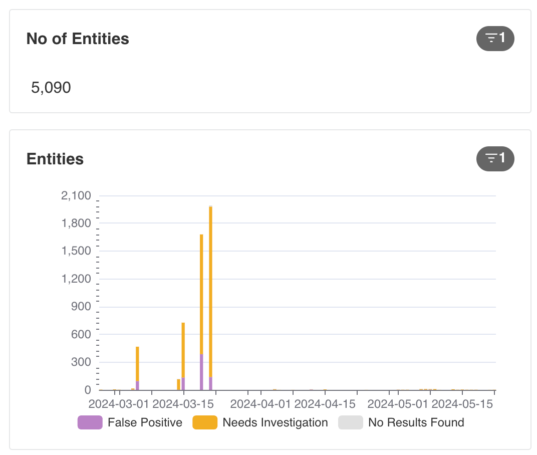
The No of Entities and Entities show the total number of entities processed daily, broken down by the investigation status. The data allows you to evaluate the volumes and understand the trends of daily investigations and their relative volumes in all searches.
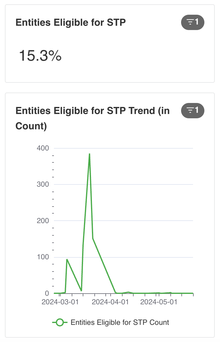
The Entity Straight Through Processing Rate % view shows the percentage of screened entities for which investigations have been closed automatically using Evan. The STP Rate% Trend view visualizes how the metrics change over time.

The Entities Eligible for Straight-Through Processing view shows the count of screened entities where investigations could have been closed automatically using Evan. You can also see how the count changes over time.
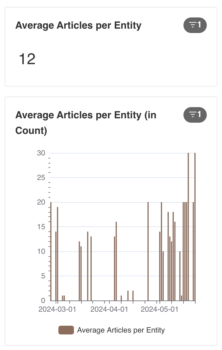
The Average Articles per Entity view shows how many articles are returned per entity on average.
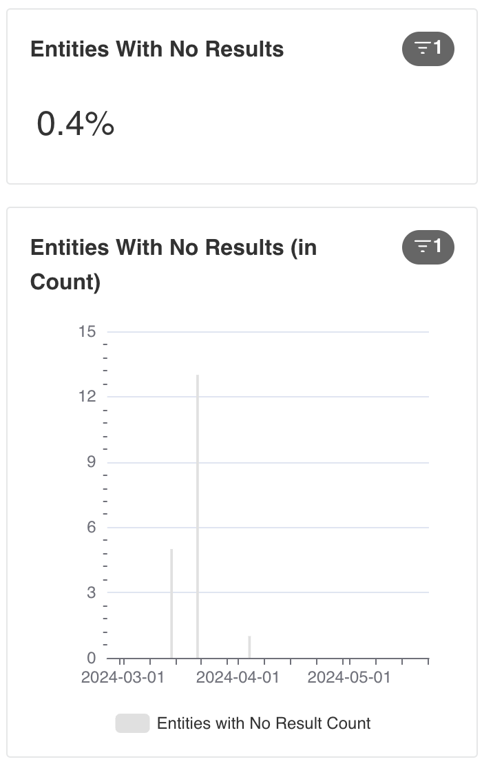
The Entities With No Results view shows how many entities were screened that had zero results.
Cost centre details
The visualization shows the distribution of processing costs across different aspects of the Adverse Media Monitoring workflow. This helps in understanding resource allocation and identifying potential areas for cost optimization.

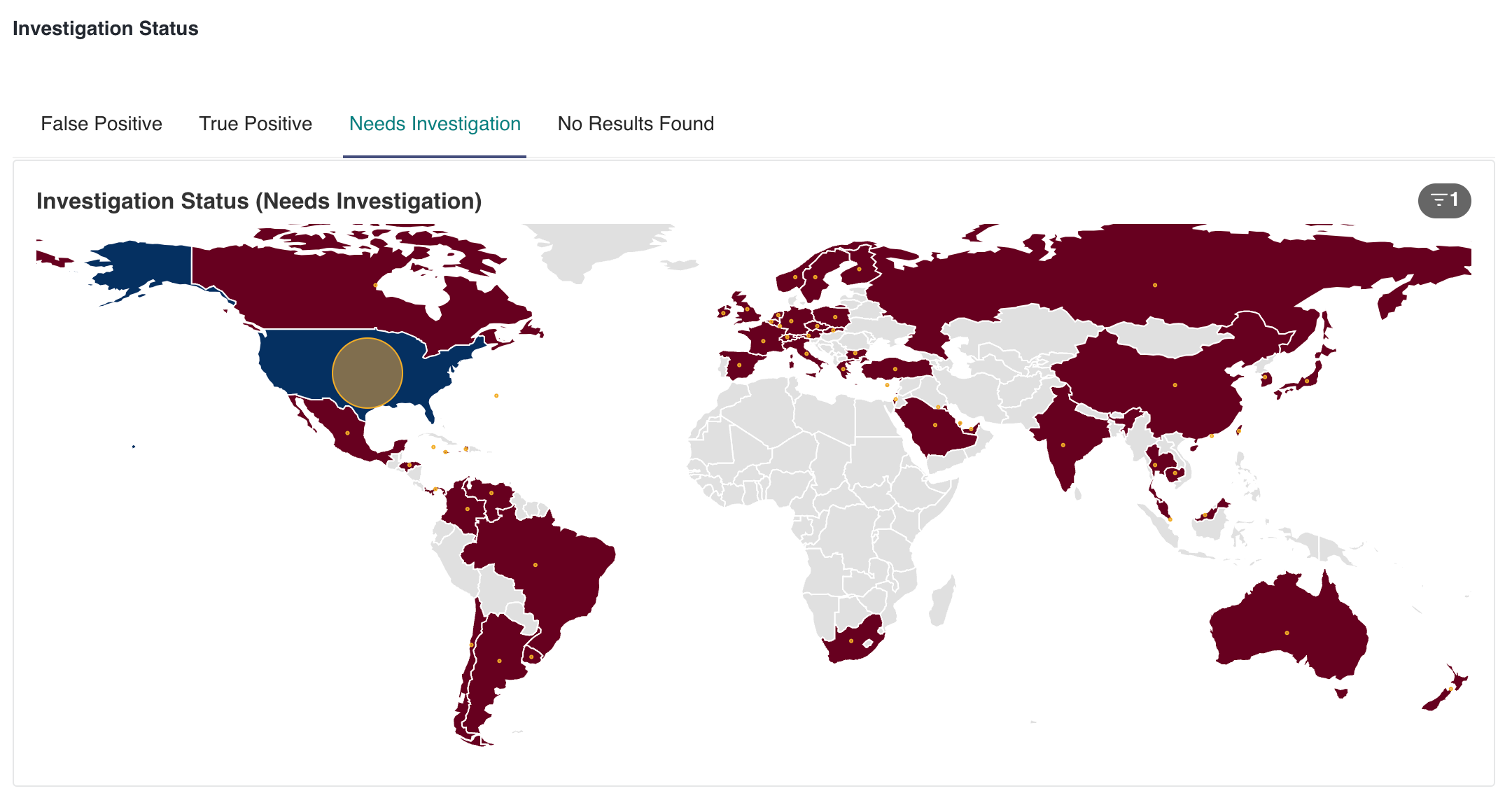
Investigation status
From the view, you can get the following information:
Top locations for screened entities
Which locations give specific statuses: False Positive, True Positive, Needs Investigation, No results found.
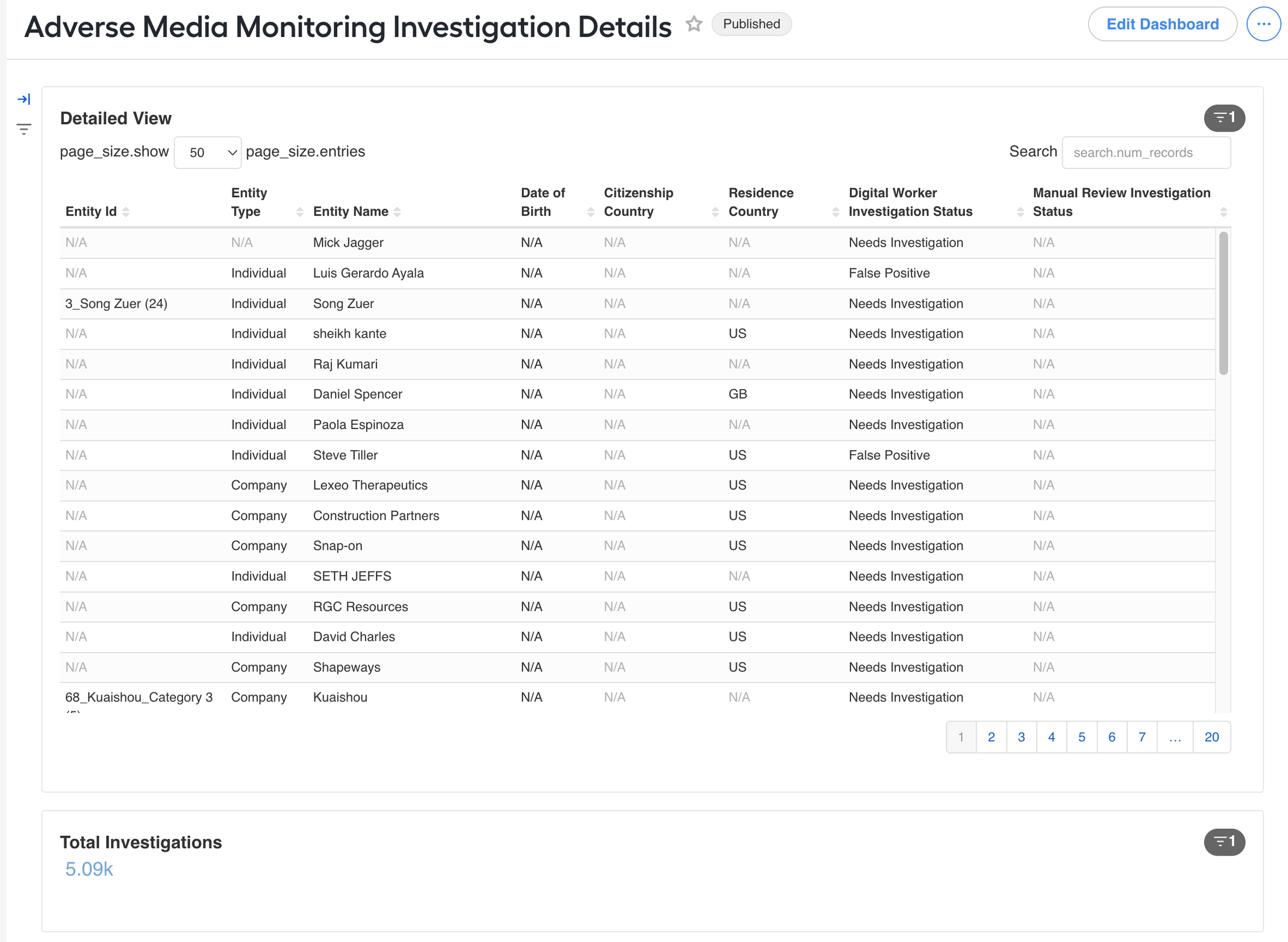
Adverse Media Monitoring Investigation Details dashboard
The dashboard allows you to review the investigation history. You can search by various parameters and choose columns to display.
Adverse Media Monitoring Article Details dashboard
The dashboard allows you to review all processed articles. You can search by various parameters and choose columns to display.