
Manual
The Manual dashboard features the statistics for human task processing within WorkFusion Intelligent Automation Cloud Enterprise. You can benefit from the data in one of the following ways:
Find the worker who executed tasks for a particular Business Process.
See the task volumes processed by a person over a definite period.
Check how many people took part in a specific Business Process or task.
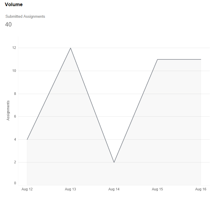
Volume
The Volume chart tracks the number of assignments submitted on a particular day.
Speed
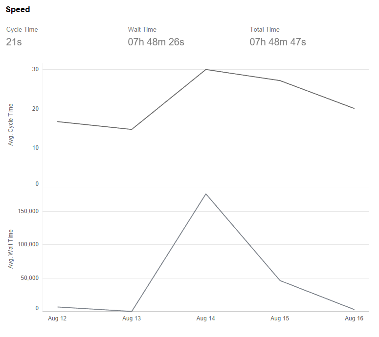
The Speed chart provides data on the average Wait Time and Cycle Time per submitted assignment daily.
The Wait Time is for how long an assignment has been in queues. The Cycle Time is the time spent on a particular task. The Total Time includes both the Wait and Cycle Times.
Tasks
The Tasks chart compares tasks by the Average Cycle Time (in seconds) and engaged Workers.
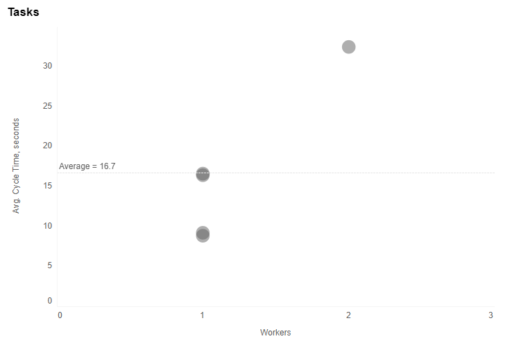
If the circles are close to each other, task processing is similar in terms of the Average Cycle Time and Workers. If not, the reason can be the varying complexity of tasks or a processing bottleneck.
Workers
The Workers chart compares workers by the Average Cycle Time (in seconds) and Submitted Assignments.
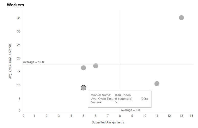
The closer a worker is to the right bottom, the better: it means fast processing and high volume. The closer circles are to each other, the more similar workers' performance is. Otherwise, it can be an indication that the work accomplished by workers under the tasks varies, or there is a processing bottleneck.
Worker Details
The tables provide detailed metrics per task and worker:
Daily efforts: average time spent on a process and a task per working day. The metric is calculated based on the following formula: sum([Spent Time])/COUNTD(day([Accept Time])).
Average Wait Time: the average time tasks spend in queues before they are processed by a worker.
Distribution on cycle time in seconds, where the cycle time means how much time a worker spends on processing a task.
Assignments: submitted Manual Tasks.