
Configuration UI guide
Intelligent Automation Cloud provides a centralized place to configure Use Cases. The feature is optional, and you can still develop Use Cases as previously. For pre-packaged Use Cases, the requirement is to be distributed via the Solution Catalog and allow intuitive and effective configuration from a centralized location.
Now, to design the end-user configuration experience, you can create a configuration form layout in form.io, bind input controls of a configuration form to Data Store cells, and package it to an Asset Bundle of a Use Case.
The platform is responsible for the configuration form layout import, rendering the form according to the layout, and updating bound Data Store entries related to the submitted data.
View workflow
Create configuration form layout in form.io
The form.io Builder enables to easily add form components, organize them into groups, perform validation, and implement conditional behavior without custom JavaScript. As an output, it creates a JSON file representing a form layout that the form.io Renderer can render. For more details, also see the Form Builder documentation.
Apply one of the following Builder instances:
- Built-in instance at your-server.com/task-designer/builder .
- Standalone instance hosted by form.io. It features more components, but the resulting form can be of a downgraded quality when imported to the platform as the components are not properly styled.
tip
If you need another Builder instance, consult about its functionality or request a component from the WorkFusion team.
Builder is stateless and doesn't allow collaborative work. Once you have a configuration form layout and need to perform minor changes, you can do this without using Builder.
To work with Basic, do as follows:
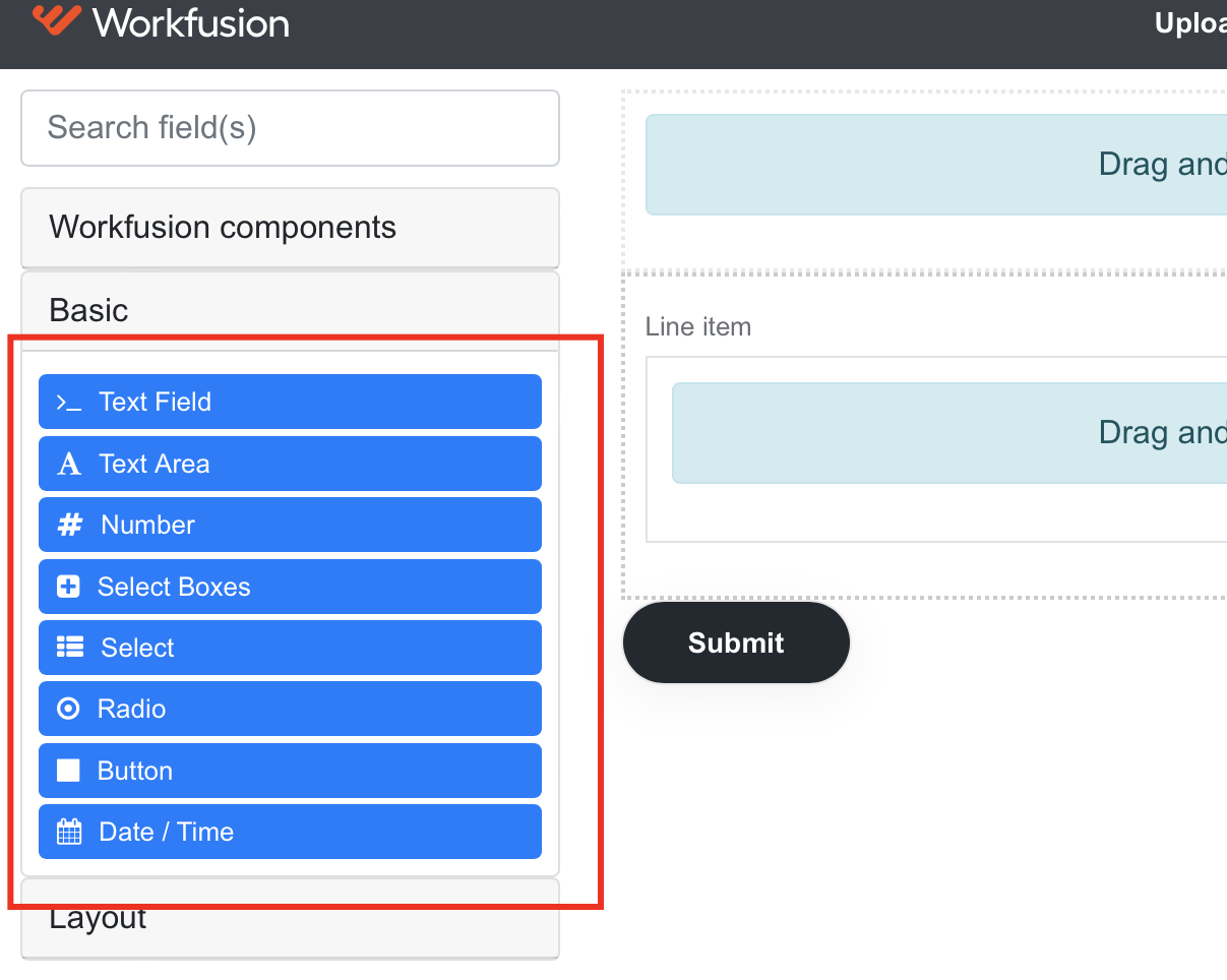
Find a suitable component on the left pane.
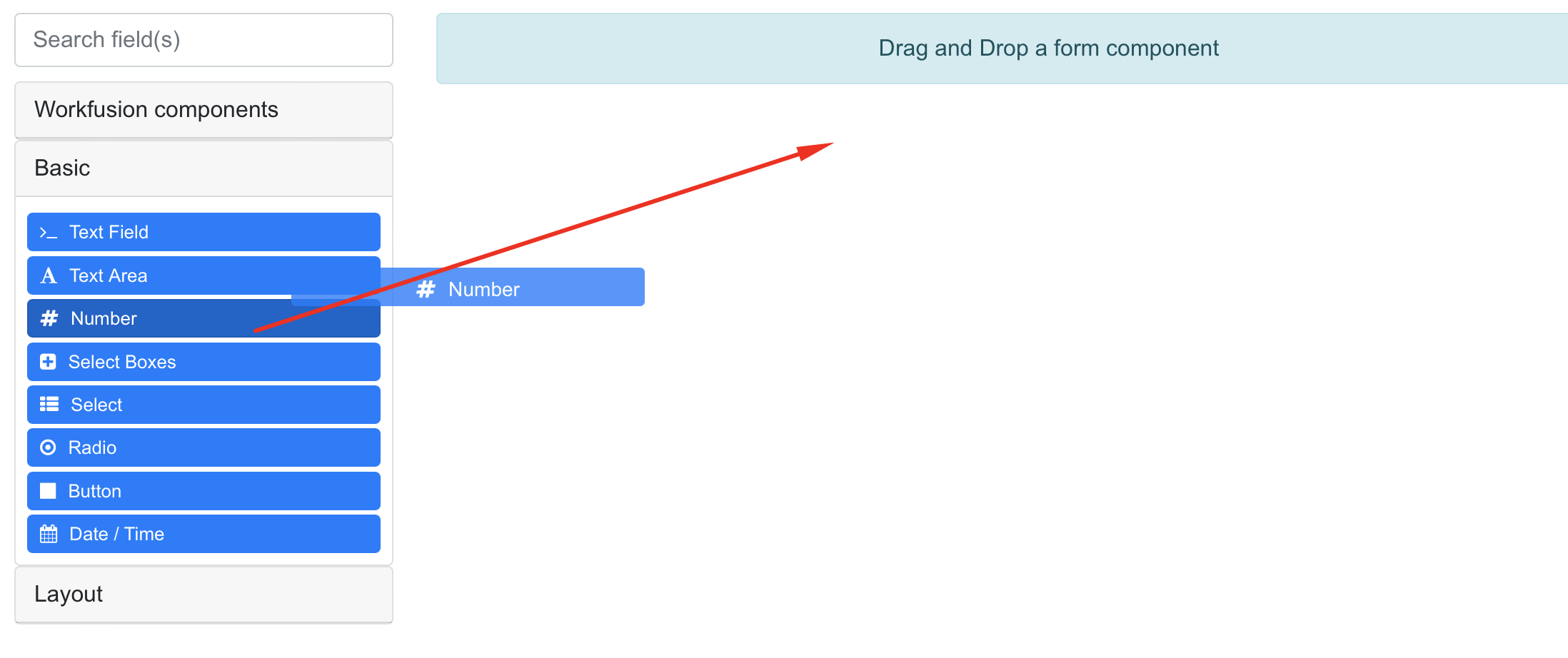
Drag and drop the component at a suitable place of the form layout.
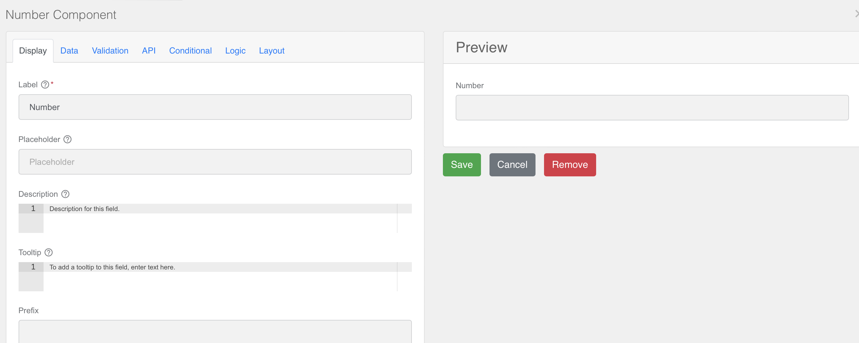
Specify the component's settings.
Bind input controls to Data Store entries
Data Stores are the only supported storage type. If Business Processes of your Use Case work with other storages, for example, S3, ETL steps, Bot Task code, port this storage to Data Stores to make them compatible to the enhanced configuration.
note
When a form is submitted, the value provided by form.io is written to Data Stores without validation and transformation. Take a look at the form submission request to find out the data format.
To make the configuration generic and compliant with the Use Case development best practices, some restrictions had to be imposed on the platform's side. The restrictions are related to the naming and structure of Data Stores for storing settings.
Data Stores used to store the Use Case settings should match the format of a standard Data Model: uc_{use_case_code}_{configuration_datastore_name}_v{data_model_version}.
Use Cases developed in ODF 2 require a Data Store to be correctly mapped from the Java code by the built-in ORMLite. That benefits ODF Use Cases as well.
Following the convention, you can use the Bundle Versions Maven Plugin that simplifies building new versions of your Use Case.
Starting from IA Cloud v10.2.3, a Data Model version can differ from that of a Use Case. Thus, you can stay on the previous Data Model version when it doesn't change in a breaking way. This allows propagating settings from the previous version of the Use Case to a new one when released.
It is recommended to use Liquibase migrations for Data Stores management to provide better control over conflict resolution between the Data Store format and data you import versus the format and data present in the environment. Also, make sure to use a Data Model Version that differs from a Use Case version.
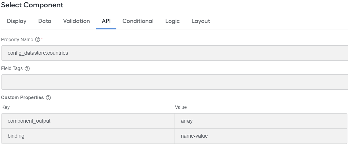
The configuration framework supports several binding algorithms. Each binding has its own contract of how the submitted form data is stored and how the stored data is restored onto the form when the settings are modified. A binding is defined at the form.io component level, with one form having components with multiple binding algorithms. To specify the binding algorithm, add the binding custom property to the component.
For non-input form.io components, the binding custom property is ignored. If you have a Well or other non-input container, the binding algorithm of all nested elements is defined by their own binding property.
The supported binding algorithms are as follows:
- binding = none
- binding = name-value
- binding = data_store
- binding = data_store_column
binding = none
A trivial algorithm assumes that a component's value doesn't need to be stored at all. Used by default if no binding property is specified.
binding = name-value
A binding algorithm is applicable for input controls that produce output as JSON primitives or flat arrays. The control's output is updated in the VALUE column of a Data Store for a row with a specified NAME.
| Column name | Type | Comment |
|---|---|---|
| NAME | Part of the binding along with a Data Store name | |
| VALUE | varchar(2048) | Value submitted with the configuration form written there |
Extra columns are allowed but aren't affected by the configuration framework.
The binding requires a component's property name to comply with the contract determining a Data Store and a row with a planned update. The Property Name attribute of the component should be named <Data Store reference>.<Value Name>, where:
<Data Store reference>equals toconfig_datastorefor the uc_b_aml_nn_config_datastore_v1 Data Store.<Value Name>is the NAME column value of the record to update.
A saved value is restored onto the configuration form depending on the value of the component_output custom property:
- Primitive (default) represents primitive value types, such as string or number. If no
component_outputcustom property is specified, the configuration framework assumes it is primitive. Upon data restore, whatever the Data Store contains is wrapped in double quotes and sent to form.io. - Array represents an array of values. Upon data restore, no transformation occurs.
- Object represents a flat JSON object. Upon data restore, no transformation occurs.
binding = data_store
A binding algorithm is applicable for input controls that act as containers, for example, Data Grids and Edit Grids, and produce output as an array of JSON objects. The entire content of a Data Store is replaced with the records derived from the elements of the component's output according to the binding of the nested components. Only values of components with the data_store_column binding are written into the Data Store.
The binding requires the component's Property Name attribute to be named as <Data Store reference>, where <Data Store reference> equals config_datastore for the uc_b_aml_nn_config_datastore_v1 Data Store.
binding = data_store_column
A binding algorithm is applicable for input controls nested in container input controls with binding data_store, for example, Data Grids and Edit Grids, and produce output as JSON primitives or flat arrays. The control's output is a part of the JSON object produced by the container input control and is mapped to a single column of the Data Store. In every container's row, the input control has a separate value.
The binding requires the component's Property Name attribute to contain only the name of the Data Store column to which the component output is mapped.
Package configuration form layout to ODF project
As a result of your work, you get the configuration form layout represented by a JSON file. For details, download the example JSON file.
A JSON representation of the configuration form layout is updated on the fly while you operate in Builder. For the Workfusion-hosted Builder, the code is located at the bottom of the Builder page.
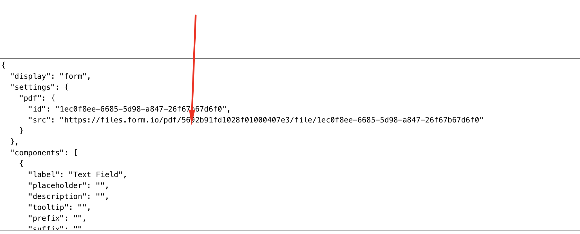
To package the configuration form layout to your ODF project structure as an asset, do as follows:
Copy the JSON to
configuration.json. Mind that the filename should be exactly like this one.Put the file into your project next to
meta-info.json: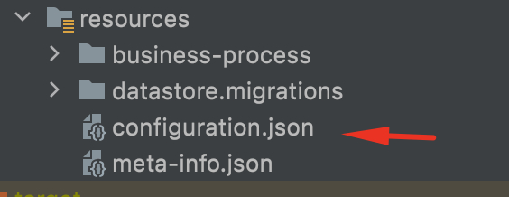
View example
If you build a form with three components for the configuration Data Store named settings, the example in Builder looks like this:
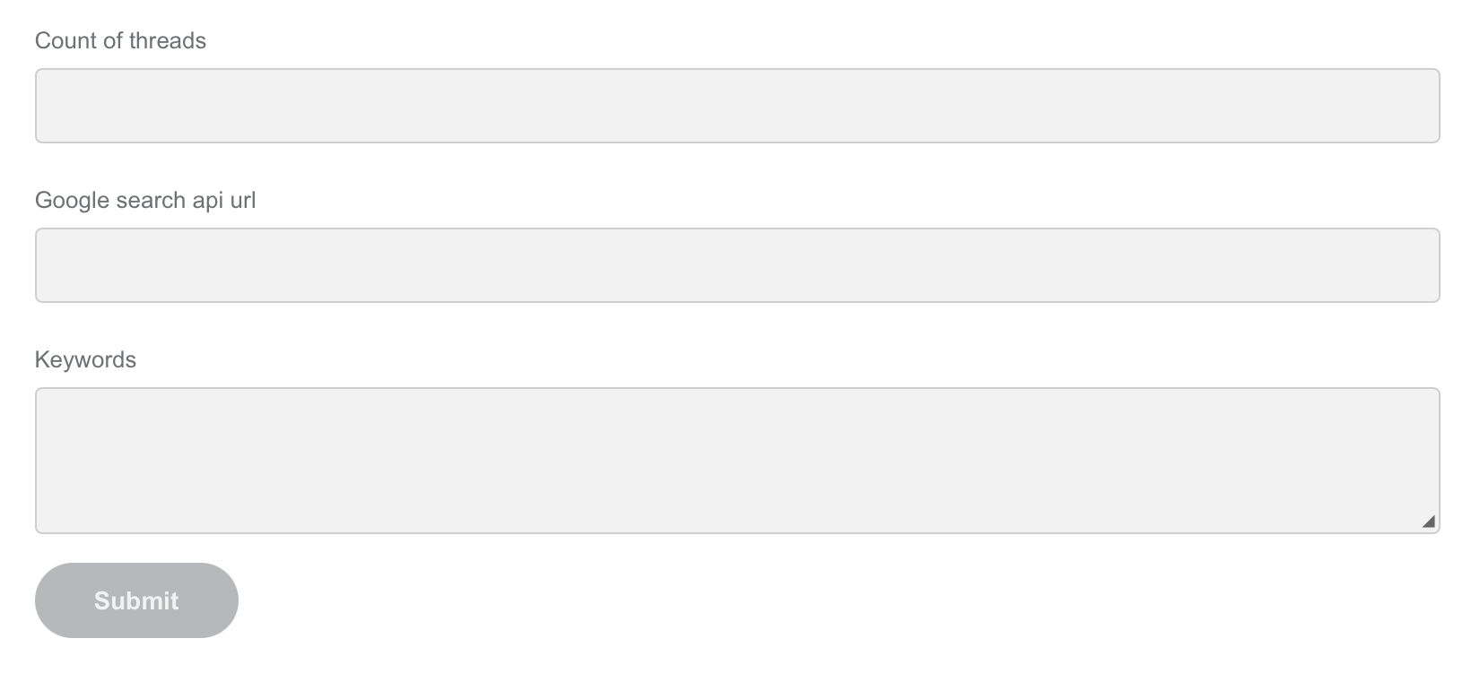
The built form has three components. For each component, add a name. The list of names is as follows:
settings.countOfThreadssettings.googleSearchApiURLsettings.keywords
For such a form, you have to build a Data Store with the following structure:
| id | name | value |
|---|---|---|
| 1 | countOfThreads | 15 |
| 2 | googleSearchApiURL | api.google.com/api/v1/ |
| 3 | keywords | ["keyword1", "keyword2"] or "keyword1", "keyword2" depending on the component properties |
note
To define default values in Data Stores, add the value in migrations as shown for the keywords above. Control Tower maps this value to the configuration automatically.
A Liquibase migration looks as follows:
<changeSet author="documentation-example" id="documentation-example_v0_1_0_0001">
    <createTable tableName="uc_usecasename_settings_v0_1_0">
        <column defaultValueComputed="NEWID()" name="id" type="NVARCHAR(36)">
            <constraints nullable="false" unique="true"/>
        </column>
        <column name="name" type="NVARCHAR(256)">
                <constraints nullable="false" unique="true"/>
            </column>
        <column name="value" type="NVARCHAR(2048)"/>
    </createTable>
</changeSet>
Make component return values
To make any component return many values, you can use any of the available options:
- Multiple Values property of a text field
- Tags component
Use Multiple Values property
You can use Text Field as the input for any text, either as a single field or a multi-value one.
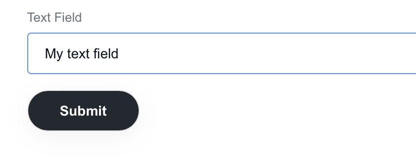
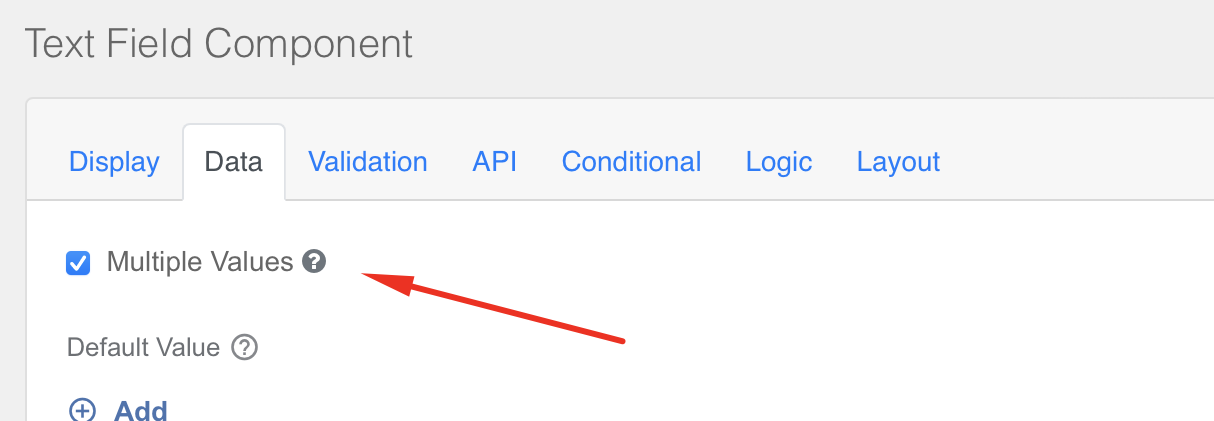
To enable a multi-value field, configure Multiple Values for the Text Field component:
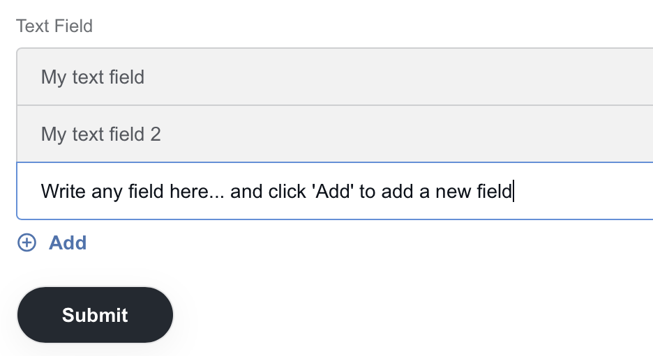
Then, you can work with the text field as a multi-value one:
note
The Text Field area supports multiple values as well.
Use Tags component
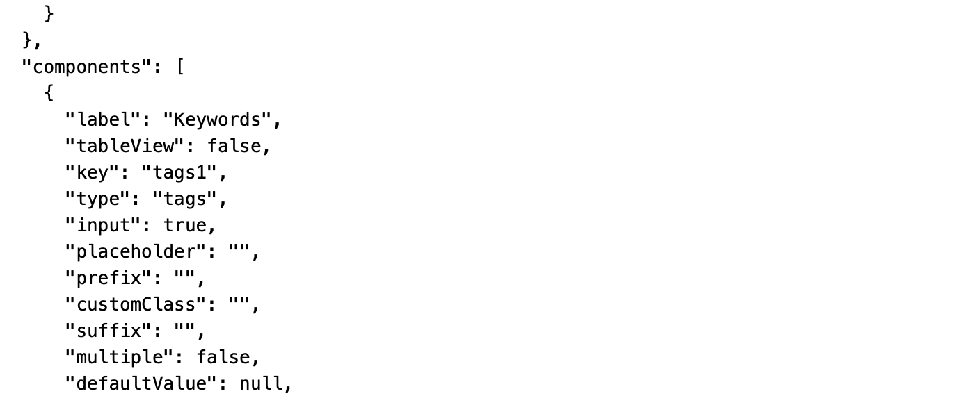
To build a form, you can also use the Tags component. If your Builder doesn't have this component on the left panel, add custom JSON code and use tags for your purposes.
To add tags to the panel with components, download the following JSON file and add it to your Builder:
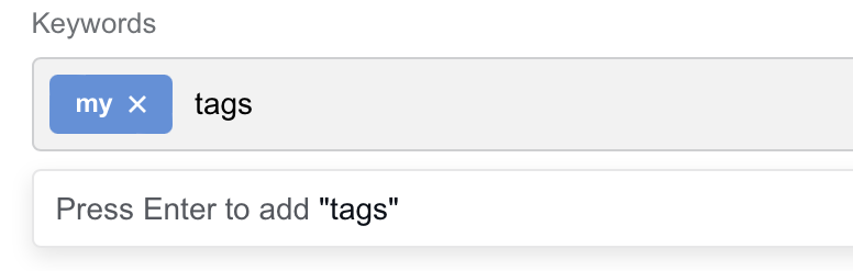
As a result, the added component appears:
Validate data
Use form.io validation capabilities
caution
Currently, Control Tower doesn't perform any component validation. To avoid unexpected values in Data Stores, cover your components with maximum restrictions in the form.
Each component has its own validation:
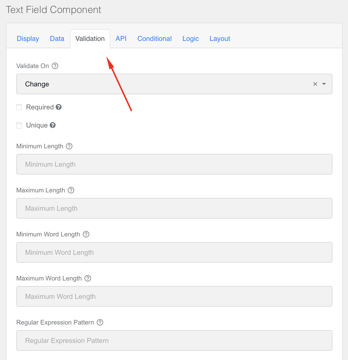
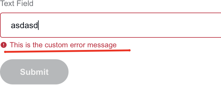
Here, you can set up different validation restrictions for your component and a custom error message for the validation logic:
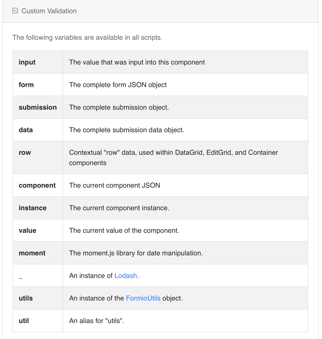
Additionally, you can write custom logic for validation using JavaScript or JSON:
tip
Sometimes, it is recommended to use a more restrictive form.io component instead of validation.
Restrict input to numeric
A number works in the same way as a text field. You can input only numbers as other characters are not accepted.
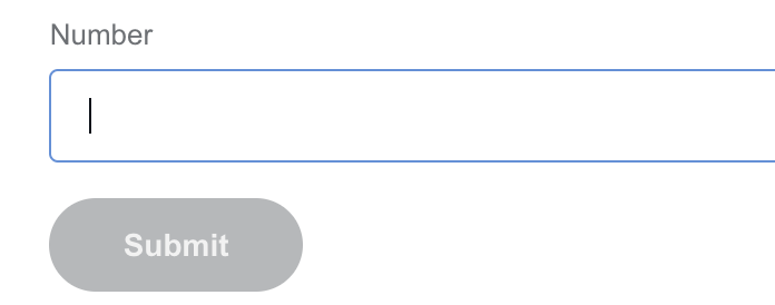
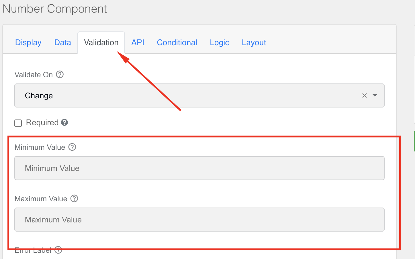
Additionally, you can add some validation logic for a number, for example, minimum and maximum values:
note
The original form.io Builder contains components restricting input to URL, currency amount, email, phone number, and so on.
Restrict input to be sourced from finite list of possible values
The Select Component functionality allows selecting data from the specified list of values.
To set up the list, do as follows:
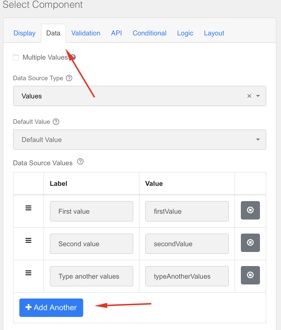
Go to the Data tab.
In the Label and Value fields, specify the required values. To add another value, click the Add Another button.
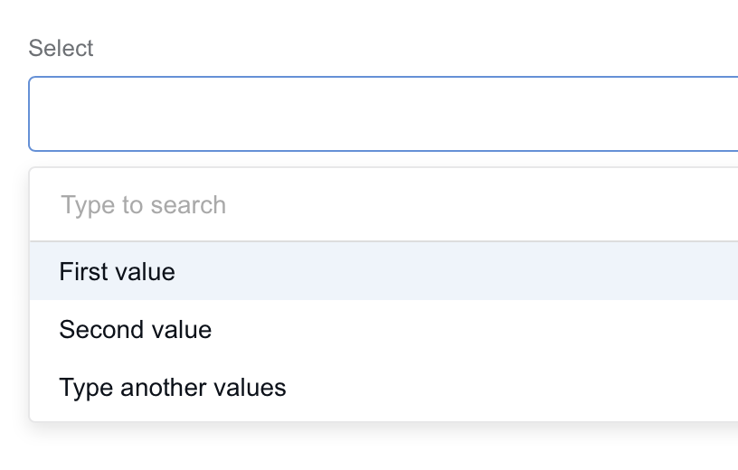
Then, you can select a required value from the list.
Additionally, you can enable multiple select.
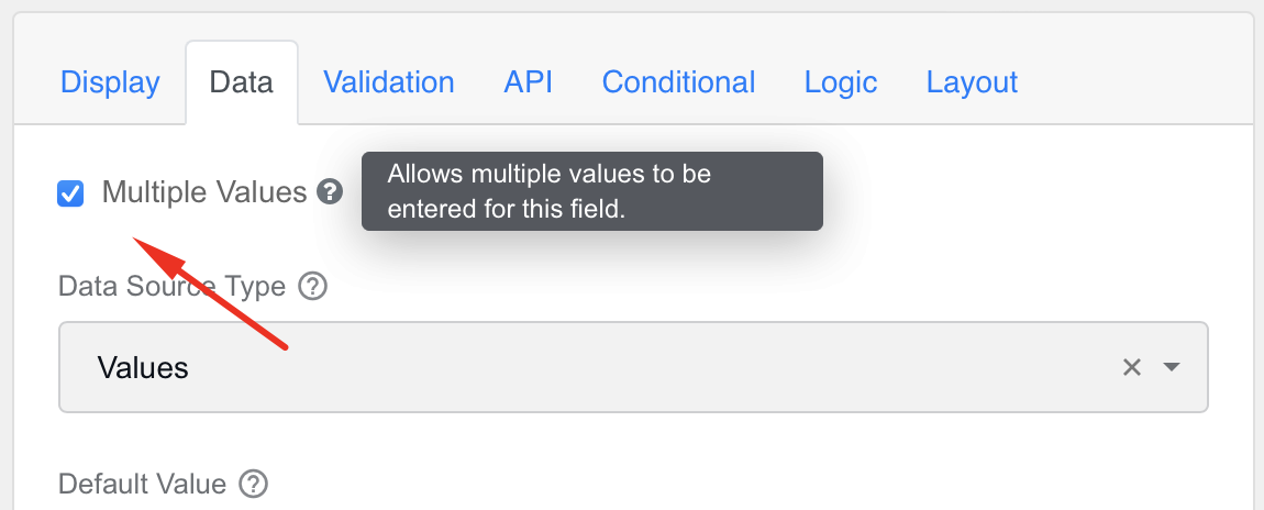
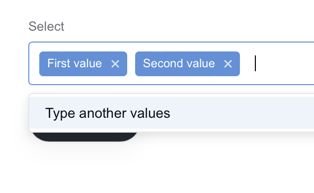
Select values in the drop-down menu:
Restrict input to be selected from Data Store entries
To use a custom Data Store as the source of the component, follow the steps below:
Go to the Data tab of your component and set URL for Data Source Type.
To use a relative path, specify Data Source URL in the following format:
{{window.location.origin}}/workfusion/api/v2/datastores/autocomplete-data?datastore={datastore_name}&maxRows=300If you use a heavy Data Store, apply
maxRowsto define a maximum amount of records to return. In the example above, 300 records are used. If the parameter is not provided, the server uses 50 records by default.
note
The autocomplete-data endpoint requires a Data Store with at least the id and name columns. If the Data Store does not contain these columns, an error is thrown.
Let's consider some required fields:
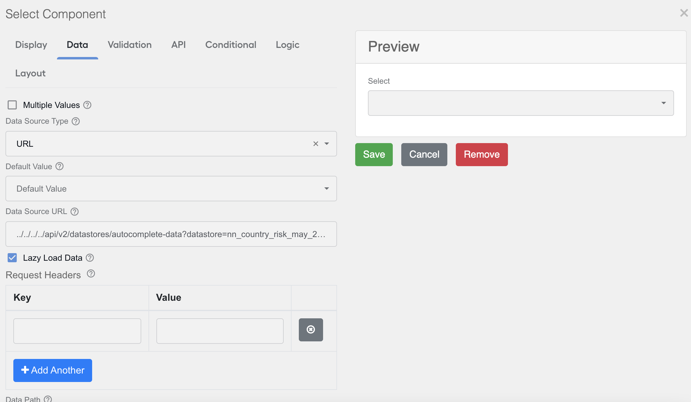
The properties are as follows:
ID Path defines where to select the option's ID, for example, the
rowData[0]element in the data source URL JSON's response.Value Property defines where to get values for selection, for example, the
rowData[1]element in the data source URL JSON's response.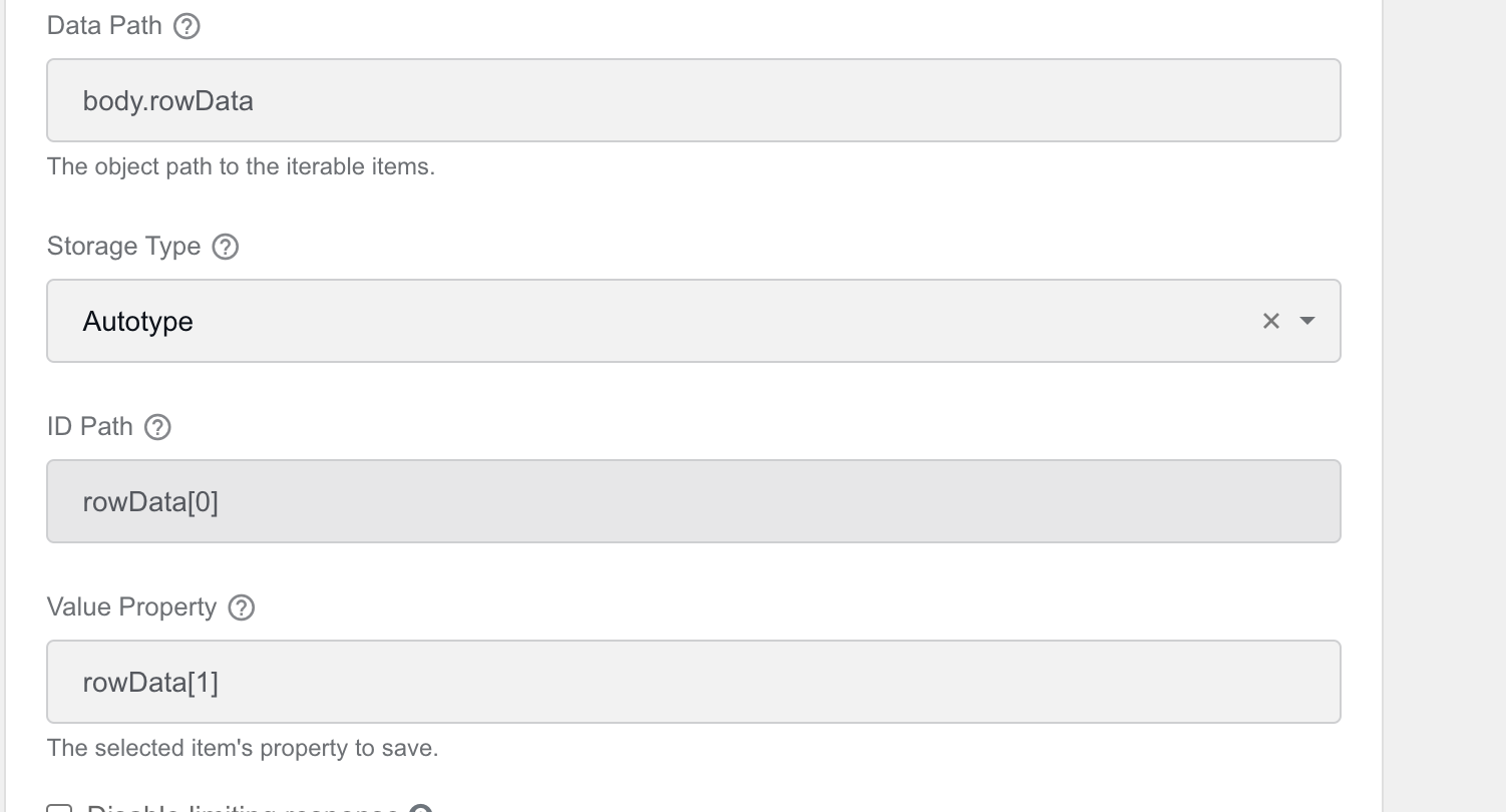
Item Template defines the HTML template to display items for selection, for example, the
rowData[1]element in the data source URL JSON's response.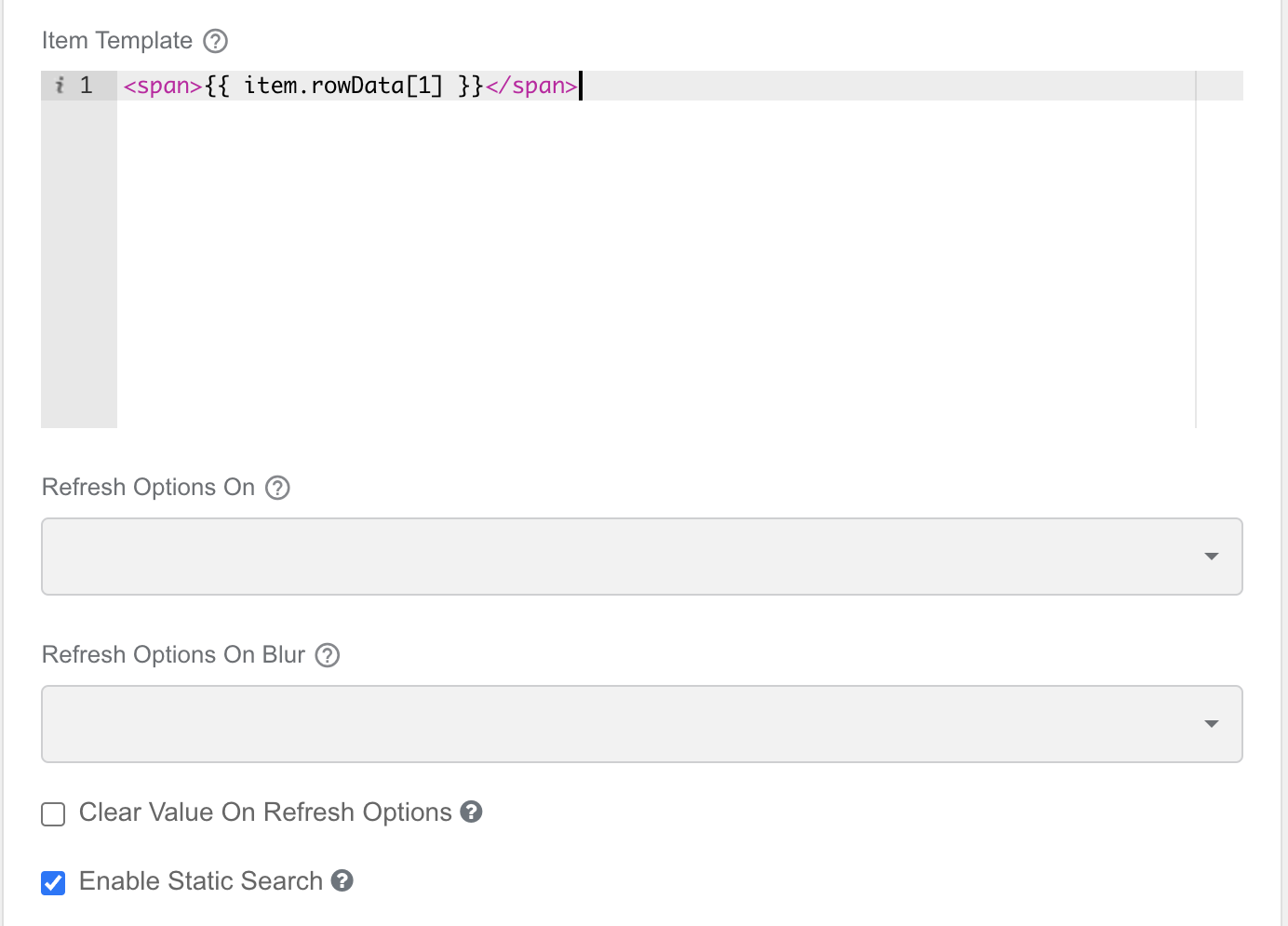
To configure other fields, follow the best practices described for http://form.io.
Restrict selection of AutoML models from available trained models
You may want to add a selection of a trained AutoML model that is relevant to your Digital Worker.
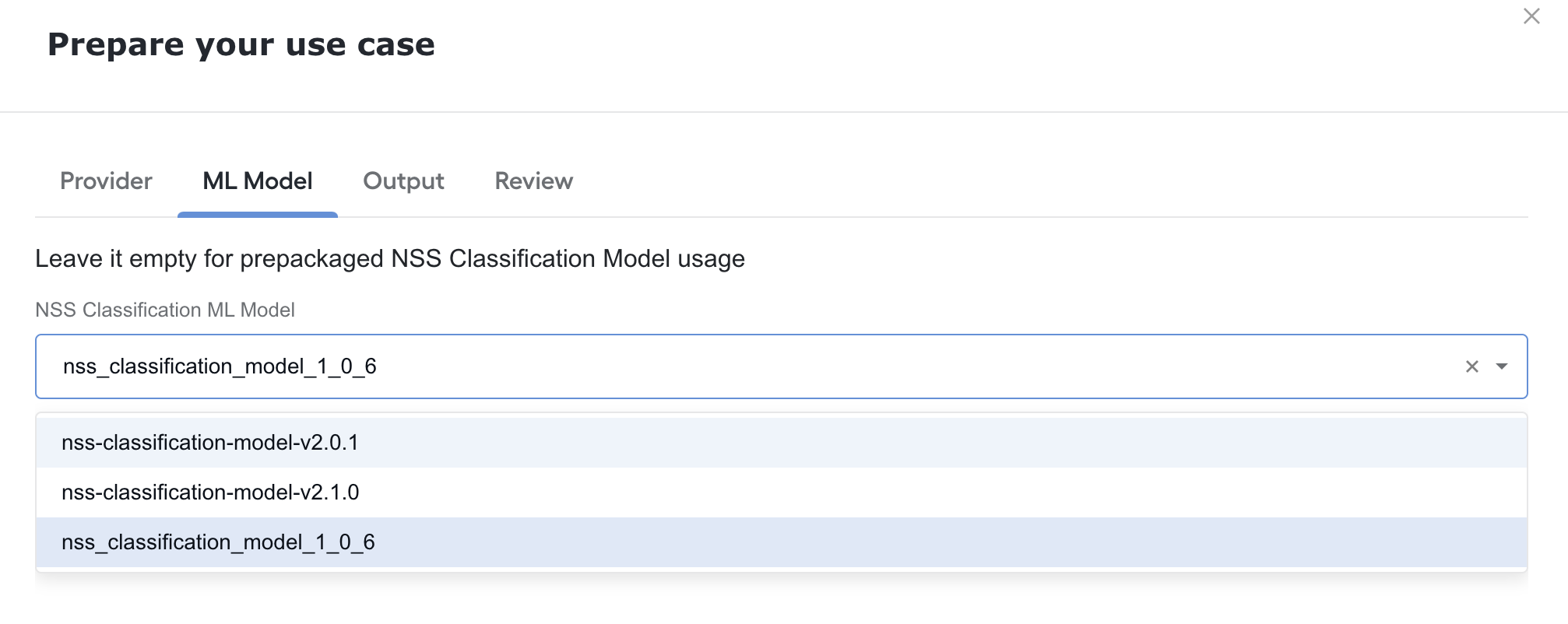
To do this, follow the steps:
Go to the Data tab of your Select component and set URL for Data Source Type.
Specify Data Source URL in the following format:
{{window.parent.location.origin}}/workfusion/api/v2/automl/trained-models?artifactCode={hyper-model-code}&size={max-number-of-items-per-page}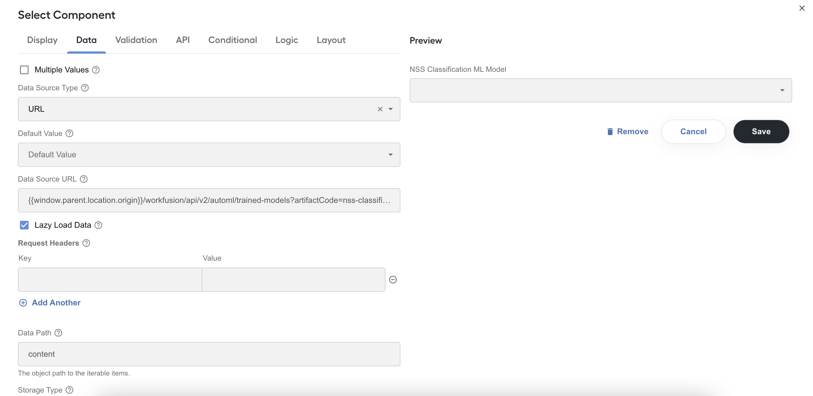
Define the Hyper model code in the
artifactCodeandsizeparameters if needed.By default, the
/v1/automl/trained-modelsendpoint returns 10 items. You may want to override it by setting any number big enough to cover the number of trained models related to a specific Hyper Model.Note that there is another limit in the settings of the component itself. This limit also defines the maximum number of items to view and is set to 100 by default.

Specify the following parameters:
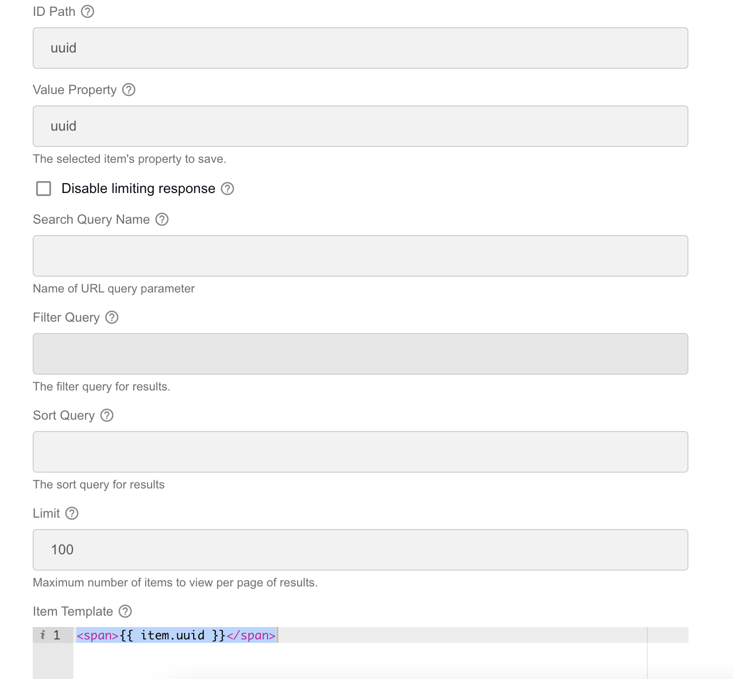
- ID Path defines where to select the option's ID. Here, the
uuidelement in the data source URL JSON's response. - Value Property defines where to get values for selection. Here, the
uuidelement in the data source URL JSON's response. - Item Template defines the HTML template to display items for selection. Here, the
item.uuidelement in the data source URL JSON's response.
- ID Path defines where to select the option's ID. Here, the
To configure other fields, follow the best practices described for http://form.io.
Implement conditional display logic
Display components based on certain condition
Let's assume you need to have different settings for two providers: Google and Factiva. To show only required fields, depending on the selected provider, follow the steps below:
Add Select Component with the required fields.
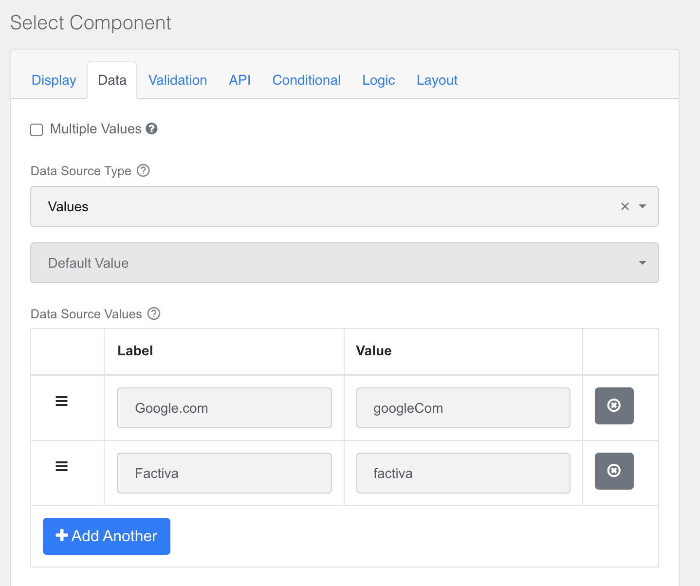
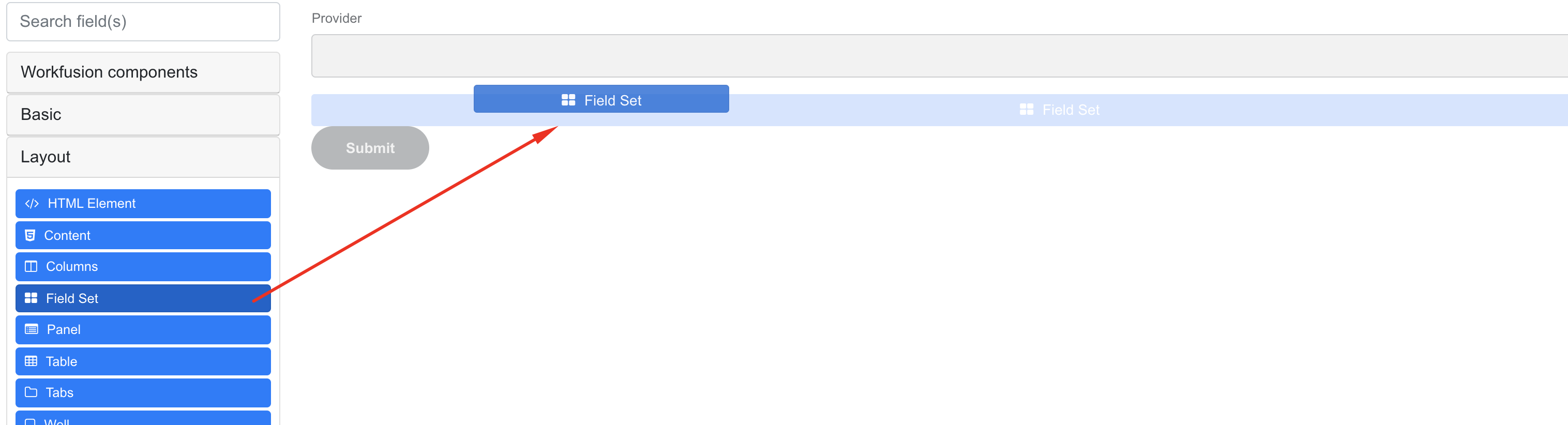
Drag the Field Set component for google.com.
Go to the Conditional tab for Field Set and specify the following settings:
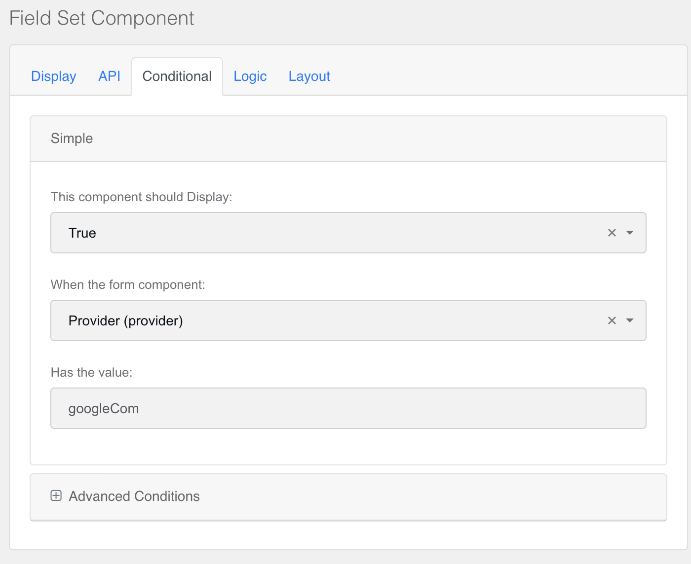
- This component should display: true. Set the field if your conditional logic to
true. - When the form component: Provider (provider). Select a component for the conditional logic from the list. Use the name in the list as a pattern: LabelName (propertyName).
- Has the value: googleCom. Type a value to be selected in the list to show the field set. Mind that the value is one of the values from the selected list data.
- This component should display: true. Set the field if your conditional logic to
Add the required components inside the created field set, for example:
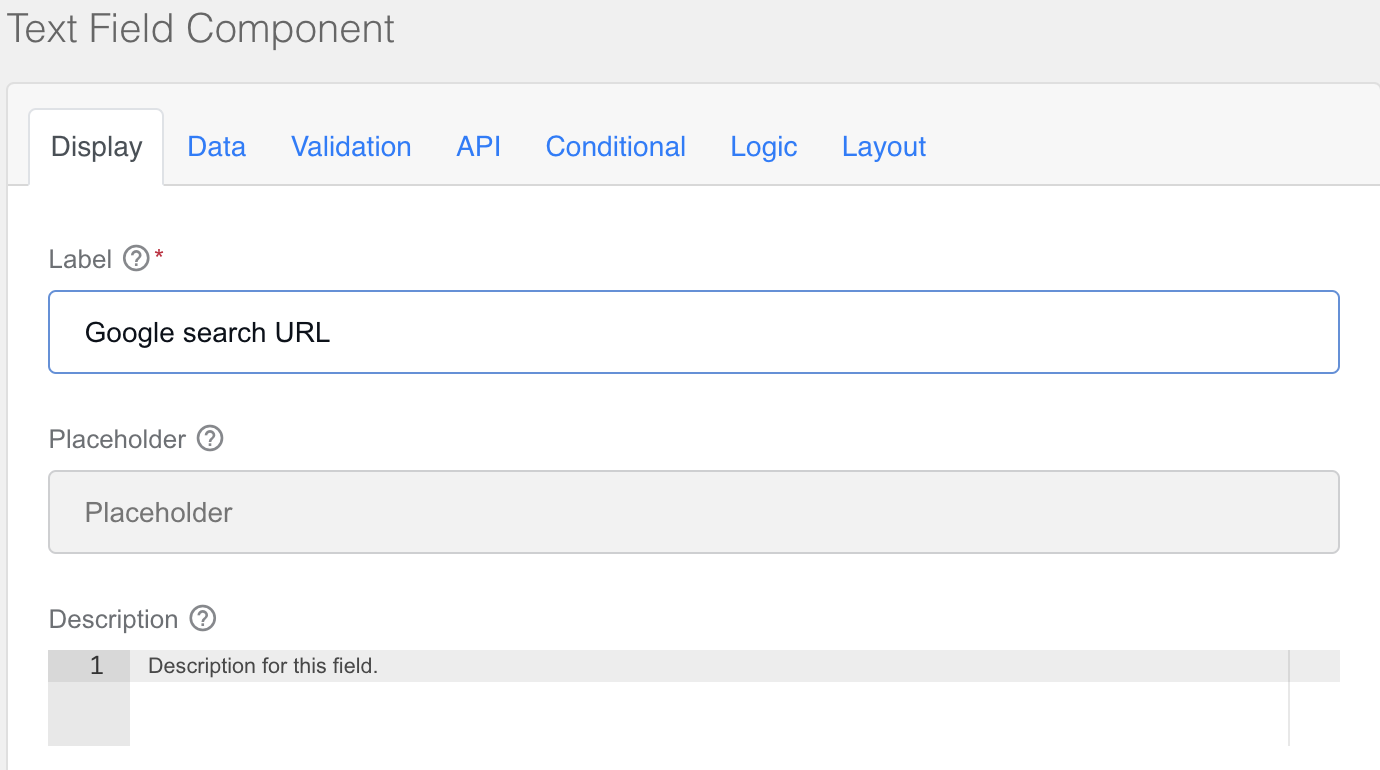
As a result, you have the form like this:
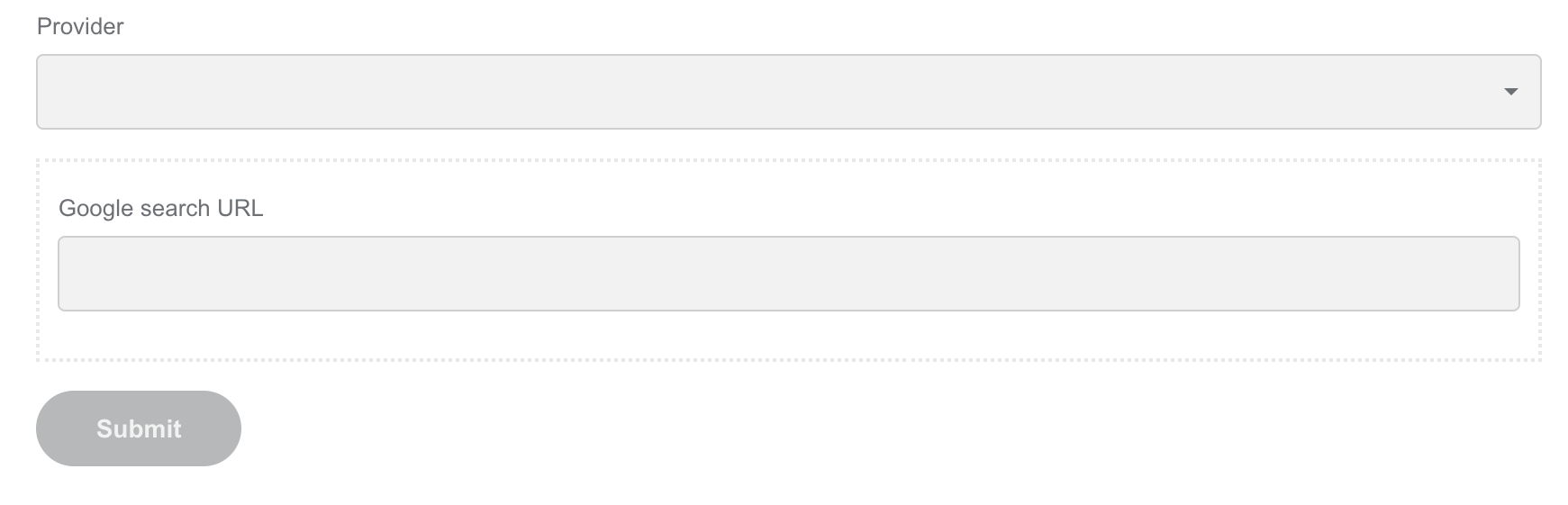
Go to Renderer and select the required provider:
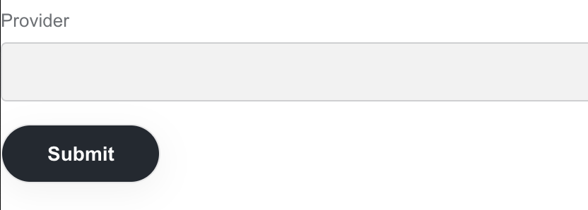
A Google search URL is shown only when you select the google.com provider.
Add other required fields to the field set.
For Factiva, add a new field set with the required logic.
Make components follow same conditional logic
A field set allows grouping a set of components based on the same logic. It can be useful when applying conditional logic to a group of fields.
Avoid letting end-user configure system identifiers
Option 1: No UI, no need for configuration. Get required identifiers inside a Business Process.
Option 2: A drop-down list with values that are not IDs but something meaningful. Configure a drop-down list for getting a required value via Control Tower REST API and work with values from API.
Display hint in Renderer
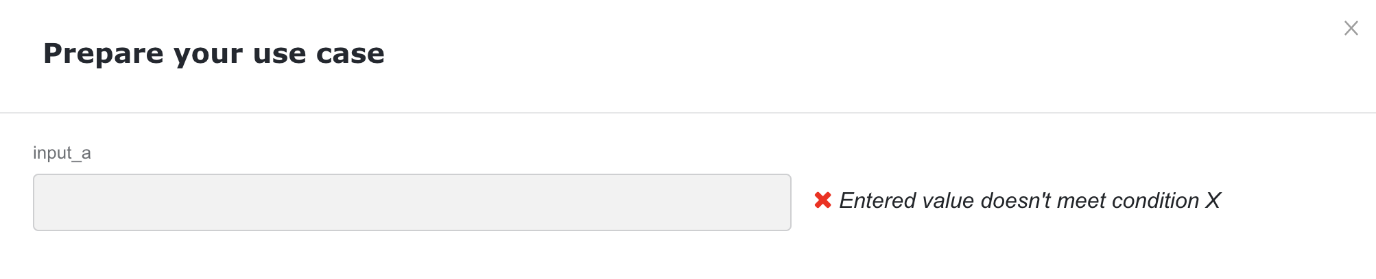
Sometimes, it is valuable to use the functionality to determine if some component meets defined conditions. For example, you need to ensure that a value you enter in a text field meets the condition defined by your custom logic so that you can find out the result before you finish the Use Case configuration. This way, you can correct the value right away before clicking the Finish button and even click the Finish button when the specified condition is not met. For such purposes, follow the steps below:
Create the Columns component from the Layout section.
Drag the Text Field component to the first column. On the Display tab, provide a corresponding label name. On the API tab, specify a property name. In the example, an input control named input_a is created.
Drag the HTML element from the Layout section to the second column. Define corresponding Label, HTML Tag, and the message displayed as a hint and changed according to the condition specified in custom JavaScript code:
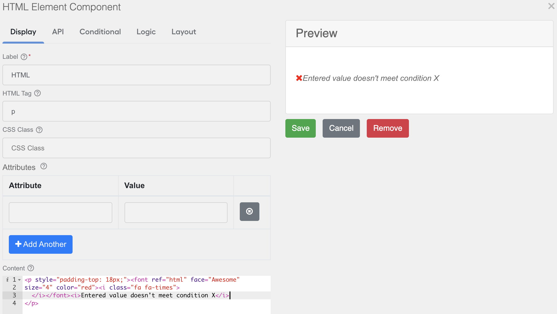
<p style="padding-top: 18px;"><font ref="html" face="Awesome" size="4" color="red"><i class="fa fa-times"></i></font> <i>Entered value doesn't meet condition X</i></p>On the API tab, specify key and value of the custom properties, where keys are names of the variables you use in your custom JavaScript code. The values define the HTML code of the hint to be displayed based on the condition you specify further.
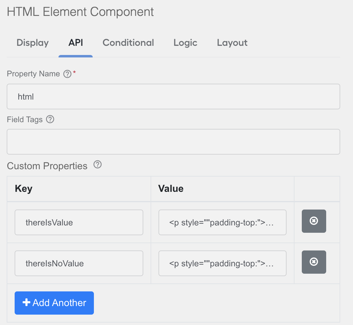
In Advanced Conditions, add custom JavaScript code to set up the properties of the component based on some logic. Here is a dummy code sample:
calculatedResult = X; // logic of any complexity that will calculate the result

component.content = calculatedResult ? component.properties.thereIsValue : component.properties.thereIsNoValue;
instance.triggerRedraw();
show = true;
In Renderer, you get the following result:
Test Use Case configuration
Enable Use Case configuration
In IA Cloud v10.2.4, the Use Case configuration feature is hidden by default under a feature flag. To enable it, go to workfusion.properties, set the variable as follows, and restart Control Tower:
use.case.configuration.enabled=true
Add Use Case configuration to Use Case bundle
To add the Use case configuration, do as follows:
Place the configuration form layout as the
configuration.jsonfile in the bundle root (the same place as formeta-info.json).Place the configuration Data Stores in the
/datastoresfolder (the same flow as for all other Data Stores).Upload the bundle to Control Tower using the following command:
mvn bundle:import
Known issues
Import of configuration containing Text Area can fail
If you use IA Cloud v10.2.4, the bundle import can fail on the configuration component, and Control Tower logs contain the following errors: com.workfusion.controltower.usecase.exception.UseCaseConfigurationParsingException: Failed to parse configuration.json file content: Not a JSON Array.
It means your configuration form contains a Text Area component with the Rows parameter that is not empty, for example:
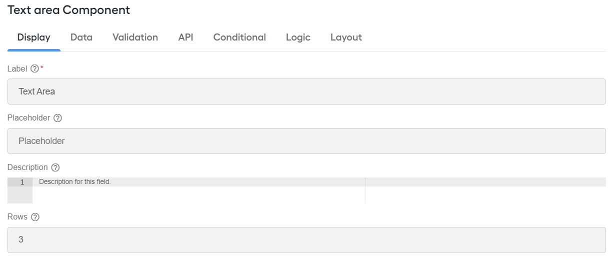
To resolve the issue, remove the Rows parameter from configuration.json and save your configuration. Then, the import will be completed successfully.