
Explore customization options for Tableau-based dashboards
Custom dashboards are a set of modified out-of-the-box (OOTB) dashboards or dashboards created from scratch to answer specific questions and allow for detailed analysis.
Solve problems
Customized dashboards are essential when you need to do the following:
- Build a visualization from scratch
- Make labels to be business-specific
- Integrate your internal reporting formats
- Add an alternative point of view to an existing visualization for diversity
- Combine required views into a single dashboard
- Add a level of detail to deep-dive into a problem where needed
- Address issues related to visibility and understanding of available data with training or additional information
- Segregate data levels by restricting access to views
To build a custom dashboard, you need data to visualize and visualization tools.
Explore solutions
WorkFusion provides Reporting API, which is a set of tables, or Datamarts, that you can connect to any visualization tool to build custom dashboards.
The benefits of Reporting API are as follows:
- You are not limited to OOTB dashboards if you need to make a more in-depth analysis. You can always put together your own report.
- You can use a BI tool of your choice against the data warehouse provided by WorkFusion.
- You can integrate the data seamlessly from WorkFusion’s data warehouse into yours.
Reporting API offers a data language for describing automation processes so that you can track progress and find bottlenecks for further improvement. Via the API, you can access the following operational metrics:
- Data from the main platform (Control Tower)
- Worker details and utilization (WorkSpace)
- Automation rates for processes (AutoML)
- Bot utilization and speed (RPA, Bot Execution Platform)
- Infrastructure metrics (CPU, Memory, and so on)
Building dashboards using Reporting API is easier than creating Excel visualizations:
- No need to understand complicated source data schemas.
- Column names are business user-friendly.
- All possible calculations are already included.
For a detailed description, read the Reporting API article.
Consider required skills
For building custom dashboards via Reporting API, you need the following:
- Understanding of the data schema in the database. For proper visualization, it is essential to seleoct correct tables with appropriate data.
- Basic skills in using visualization tools, which is crucial for building dashboards. Some tools even provide a drag-and-drop mechanism for enhanced user experience, facilitating the dashboard delivery process.
The following advanced skills can be a plus:
- Thorough understanding of SQL and relational databases, which is essential to create advanced SQL queries for targeted data extraction or aggregation.
- In-depth knowledge of visualization tools to build dashboards with additional calculations, create mature objects, and share results.
Helpful links
The following existing guides help to understand the data schema, connect to required data, as well as create and deploy custom dashboards:
- Create custom Tableau-based dashboards
- Deploy custom Tableau-based dashboards
- Track transactions instructing on working with Business Processes to get necessary data
- Tableau video tutorials
Account for hierarchy and naming conventions
The Analytics component supports the three-level hierarchy defined by the Tableau Workbook naming conventions. Visually, it can be presented as the following structure:
Analytics/
  ├─ Name category 1/
  │   └─ Subcategory 1/
  ├─ Name category 2/
  │   └─ Subcategory 2/
  └─ Name category 3/
      └─ Subcategory 3/
When developing a Workbook and publishing it from Tableau, follow the naming conventions listed below to create the hierarchy:
- Separate each menu level with the _ symbol.
- The full name must not contain any special characters, except the + sign. In the user interface, the sign is replaced with blank spaces.
- To define the language and location, add a prefix to the dashboard name (for example, en_).
- The _custom postfix is required to indicate custom dashboards.
note
Alternatively, you can create the structure directly on the Tableau Server.
The hierarchy levels are optional, and there can be one or two group identifiers. The third level is defined by the sheet name for the dashboard.
Examples:
- The en_Anti+Money+Laundering_Adverse+Media+Screening_Articles_custom.tbw filename creates the following structure: Analytics menu > Anti Money Laundering category > Adverse Media Screening subcategory > actual dashboard. Here, "Articles" is used for the name uniqueness.
- The en_Identity+Verification_Overview_custom.tbw filename defines the following structure: menu Analytics > category Identity Verification with the direct link to the Dashboard next to it. Here, no subcategory is created.
View custom dashboard examples
Let's see how customization works for the legacy Manual dashboard providing information on worker efforts and productivity.
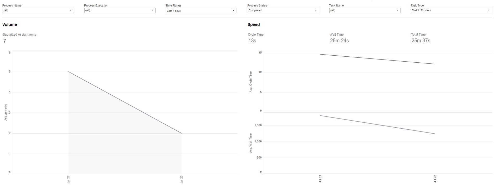
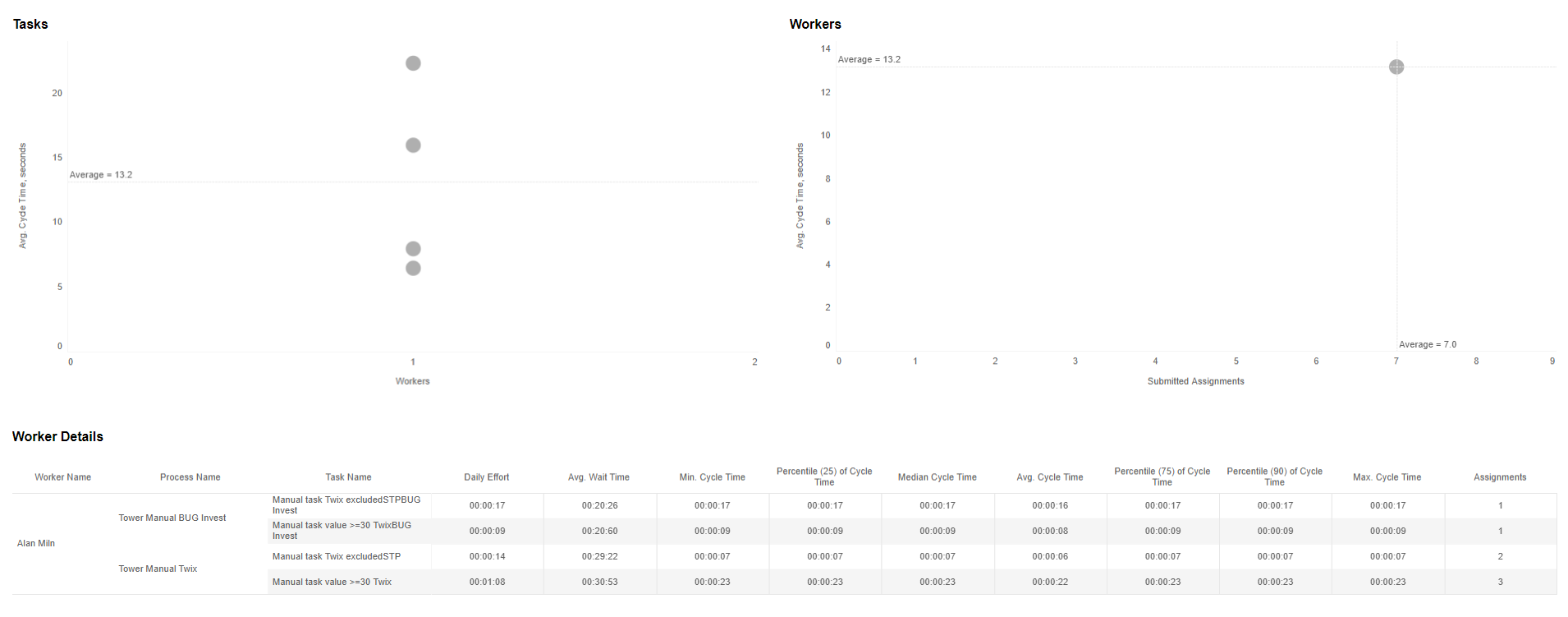
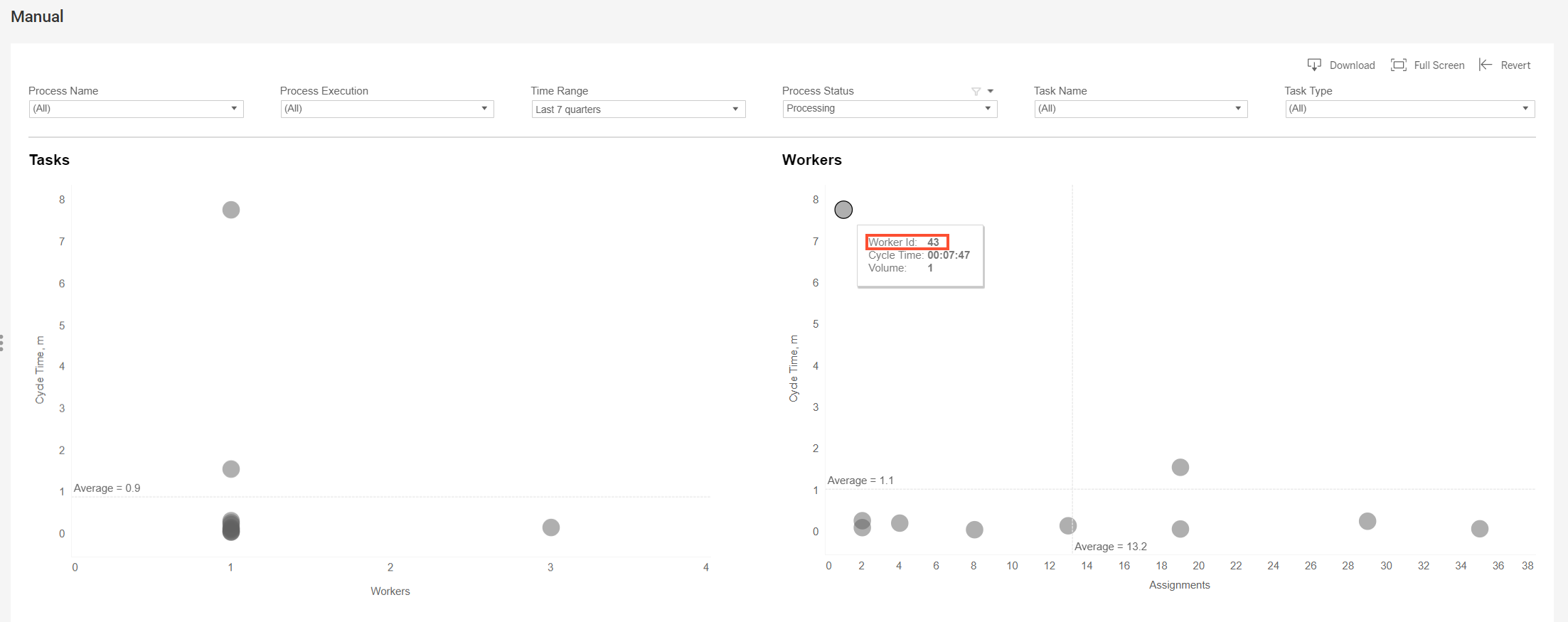
The first customization example is based on the General Data Protection Regulation (GDPR) policy requiring no worker names to be displayed. Names are replaced with user IDs.
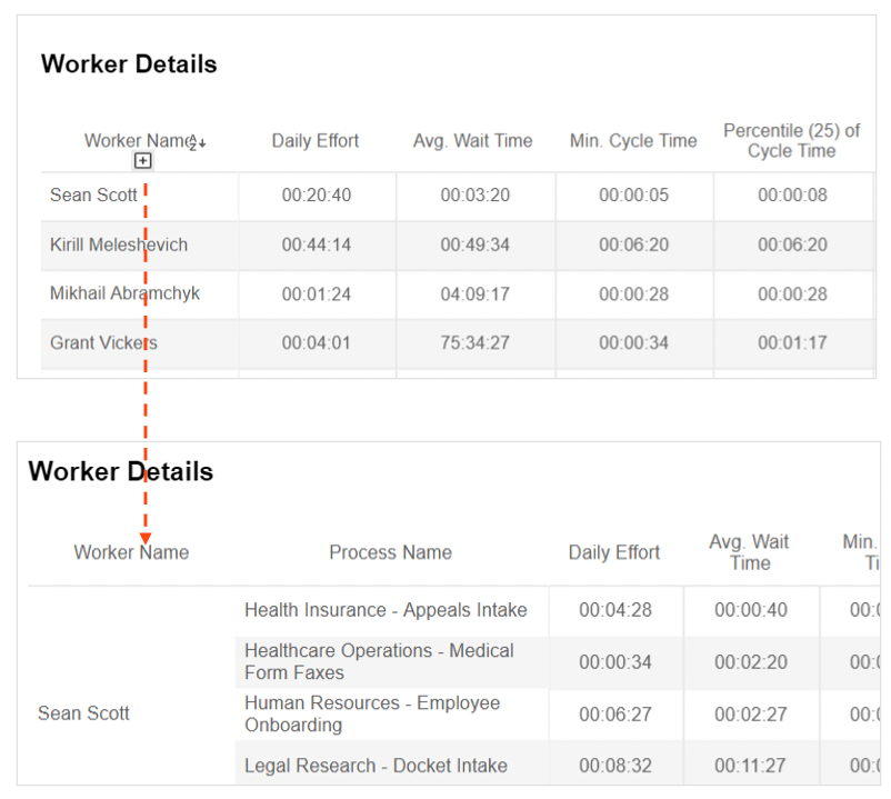
The second customization example enables several aggregation levels to deep-dive into information. When expanded, the Worker Name > Process Name > Task Name hierarchy provides information on worker efforts per task. When collapsed, it shows aggregated worker effort.
For an instruction to create and deploy a custom dashboard to monitor Business Process schedules, refer to the following guide.