
Speed
Speed dashboard is meant to help find any bottlenecks of the process executions. Monitor the speed of the process execution on the process summary graph, which also provides a quick view of the SLA violation and cycle time. Breakdown summary will help to find out which type of task took the most of processing time, how long it took and the volume being processed within process execution.
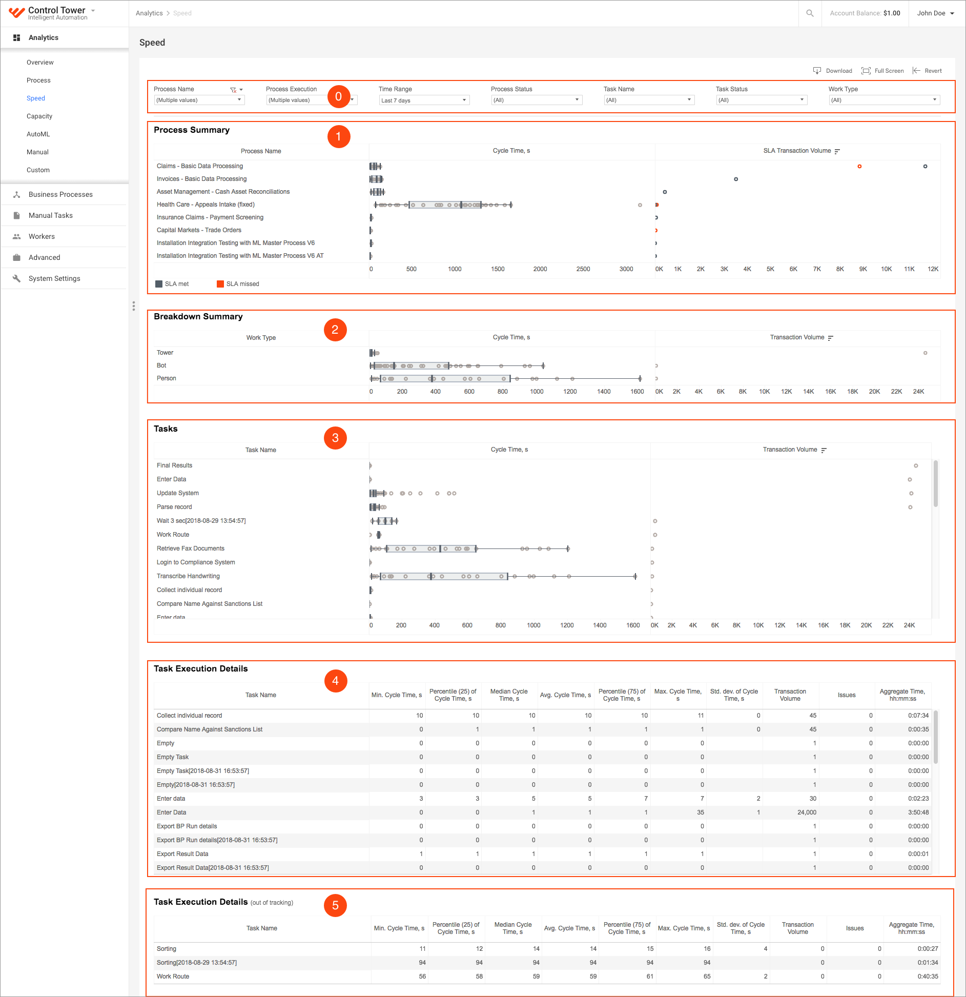
1 - Process Summary
2 - Breakdown Summary
3 - Tasks
4 - Task Execution Details
5 - Task Execution Details (out of tracking)
A tooltip is displayed on mouse hover over an element (point or bar). It contains additional information about a specific element.
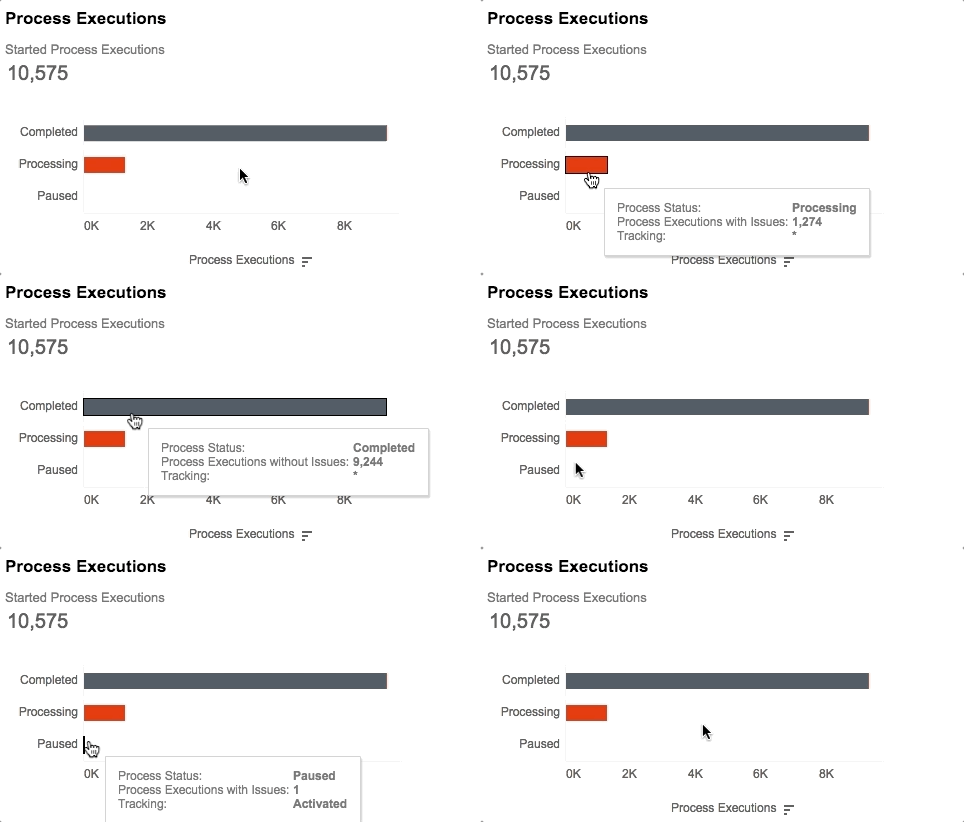
The Tracking field in the tooltip means Transaction Tracking. There are three values:
- Activated: For all Process executions transaction on this day transaction tracking is enabled. Transactions count by documents.
- Not Activated: Transaction tracking NOT enabled for all process executions on this day. Transactions count by input records automatically.
- *: multiple values. Only in some process executions transaction tracking is enabled.
In the others fields, also If there is more than one possible value, it returns the (*) in the tooltip, for example, SLA values.
Filters
Task Name
Users can filter all tasks.
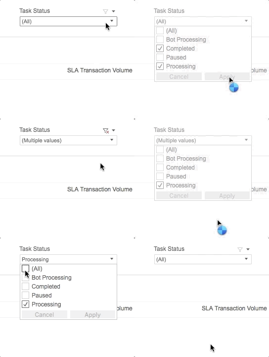
Task status
Allows users to choose one or several task statuses:
- Bot Processing
- Completed
- Paused
- Processing
Work Type
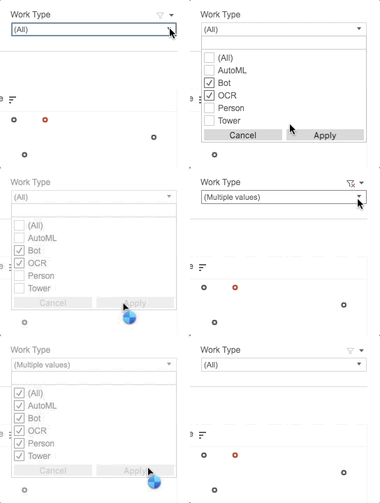
By using work type filter you can filter out the dashboard by particular work type of the process execution.
There are following work types:
- All
- Bot
- Tower
- OCR
- AutoML
- Person
Process Summary
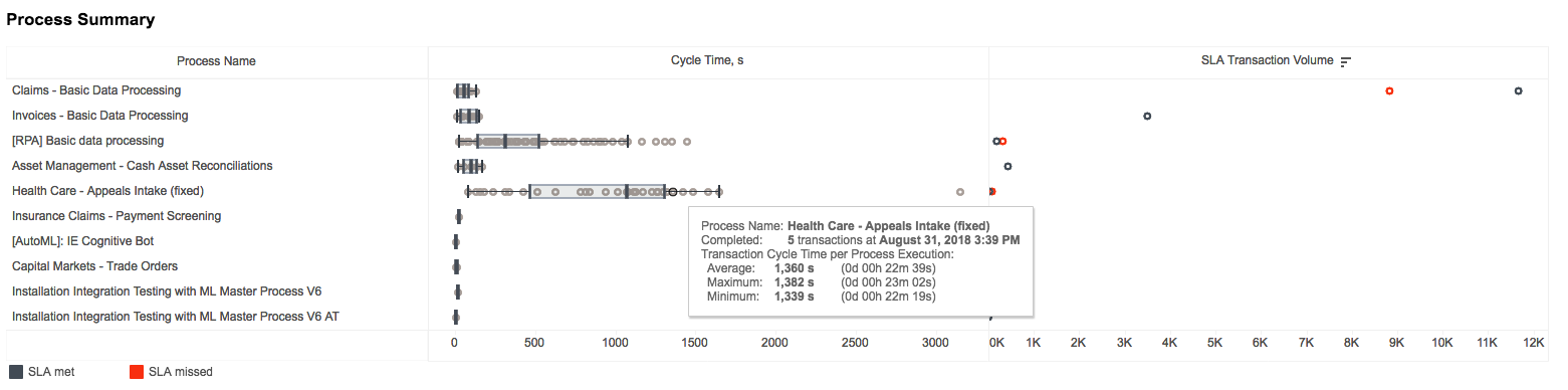
The chart divided in two parts: Cycle time and SLA Transactions volume
- Y-axis: common for two parts and shows list Process name.
- Cycle Time: the Cycle time for completed transactions group by minutes, when transactions was ended. Every dot on this chart is a batch of transactions positioned at average cycle time for this transaction. For each process, there is a box plot that shows distribution of transactions by their cycle time.
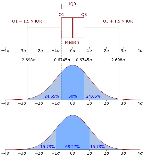
BoxPlot: method for graphically depicting groups of numerical data through their quartiles.
In descriptive statistics, the interquartile range (IQR), also called the midspread or middle 50%, or technically H-spread, is the measure of statistical dispersion, being equal to the difference between 75th and 25th percentiles, or between upper and lower quartiles IQR = Q3 - Q1. In other words, the IQR is the first quartile subtracted from the third quartile; these quartiles can be clearly seen on a box. It is a trimmed estimator, defined as the 25% trimmed range, and is a commonly used robust measure of scale.
The IQR is a measure of variability based on dividing a data set into quartiles. Quartiles divide a rank-ordered data set into four equal parts. The values that separate parts are called the first, second, and third quartiles; and they are denoted by Q1, Q2, and Q3, respectively.
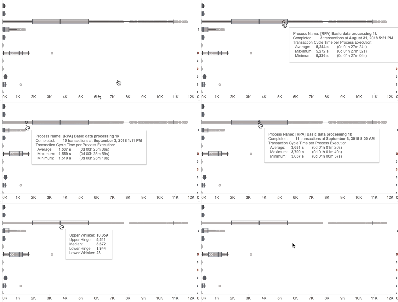
- X-axis: average Cycle time for batch of transactions
- Tooltip:
- For dots:
- Process name
- Number of transactions in this batch and full date and time when this batch of transactions was ended
- Transaction Cycle Time (in two formats: total seconds and date and time format):
- Average
- Maximum
- Minimum
- For boxplot:
- Upper Whisker
- Upper Hinge
- Median
- Lower Hinge
- Lower Whisker
- For dots:
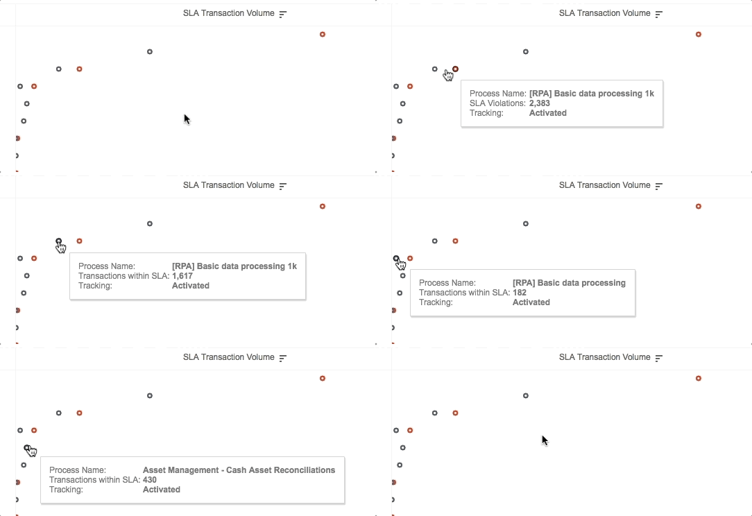
SLA Transactions Volume shows the number of transactions within SLA and SLA violations for each process.
- X-axis: number of transactions
- Grey dot: transactions within SLA (met SLA)
- Red dot: SLA violations (missed SLA)
- Tooltip:
- Process name
- Number on SLA violations OR transactions within SLA
- Transactions Tracking
Breakdown summary
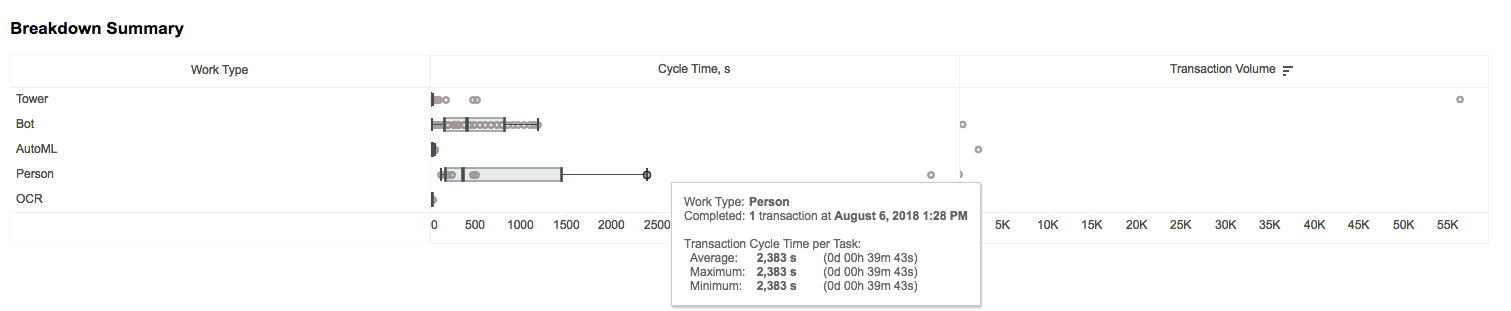
The chart is divided in two parts: Cycle time and Transactions volume
- Y-axis: common for two parts and shows list of work types.
- Cycle Time: the Cycle time of transaction by this Work Type and group by the minutes, when part of transaction was completed.
- BoxPlot: method for graphically depicting groups of numerical data through their quartiles.
In descriptive statistics, the interquartile range (IQR), also called the midspread or middle 50%, or technically H-spread, is the measure of statistical dispersion, being equal to the difference between 75th and 25th percentiles, or between upper and lower quartiles IQR = Q3 - Q1. In other words, the IQR is the first quartile subtracted from the third quartile; these quartiles can be clearly seen on a box. It is a trimmed estimator, defined as the 25% trimmed range, and is a commonly used robust measure of scale.
The IQR is a measure of variability based on dividing a data set into quartiles. Quartiles divide a rank-ordered data set into four equal parts. The values that separate parts are called the first, second, and third quartiles; and they are denoted by Q1, Q2, and Q3, respectively.

- X-axis - average Cycle time in seconds
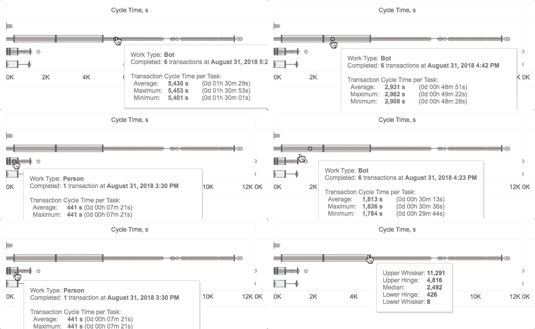
- Tooltip:
- For dots:
- WorkType
- Number of transactions in this batch and full date time when this part of transaction was completed
- Transaction Cycle Time (in two formats: total seconds and date and time format):
- Average
- Maximum
- Minimum
- For boxplot:
- Upper Whisker
- Upper Hinge
- Median
- Lower Hinge
- Lower Whisker
- For dots:
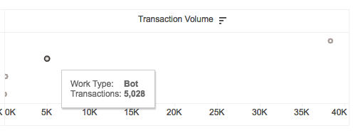
Transactions Volume shows number of transactions.
- X-axis: number of transactions
- Tooltip:
- WorkType
- Number of transactioins
Tasks
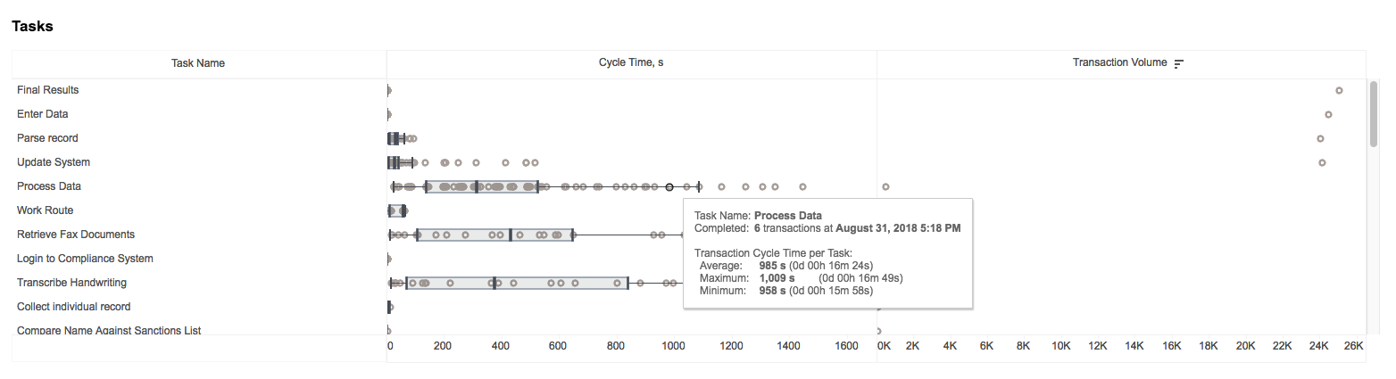
The chart is divided in two parts: Cycle time and SLA Transactions volume
BoxPlot: method for graphically depicting groups of numerical data through their quartiles.
In descriptive statistics, the interquartile range (IQR), also called the midspread or middle 50%, or technically H-spread, is the measure of statistical dispersion, being equal to the difference between 75th and 25th percentiles, or between upper and lower quartiles IQR = Q3 - Q1. In other words, the IQR is the first quartile subtracted from the third quartile; these quartiles can be clearly seen on a box. It is a trimmed estimator, defined as the 25% trimmed range, and is a commonly used robust measure of scale.*
The IQR is a measure of variability based on dividing a data set into quartiles. Quartiles divide a rank-ordered data set into four equal parts. The values that separate parts are called the first, second, and third quartiles; and they are denoted by Q1, Q2, and Q3, respectively.
Y-axis: common for parts and shows list of task names.
Cycle time: the cycle time of transaction by this task and group by the minutes, when part of transaction was completed. For each task, there is a box plot that shows distribution.
X-axis: average Cycle time
Tooltip:
- For dots:
- Task name
- Number of transactions in this batch and full date time when this part of transaction was completed
- Transaction Cycle Time (in two formats: total seconds and date and time format):
- Average
- Maximum
- Minimum
- For boxplot:
- Upper Whisker
- Upper Hinge
- Median
- Lower Hinge
- Lower Whisker
- For dots:

Transaction Volume: number of transactions
- X-axis: number of transactions
- Tooltip:
- Task name
- Number of transactions
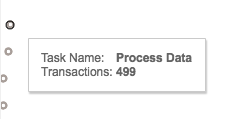
Tasks Execution details
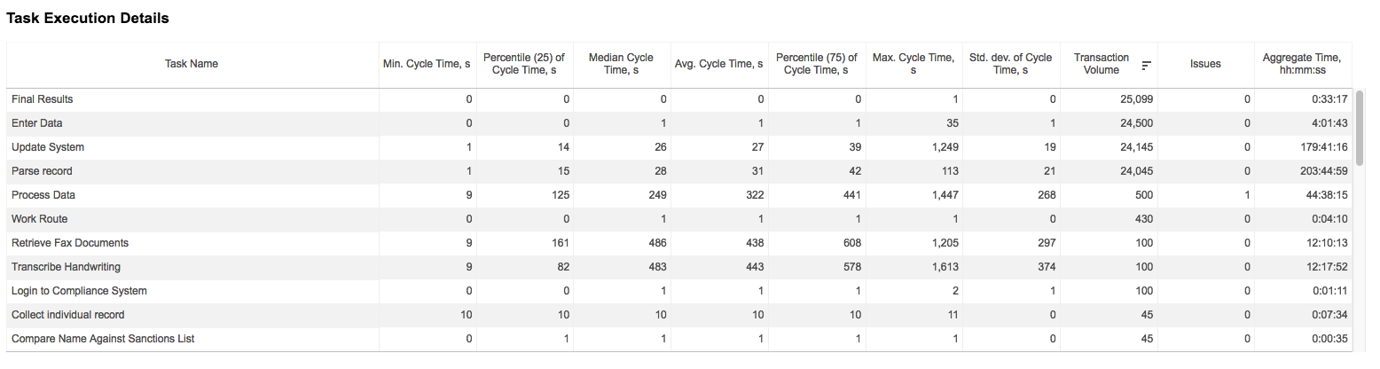
Table shows details information for each task. It has 11 columns:
- Task name
- 7 column for descriptive statistics of Cycle time in seconds:
- Minimum
- Percentile (25)
- Median
- Average
- Percentile (75)
- Maximum
- Standard deviation
- Transaction Volume
- Issues
- Aggregated time in the
hh:mm:ssformat
Tasks Execution Details (out of tracking)

The table shows detailed information for tasks which are out of tracking, for example, steps before an activated tracking step. It has the same 11 columns like in previous one:
- Task name
- 7 column for descriptive statistics of Cycle time in seconds:
- Minimum
- Percentile (25)
- Median
- Average
- Percentile (75)
- Maximum
- Standard deviation
- Transaction Volume
- Issues
- Aggregated time in special time format - hh:mm:ss