
Design manual task
The Design Task tab provides the means to edit the Task structure, description, look and feel, and answers.
The Main Panel (left side of the tab) is composed of a WYSIWYG editor, and the Side Panel (right panel) is reserved for adding and configuring relevant Task Section.
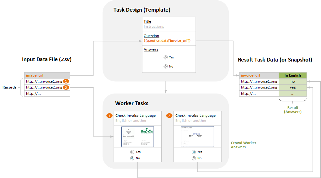
Task design schema
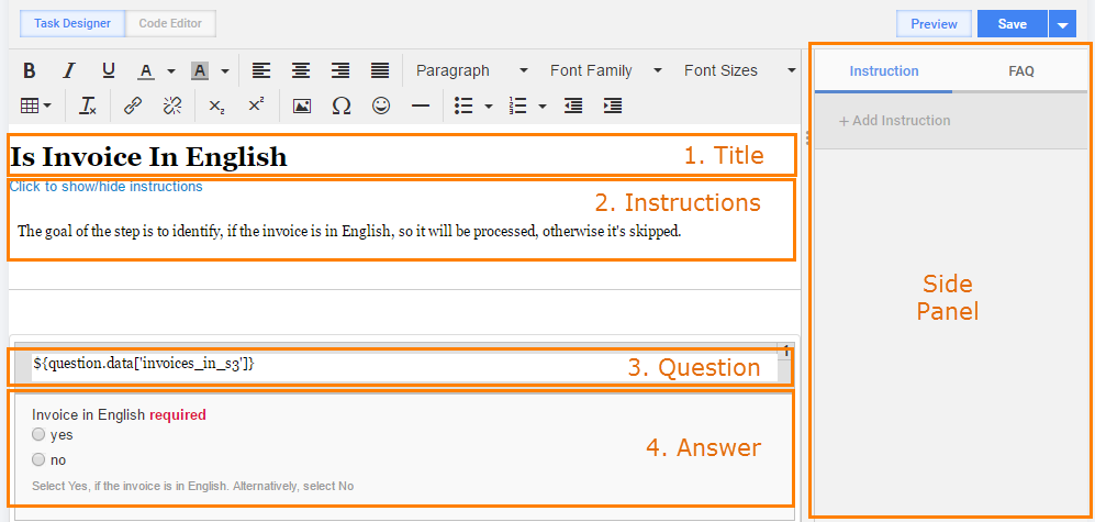
The following image displays the sections of the Task Designer.
To edit the Task Design, do as follows.
- Place cursor into the target Section by clicking inside it (Title, Instructions, Question, or Answer).
- Perform an action (from Main Panel or Side Panel) - see the list of available actions in the table below.
- To check the updated Task Design, click the Preview button.
- (optional) Save the Task.
| Section | Main panel actions | Side panel actions | Common/per record* |
|---|---|---|---|
| Title |
|
| common |
| Instructions |
|
| common |
| Question |
|
|
|
| Answer | no actions |
|
|
* The last column indicates whether the section content is common for all Records in the Task or the section content is unique per Record.
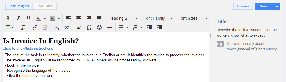
Title
- Use informative unique wording to distinguish the Task among others and to clearly state the Task goal.
- Do not insert line breaks and rare ASCII characters.
- Use heading style with big font.
- Save to apply changes.
Instructions
To add Instructions, perform the following actions.
On the Design Task tab, click inside the Instructions section, select the Instruction tab, and click the Add Instruction button. The Add Instruction window will pop up as shown below.
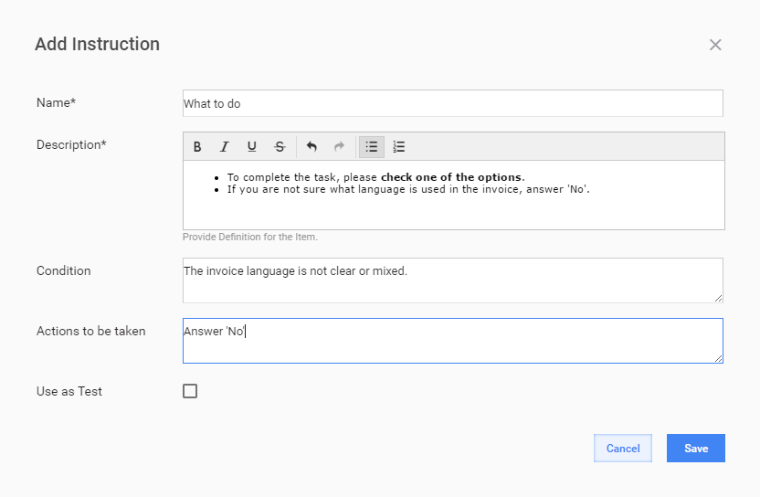
Enter Name and Description and click the Save button.
Specify Condition[, that is information about condition of Task that is displayed in Instruction body (When).
Set Actions to be taken, that is information on how to handle the condition that is displayed in Instruction body (What to do).
Check Use as Test to use the instruction as a test.
note
When Instructions are used as Tests, Workers are granted access to the Task only after answering the Test question correctly.
If the worker answers are incorrect, test is refreshed and access to the Task is not provided. Workers are told to try answering the question again.
If the Use as Test checkbox is marked, the following additional fields are displayed in the form.\
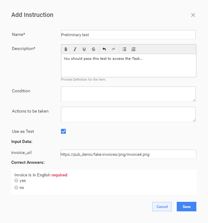
Fill in Input Data and Correct Answers.
- Input Data - field names are parsed from Input file Data.
- Correct Answer - field names are parsed from Answer Codes.
Click Save.
tip
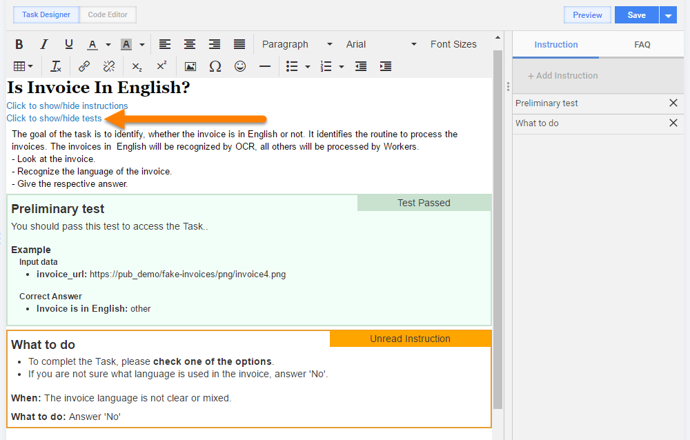
To show/hide Instruction or Tests, click the appropriate link shown below.
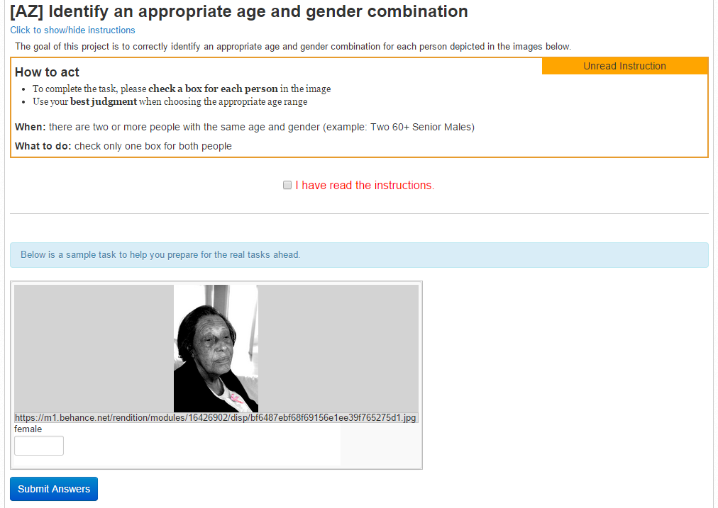
Workers need to tick the I have read the instructions checkbox to work on the task.
When a Task contains Instructions as Test, Workers see the test question. If Workers answer the question incorrectly, an error message is displayed.
When the Worker's answer is correct, the Worker can access The Task and a Test Passed instruction is displayed.
Questions
Questions section can contain question text together with Data Elements.
Data Elements are taken from column names of the Data File. If the column headers do not match the variables within the Task design, a warning message is displayed alerting you which column names need to be remapped. See the Upload Data topic for details.
Data Elements have the following template: ${question.data['data_element_name']}
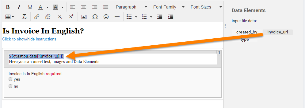
In the Question section, you can perform the following actions:
- type Rich Text
- type Data Elements
- delete Data Elements
In the Side Panel, you can only insert Data Elements at the current cursor position.
caution
Do not type or paste Data Elements into Title or Instructions sections - the Preview will not be accessible.
Answers
To add an Answer, complete the following actions.
- On the Design Task tab, click inside the Answer section. On the Side Panel, you will see Answers list.
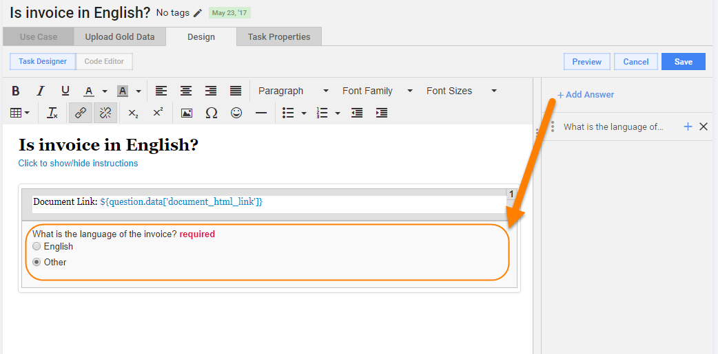
- Click the Add Answer button. The Add Answer window will pop up as shown below.
- Fill the Answer fields and click the Save button.
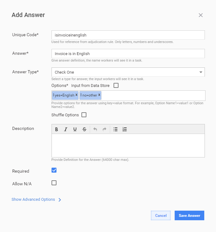
When the Answer is saved, you can preview it and edit if needed.
Answer input fields
- Code - this field provides a reference point to be used by associated Adjudication Rules. It is also used as the header for the Output Data file generated at thу completion of the campaign. Enter a unique text string (only letters, numbers, and underscores).
- Answer - this field is a label above the Answer field. Workers see it as a definition of an Answer.
- Answer Type - a drop-down menu for selecting UI data input control. See the Answer Types topic for detailed information on the design and logic of each control.
- Options - options for multi-variant answers in key=value format. (Option_Name1=Value1). You can use dynamic expressions in options. To enter a new option, click Enter or TAB. You can also reorder the option items by dragging them, or delete them. Options can also contain different information depending on the Answer Type:
- for Long Text - number of rows
- for Masked Text - ability to define the mask for answer
- for Map - enable/disable street view, etc.
- Shuffle Options - tick this checkbox to shuffle the order in which the options are presented to Workers.
- Input form Data Store - tick this checkbox to import Answer options from a Data Store.
- Description - this field allows you to describe in detail what's required by your Worker and is displayed underneath the Answer field. It supports Dynamic HTML and HTML snippets.
- Required - setting this option engages automatic validation checks ensuring that the Worker can not submit the task without providing the Answer.
- Allow n/a - select this checkbox to add an additional alternative answer option like "I do not know". CSS Rules - To customize the Answer look and feel, enter a name for your custom CSS class. After saving the Answer, switch to the Code Editor and add your CSS code for this class in the <style> section. For Sub Answers, this field should contain expand:on(Parent_Answer_Option_Value).
- Default Value - this value is inserted by default and can be modified by Workers. Default value can be taken from Input Data file by using the following expression format: ${question.data.column_name}
- Do Not Use in Adjudication (SA) - tick this checkbox to omit the Answer from being considered when calculating adjudication (majority determination). This option is useful when the answer is being used for comments or similar free form type answers.
note
You can add multiple answers or even no Answers at all, if your Task does not require it. To modify the order of Answers, drag them up and down.
To delete an Answer, click the close icon (x) to the right of the respective element.
Dynamic expressions in Answer options
Select One, Select Multi, Check One, and Check Multi answer types support dynamic expressions in options of the following type:
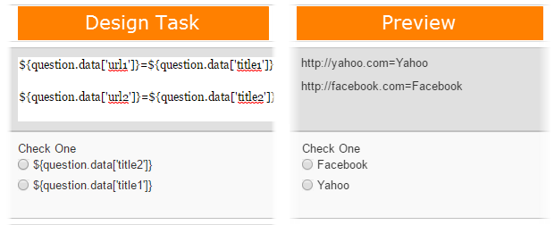
${question.data.A}=${question.data.B}
${question.data.A}=1; 2=${question.data.A}
PREFIX${question.data.A}SUFFIX${question.data.B}=${question.data.C} // PREFIX, SUFFIX - any strings
In the example above, A and B are the column names from input Data file. On Preview and Endpoints these expressions are substituted by values from corresponding columns.
Dynamic expressions are useful in case these answers should have multiple values - no need to enter them manually. For example:
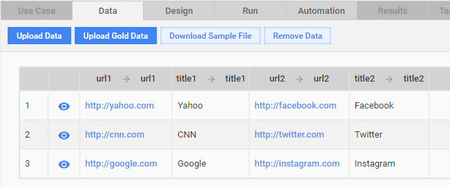
| Input file or Data Store | What Worker sees | What Worker selects | Result |
|---|---|---|---|
| Title: Yahoo, Facebook; URL: http://yahoo.com , http://google.com | Yahoo, Facebook | Yahoo | http://yahoo.com |
To use these columns in Answers, add the following dynamic expressions to the Options.
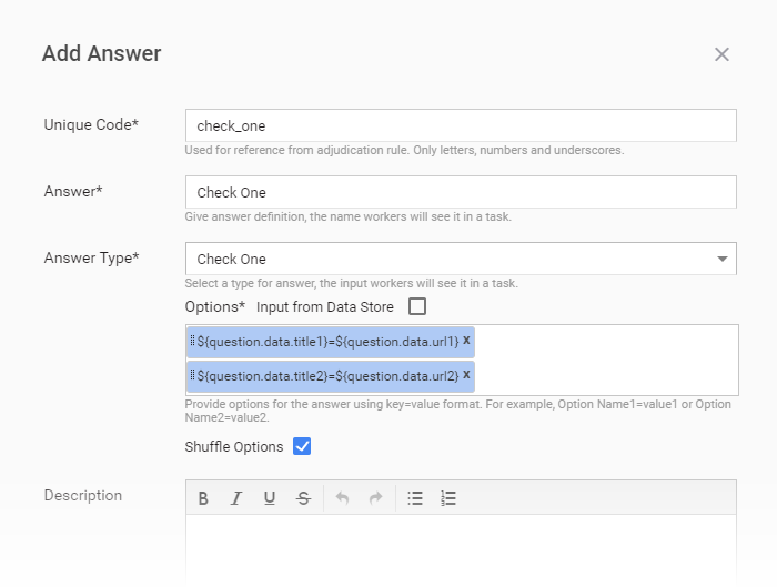
The following figure displays dynamic expressions in Design Task and Preview.
WYSIWYG editor
You can use the WYSIWYG editor (TyniMCE) to format text, insert links, images, tables, lists into Instructions or Question sections.

tip
- Try not to copy and paste formatted text directly from MS Word or other advanced text editors, because these insertions can significantly increase the Task size and slow down its loading. When you want to copy and paste text, do it from simple text editors (NotePad++, Sublime Text) and format it in WorkFusion.
- The Task Design Schema can significantly vary depending on the Use Case selected. Possible variations:
- section order changed
- some sections missing
- new sections created
- styles changed
- See a detailed editor description here.
To insert images, do as follows.
- Place the cursor where you want the image to go.
- Click the Insert/Edit Image. An Image dialog appears.
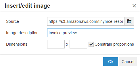
- To choose an image location, you can use one of the following options:
- Paste a link to your image into the Image URL field. Example: https://yourserver.domain/images/your_image.jpeg
- If your input file contains a column with image URLs, enter the appropriate Data Element into the Image URL field. Example: ${question.data['img_url']}
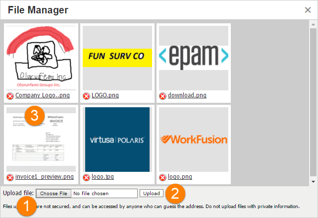
- To upload an image file from your local PC, click the search folder icon to the right of the Image URL field. Click the Choose File button and then the Upload button. Finally, select the uploaded image from the gallery.
- After uploading image or entering the image URL, you can edit the image formatting on the Appearance tab.

Code editor
By default, the WYSIWYG editor is presented in Task Designer Mode which allows you to easily format all aspects of your question including links and images. Switching to the Code Editor mode allows you to edit the underlying source code (Javascript, HTML, CSS, and FreeMarker) used in rendering the information.
Preview
Once input data has been uploaded, you can preview how it will appear to workers via clicking the Preview button in the top right corner.
See an example of Task Preview below:
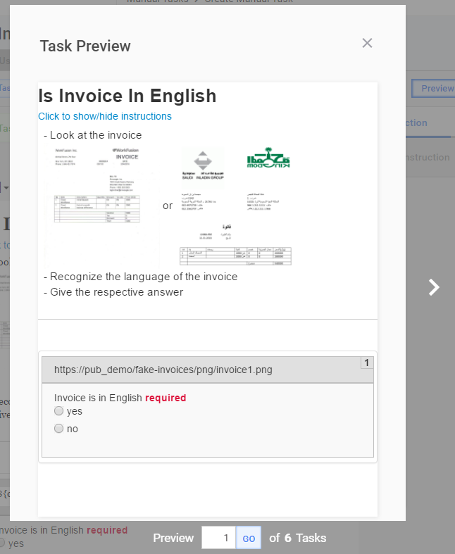
To switch among Previews for different Task Records, use side arrow buttons or bottom navigation control.
Save
Note that a Task is not created until the first saving. When the Task Design is finished, click the Save button.
While designing a new Task - SAVE after each new element is added - Tasks are NOT saved automatically.
To make the current Task reusable, you can create a Use Case out of this Task by clicking the Save as Use Case button.
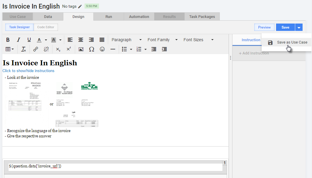
When you are finished with the Task design, click the Next button in the bottom right corner or select the Run Task tab.
Set up options
On the Run Task tab, you can:
- view Task summary details
- edit Task Tags
- perform Task Actions
- call the Advanced Options
- run the Task
note
You should always test your Tasks or Business Processes to ensure that the instructions make sense and that everything is configured correctly.
Edit tags
You can optionally add Task Tags to categorize it and make it easier for Business Users to find.

Edit task settings
In the Task Settings block, you can edit the Block Size and Task Priority fields.
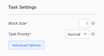
Block Size is the number of Records a Worker will get in each Task. Default value = 1. If the Block Size = 3, a Worker should complete 3 Records to get paid for one Task.
Task Priority is used to specify the Task ranking in search results of target Endpoints. Tasks with High priority will be displayed at the top.
note
For example, you have 2 similar Tasks with different input Data files. And you want Workers to complete the 2nd Task primarily. For this purpose, set the Priority = Max for the 2nd Task.
When a Worker finds this type of Task and clicks the View link, the Worker will see the Tasks with the highest priority on top.