
Form Builder
Form Builder is used to design Digital Worker configuration windows. To access it, go to <Control Tower URL>/task-designer/general-app/builder.
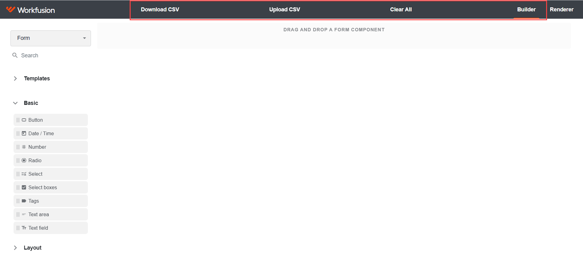
The available options in Form Builder's top menu are as follows:
Download CSV: export a JSON form schema as a CSV file that you can use later.
Upload CSV: import an existing JSON form schema as a CSV file. When the file is imported, you can proceed with its editing in the Builder mode.
Clear All: remove all form components and clear the JSON schema.
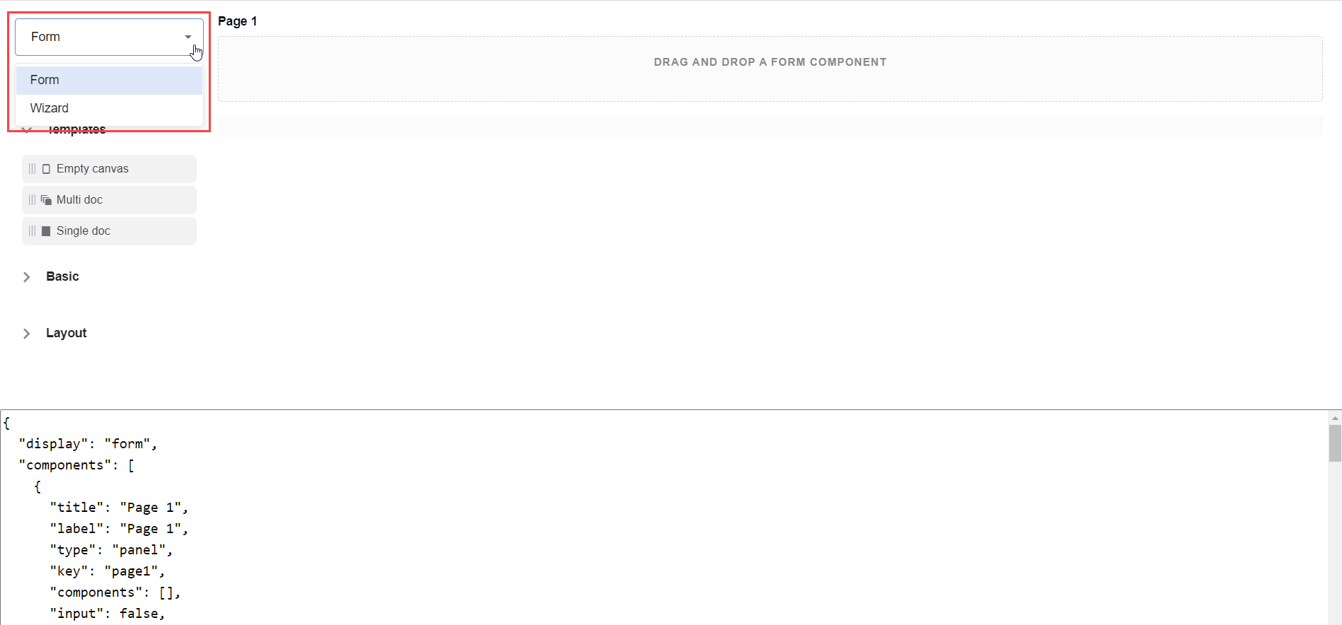
Form Builder generates two types of layouts: Form and Wizard. Select a layout type in the upper left corner.
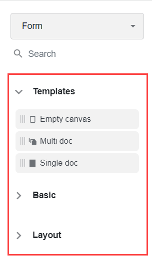
Form components determine how form objects will look like. There are three groups of components available on the left pane:
Once you finish configuring your form, you can test the changes. To do that, select Renderer in the top right corner. The entire configuration form with its modifications is rendered.
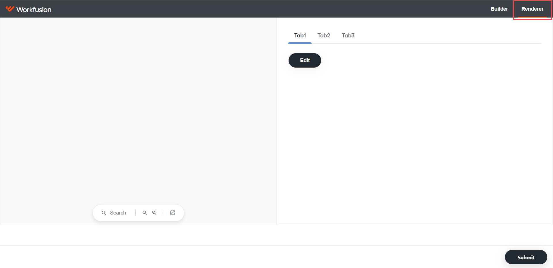
- To save the form, click Submit.
- To continue editing, return to the Builder mode by clicking Builder.
Add component
To add a form component to a form, perform the following steps:
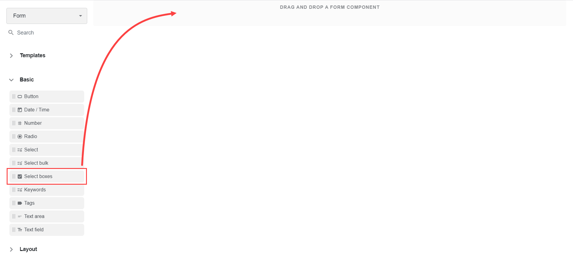
Select a form component from the left pane and drag it to the desired location on the main canvas.
Specify the component properties.
important
The typical Display settings for basic and layout components are as follows:
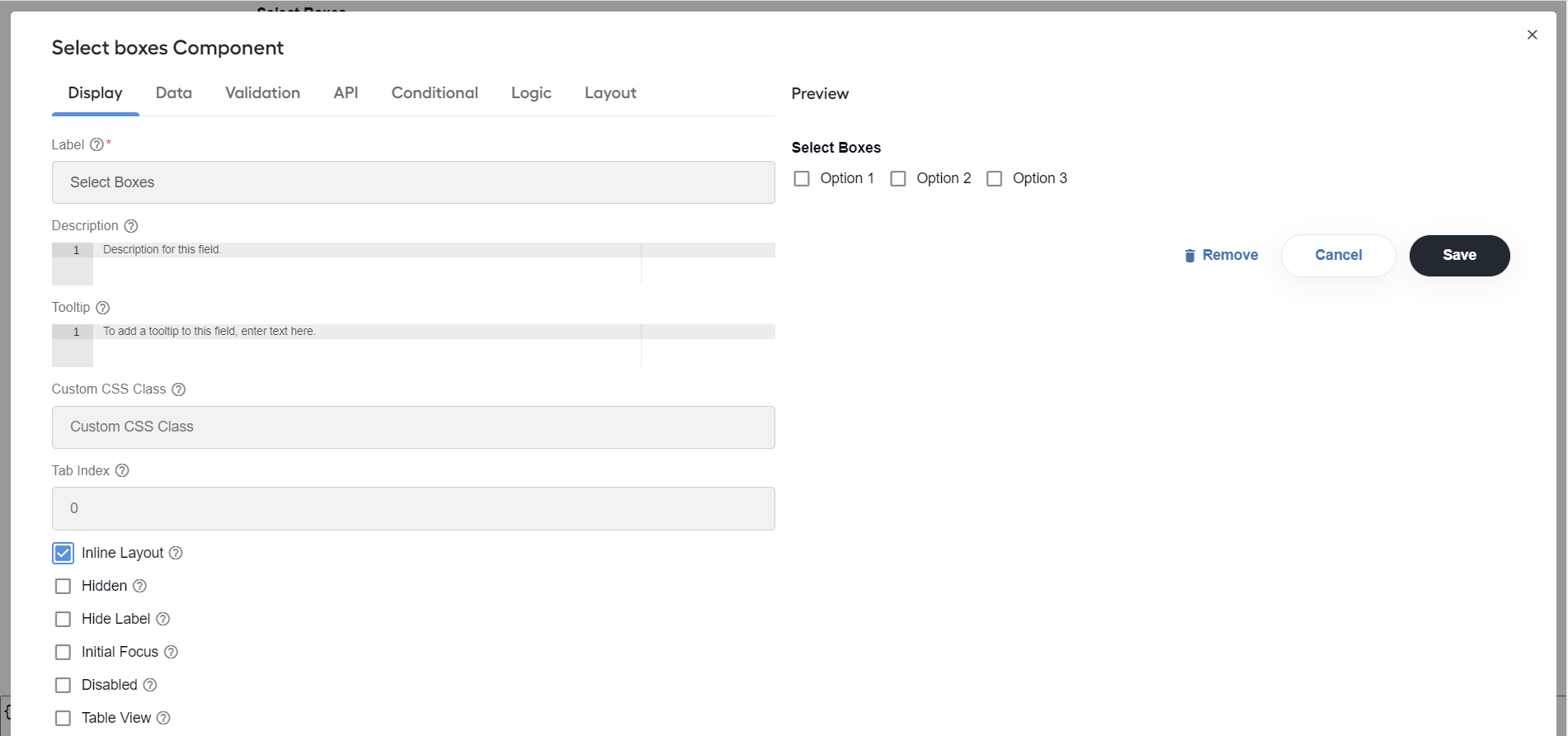
- Label: specify a name or a title for the component.
- Placeholder: specify placeholder text that appears when the field is empty.
- Description: enter text to show below the input field.
- Tooltip: add a tooltip to show to the side of the field.
- Prefix: enter text to show before the field, for example,
$for money. - Suffix: enter text to show after the field, for example,
lbsfor weight. - Custom CSS Class: specify a custom CSS class to add to the component. You can add multiple class names separated by a space.
- Tab index: set the
tabindexattribute to override the form's tab order. - Hidden: set to hide the field when rendering the form view.
- Hide Label: hide the component label or title. The setting displays the label in Form Builder but hides it when the form is rendered.
- Hide Input: hide input in the browser. Do not use the setting for passwords.
- Initial Focus: make the field the initially focused element of the form when rendered. If more than one component in the form has the Initial Focus setting checked, only the last component in the JSON structure with the setting enabled is focused in the form.
- Allow Spellcheck: enable spellcheck in the field.
- Disabled: disable the form input.
- Table view: select to display the value in the table view of the submission list.
- Autocomplete: indicate if input elements can have their values automatically completed by the browser.
- Modal Edit: select to open up a modal to edit the component value.
The typical Data settings for basic and layout components are as follows:
- Multiple Values: select to add multiple values in the field. The Add Another button allows to create additional fields for the component.
- Default Value: set the default value for the field before user interaction. The value overrides the Placeholder text.
- Storage Type: select a type to store the data. Available storage types are as follows: Autotype, String, Number, Boolean, Object.
- Protected: select to assign the field for input only.
- Database Index: set the field as an index within the database. It increases performance for submission queries.
- Input Format: force the field output to be sanitized in a specific format: Plain, HTML, Raw (Insecure).
- Redraw On: redraw the component if another component changes. Select the option in case of interpolating the component parts like the label.
- Clear Value When Hidden: select to clear the value when a field is hidden.
- Allow Manual Override of Calculated Value: select to allow to manually override the calculated value.
Specify the API settings if needed:
- Property Name: by default, generated by the Title field.
- Field Tags: tag the field for use in custom logic.
- Custom Properties: set any custom properties for the component. Specify Key and Value for each property.
Configure viewing conditions on the Conditional tab. The conditional logic is based on the following rules:
- You can hide or display any form component.
- The component visibility depends on another component defined within the form.
- The logic is activated when the configured field contains the plaintext value defined in the settings.
There are two kinds of logic to configure:
- Simple: set the Display value to
trueorfalse. - Advanced: apply actual JavaScript for any combination of conditions, for example, for components within Multi doc, Data grid, or Edit grid that can be dynamically created at runtime. Set the Show value to
trueto display a component orfalseto hide it.
Apply the Layout settings (in addition to layout components) to configure the arrangement of components for rendering in PDF. Specify a margin amount in the Left, Top, Width, or Height fields. For proper rendering, specify a valid CSS measurement input, for example,
10px.
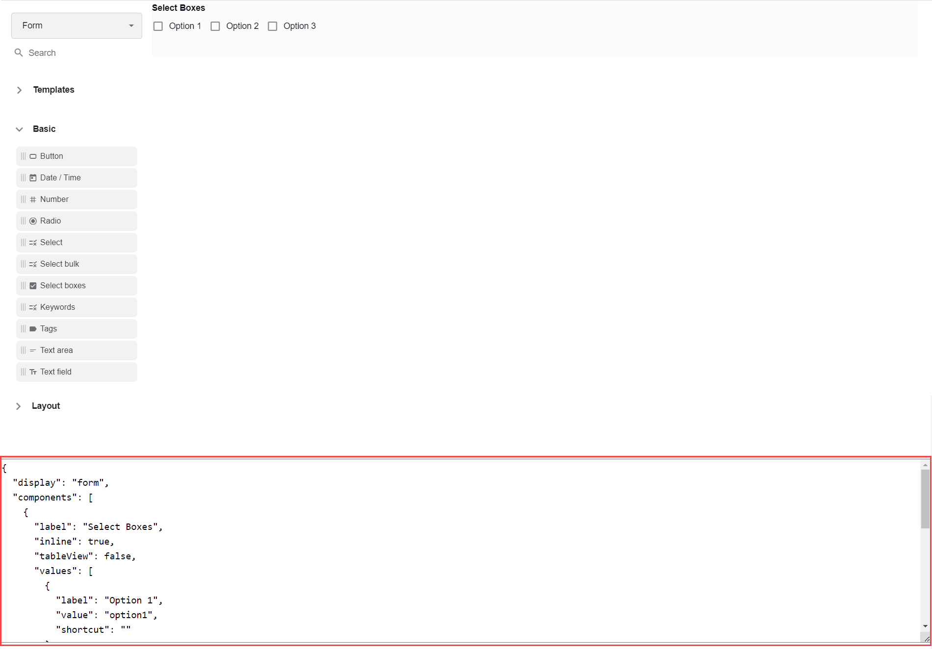
Click Save. A result of the operations above is also generated as a JSON schema representation of the form, which is available at the bottom part of the screen.
Select template
Templates are used to contain other form components to build complex configuration windows, for example, for processing Manual Tasks. Choose a template according to your needs.
Empty canvas
Expand to learn more
Select the Empty state template if you don't need to work with any documents in your configuration window.
Specify the name of a component in the Label field. Here, you can type in any value, as it will not be used anywhere. Though, the value is required.
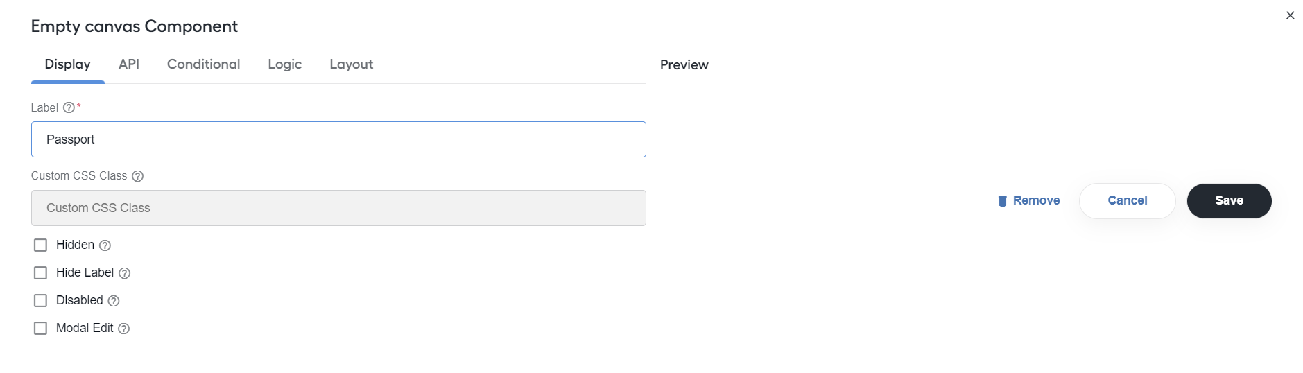
To continue building a layout, drag needed components from the Basic or Layout menus on the left to the Empty canvas drop area and set as appropriate.
Multi doc
Expand to learn more
Apply the Multi doc template when you build a configuration window for processing multiple documents in a single Manual Task.
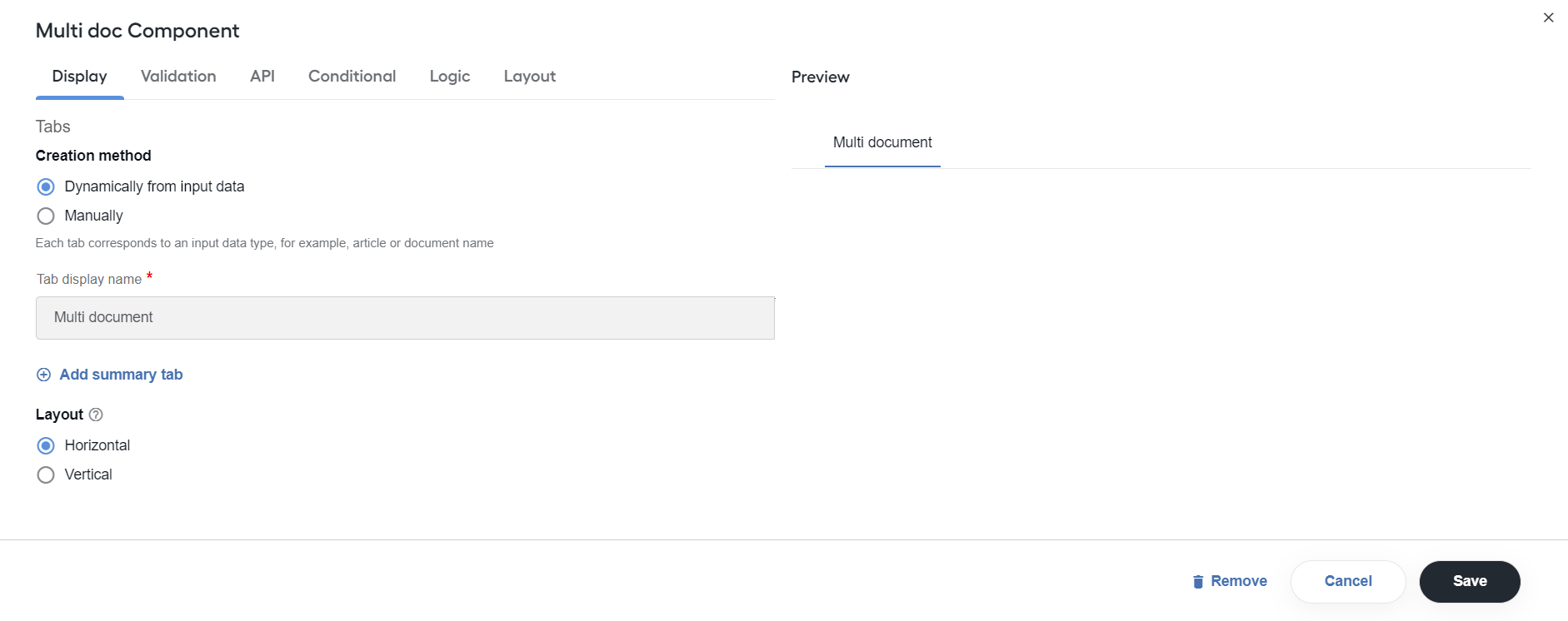
Configure the following settings:
Creation method: choose the creation method for selecting dynamic or manual tabs.
Dynamically from input data (default): retrieve data from an uploaded document dynamically based on the key specified in the Tab display name field, for example,
{{item.doc_name}}, wheredoc_nameis the key for the document name.With a single Tab display name field, any number of documents is loaded dynamically.
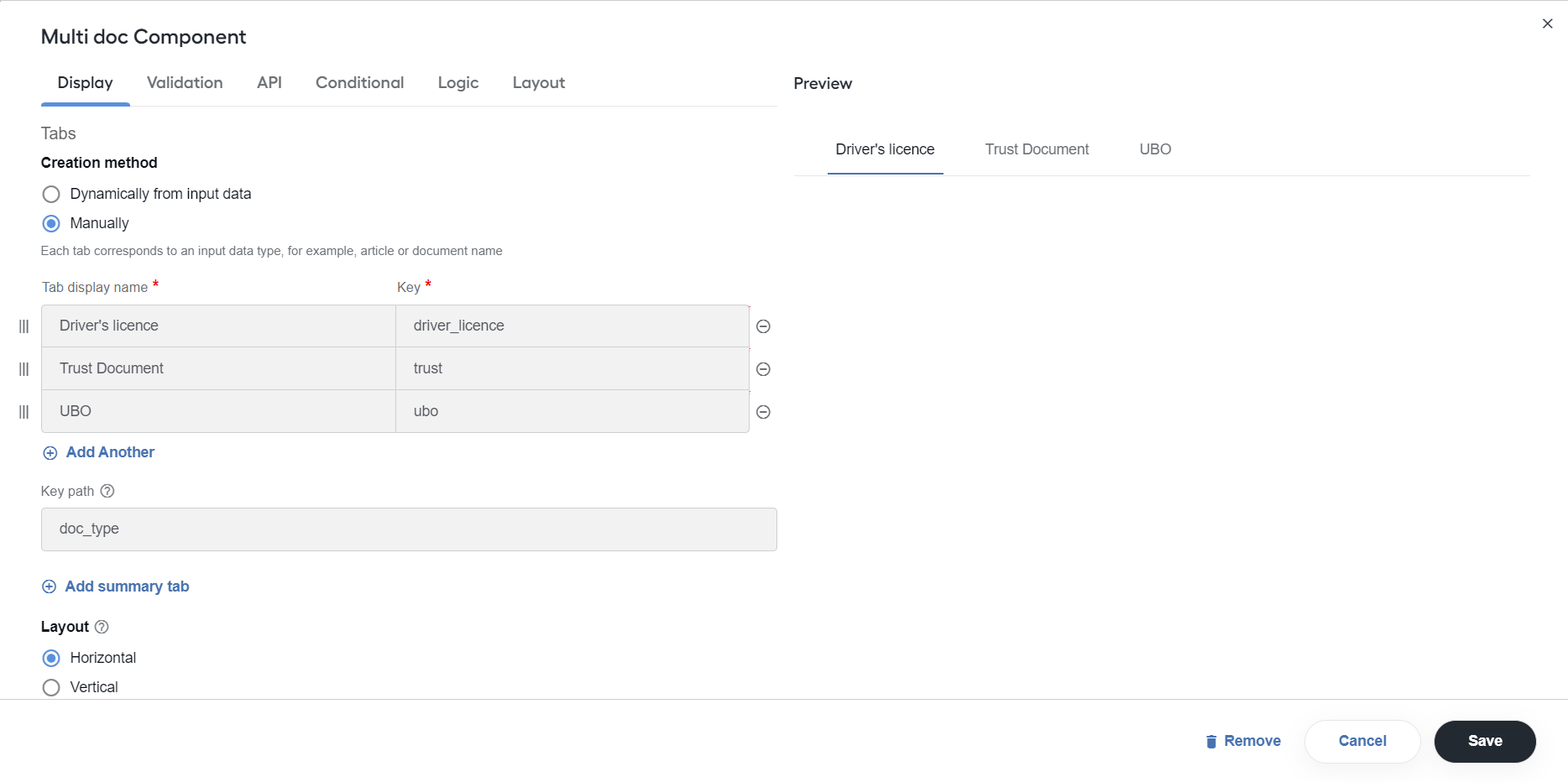
Manually: specify configuration per each tab, for example, a different layout per tab and different set of fields.
In the Tab display name section, add any number of documents together with keys using the Add Another button.
In the Key path field, provide the path in the document to search for the key.
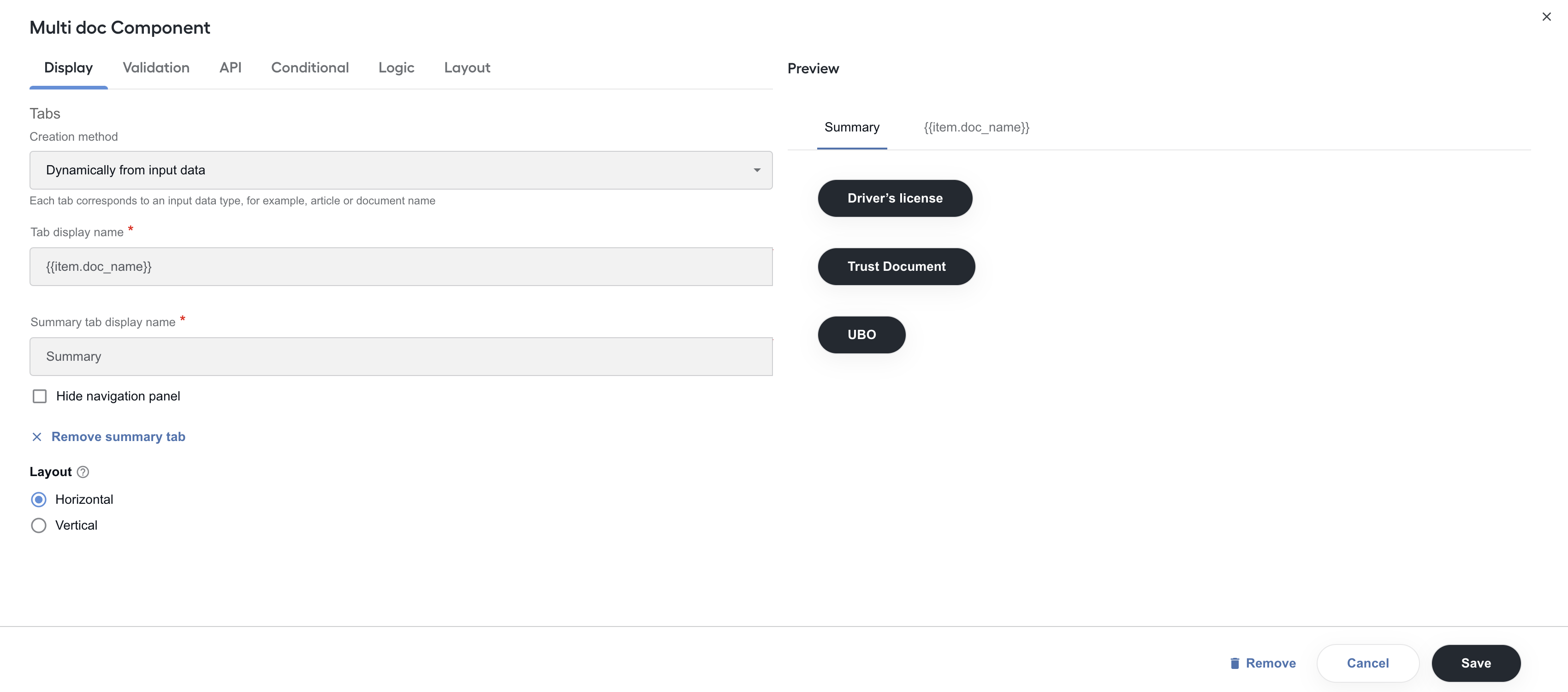
Add summary tab: select to add the Summary tab that will appear as the first tab in the list of tabs when cumulative details from other tabs can be provided.
In the Summary tab display name, enter a name for the tab.
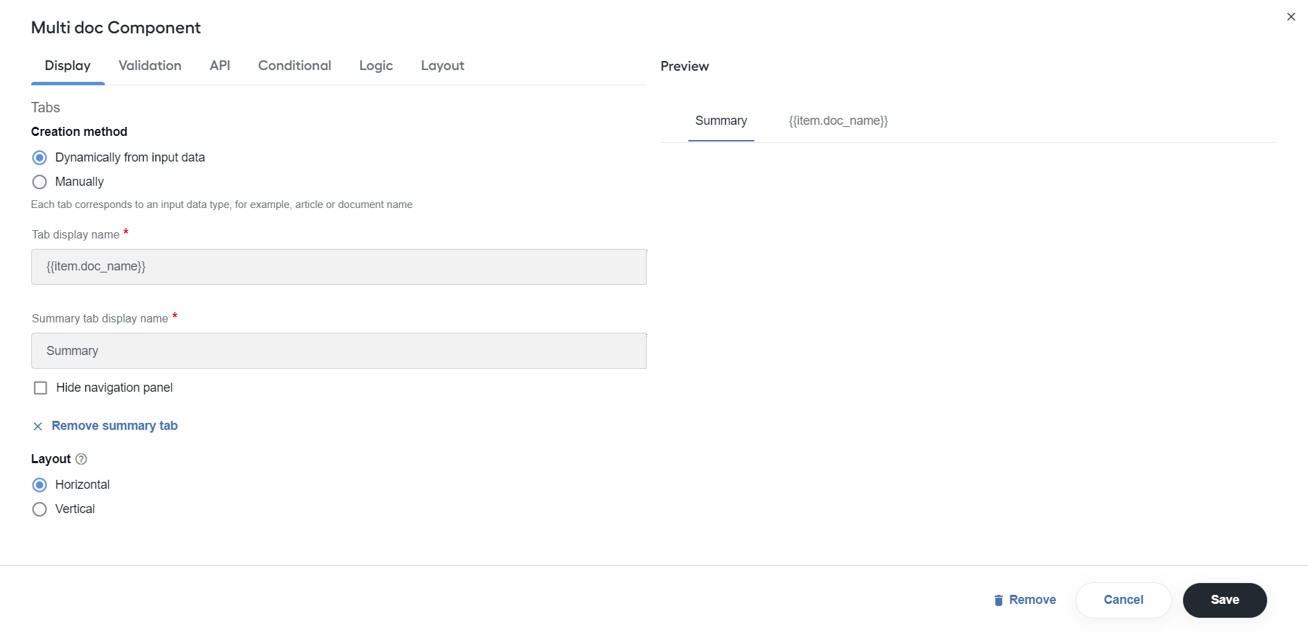
Select the Hide navigation panel checkbox to hide navigation for the summary tab.
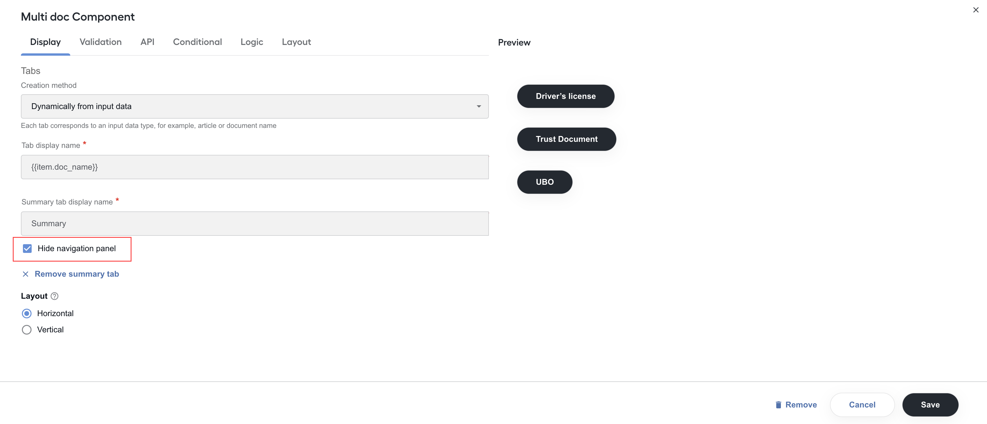
You can hide the navigation panel, for example, when applying the drill-down or panel list grid functionality in the Summary tab inside Multi doc.
Layout: select Horizontal or Vertical to set how the tabs will be arranged relative to each other when rendered. For the Vertical view type, you can also set the tabs to be grouped by document types. For that, click Group tabs and specify the
doc_typegrouping key.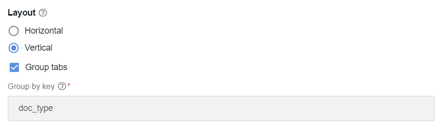
Property Name: specify the value to match the transaction data column name in the CSV file. Typically, it is
_sys_transaction_json.Data path: provide the path to access documents from an input file.
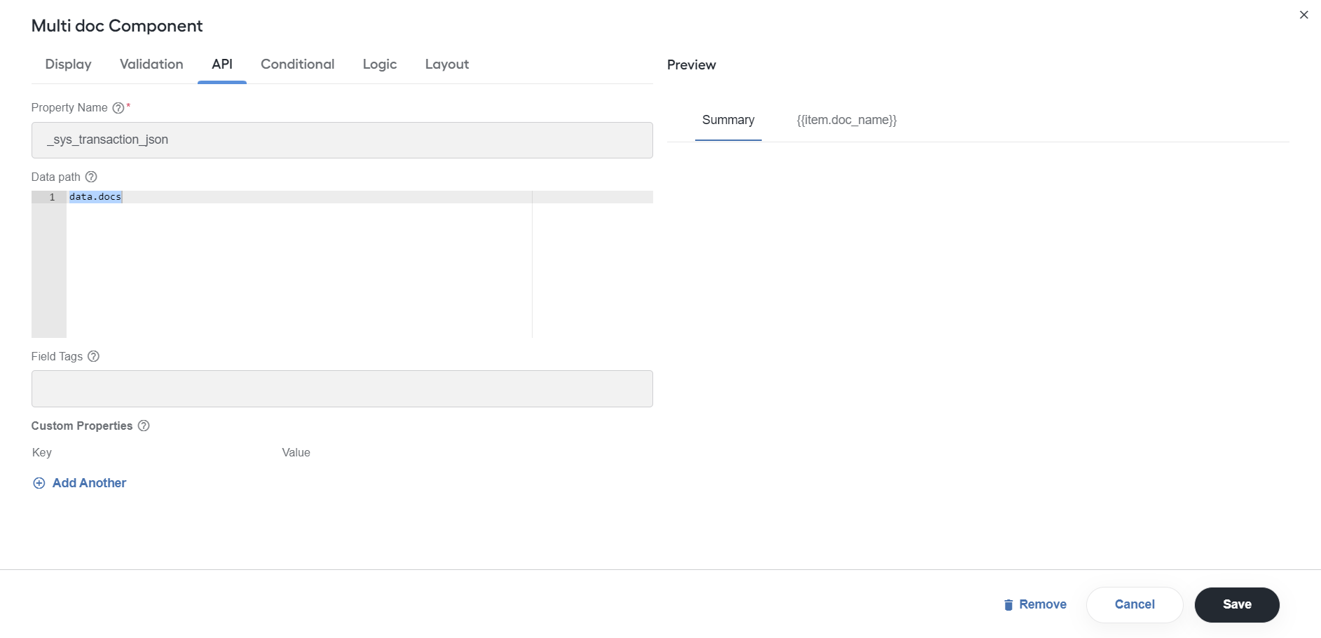
To set up a layout for each document form, drag needed components to the drop area of the appropriate dynamic tab. For more details, see Design Manual Tasks via Task Designer Operation | Multi-document Manual Task.
Single doc
Expand to learn more
Single doc is used for building Manual Tasks configuration forms if you have only one document to process in your Manual Task.
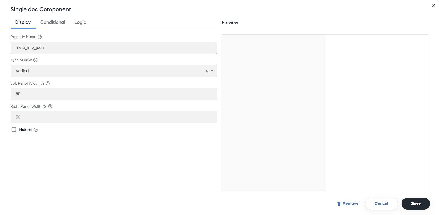
Configure the following settings:
- Property Name: enter the name of a column with the task data from an input CSV file. Typically, it is
meta_info_json. - Type of view: select the markup style. You can choose between Vertical and Horizontal. The Horizontal view is recommended for Excel or large tables.
- Left Panel Width, %: specify the left panel size in %.
- Right Panel Width, %: specify the right panel width in %.
- Hidden: Select the checkbox to hide the component. Hidden components are not displayed but are still part of the form's JSON and data submission. To configure conditional show and hide, go to the Logic tab.
To add fields for tagging values, select components from the Basic or Layout menus on the left, drag them to the drop area on the right, and set as appropriate.
When you add a Basic component into a Single doc template, it has the Allow labelling attribute checked by default so that the component can be used for tagging.
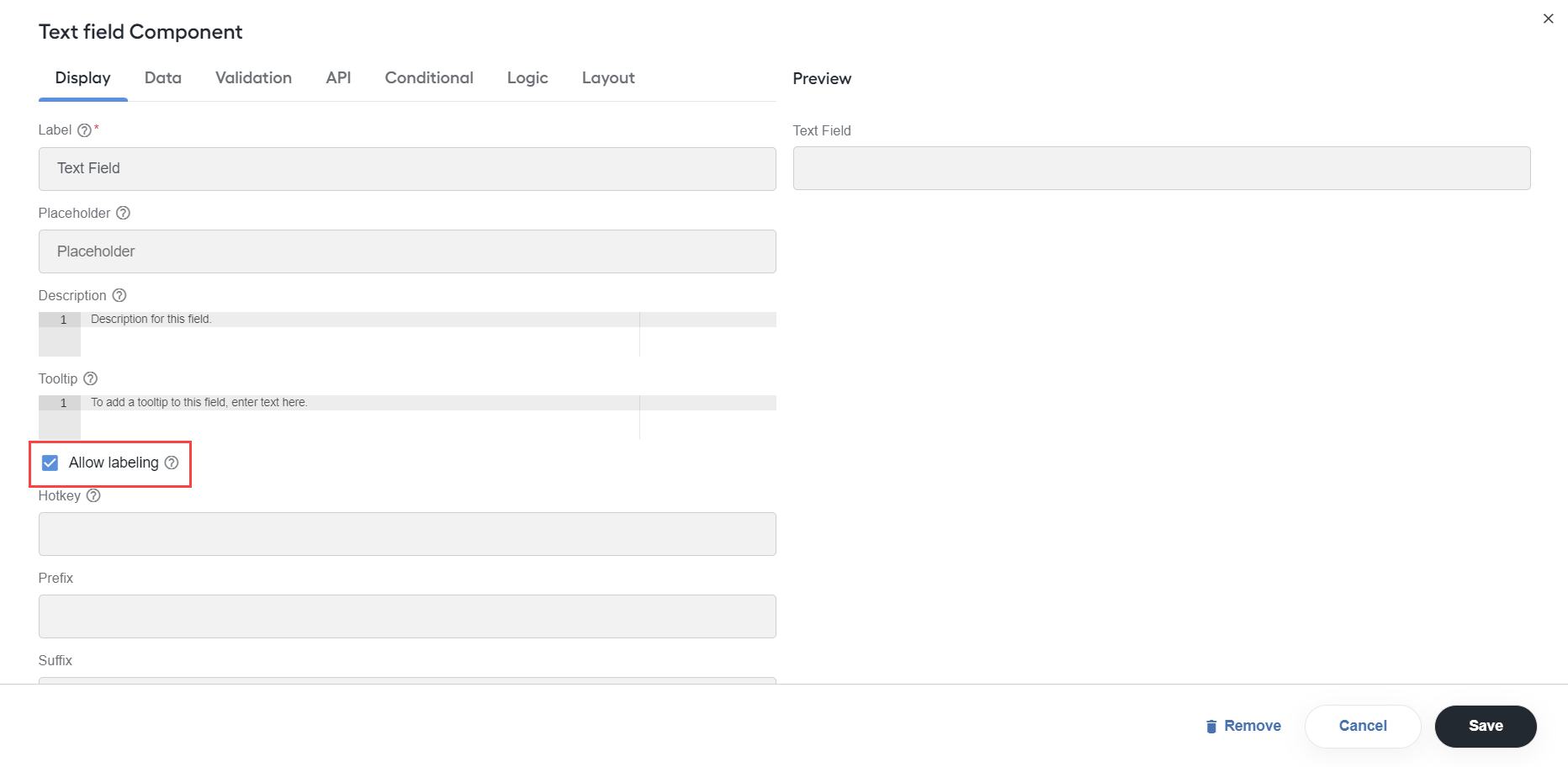
Colored labels are displayed next to components with the enabled Allow labelling option.
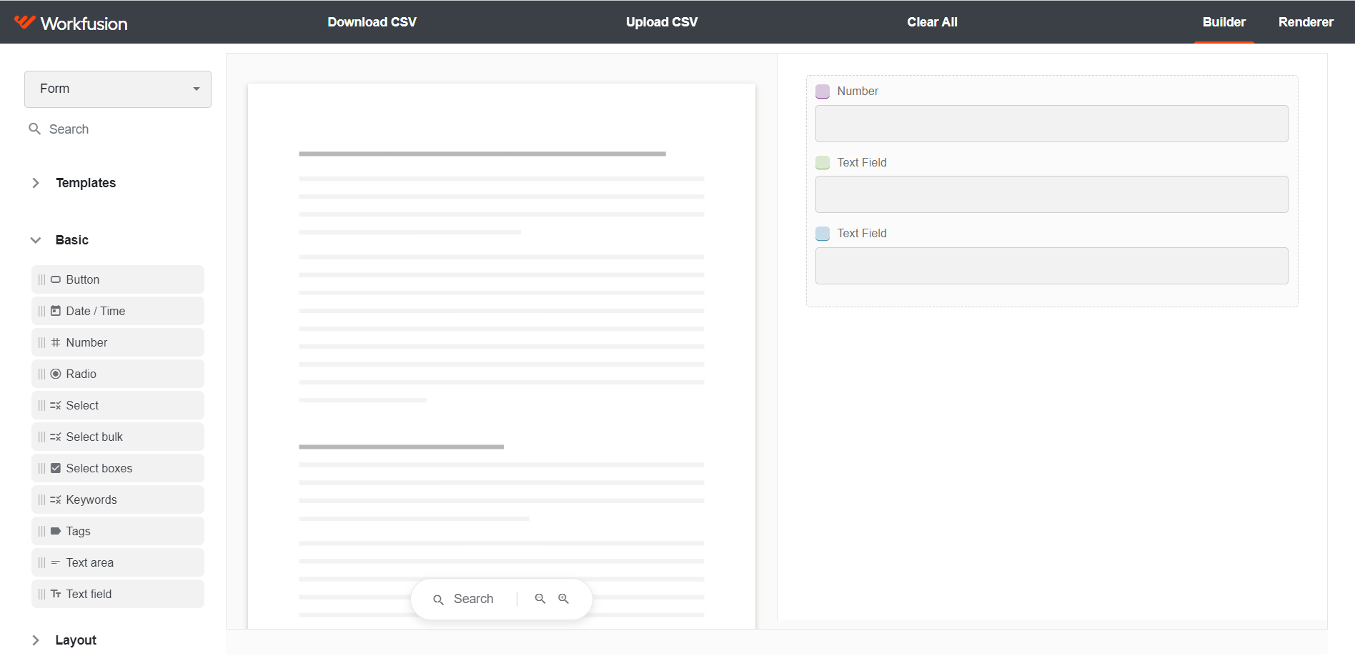
If you uncheck Allow labelling:
Text selected in a document cannot be set as a value to a field. Once you place a cursor inside the field, the text selection is discarded.
The Hotkey field for selecting tagging hotkeys is hidden.
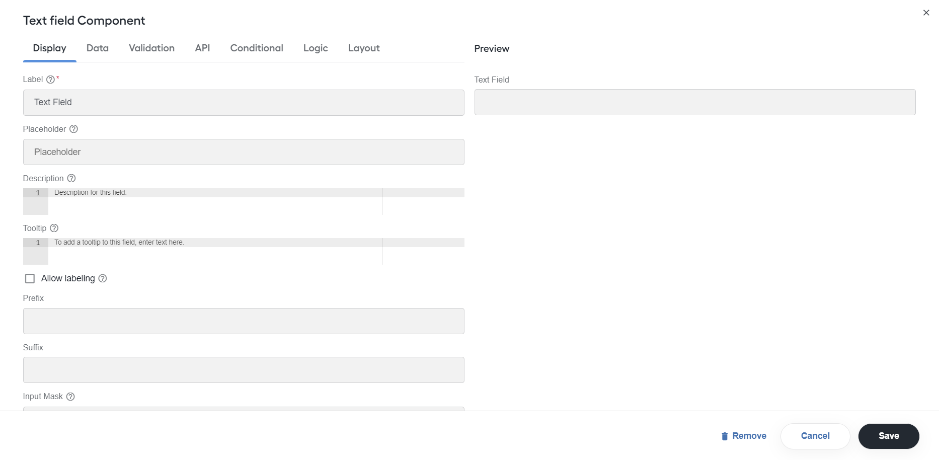
A colored label is not displayed next to the component in Builder and Renderer.
tip
For more details, see Design Manual Tasks via Task Designer Operation | Single-document Manual Task.
Add basic components
A basic form component collects data and displays it within the user interface.
note
For general settings applicable for all basic components, see Add form component. The instructions below allow configuring settings specific to selected basic components.
Button
Expand to learn more
Buttons are added for users to perform various actions in the form.
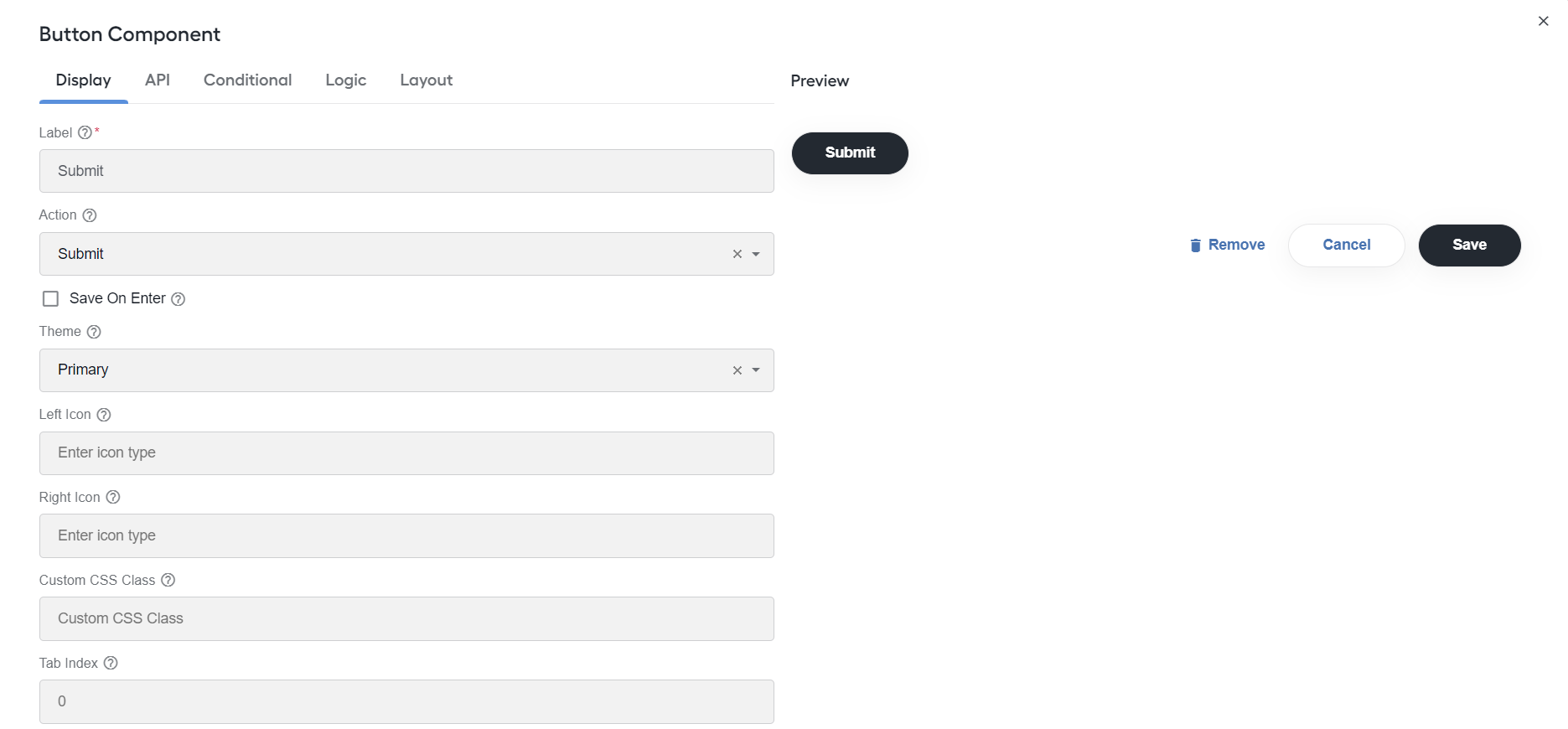
Configure the following settings:
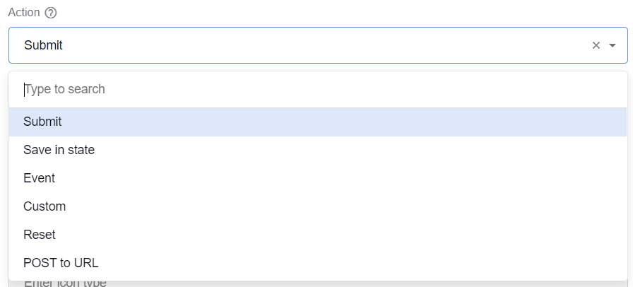
Action: select an action to be performed when a user clicks the button.
Save on Enter: press Enter to submit a form.
Theme: set a theme (color) for the button.
Left Icon: if you have an icon library and want to include an icon to the left of the button label, add the icon class here.
Right Icon: if you have an icon library and want to include an icon to the right of the button label, add the icon class here.
Disable on Form Invalid: select to disable the button if any of the client-side validation fails. The setting is used to prevent submitting a form with invalid data.
Date/Time
Expand to learn more
Use the Date/Time component to input a date, time, or both a date and time.
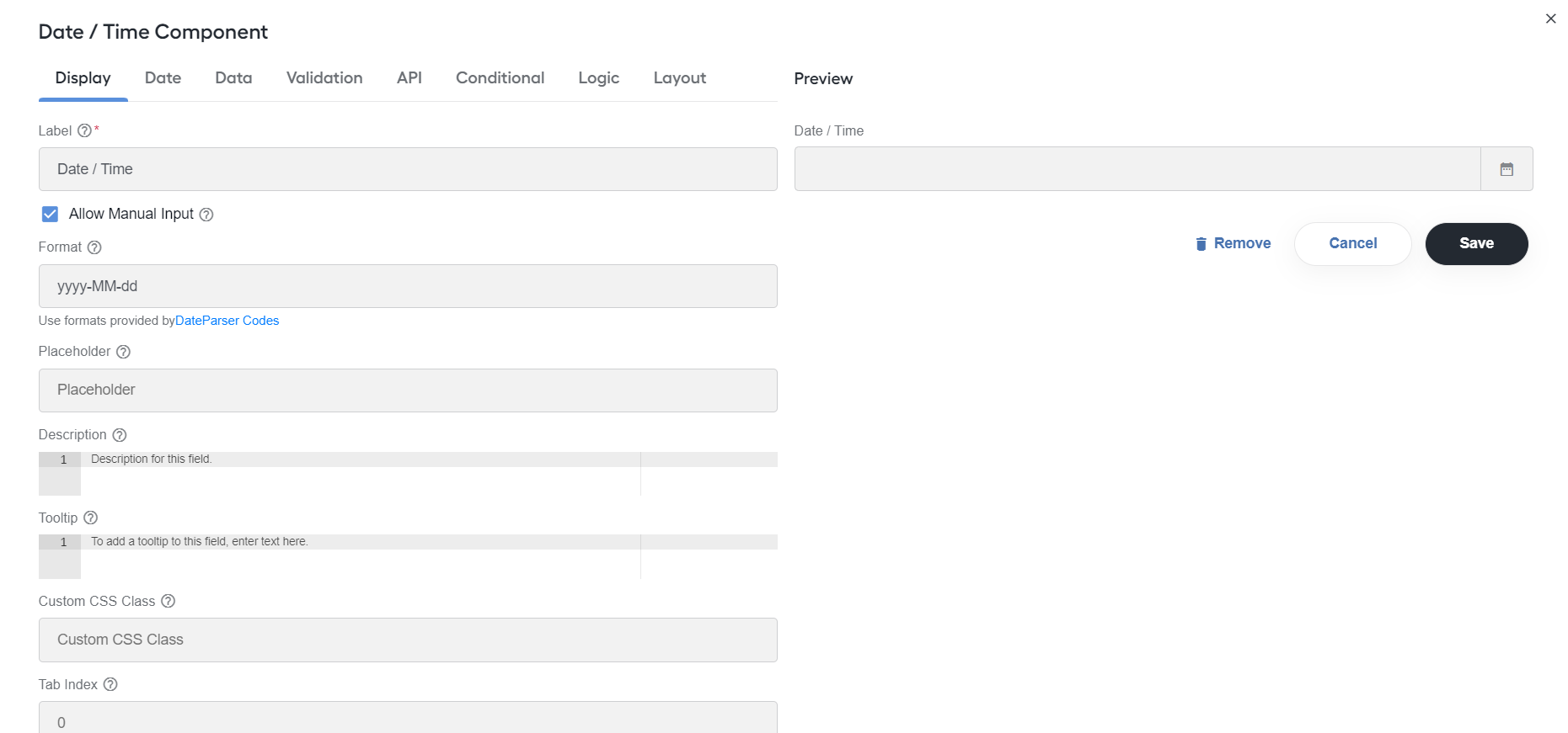
Configure the following settings:
Default value: specify the default value. You can put
new Date();for the current date or use Moment.js functions to set the date to a specific date, for example,moment().add(50, 'days').calendar();. You can use the add or subtract function to go forward or backward in dates.Allow Manual Output: select for a user to manually enter a date.
Format: specify format used to display the field's date.
Shortcut Buttons: specify the buttons to show above the calendar:
- Label: enter the button name.
- onClick: define the date and time to be set when a user clicks the button, for example,
date = new Date().
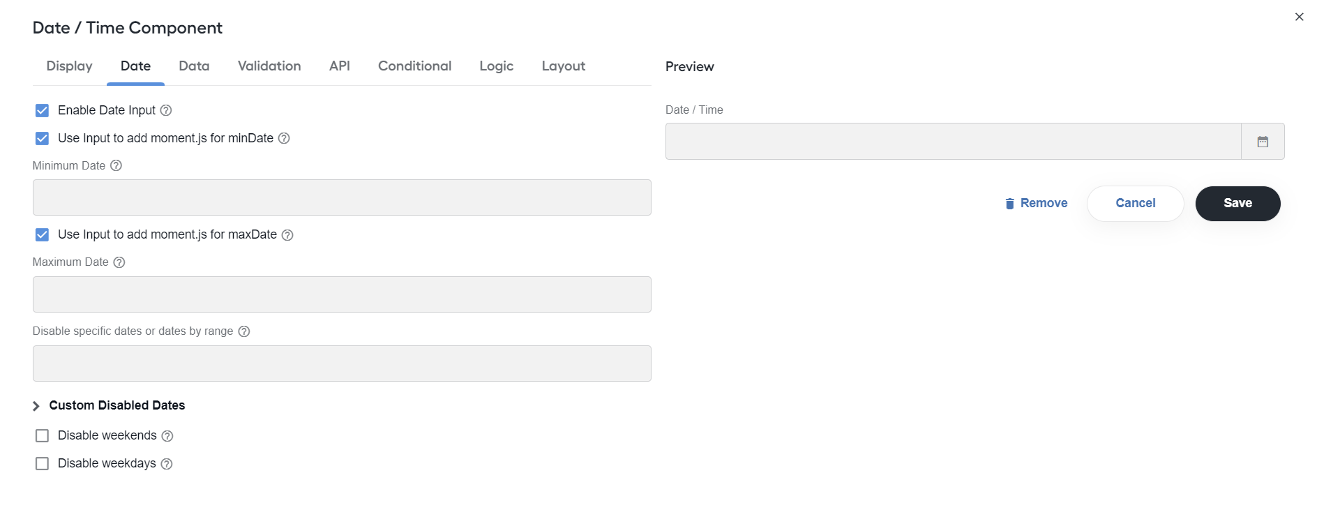
Enable Date Input: select to enter dates for the field.
Use Input to add moment.js for minDate: enable to use input for moment functions instead of the calendar.
Minimum Date: specify a value of the date that the field's value must follow.
Use calendar to set minDate: enable to use the calendar to set the minimum date.
Use Input to add moment.js for maxDate: enable to use input for moment functions instead of the calendar.
- Maximum Date: specify a value of the date that the field's value must proceed.
Use calendar to set maxDate: enable to use the calendar to set the maximum date.
Disable specific dates or dates by range: add dates to a blacklist, for example,
2025-02-21.Custom Disabled Dates: disable dates by a function. For more details, see Disabling dates.
Disable weekends: select to disable weekends.
Disable weekdays: select to disable weekdays.
Number
Expand to learn more
Use the Number component whenever a field should be limited to a type of the number value.
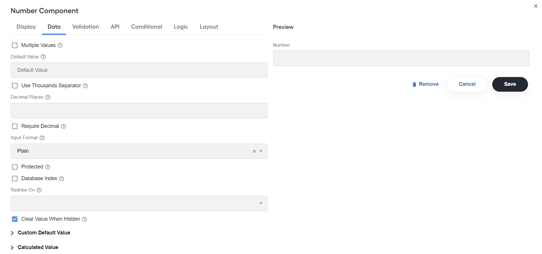
Configure the following settings:
Use Thousands Separator: select for the component value to separate thousands by a local delimiter.
Decimal Places: set the maximum number of decimal places for the values in the field.
Require Decimal: select to always show decimals for the field, even if trailing zeros.
Decimal Symbol: change the default Decimal Symbol for the Number component. This is a hidden setting. To configure it, in the Number component JSON schema, add the following line:
"decimalSymbol": ","After you save the changes, the Number component changes the default decimal to the designated symbol.
Radio
Expand to learn more
The Radio component allows a user to select only one value from the list of options.
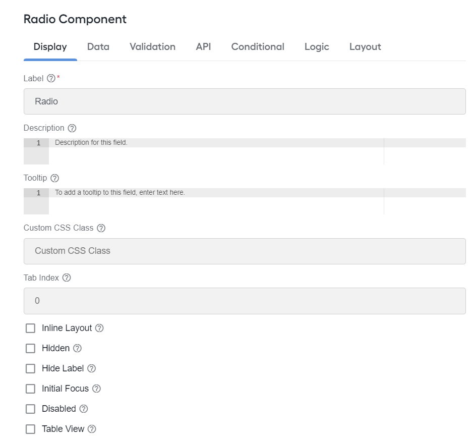
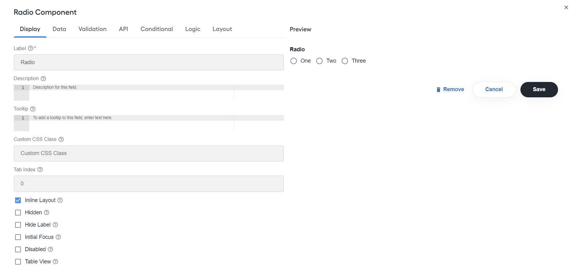
Configure the following settings:
Inline layout: layout radio buttons horizontally instead of vertically.
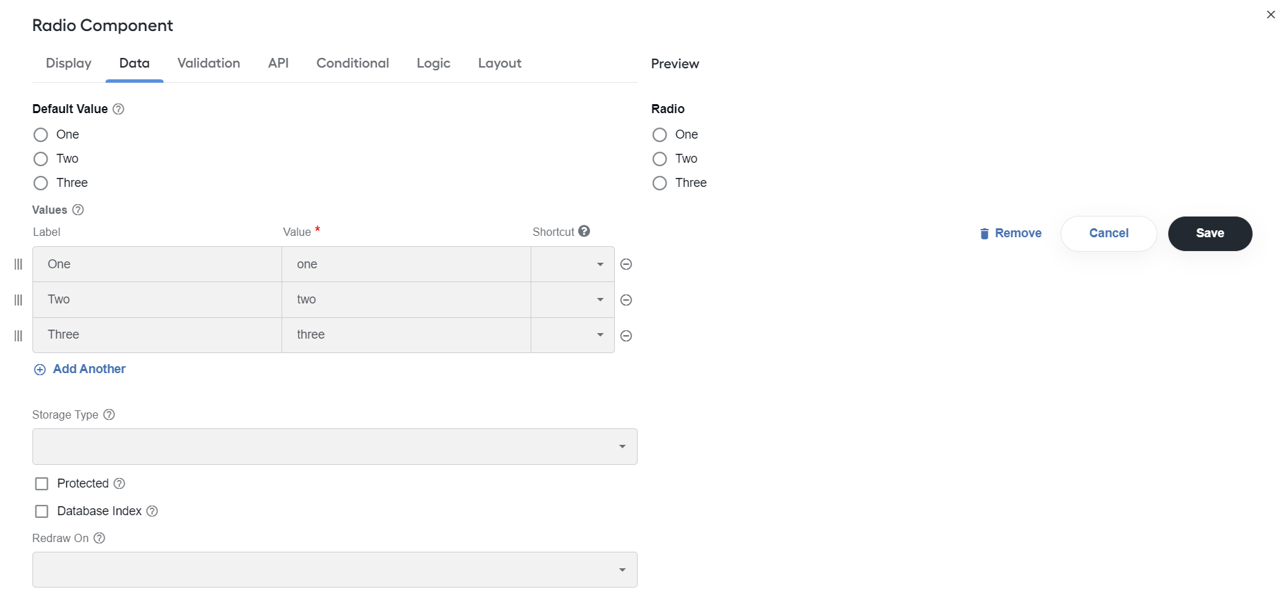
Values: specify values to be selected in the field. For each value, specify Label, Value, and Shortcut.
Select
Expand to learn more
The Select component displays a list of values in the dropdown list to users.
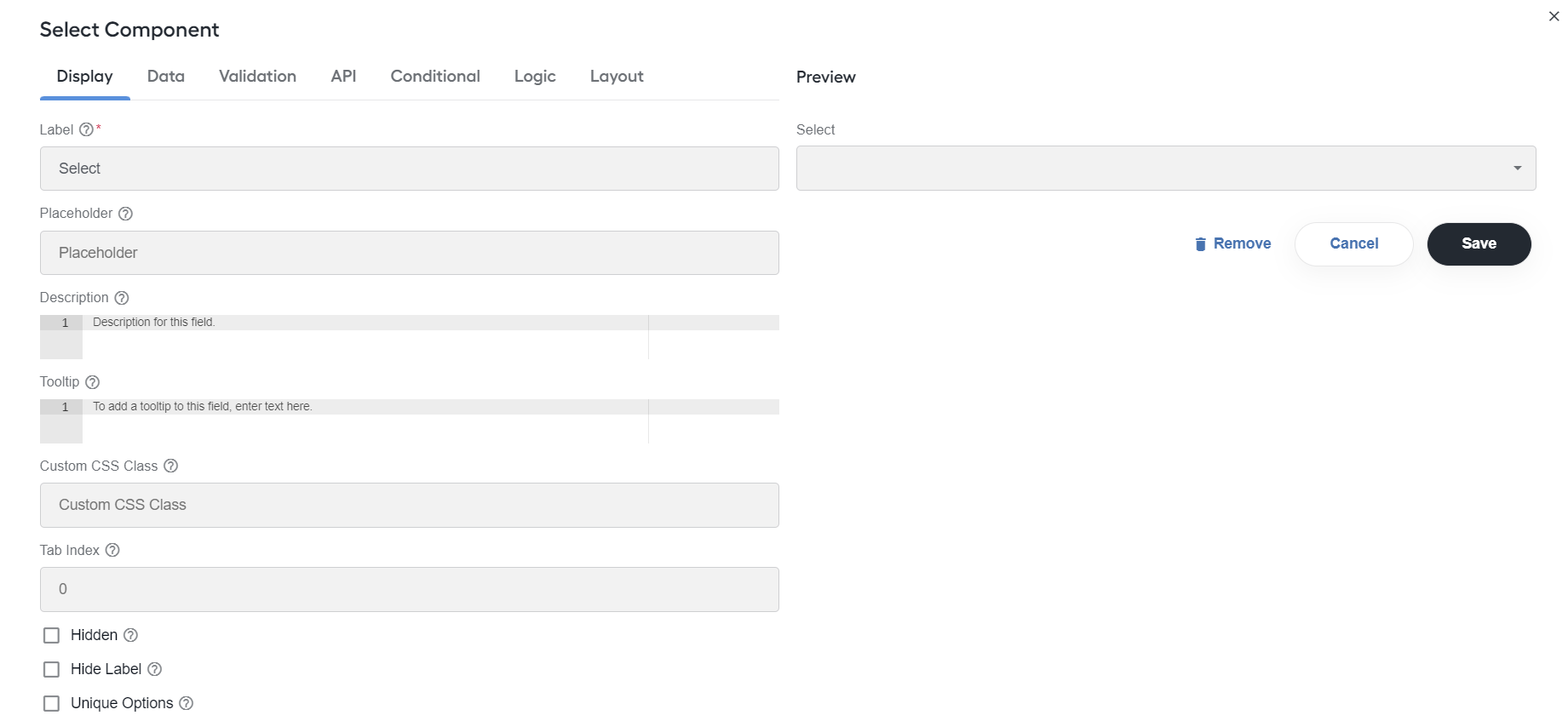
Configure the following settings:
Unique Options: display only unique dropdown options.
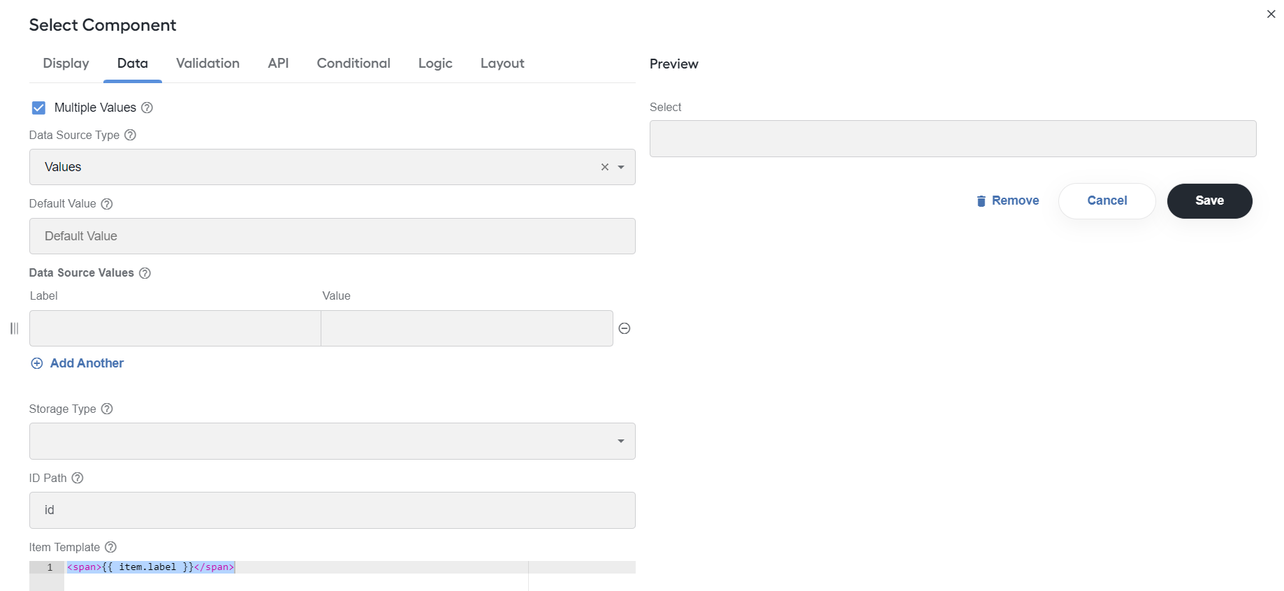
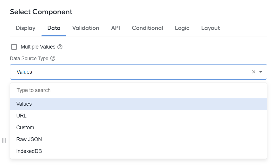
Data Source Type: select the type of data the options are pulled from.
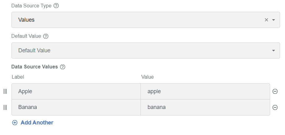
Data Source Values: set values to be selected in the field. The Value column is stored in the database, with its Label shown to users.
ID Path: specify the path to select the ID option.
Refresh Options On: refresh data when another field changes.
Refresh Options On Blur: refresh data when another field is blurred.
Clear Value on Refresh Options: clear the component value when the Refresh On field is changed.
Enable Static Search: select to allow for searching within the static list of items provided.
Search Threshold: specify a threshold when the match algorithm gives up, for example,
0.0requires a perfect match, while1.0matches anything.
Select bulk
Expand to learn more
The Select bulk component is used to add drop-down menus (lists) comprising multiple items with selection boxes. On the menu (list), users can select or deselect more than one box at a time or switch the Select all toggle to choose them all.
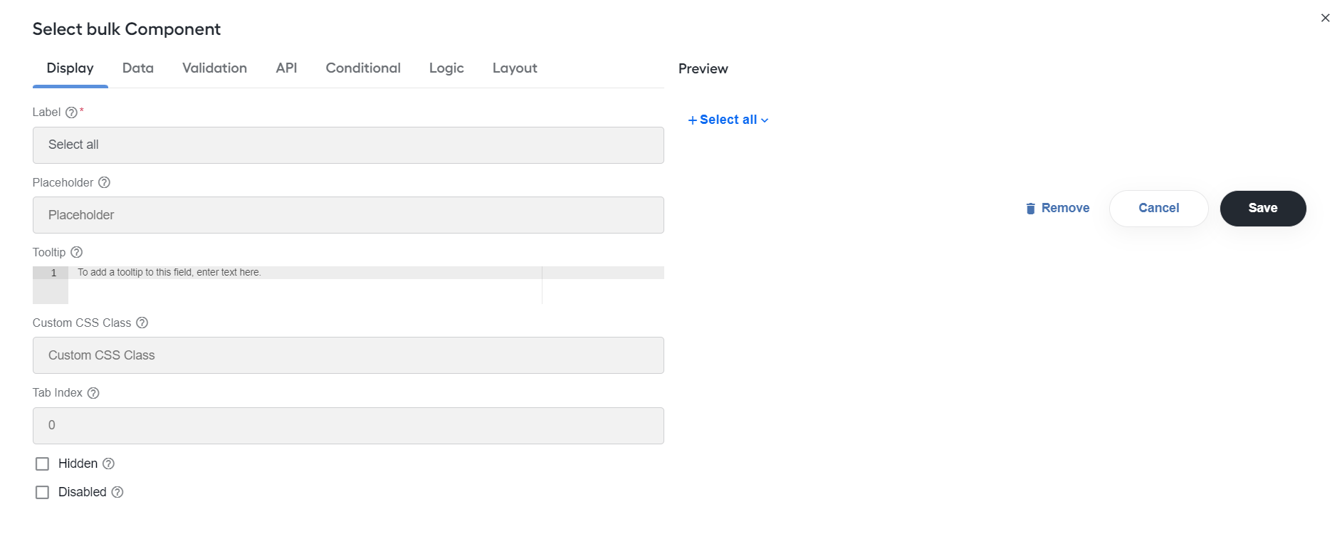
Configure the following settings:
Label: enter a name or a title for the drop-down menu.
Values: specify values to be selected in the drop-down menu. The Value column is stored in the database, with its Label shown to users.
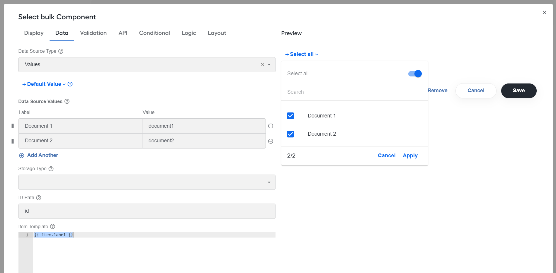
Enable Static Search: select to enable search within the list.
Select boxes
Expand to learn more
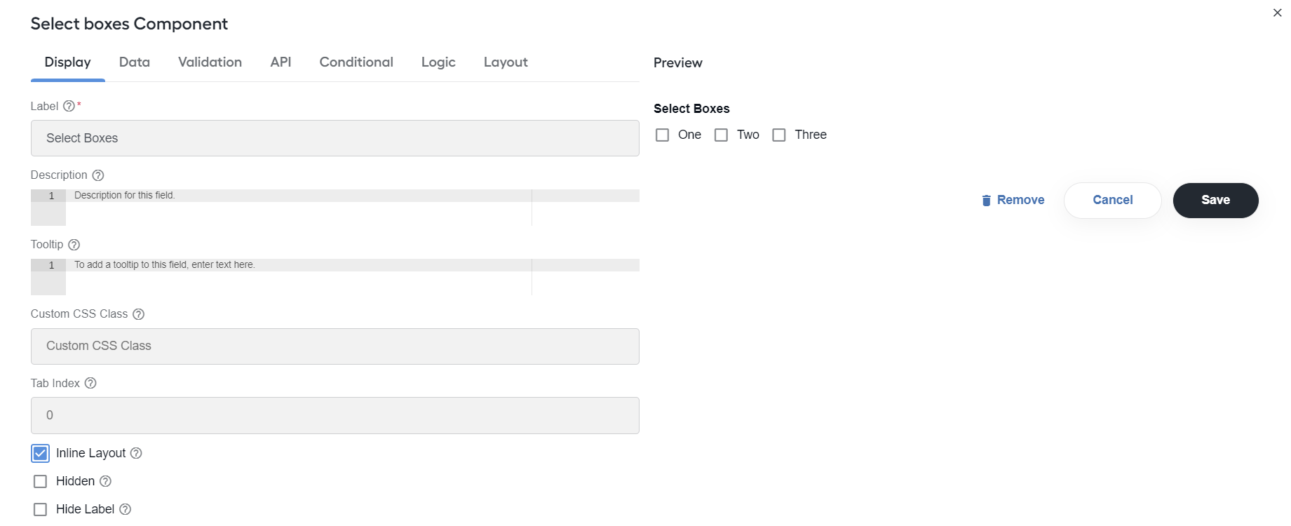
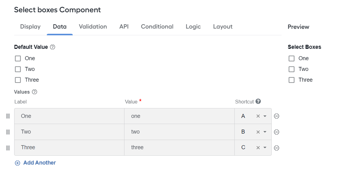
The Select boxes component allows to select multiple values from the list of options.
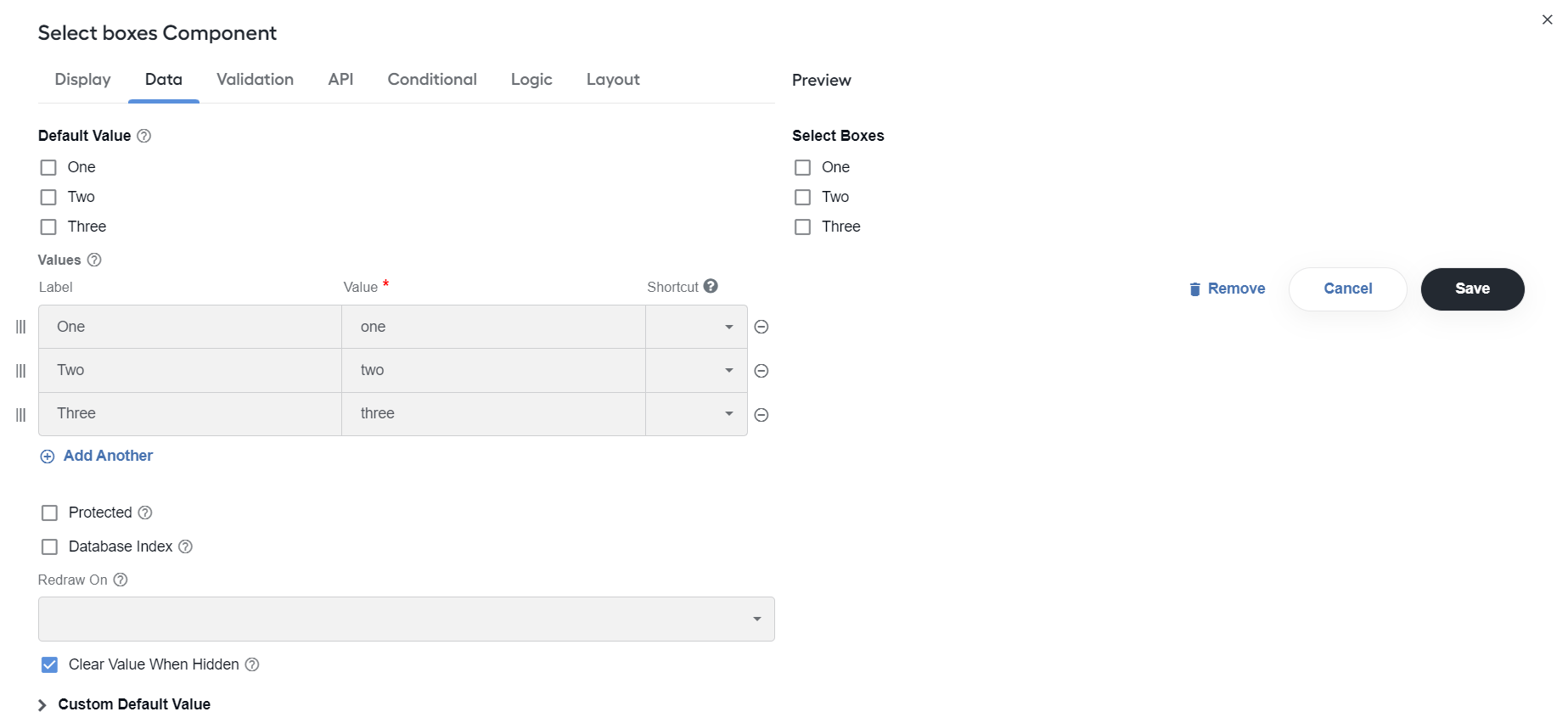
Configure the following settings:
Inline Layout: layout checkboxes horizontally instead of vertically.
Values: specify values to be selected in the field. The Value column is stored in the database, with its Label shown to users.
Keywords
Expand to learn more
You can include a field and an upload button to add or remove individual keywords or custom keyword lists, for example, for screening Digital Worker skills.
In the field, users enter keywords as comma-separated values based on their business needs. If there are too many keywords, they can import a CSV file with a list of values located in rows or columns via the Upload button. The component also features duplicate keyword validation.
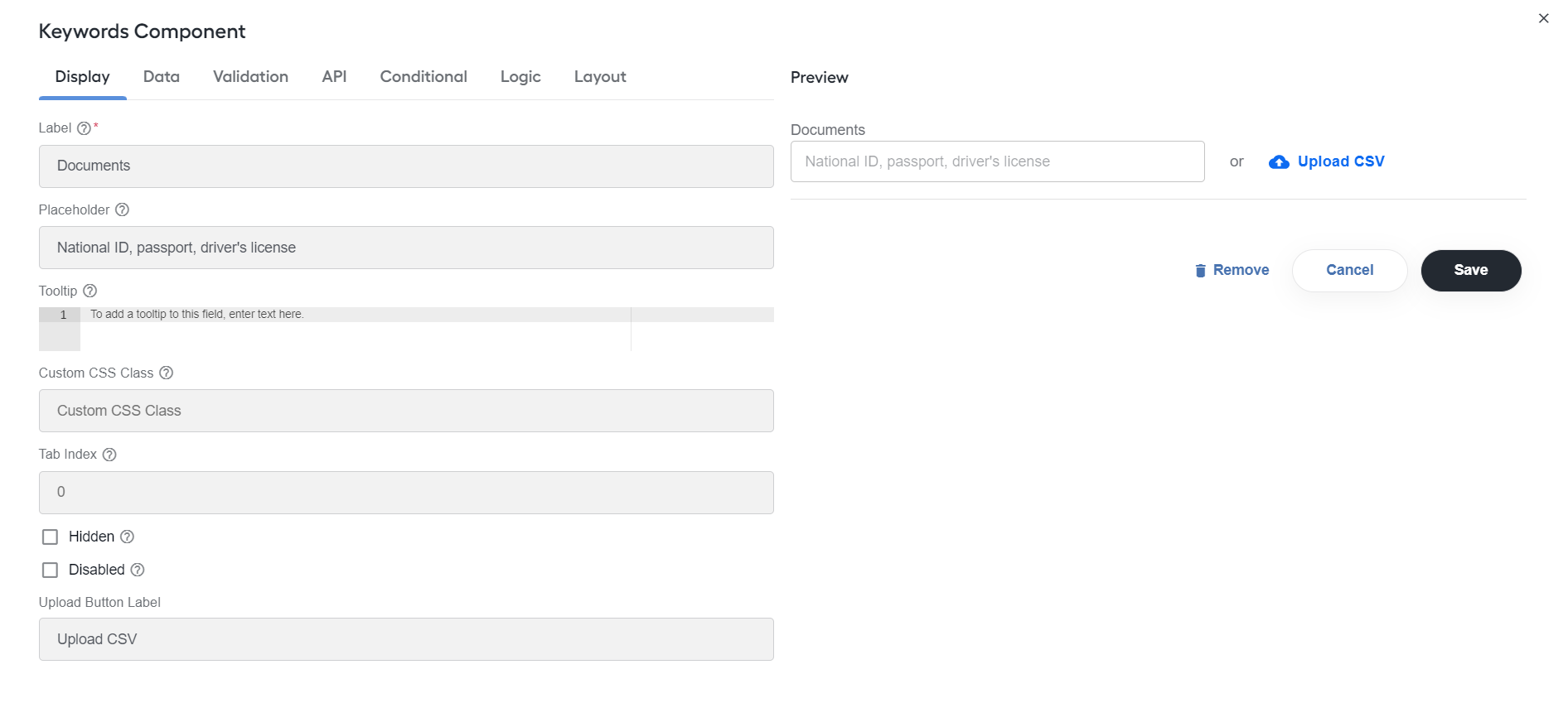
Configure the following settings:
Label: enter a name or a title for the field.
Placeholder: specify placeholder text that appears when the field is empty.
Upload Button Label: enter a name for the Upload button.
Tags
Expand to learn more
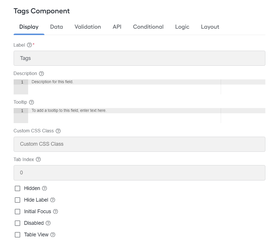
You can use multiple or single tags to categorize items.
Text area
Expand to learn more
The Text area component is a multi-line input field that allows for longer text in comparison to Text field.
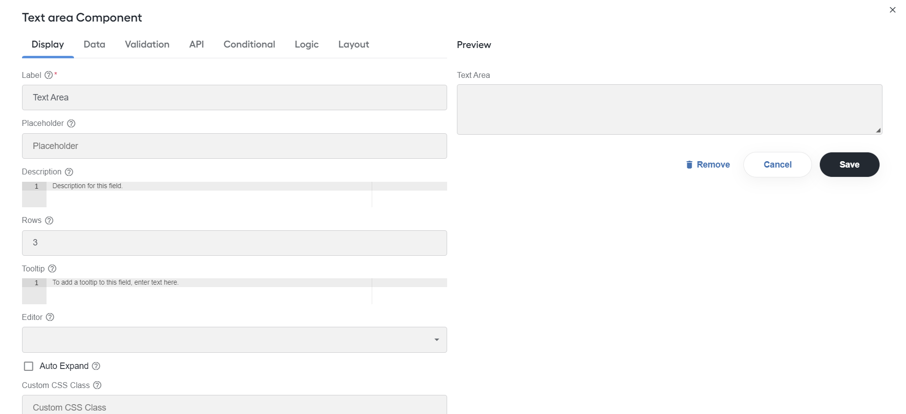
Configure the following settings:
Rows: specify the number of rows visible in the Text area component.
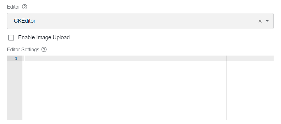
Editor: turn the text area into the WYSIWYG editor user interface of your choice, for example, ACE, CKEditor, or Quill.
Editor Settings: modify the WYSIWYG editor JSON configuration to customize the user interface specific to your needs.
Auto Expand: select to auto-expand the component height depending on the number of characters.
Show Word Counter: select to show a live count of words.
Show Character Counter: select to show a live count of characters.
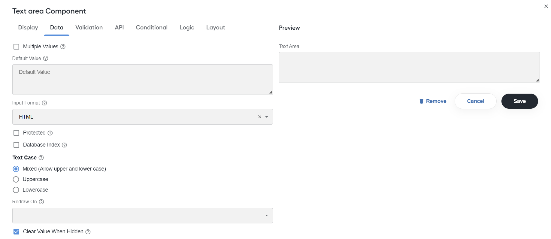
Text Case: change the value case of entered data. The options are as follows: Mixed (Allow upper and lower case), Uppercase, Lowercase.
Text field
Expand to learn more
Use the Text field component for short and general text input.
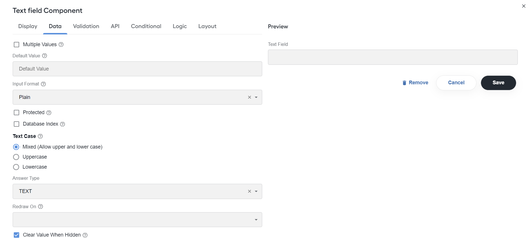
The options are the same as for the Text area component, including:
- Input Mask: specify a predefined format for the input field. For example, for a phone number field, the input mask defaults to
(999) 999-9999. - Answer Type: define an input field type and format. The options are as follows:
- ADDRESS_LINE
- CITY
- COMPANY_NAME
- COUNTRY
- CURRENCY
- IDENTIFIER
- CUSIP
- DATE
- FULL_ADDRESS
- IBAN
- LINE_ITEM
- NUMBER
- PERSON_NAME
- STATE_PROVINCE
- SWIFT
- TEXT
- UPC_CODE
- ZIP_POSTAL_CODE
- OTHER
Add layout components
Use layout components to change the general layout of forms.
note
For common settings applicable for all layout components, see Add form component. The instructions below allow configuring settings specific to selected layout components.
Columns
Expand to learn more
Use the Columns component to group other components, like Text field or Text area, into configurable columns. With the help of Columns, you can also display more than one component in one line.
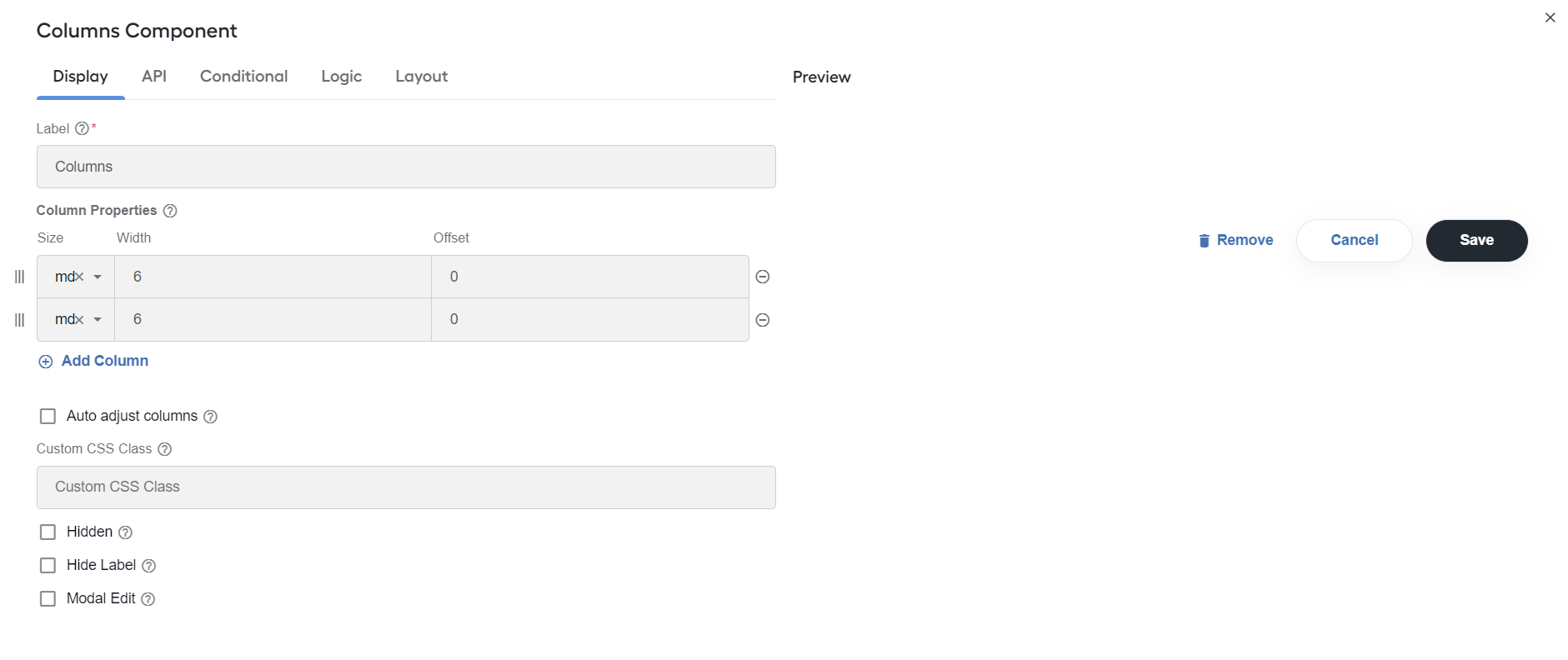
Configure the following settings:
- Column Properties: configure a number of columns to be displayed in a form and specify the size, width, offset, push and pull settings for each column. When configured, you can easily rearrange the columns using the drag-and-drop feature without a need to make everything from scratch.
- Auto adjust columns: select to adjust all the other column position if all the nested components inside one of the columns are hidden.
Content
Expand to learn more
You can add the Content component to provide non-field information, for example, if you need instructions that are for display only. A WYSIWYG editor is provided to help with formatting the content. If you use the HTML view of the editor, note that all unsafe HTML is stripped before rendering to prevent cross-site scripting exploits. This includes tags like <script>, <embed>, and <style>, and attributes like onmouseover or onload.
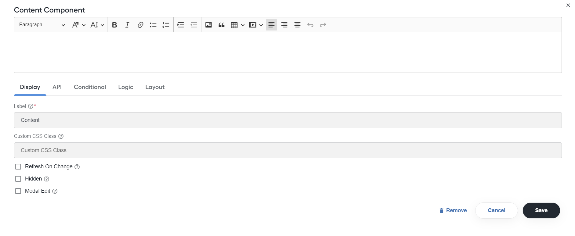
Select the Refresh on Change option to re-render the component whenever any value in the form changes, for example, if you want the Content component to display dynamic data of other components after they are filled in with values.
Data grid
Expand to learn more
Data grid allows to add multiple components to a line item grid. Additionally, you can add any number of grids in a form, for example, when you add or duplicate multiple field sets.
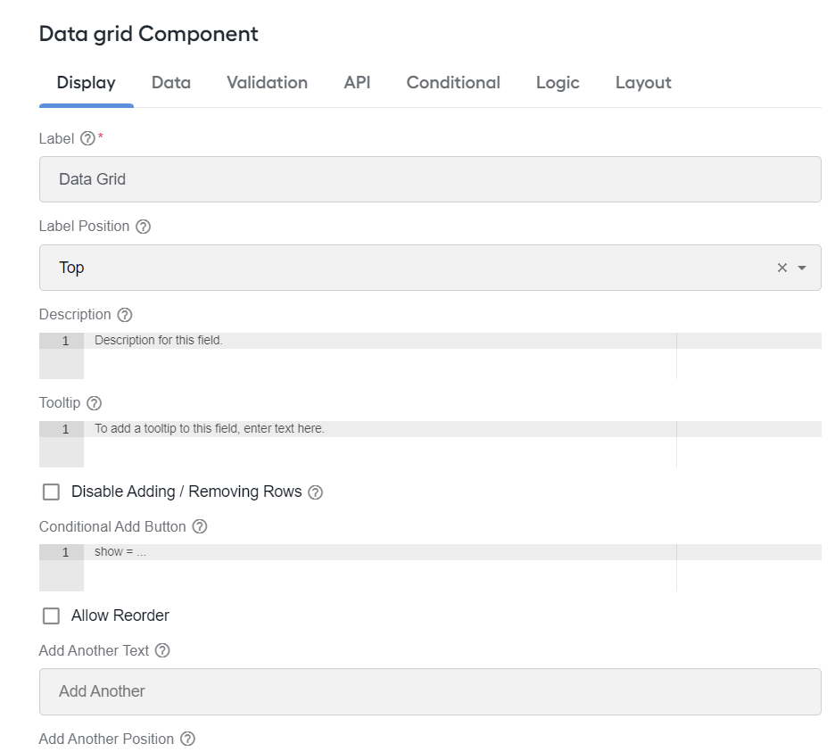
Below is a list of the Data grid main settings:
Disable Adding / Removing Rows: select to hide the Add Another and the Remove Row buttons.
Conditional Add Button: specify a condition when the Add Button is displayed.
Add Another Text: set the text of the Add Another button.
Add Another Position: specify a position for the Add Another button regarding the Data Grid location. You can place the button at the top or at the bottom of Data Grid, or in both places at once.
Allow Reorder: select to reorder rows by drag and drop.
Equal column width: select to make the column size equal in width.
Enable Row Groups: select to separate the Data Grid rows into groups. You can add groups, specify their labels, select a number of rows in certain groups, and delete groups.
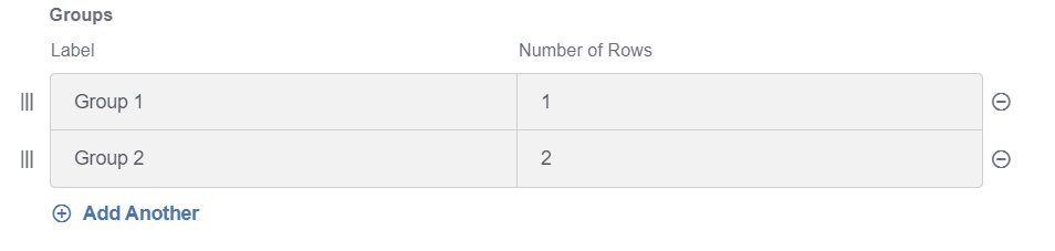
Initialize Empty: select to hide visible rows when initialized.
Edit grid
Expand to learn more
The Edit grid component is used to replicate a table-like structure when it comes to the capture and display of form data. You can add multiple components inside Edit Grid. Additionally, you can add any number of grids in a form, for example, when you add or duplicate multiple field sets.
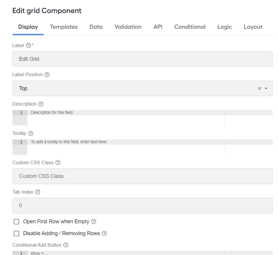
Below is a list of the Edit Grid main settings:
Open First Row When Empty: select to open the first row when Edit grid is empty. This way, Edit grid will never be empty.
Disable Adding / Removing Rows: select to hide the Add Another and the Remove Row buttons.
Header, Row and Footer Templates: customize the grid using basic JavaScript. On the Templates tab, you can modify the display of components shown in the grid row along with the header or footer.
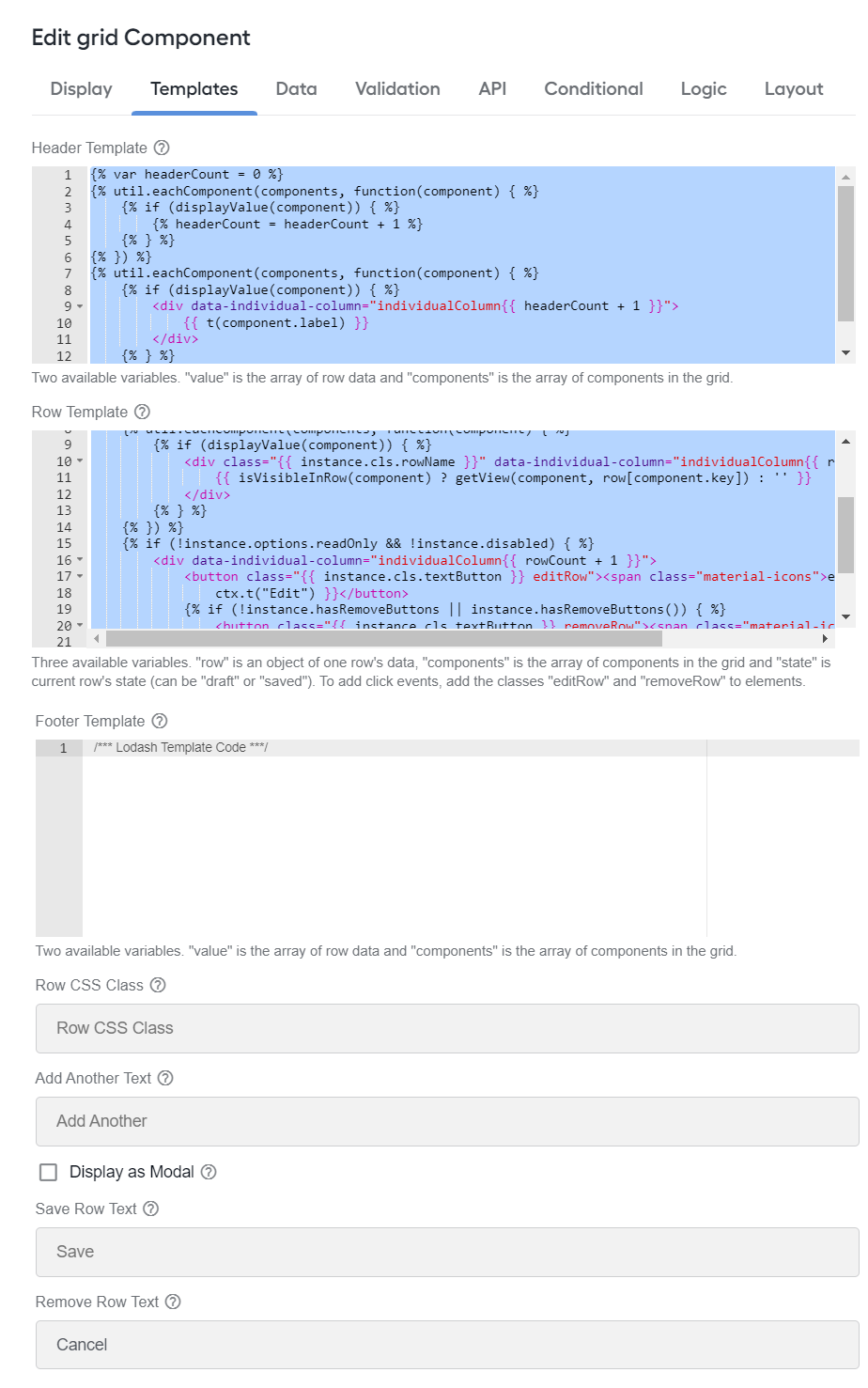
Add Another Text: enter text for the Add Another button.
Display As Modal: select to display the form layout to add or edit a data entry in a modal view.
Save Row Text: enter text for the Save Row button.
Remove Row Text: enter text for the Remove Row button.
Field set
Expand to learn more
Use the Field set component to create a title of an area of the form. You can put it inside layout components or in between other related components.
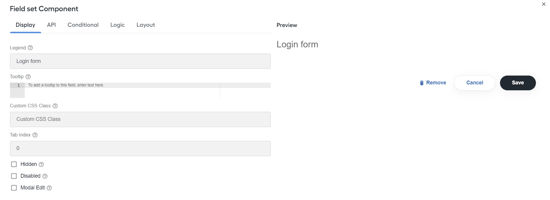
Configure the following settings:
- Legend: specify a legend that appears for the component in the form.
Drill down
Expand to learn more
Apply the Drill down component to make elements clickable inside other components placed within the Multi doc template.
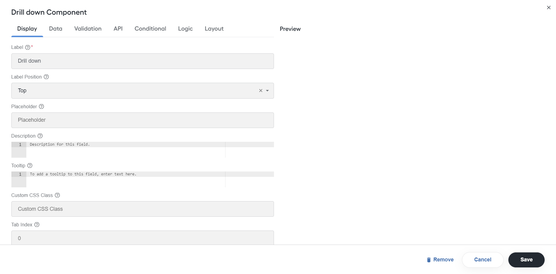
For more details, see Design Manual Tasks via Task Designer Operation | Drill down.
HTML element
Expand to learn more
You can add the HTML element component to display a single HTML element, for example, if you need to quickly insert and configure some HTML in your form. All unsafe HTML is stripped before rendering to prevent cross-site scripting exploits. This includes tags like <script>, <embed>, and <style>, and attributes like onmouseover or onload.
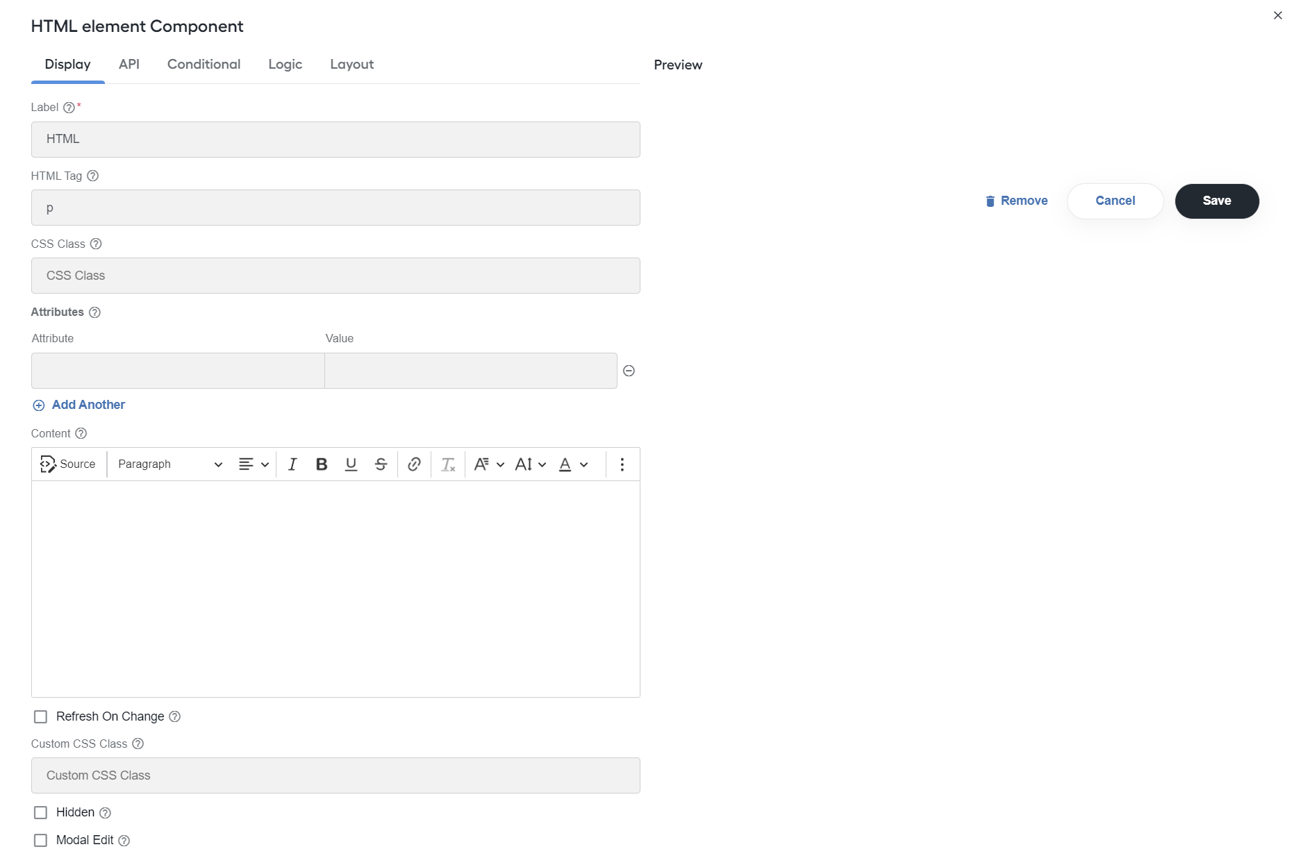
Configure the following settings:
HTML Tag: enter the name of the HTML tag to display.
CSS Class: specify the CSS class to add to HTML element. You can specify multiple classes by separating them with single spaces.
Attributes: define attributes and their values to add to HTML element. Only safe attributes are allowed, for example,
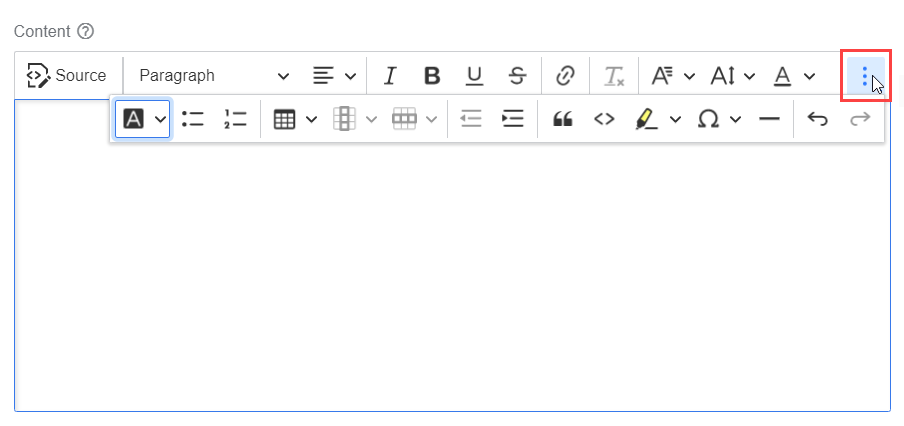
src,href, andtitle.Content: enter the text content in case of adding more child HTML tags to easily write and preview more complex HTML. You can use the Rich Text Editor editor to add formatting to your content.
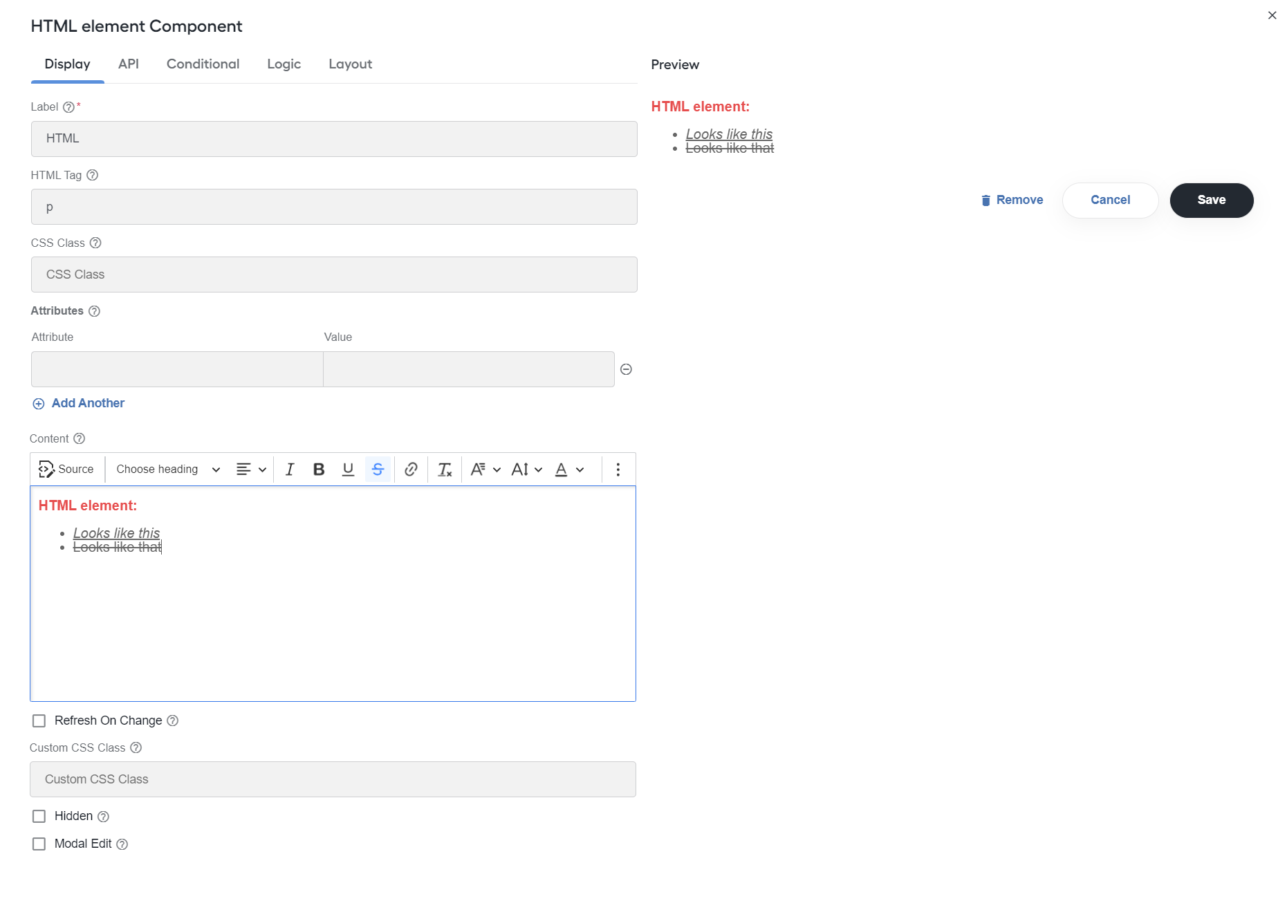
To see all available formatting options, click the menu button:
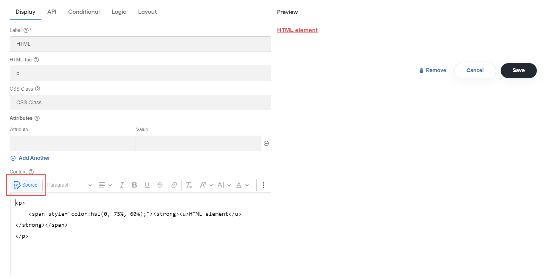
To automatically convert HTML markup (from earlier versions) into rich text, click Source.
important
String interpolation breaks if styles are applied solely to a variable when using a templating language. The correct way is to apply styling to handlebars as well:
<b>{{row.doc_type}}<b>.Refresh on Change: select to re-render the component whenever any value in the form changes, for example, when you want the HTML element component to display dynamic data of other components after they are filled in with values.
Line item
Expand to learn more
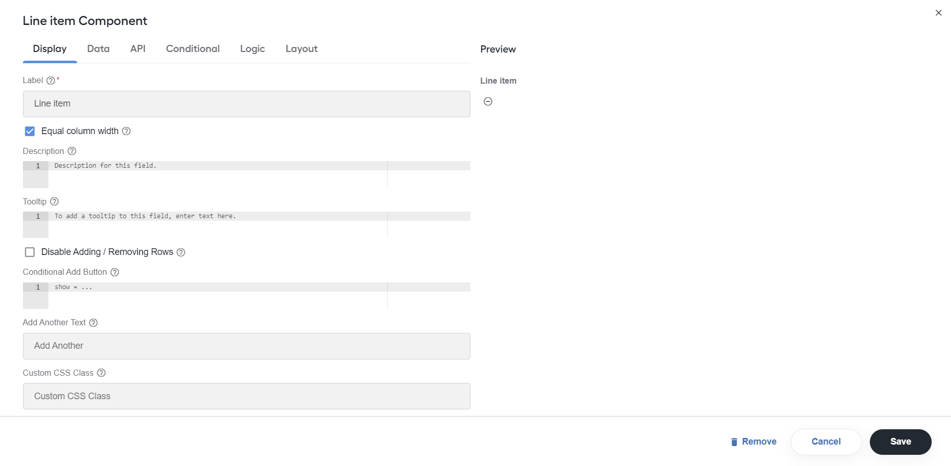
You can add the Line item component to other form components, for example, Data grid or Edit grid, for users to input data. The settings are similar to those of the grid components.
note
By default, columns in a Line item table are set to have identical minimum widths: the Equal column width checkbox is selected, and all Column Minimum Width values are 120 px. The preset minimum width guarantees that columns will resize dynamically as per current UI behavior but never below the set minimum value.
To set the column width in the Line item component, see Design Manual Tasks via Task Designer Operation | Set column width in Line item table.
Panel
Expand to learn more
Use the component to wrap groups of fields with a title and styling.
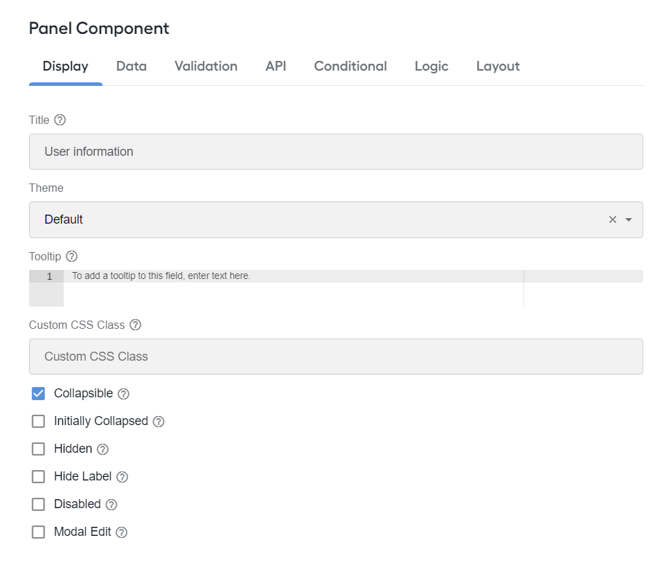
Configure the following settings:
- Title: enter the title to be displayed at the top of the panel.
- Theme: specify the theme. Select one of the options to have the class added to the wrapper div.
- Collapsible: make the component collapsible. Thus, you can improve the usability of the form that has many components, allowing users to hide the fields they don't want to see while filling in one or another section of the form.
- Initially Collapsed: select to make the panel collapsed on the form load. The setting is visible only if Collapsible is enabled.
Panel list
Expand to learn more
Use the component to set up a Data Grid on a static (summary) tab for working with data from the dynamic tabs of your template.
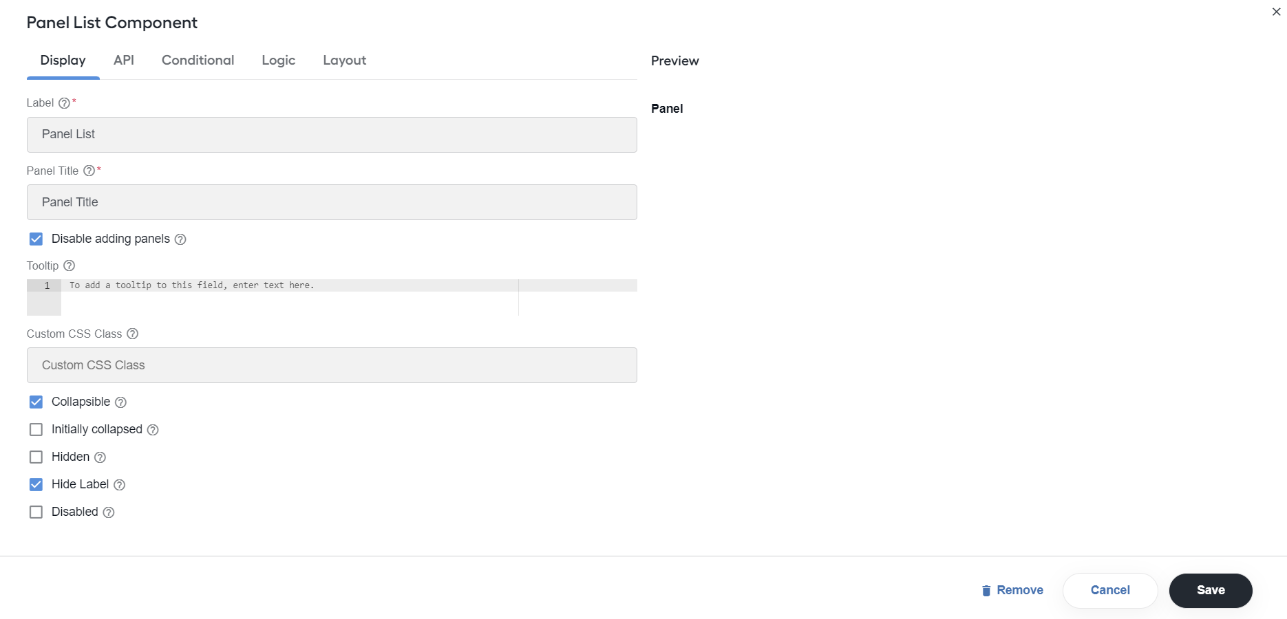
The Panel list component contains one Panel component by default. You cannot remove this panel, but you can add more panels based on input objects. Configure the following settings:
Panel title: specify the title that will be applied to child panels. You can set up a statiс title or a dynamic one from input JSON. The dynamic title is a path to an object that is generated based on the grouping key, for example,
{{data.status_title[status]}}.Disable adding panels: uncheck to show the Add panel and Remove panel options.
Add panel button text: enter the name for the Add panel button. The option is available only when Disable adding panels is unchecked.
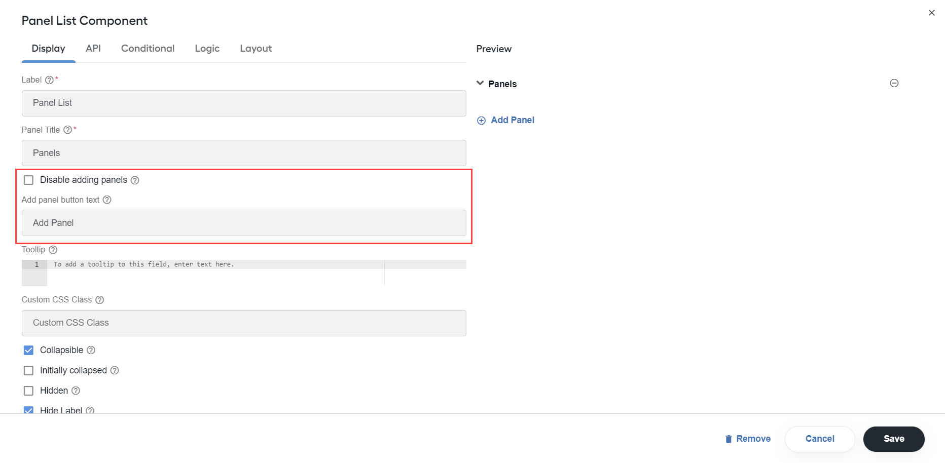
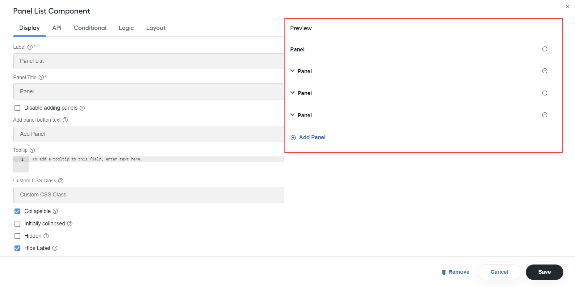
Now, in the Preview section, you can add new panels via the Add panel option and remove them by clicking the Remove button.
Collapsible: check to make the child panels collapsible.
Initially collapsed: check to show the child panels originally collapsed.
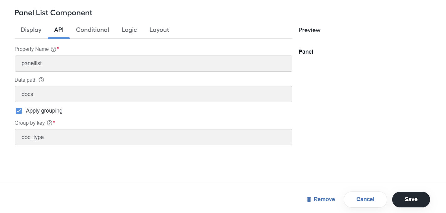
Data path: specify a path to your list for nested input data. You can set a path to a property in a single record for sorting records into different panels. For example, a single record is a document or an article, and the property refers to a status.
Apply grouping: check to group the child panels by key. In the Group by key field, provide the attribute to filter data and group the panels accordingly.
tip
You can include one Panel list into another Panel list.
Table
Expand to learn more
The Table component allows creating a table with columns and rows where you can add additional components.
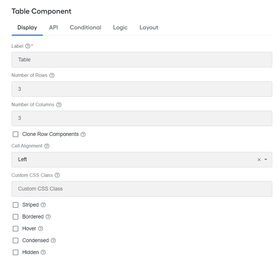
Configure the following settings:
- Number of Rows: define the number of rows in the table.
- Number of Columns: define the number of columns in the table.
- Clone Row Components: clone the components that are in a cell of one of the columns to other cells of that column. It can be useful if you want to add many rows with the same content.
- Cell Alignment: set up alignment for the table cells. The options are as follows: Left, Center, and Right.
- Striped: add striped shading to table rows.
- Bordered: add visible borders for the table.
- Hover: highlight a row on a mouse hover.
- Condensed: condense the size of the table, making it take up less space.
Tabs
Expand to learn more
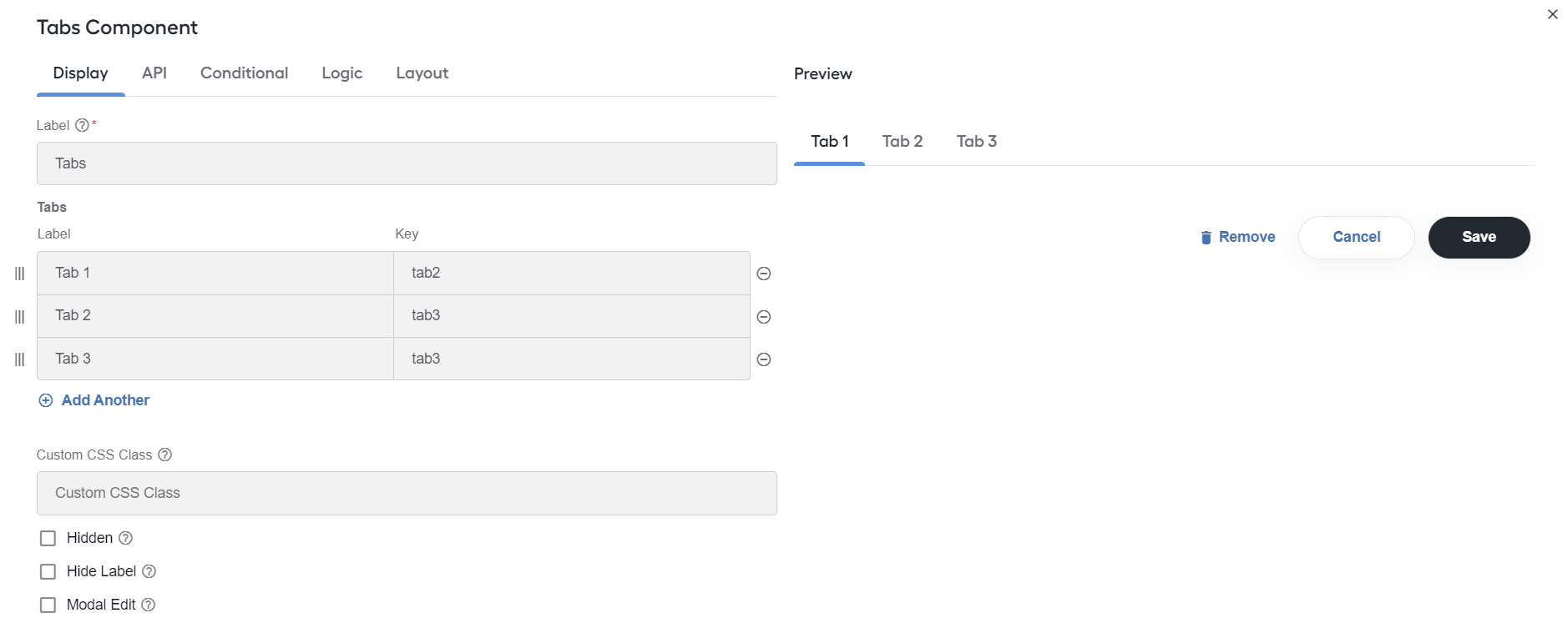
The Tabs component allows creating tabs used to group various sets of components. To switch between tabs, use a navigation bar with tab buttons, each of which opens an appropriate tab with a set group of components. Only one tab at a time displays in a rendered form.
The Tabs configuration allows adding, configuring, reordering, and removing tabs. Click Add Another to add a tab and specify a label for each added tab.
Edit component
To edit any component settings, select the component, hover over it and, in the top-right menu, click the cogwheel button to open the Settings page. The component settings open in a new window.

Make required changes and click Save.
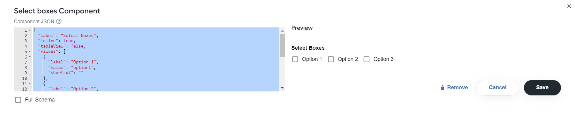
You can also edit a JSON schema of any form component. To do that, hover over a component and click the Edit JSON icon.

Edit a JSON schema and click Save. Select the Full Schema checkbox to view a full schema.
Copy component
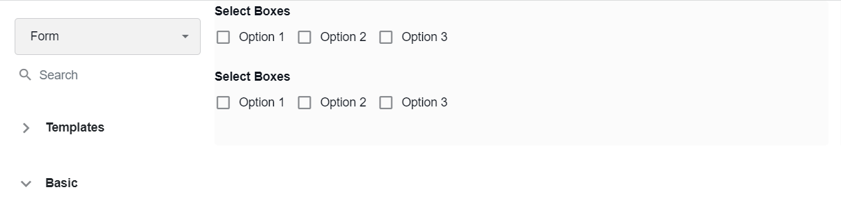
To copy a form component, select the component, hover over it and, in the top-right menu, click the Copy button.

A Paste button appears. Click it to paste the form component.

The copied form component appears below.
Move component
To move a form component, select the component, hover over it and, in the top-right menu, click the Move button.

Then, move the component to the needed place on the main canvas. The form component is moved.

Delete component
To delete a form component, select the component, hover over it and, in the top-right menu, click the Delete button. The form component is deleted.

Be careful with deleting a component that contains several form components within it. Removing this component will also remove all of its children. To finish the deletion, click OK on the confirmation message window.
